| |
What does a web site’s structure look like? A site is made up
of thousands of pages, all linked together in a tree-shaped structure.
A ‘map’ of the structure can be drawn using illustration
software, but the diagram quickly becomes tangled in anomalies because
the site is not as hierarchical as would be expected. To further
complicate matters, the contents of the site are continually
changing. Web pages are added and removed daily, so by the time the
map could be finished, it would already be inaccurate. How can these
changes be represented visually?
How can a connection be made between the site’s usage statistics
and that structure? How can the paths that visitors take through the
site be expressed? A number next to each page could keep track of the
total number of visitors, but because the traffic patterns are
continually changing, it becomes clear that the totals aren’t as
useful as hoped. How can the day to day and month to month changes in
these numbers be expressed? How can the movement between pages be
represented, making it apparent that some areas are more closely
related than others?
Anemone is a project that uses the process of Organic Information
Design to make this set of problems more approachable. Data from the
Aesthetics and Computation Group’s web site was used as input in
the examples shown here. Rules for growth can govern the creation of
new branches of structure within the site. Atrophy rules decay unused
areas, eventually removing them. Individual web pages can call
attention to themselves as they are visited more rapidly than
others. A set of rules governing movement can group related areas.

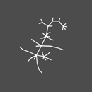
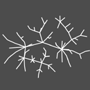
Figure 1 several steps showing growth of the web site’s structure
Individual branches grow based on input from the data. As the Preprocessor Engine reads the usage log, a reproduction rule causes branches to grow whenever parts of the site are visited for the first time. This avoids the problem of having to keep track of what pages are added to or removed from the site. Using the usage data to create an implicit model of structure is a common theme in Organic Information Design.
To balance growth is the notion of ‘atrophy’. Branches associated with areas of the site that have not been visited will slowly wither away, causing them to visually thin out. Eventually the branches die, and are removed from the system.
A movement rule keeps the individual nodes within a set distance from
their parent node. A second rule maintains a distance between nodes
and their neighbors, so that branches overlap as little as
possible. The composition is brought to life through the interactions
of the growth and movement rules. The figure moves about the screen in
a hyper, erratic fashion as it creates the initial parts of the
visualization. After some time, this growth reaches an equilibrium and
the pseudo-organism ‘settles’.
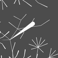
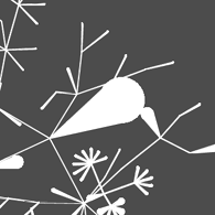
Figure 2 nodes attracting attention and declaring their importance through changes in thickness
Nodes at the tip of each branch represent a web pages. As seen in
figure 2, each time a user visits a page, its node in the
visualization becomes slightly thicker. Nodes for pages that are
visited often become very thick relative to other nodes. This can
happen rapidly, as nodes attempt to ‘call attention’ to
themselves.
If several users visit a particular section of the site, that group of
nodes will collectively thicken, drawing attention to the group. An
interesting phenomenon can be watched as it propagates back through
the site structure. For example, many people may visit the site from a
link referring to it in the Yahoo directory (www.yahoo.com). This
traffic can be watched while it propagates outward from the linked
page.
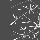
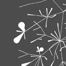
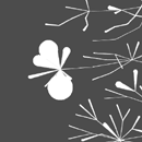
Figure 3 progress of thickening in a group of related nodes
In addition, the appearance of the nodes self-regulate. If a
particular page is frequently and consistently visited, its associated
node in the visualization will thicken, but only up to a certain
threshold. Not much additional information is learned therefore there
is no need to allow the node to grow to enormous proportions. This
homeostasis rule causes the node to settle to a certain size until
changes in its use occur.
The Anemone experiment looks at how structural information can be
juxtaposed with less structured usage patterns. Figure 4 is an image
of Anemone with two layers. The top layer is the directory structure
of the site (depicted with branches), determining a hierarchy for
where individual web pages are located. The layer beneath represents
the paths taken by users as they visit the site.
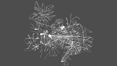
Figure 4 the two layers of Anemone, juxtaposing structured hierarchy with nonlinear usage
The paths can follow the directory structure, which is closely related
to the link structure, as in the case of the web site being visualized
here. The paths can also have disparate jumps to various areas of the
site. Looking at the two layers together show interesting trends in
the paths that large quantities of users take through the site. For
instance, a large number of paths can be seen that connect the home
page of Professor Maeda into other areas of the site. This is because
many external links point to his page. In addition, a large number of
visitors arrive from search engines having queried for his name.
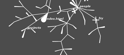
Figure 5 user interaction, dragging nodes with the mouse
User interaction with this visualization is important. The viewer can
click a node to discover which web page it represents (figure 5). They
can also move nodes around as a way to peek inside the data set and
take a closer look at what’s happening. Nodes can be dragged about
the screen, pinned down, and watched in relation to other parts of the
structure.
| |
| |