Computational Information Design
5 Process
This chapter describes the process of Computational Information Design in greater detail. For each step, the goal is to provide an introductory (though hardly exhaustive) reference to the field behind it, as each step has its own considerable background. The intent of Computational Information Design is not to make a inter-disciplinary field, but rather that single individuals should be able to address the spectrum of issues presented—the goal is to understand data, so one needs to be familiar with the issues in handling data from start to finish.

Consolidation often occurs when an established set of fields with their own considerable background meet a technological shift. The combination of an affordable laser printer, scalable font technology, and page layout software gave rise to desktop publishing in the mid 1980s. This collapsed the role of the many practitioners required in publishing, making it possible that a single individual could (from their “desktop”) write, layout, print and distribute a printed artifact such as a flyer or a book. Previously such tasks were left to a writer to produce the text, a graphic designer to arrange it on a page, a person to set the type, another to photograph it for printing, produce negatives, then positives, make printing plates, and finally print the finished product on a printing press. The process was tedious and costly.
The combination of technology and tools that resulted in desktop publishing subsequently created an opening that led to an entirely separate process that focussed on the act of publishing, rather than on the individual tasks (layout, typesetting, printing) involved. It also filled a significant need by making information easier to disseminate and publish. Of course desktop publishing did not replace traditional publishing, rather it both brought publishing to a wider audience on the low end, and revolutionized the process on the high end, making it far more efficient and flexible.
For Computational Information Design, a history has been established (as set out in the third chapter of this thesis) amongst a range of fields, some more traditional like mathematics and statistics, others more recent like Information Visualization and Human-Computer Interaction. The range of work, by the vlw, and other research laboratories and institutions, point to a next step for the handling of data.
As a technological enabler, the availability of extremely powerful, and surprisingly inexpensive computer hardware with advanced graphic capabilities (driven by the consumer push for internet access and the gaming industry, respectively) puts the ability to build this work in the hands of a far wider audience.
As a further enabler, the Processing software development tool has been created as a step to bring development of visually-oriented software to a wider audience. While the requirement to write software is still considerable (and thus is not necessarily expected to lead to the sort of “revolution” characterized by desktop publishing), it provides an initial bridge that has shown early signs of success—thousands of developers and hundreds of projects being developed by the community surrounding it.
Not unique to this author, the process is also largely an attempt to codify what is being addressed by many dynamic information visualization projects, while addressing the gaps that exist in many of these implementations. Individuals and laboratories have addressed all or part of this process in these works, but as yet, little attempt has been made to teach it as a whole. This leaves the ability to build such works in the hands of a small number of practitioners who have figured it out on their own, while individuals in the larger design or computer science communities are often left perplexed at how to begin.
For these reasons, the goal of this thesis has been to demonstrate the use of such a process in basic (chapter two) and advanced (chapter four) settings, explain it for a wider audience (this chapter) and then make available a tool to make the process easier (chapter six).
5.1
what is the question?
As machines have ever-increased the capacity with which we can create (through measurements and sampling) and store data, it becomes easier to disassociate the data from the reason for which it was originally collected. This leads to the all too often situation where visualization problems are approached from the standpoint of “there is so much data, how do we understand it?”
As a contrast, one might consider subway maps, which are abstracted from the complex shape of the city, and are instead focussed on the goal of the rider, to get from one place to the next. By limiting the detail of each shape, turn, and geographical formation, this complex data set is reduced to answering the question of the rider: “How do I get from point A to point B?”
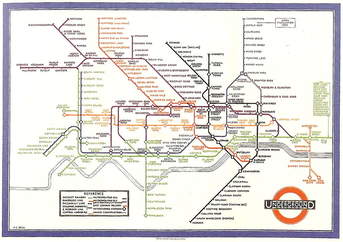
The system of subway maps was invented by Harry Beck in the 1930s who redesigned the map of the London Underground [Garland, 1994]. Inspired by the layout of circuit boards, the map simplified the complicated tube system to a series of vertical, horizontal, and 45º diagonal lines. While preserving as much of the terrain as possible, the map shows only the connections between stations, as that is the only information usable for the rider in making the decision of their path.
In addressing data problems, the more specific the question can be made, the more specific and clear the visual result. When questions are scoped broadly, as in “Exploratory Data Analysis” tasks, the answers themselves will be broad and often geared towards those who are themselves versed in the data. But too many data problems are placed in this category simply because the data collected is overwhelming, even though the types of results being sought, or questions being answered, are themselves far more specific.
Often, less detail will actually convey more information, because the inclusion of overly-specific details cause the viewer to disregard the image because of its complexity. Consider a weather map, with curved bands of temperatures across the country. Rather than each of these bands having a detailed edge, their specificity is tied to conveying a broader pattern in data that is itself often subject to later be found inaccurate.
It is a somewhat jocular endeavor to boast of how many gigabytes, terabytes or petabytes of data one has collected and how difficult the analysis will be. But the question needs to be asked, why have they been collected? More data is not implicitly better, and often serves to simply confuse the situation. Just because it can be measured doesn’t mean it should.
The same holds for the many “dimensions” that are found in data sets. Web site traffic statistics have many dimensions: ip address, date, time of day, page visited, previous page visited, result code, browser, machine type, and so on. While each of these might be examined in turn, they relate to distinct questions. Because the question might be “how many people visited page x over the last three months, and how has that changed month over month,” only a few of the variables are required to answer that question, rather than a burdensome multi-dimensional space that maps the many points of information.
The focus should be on what is the smallest amount of data that can be collected, or represented in the final image, to convey something meaningful about the contents of the data set. Like a clear narrative structure in a novel or a well orated lecture, this type of abstraction would be something to boast about. A focus on the question helps define what that minimum requirements are.
5.2
acquire
The first step of the process is about how the data is first retrieved (where does it come from?) and the most basic aspects of how it is initially filtered. Some typical kinds of data sources:
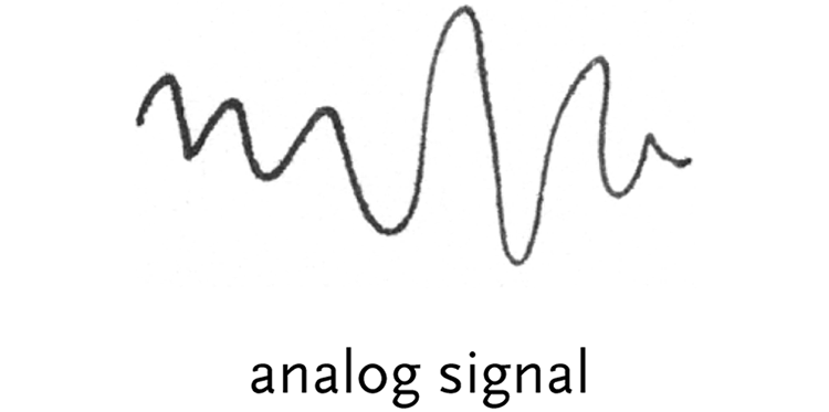
analog signal – an analog signal is simply a changing voltage, which is “digitized” by an analog-to-digital converter (adc) into a series of discrete numbers. For instance, the waveforms that make up the audio on a compact disc are sampled into values that range from 0 to 65535, meaning that 65535 is the highest peak of the wave, and zero is the lowest. A value halfway between those two numbers is silence. There are 44,100 such levels for each second of audio, and the numbers are stored as binary on the disc.
The numbering of 0 to 65535 is because the data is stored as two bytes, or 16 bits that can be either zero or one. Sixteen bits can represented 216 numbers, which is 65536 total values (when counting from one, but 65535 because electronics count from zero).
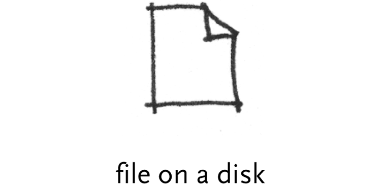
file on a disk – this is perhaps the simplest type of data to acquire, since files exist only to be read and written. Files are either text (such as plain text documents or html files) and human readable, or binary (such as jpeg and gif image files) and generally only machine readable. Making sense of such data is described in the section that follows.
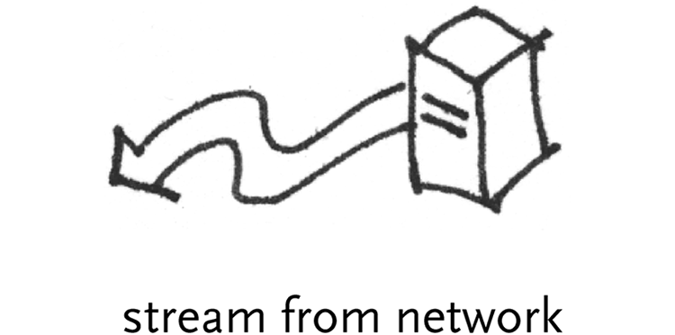
stream from a network – it is common for live data to be “streamed” directly from a network server. Common examples are the raw data from news feeds (generally text data) or live video and audio. The type of acquisition shifts because it is often unclear how much data is available, or it represents a continuously updating set of values, rather than something more fixed like a file on a disk.
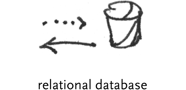
relational database – A relational database is simply a large number of ‘tables’, which are themselves just rows of data with column headings. For instance, a table for addresses might have columns for first and last name, street, city, state, and zip. The database is accessed via a “driver” that handles the “stream from a network” style data. The database is first given a query, typically a command in a language called sql, (short for Structured Query Language) for example:
SELECT * FROM addresses WHERE firstname IS joe
This query would grab a list of all the rows in the “addresses” table where “Joe” was found in the column named “firstname.” Despite their important sounding name, at a fundamental level, databases are extraordinarily simple. The role of a database is to make queries like this one, or others that can easily get far more complicated run exceptionally fast when run on enormous tables with many, many rows of data (i.e. a list of 10 million customers).
The pitfall of databases in interactive environments is that it’s not always easy to have data from them update automatically. Because they are fundamentally a means to “pull” data (rather than having it pushed continuously, like a network stream) software that uses a database will have to hit the database with a new query each time more or a different set of data is needed, which can easily cause a lag in an interface (several steps later in the process) or be prohibitively cumbersome for the system (i.e. thousands of people using an interactive application that’s connected to a database and running a new query each time the mouse is dragged to change values in a scroll bar).
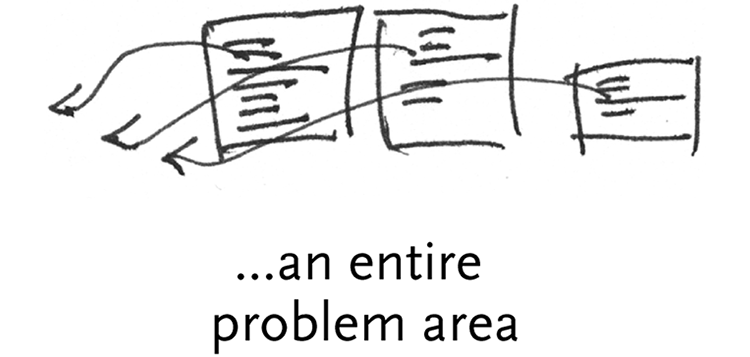
an entire field – The data acquisition quickly becomes its own field, regarding how information can be obtained and gleaned from a wide variety of sources, before they’re even codified into a manageable digital format. This is a frequent problem concerning how relevant data is recorded and used. For example, how does one quantify the ‘data’ from an hour-long meeting, that involved a verbal discussion, drawings on a whiteboard, and note-taking done by individual participants?
In terms of Computational Information Design, the acquisition step is perhaps the most straightforward, however it’s important to understand how sources of data work (such as the distinction between text and binary data) , and their limitations (how common relational database can and cannot be used).
5.3
parse
This step looks at converting a raw stream of data into useful portions of content. The data might first be pre-filtered, and is later parsed into structures usable by a program. Almost always, data boils down to just lists (one dimensional sets), matrices (two dimensional tables, like a spreadsheet), or graphs (sometimes trees, or individual ‘nodes’ of data and sets of ‘edges’ that describe connections between them). Strictly speaking, a matrix can be used to represent a list, or graphs can represent the previous two, but the over-abstraction isn’t useful.
5.3.1 Pre-filter
Pre-filtering are the most basic operations on the binary data of the previous step. It is not the more complicated content-oriented filtering that comes from in the “mine” section of the next step of the process, but rather involves issues of synchronization to find the content in a data set.
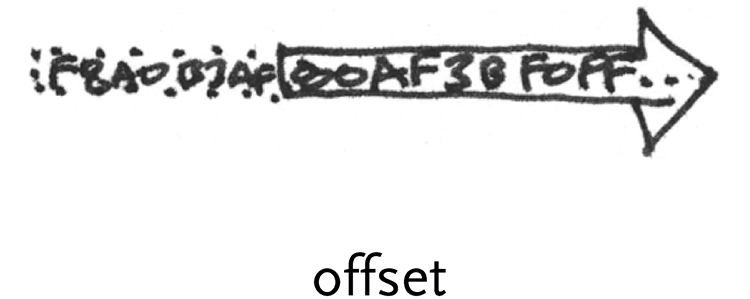
offset – finding appropriate offset and subset of data in a binary stream. Often, a stream of data will have a “synchronization” signal that signifies the beginning of a new set of data.
For instance, a television signal is a one-dimensional stream of information, an analog wave whose intensities determine the intensity of each pixel on the television screen from left to right, top to bottom. For each line of the image, the signal has a specific up/down change that determines the end of one line of the image and the beginning of the next. Another signal marks the beginning of a new screen of data. When first turned on, a television receiver will wait until the first time it sees the signal’s wave make the pattern for a new screen, and then begin reading and drawing to the screen from that point.
An offset might also be used in a similar way for a binary stream, so that some initial data is ignored, perhaps until a flag or marker is seen that quantifies a beginning point.
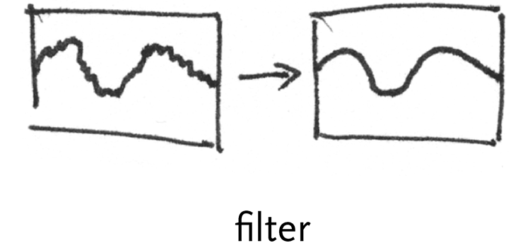
filter – a “low-pass” filter might be placed on the waveform to steady a bad signal, removing small deviations from the signal (“high frequency” data, passing only the “low”) to clean it.
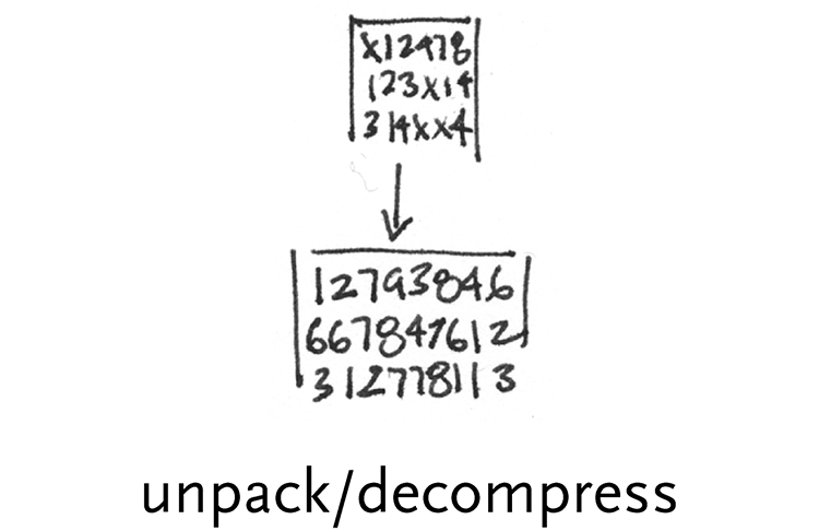
unpack/decompress – unpacking involves expanding data that may have been compressed with regards to its information content. For instance, it’s more compact to store an image on disk by saying that there are a stream of 500 pixels of red, than to write out “red” 500 times. This is the method of simple compression algorithms like rle, which stands for run-length encoding.
Others, such as gzip, pack data using slightly more complicated methods [www.gzip.org]. Unlike gzip which can act on a stream of data as it is emitted, table-based compression algorithms like lzw, (used for gif images) first create a table of features in the data set that appear most often, rank them, and then assign the smallest possible amount of bits to the most common entries in the table.
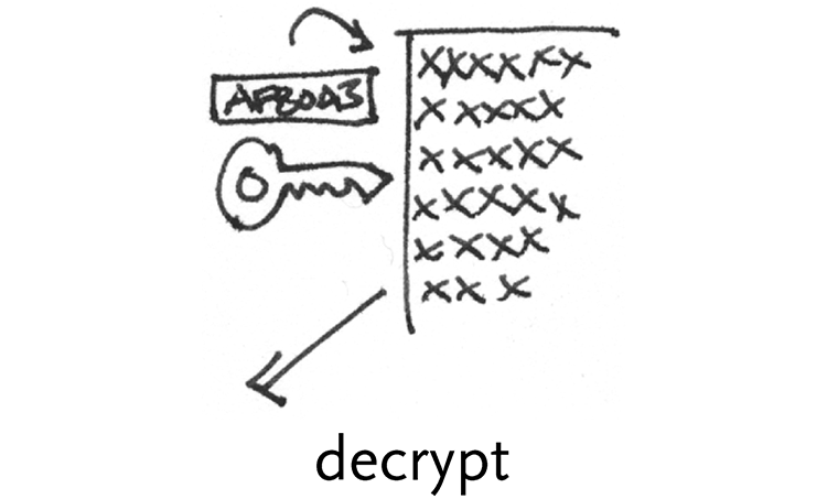
decrypt – decryption involves using a mathematical key as a way to decode a data set, usually a very large number multiplied or divided by another.
Perhaps the simplest form of encryption/decryption is rot13 [demonstration at www.rot13.com], which simply rotates letters by 13 places (i.e. a becomes n, b becomes o, ... , and so on until n also becomes a).
More feasible forms of encryption include ssl, widely used on the web to keep credit card information safe when making online purchases [www.netscape.com/eng/ssl3]. It relies on large number ‘keys’ (arbitrated between the customer and merchant’s computers) to encode data.
5.3.2 Parsing Tasks
The parsing step involves breaking the data into known structures that can be manipulated by software. The result of this step is a set of data structures in memory. For this step in the zipdecode example in chapter two, this distilled the 45,000 entries in the zip code table into individual “records” stored in memory.
5.3.2.1 Bits with periodicity
This category is for situations where bits are broken into a linear stream at periodic intervals.
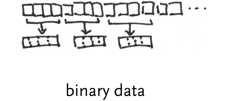
binary data – list of binary values that encode numbers. For instance, a temperature sensor connected to a computer might send a byte for its current reading each time it changes.
On the other hand, this could be a file filled with four byte numbers that encode a series of readings from a more sensitive device. Each byte is made up of a series of bits representing 27 down to 20, so for the byte 10110001, that looks like:
1
27
128
0
26
64
1
25
32
1
24
16
0
23
8
0
22
4
0
21
2
1
20
1
The second row shows the power of 2 for each bit, and below that is the value for that power of two. Each bit set to one has its value added, so this byte represents:
27 + 25 + 24 + 20 = 128 + 32 + 16 + 1 = 177
Because a byte can only signify a number from 0..255, several bytes can be used together through bit shifting. Two bytes used together can represent 216 possible values (0..65535). This is done by making the first byte signify 215 down to 28, and then adding that number to the second byte, which represents 27 down to 20. More bytes can be added in the same manner, on current machines, four bytes will be used to represent an integer number. In addition, the left most bit is sometimes used to signify the ‘sign’ of the number, so if the bit in the 27 place is set, the number is negative. This will provide numbers from -128 to 127.
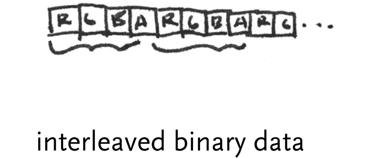
interleaved binary data – this is often used for image data, where a series of bytes will depict the red, green, and blue values for a pixel. The first byte might be a value from 0..255 for red, followed by one for green, and another for blue. Images are commonly stored in memory as 32-bit integers, where the fourth byte is either a value for alpha, or left empty because it’s more efficient to deal with 32 bit numbers than 24 bit numbers (the binary design of computers makes powers of 2 most efficient)
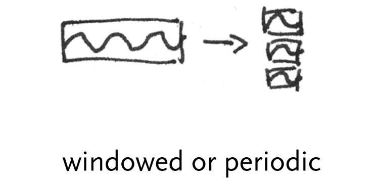
windowed or periodic data – a windowed data set might be a signal that has a particular periodicity, and these “frames” might be compared against one another for changes.
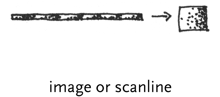
image or scanline – the two dimensional data of an image is unwound into a single stream of data, the width of each line being called the ‘scanline’, similar to the example of the television signal.
5.3.2.2 Text characters
Text characters can take a variety of forms, whether separated by a simple delimiter like a comma (or a tab, as in the zipdecode example) or must be parsed by a markup language or something more advanced like the grammars used to parse the text of a program.
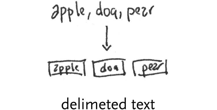
delimited text – plain text lines. One of three types is most prevalent. First, whitespace (a tab or space character) might be used as a separator:
apple bear cat potato tomato
Another common format is csv, or comma separated values, which might be used to save a spreadsheet, and for each row, uses a comma to separate the columns of data (a column that has a comma as data is placed in quotes):
apple, bear, cat, “worcester, ma”
Finally, text files are sometimes fixed width, where each column is separated by padded spacing, so that new columns of data always start at specific positions. This is becoming less common, but was used heavily in older formats and computer systems because programming languages of the time (such as Fortran) were better at splitting data at specific positions, rather than on specific characters:
12345678901234567890123456790
apple 1456990 3492
bear 3949 22
cat 33923 619
In this example, first column is from character 1 through 12, the second is from 13 through 19, and the final is from 20 through 27. A Fortran programmer couldn’t be happier.
varied delimiters – delimiters are often more complicated, so regular expressions are often employed. Regular expressions (or regexp) are a way to match text that might vary in length or have delimiters that change. Regexp commingle special sequences like \w, which means match any “word” character (the letters a-z and A-Z) or \d which means any numeric digit (0-9). Next, the modifier + can signify “one or more” or * might signify “zero or more” For instance:
\w+\s\w+
means to match any number of “word” characters, followed by some kind of whitespace (tab or space char), then another series of one or more word characters. Regexp can become very complex, for instance, the following is a single line of text is taken from a web server activity log:
mail.kpam.com - - [22/Apr/2004:
to parse this into a series of useful pieces (using the Perl programming language), the following regexp is used:
^(\S+) (\S+) (\S+) \[(\d+)\/(\w+)\/(\d+):(\d+):(\d+):(\d+) ([^\]]+)\] “(\S+) (.*?) (\S+)” (\S+) (\S+) “(\S+)” “(.*)”$
Internal to the computer, regexps are compiled programs and can run surprisingly fast.
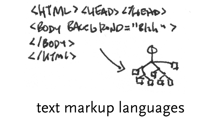
text markup languages – while regexps are useful for single phrases or lines of data, tagged formats, such as html, are popular for whole documents. As evidenced by the enormous amount of interest in formats like xml, these can be useful way to tag data to make them easy to exchange.
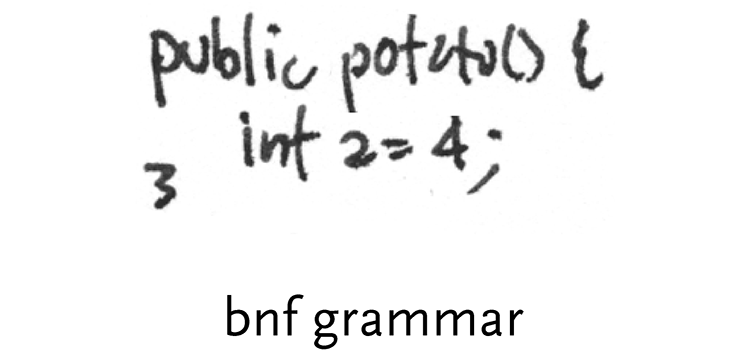
bnf grammars – a step past regexps and markup languages are full bnf grammars, most commonly used for the parsing of programming languages, and also useful in protocol documents (i.e. the documentation for the http standard that describes how communication works between web browsers and web servers) because of their specificity. A bnf grammar, which is human readable and editable, is compiled to program code by a parser generator, that makes far less intelligible, but very fast-running code. An example of a (not very strict) grammar:
word = token | quoted-string
token = 1*<any CHAR except CTLs or tspecials>
tspecials = “(“ | “)” | “<” | “>” | “@”
| “,” | “;” | “:” | “\” | <”>
| “/” | “[“ | “]” | “?” | “=”
| “{“ | “}” | SP | HT
quoted-string = ( <”> *(qdtext) <”> )
qdtext = <any CHAR except <”> and CTLs,
but including LWS>
As can be seen in this example, the grammar is built all the way up from small components like characters, and into more complicated structures like a quoted string.
5.3.2.3 Structured data
Structures and hierarchies refer to the common situation of a data set having a hierarchical structure of elements within elements, or elements that have pointers to one another.
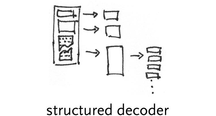
structured decoder – many kinds of data have a hierarchical format of objects within objects. For instance, a hard disk is made up of a partition table that describes its hierarchy, followed by a series of partitions that show up as individual drives on a user’s machine. Each partition has a file system, which describes how files are laid out on the disk and where they are located physically on the disk. In the case of a Mac OS file system, the files are made up of two forks, one for actual data and the other for resources, or metadata. The resource fork itself has a table that describes what kind of resources it contains and where they’re located within the file. Each resource has its own structure that provide still more tables within tables. For highly structured data, these can be dealt with in a very generic way (where most things are tables or lists or values, etc).
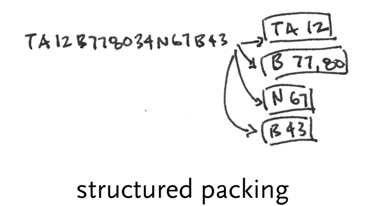
structured packing – data might be packed into a stream to make it more condensed, though it’s not necessarily considered compression (described in the ‘acquire’ section). One case is Postscript fonts, where an encoding called CharStrings is used to convert individual commands for drawing a letter (like lineto and moveto) into specific binary numbers, making the file easier for a program to parse (than plain text) and also more compact.
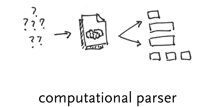
computational parsers – Non-uniform data structures require more logic than a simple description of hierarchy, or unpacking based on indices. These are dealt with by a program designed to understand the higher variability of the structure. No doubt some rules are employed, but they are implemented via a full programming language because they are too complicated to abstract.
5.4
filter
The filtering step handles preparing a relevant subset of the data to be considered by the user. It is strongly tied to the later ‘interact’ step, because the data of interest might change based on
The filter used in the zipdecode example of chapter two was basic, removing cities and towns not a part of the contiguous 48 states. More advanced filtering can be seen in section 4.7, where the user is capable of swapping between a view of the “affected” versus “unaffected” individuals in the study, or a combination of both. Comparing what the data looks like for individuals that exhibit symptoms of the disease in question might reveal clues about snps that identify or play a role in the disease.
In another case, the initial data set in question might be extremely large, another project, used more than a hundred regions of data (rather than the single ones shown in the chapter four examples) that were available as a single large data file. The filtering step in this case broke the data into its constituent regions so that they could be handled separately, or even re-exported based on a per-region basis, for use in tools that could only handle individual regions.
The filtering step sits in the middle of the process steps, the first step that doesn’t handle the data in a completely “blind” fashion, but its methods are not as advanced as the statistics and mining methods of the step that follows.
5.5
mine
The name of this category is simply meant to cover everything from mathematics, to statistics, to more advanced data mining operations.
5.5.1 Basic Math & Statistics
As described by the quote from John Tukey in chapter three, statistics is fundamentally about understanding the contents of data sets, to get an intuitive sense of what is represented by the numbers. Statistics provide an interpretation for the overall “shape” of data. Among the methods are sorting operations, distance metrics, standard deviation, and normalization.
Another important aspect of statistics is understanding the amount of coverage in a data set. A plot of even as many as 500 points across a grid of size 100 × 100 will still only cover 5% of the area. This small amount of coverage should be considered when trying to make the data set as compact as possible – for instance, it might be a clue that the grid of 100 × 100 might be a wasteful representation of the data.
A selection of additional methods and their use:
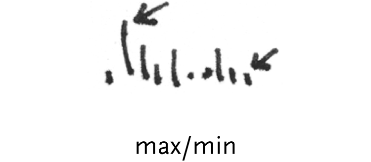
max & min – simply calculating the highest and lowest value in a list of numbers (used in the zipdecode example to determine the ranges for latitude and longitude)
median & mean – the median point is the very middle point of the data set. For a set of five numbers, it is the third, regardless of its value. The mean, or average, is the sum of all the numbers divided by the count.
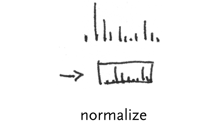
normalization – a basic normalization is to re-map a set of numbers to range from zero to one, making them easier to handle for subsequent calculations. In the zipdecode example, this was employed for latitude (and longitude). The span was calculated from the max and min:
span = maxLatitude – minLatitude
Then, each latitude was subtracted by the minimum value, and divided by the span, so each number would fall between zero and one:
normalizedLatn = (latituden – minLatitude) / span
Having done this, zooming calculations are simpler, or even without zoom, the y position of each point can be calculated by multiplying the number between zero and one by the height, producing a number between zero and the height.
variance – provides a measure of how numbers are distributed, the formula for variance:
σ2 = Σ(xi – mean)2 / n
Where n is the count of the numbers to be observed, and xi is each number. The formula above simply means: 1) subtract a number in the list from the mean, and square the result. 2) divide that value by the count. 3) do this for each number in the list, and add them all together.

standard deviation – this is the square root of the variance, and it helps one to understand where numbers fall in the data set in question. The normal distribution looks like:
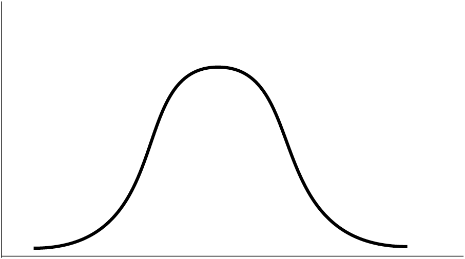
and the standard deviation provides a means to calculate where on the curve the number in question is located.
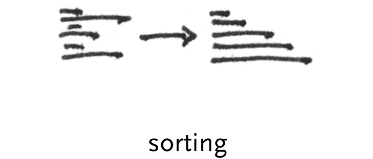
sorting – generally speaking, types of sorts fall under three categories. First, based on simple numeric criteria (ascending or descending values), next alphabetical sorting of strings, or finally, based on a compare function, that might use each value as a lookup into a dictionary, and the results of the respective lookups are compared against one another. There are many methods for sorting, the most common software algorithm is QuickSort, which, as its name implies, is the fastest method for handling randomized data sets (perhaps oddly, it performs its worst when the data is too ordered).
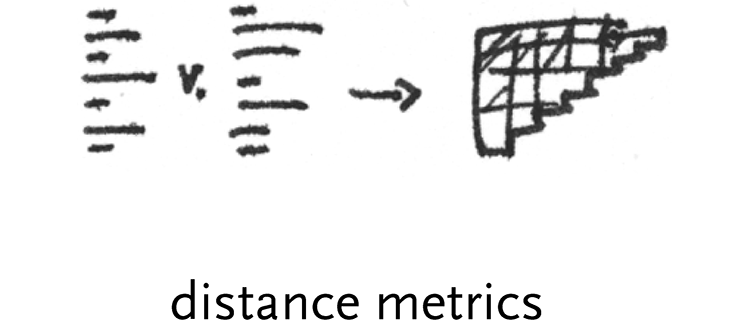
distance metrics – a distance metric is used to calculate the distance between two data points, or sometimes two vectors of data (where each ‘point’ might have multiple values). For instance, a distance metric is used in section 4.4 to calculate how similar each row of data is so that it can be clustered. A similarity matrix is also employed, which is a half-matrix of each row compared to the others (not unlike the D´ table).
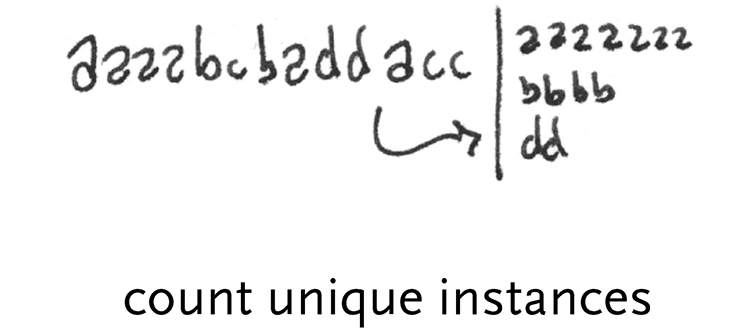
count unique instances – if column of data is made up of one of 20 different words, a common task will be to make a list of all the words that are unique in the set, along with a list for how often each word appears.
5.5.2 Dimensional Measures & Transformations
The last sections consider methods commonly associated with data mining. Dimensional measures and transformations include methods for handling multidimensional data sets, such as principal components analysis, which is used to determine the most ‘important’ dimensions in a data set, or the fourier transform, used to break a signal into its component frequencies.
principle components analysis – pca is a method from linear algebra to decompose matrices that have many dimensions into a smaller number of dimensions by calculating which of the dimensions in question are of greatest importance.
multidimensional scaling – is similar to pca, but used when the data set looks like a Frank Gehry building. Rather than the single planar dimensions of pca, multidimensional scaling untangles data while still trying to maintain relevant distances between points.
fourier transform – the fourier transform converts data to frequency space, or the inverse fourier transform (ift) can be used to transform it back. On a computer, the fast fourier transform, or fft is most commonly used, because it is far faster (remember QuickSort) than the mathematically intensive fourier. But this leads to a problem with fft, because the frequencies it calculates are log-based, which is adequate for many situations but not all. Another alternative is the discrete fourier transform, or dft, in which specific (“discrete”) frequency bins are calculated.
autocorrelogram – these are used in particular for audio applications, to show an additive time-lapse plot of how a fourier transform of the data changes.
5.5.3 Classification, Scoring, & Search
Once the data has been fit to a model and dimensionality has been determined, classification might be used to group related elements. Clustering methods (such as k-means or self-organizing maps) exist to break a data set into hierarchies of related elements. Finally, evaluation metrics are considered, to determine how well the model fits the data, and whether it was a sufficient predictor of organization.
clustering – used in section 4.4 to group similar rows of data together for easier comparison, or often in microarray experiments [Eisen, et al 1998]. Several clustering methods exist, the method for that section was an algorithm called cast [Ben-Dor, et al. 1999] and another more popular method is called k-means.
probability – as demonstrated briefly in the discussion of Linkage Disequilibrium in chapter four, probability can be used to estimate information-rich areas in a data set.
self-organizing maps – Kohenen’s self-organizing maps are a another means of classification, based on an iterative process of selection [for an introduction, see p.69 Fayyad, Grinstein, & Wierse. 2001].
dimensional reduction – Sammon dimensional reduction is an additional such method [for an introduction, see p.69 Fayyad, Grinstein, & Wierse. 2001]
scoring methods – a class of data mining methods for determination of “what’s interesting” in a data set.
search & optimization methods – another class of data mining methods, which focus on rapid search and analysis.
5.6
represent
The fourth part of the process considers representation in its most basic forms. This is a laundry list of techniques, some of them older, like the bar graph invented by Playfair, or more recent, like parallel coordinates. The visuals are themselves a catalog of starting points to be used by the designer when considering the data in question. The thesis will describe each of these techniques in turn, and how they apply to a variety of data types. The intent is that by this point, the designer has the appropriate means with which to choose what type of representation might be most appropriate, given how the data has been pulled apart in the first three steps of the process.
5.6.1 Catalog of Common Representations
The choice of representation is based on what is the simplest possible form that conveys the most relevant aspects of the data set.
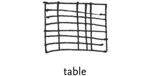
table – the display of tables from a database or spreadsheet is the standard form for two dimensional quantitative data. Tables are useful for showing all the data, but when too many rows or columns are required they are quickly cumbersome. The invention of the spreadsheet (in the form of VisiCalc, invented by Dan Bricklin) in the very late 70s was a major invention that allowed users to show “sheets” of their data spread across multiple pages of printouts or on-screen.
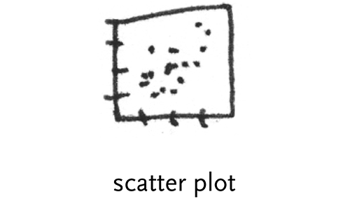
scatter plot – in one dimension, a scatter plot is a disconnected line graph with one axis as the point count. In two dimensions, it is a cloud of points with horizontal and vertical locations based on their values. These can be extended to three and more dimensions by transforming down to the two dimensional plane (same as how 3d graphics map a spatial scene to the two dimensional plane of the monitor). More than two dimensions will require the ability to swap dimensions or rotate across dimensions to show how they relate to one another.
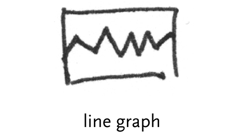
line graph – a series of points connected by lines
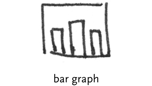
bar graph – Playfair’s invention for showing series data (usually done with a line graph) where values were not connected to one another, or had missing data.
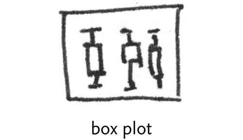
box plot – a two dimensional plot that shows a point and its first (and sometimes second) standard deviation, a useful depiction of the fact that data is often not simply discrete points, but ranges of likelihood. This was invented by John Tukey, more on his role in Exploratory Data Analysis is described in the third chapter.
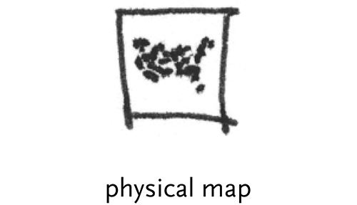
physical map – ordering elements by physical location, such as the latitude and longitude points of the zipdecode example.
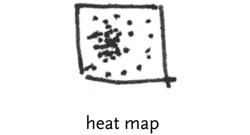
heat map – a map that uses color or some other feature to show an additional dimension, for instance a weather map depicting bands of temperature.
matrix – any two dimensional set of numbers, colors, intensities, sized dots, or other glyphs.
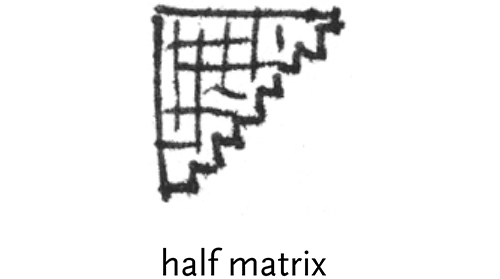
half matrix – where only half a matrix is shown, usually used for similarities, or where two items are being compared against one another (i.e. the D´ table). Only half the matrix is needed because it is the same when reflected across its diagonal.
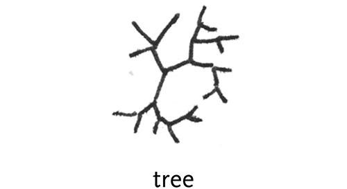
tree – hierarchically ordered data connected by lines of branches.Trees are very common because so many data sets have a hiearchic structure. However, even though the data is hieararchic, this is not the proper representation, because the understanding sought from the image is not associated with this hierarchy.
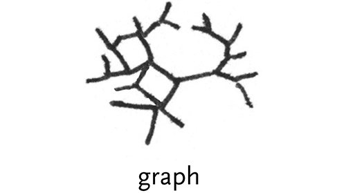
graph – a tree that has less order, and can connect back to itself. Rather than a pure hierarchy, it is a collection of nodes and branches that connect between them.
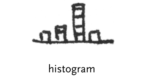
histogram – a bar chart that displays how many instances of each value on one axis is found. For example, used with a grayscal e image where the horizontal axis are possible color intensities (0..255) and the vertical is the number of times that each color is found in the image.
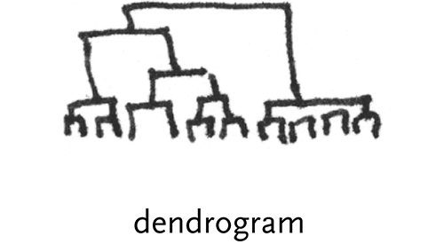
dendrogram – a stacked tree shown connected to points, where the height of the branches show an additional variable. Often used to depict the strength of clustering in a matrix.
parallel coordinates – used for multi-dimensional data, where vertical bars represent each dimension. Each element of the data set has values for each dimension, which are shown as points along the vertical axis and then connected together.

radial parallel coordinates – like several superimposed star plots that show multiple records of data.
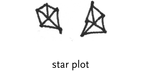
star plots –similar to parallel coordinates, but with a single record of data where its points are shown radially.
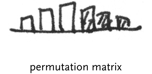
permutation matrix – Bertin’s sortable bar charts for the display of multi-dimensional data.
survey plot – popularized in the “Table Lens” project from Xerox parc [Rao and Card, 1994], these resemble series of bar graphs that can be sorted independently.
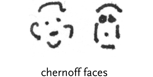
chernoff faces – a method for diagramming multi-dimensional data through the use of facial features. Chernoff’s idea [Chernoff, 1977] was that because our visual system is particularly tuned to understanding and remembering human faces, that people would be able to more readily understand many more dimensions as mapped to a face than might be possible with other types of glyphs or diagrams.

rubber sheet – like a heat map, but used to map four or more dimensions, through the use of a colored, three dimensional surface.
isosurfaces – maps of data that resemble topographic maps.
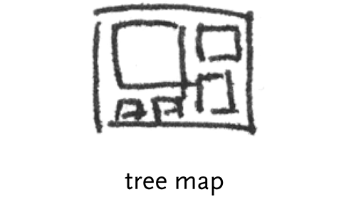
tree maps – first popularized by Shneiderman in [Shneiderman, 1992], and later used for Wattenberg’s successful “Map of the Market” that depicts a hierarchically ordered set of boxes within boxes for the sectors, and largest stocks in the market.
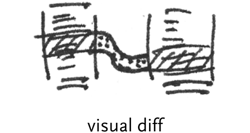
visual diff – a common differencing representation that shows two columns of text connected by lines to show where changes have been made between the two versions.
5.6.2 Regarding 3d and 2d Representations
When presented with a problem of many dimensions, an initial instinct is often to employ a three-dimensional view of the data. This is problematic for many reasons:
The plane of the computer screen is inherently 2d. The advantage of truly three-dimensional objects is being able to look around them, see inside, etc. Most of these affordances are missing in screen-based representations.
Users tend to have a difficult time with understanding data in 3d, because of their unfamiliarity with such representations. This was reportedly a problem that held back the wider adoption of Strausfeld’s Financial Viewpoints project. While it might be engaging, we’re limited by our familiarity with two-dimensional computer screens and printouts.
Because the number of dimensions being looked at is more like six, it’s often the case that additional confusions coming from a three-dimensional representation serve to only detract further.
Sometimes it makes more sense to make it easier to navigate between multiple two-dimensional planes of data that show multiple aspects. For instance, a Financial Viewpoints style representation that “locked” to each particular view.
Considerations for using three-dimensional representations:
Understand that the screen is not a 3d space, so the additional dimension should show data that can be occluded by other points that might be “in front” of it.
The use of subtle perpetual motion to rotate the representation can help the viewer identify the contents of the data set because this tends to construct a 3d image in one’s own mind.
Try to flatten the dimensionality wherever possible. If the data is mostly two dimensions, with a couple of spikes in another dimension, those might be shown differently, but needn’t make the entire representation multiple dimensions to meet the lowest common denominator in the data set.
5.7
refine
Even though data sets can be boiled down to simply lists, matrices (multi-dimensional lists), and trees (hierarchic lists), it is not sufficient to simply assign a representation to a data set that it fits. Each of the tools from the previous step can be applied depending on what category the data falls into, but it is the task of the designer to then pull out the interesting or relevant features from the data set by refining the basic representation through the use of visual design techniques.
Graphic design skills provide useful fundamentals for the type of questions to be asked when seeking to communicate the content of a complex data set. The thought processes ingrained in the visual designer, everything from “How can this be shown most cleanly, most clearly?” to more subjective “Why is that ugly and confusing?” are best suited to the goals of clearer communication.
Perhaps the best reference on visual refinement as regards to data are Tufte’s series of books [Tufte 1983, 1990, 1997] that clearly make the case for a broad audience.
5.7.1 Contrast and Differentiation
The goal of information design is to show comparisons between elements. The comparisons can be highlighted through:
Contrast – Contrast is perhaps the most fundamental visual property. This is because our visual system is tuned to finding contrasts, whether to understand where one object ends and another begins, or at a higher level, for decision-making processes. The pre-attentive features shown in section 3.1 are all means of contrast between visual elements.
Hierarchy – Related to contrast is hierarchy, the means with which an order of importance between elements is established on a page. As is the case for writing, for instance, an information graphic should provide narration about what is being represented, what it means, and reveal its details. Just as a topic sentence must be found in every paragraph, so should a graphic place emphasis on a list of its larger points, while de-emphasizing minor supporting points.
Grouping – “Grouping is represented by objects that cluster or gravitate to each other, implying likeness or some common value or meaning. Grouping creates patterns.” [Christopher Pullman, private discussion] This can be as simple as two colors being used to show what objects are part of what group. A more sophisticated example is the redesign solution in section 4.4 that used a visual grouping of elements to highlight the similarities between objects, by providing a clearly delineated set of groups found within the data. At the same time, it also helps to highlight the differences, by placing broadly similar elements together, it also helps to highlight the differences, the minute changes between rows of data.
5.7.2 Visual Features for Differentiation
Size, color, and placement are some of the devices used by graphic designers to differentiate and provide contrast. This section describes their use and misuse.
5.7.2.1 Size & Weight
It is important to pay careful attention to how the relative sizes of elements work with one another. Size is a powerful pre-attentive feature (see section 3.1) that can highlight or distract.
The size or thickness of lines can often be used to show relative importance between two sets of values, or a thick line might be used to differentiate from thinner lines beneath it that denote a grid used to show the scale of the figure. Using such a method to decrease the impact of the gridlines is important to placing the most prominence on “showing the data” [Tufte, 1990], rather than allowing the viewer to become distracted with data versus the design of the diagram itself. This can also be applied to lines used as borders around shapes, which are almost always extraneous additions. This is discussed at length in Tufte’s text, described as “reducing the amount of non-data ink,” a useful phrase that addresses a remarkably common issue when evaluating diagrams.
5.7.2.2 Color
On the computer, color is a mixture of proportions of red, green, and blue components, collectively referred to as rgb. This is an artifact of how the color is generated on screen, where tiny elements of each are placed closely to give the illusion of color to the eye. A more intuitive, traditional model of color uses ranges of hue (or chroma), saturation, and value. When referring to color, what is usually meant is its hue, for instance orange or blue or violet. Saturation is the intensity or richness of the color, and value is the brightness, a range of white to black.
Color is often employed as the most obvious means to denote between categories of data. Yet this quickly becomes problematic for several reasons. First, the human brain can only distinguish between and recall roughly five separate colors [via Ware, 2000], where the number of categories of data will more often than not exceed five, leading to sets of ten or even twenty colors that are hardly distinguishable from one another.
Second, overuse of color often leads to diagrams that use identical colors to depict values that are unrelated, for instance combining a full-spectrum scale that shows “temperature” while also using five colors (that can be found in the scale) to delineate physical boundaries to which the temperatures apply.
Often, the output media may not support color, the majority of printing and copying devices still black and white.
And finally there is the issue of color blindness, such as dichromatism, affecting approximately 8% of men and 1% of women, meaning that the colors are often likely to be perceived differently across the target audience. In the end, color is best used sparingly, and most diagrams should be made to work on their own in black and white, using color only to punctuate or support another feature that might be optional.
A paradox to the use of color is that in software, which makes available millions of colors to the user, the tendency, rather than a variety of sensible colors, is to use the maximum value of “red” to produce a red, and zeroes for the other values. This produces a jarring non-natural looking color that easily distracts a viewer. A better method is to consider how colors are found in the natural world, where any colors are rarely if ever pure shades of color components, and instead subtle mixtures of the red, green, and blue (or hue, saturation and value under the alternate model). Sampling colors from a photograph, for instance, can produce a set of colors that are already demonstrated to work together, along with many shades of each for highlights or secondary information.
When many categories of data are to be considered, one might employ numbered annotations, or small symbols known as “glyphs” or “icons” instead of color. Even small pieces of text are often better than a dozen colors competing for the viewer’s attention. More often, consideration should be given to whether it is important enough to show every single category in the diagram, because the extreme variety will likely dominate the representation, clouding the communicative effect of other features that have greater importance (even if they are larger or more colorful). The quantity of identical elements is another signifier of importance, because the brain is inclined to search for patterns and groupings in an image to quickly draw conclusions.
5.7.2.3 Placement
Placement conveys hierarchy by providing an ordering to elements, for instance, the way that the title is found at the top of every newspaper article. Contrast might be conveyed by placement through the use of a set of similarly placed elements and an outlier that is disconnected from the rest of the group. Grouping is the predominant use of placement.
In addition to contrast, hierarchy, and grouping, the placement of elements also plays a role in how a diagram is read, with the majority of audiences reading left-to-right, top-to-bottom either natively, or at least being familiar with that mode for the context of scientific publications. Combined with size changes, the designer can “lead” the viewer’s eye around the diagram, not unlike how a narrative thread runs through a paper. The eye will begin with visually strong (large, colored, with prominent placement) elements and then search for details among those less prominent.
5.8
interact
Interaction methods involve either how the data interacts with itself on-screen (the type of interactions investigated by the vlw), or how users can interact with and control the data representation, the latter being the field of hci, or Human-Computer Interaction.
5.8.1 Data Self-Interaction
Basic layout rules might be simple connections between elements in the diagram (a rule to maintain left alignment between two objects) through more complicated design rules that use data tagged by its “importance” to achieve a continuously updating composition.
5.8.1.1 Basic layout rules
Some of the layout rules used in common practice, most based on straightforward algorithms:
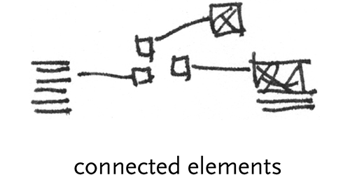
connected elements – graphics that connect one element to another, i.e. a line connecting a box to a magnified version of the same
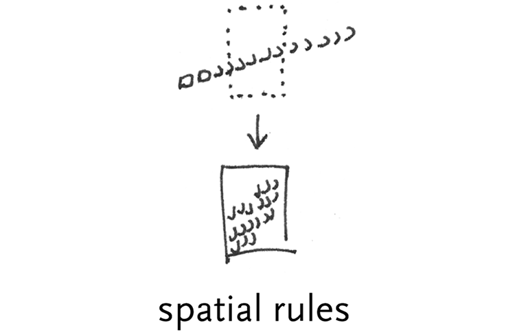
spatial rules – items must fit within a certain overall area – scale all elements to fit a predefined space. For instance, line and page breaks, where at a certain width or height, a new line or new page is started.
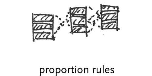
proportional rules – this might control the even distribution of spacing between elements.
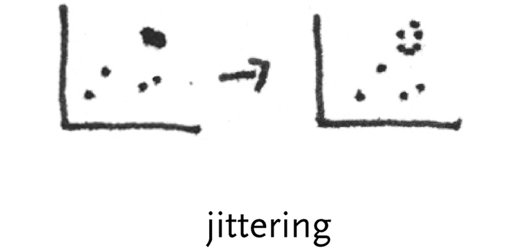
jittering points – slight perturbation of data points to prevent occlusion, and show when points are stacked on top one another.
weighted scale & zoom – consideration of the optical effects of scaling. Through hinting, or other more advanced techniques like MetaFont or Multiple-Masters, typefaces at larger sizes typically show more detail and subtlety than when rendered at small sizes. This can be a powerful means to add more detail to a representation as the viewer looks closer.
label stacking – without adequate room for labels that would otherwise occlude one another, simply showing them as a list.
cartographic labeling – on a map with many cities and towns, non-overlapping labels are needed
gridlines – major and minor axes, weighted towards ‘pleasant’ numbering that doesn’t interrupt reading of the data.
5.8.1.2 Physics-based placement
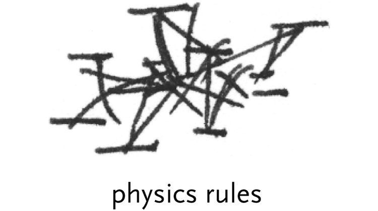
It is common for contemporary information visualization projects to use physics rules for movement and placement. These rules are generally based on a series of masses (data points) and springs (connections between them, visible or invisible). A simple Hooke’s Law spring can be used to set a target length between two objects and over time these can be drawn together. For instance:
attraction – move elements closer based on a criteria
deflection – push elements away based on some criteria
Both can affect either single elements, or overall groups, e.g.
single element – move item closer to another item based on their relatedness
multiple elements – pull all parts of a group together around a center point
These rules were discussed at length in the author’s Master’s Thesis [Fry, 2000], where a physics based model was used to introduce a kind of behavior to a data set for data sets such as web traffic or the content of bodies of text.
5.8.1.3 Smart graphics, design knowledge
There are limits to the ability of designers, because we cannot singularly specify the attributes of hundreds of thousands of elements, tweaking each for perfection. The computational process becomes a way to extend the power of the designer to address far larger and more difficult problems than previously possible.
Instead of specific layouts, the practitioner instead designs a set of rules (sometimes called metadesign) over the system to determine behaviors or to make basic design decisions that fall within a set of criteria.
Another common instantiation is that of knowledge-based design systems [Coyne et al, 1990], this research area is often treated separately from the other components of the task (everything from data acquisition to final color choices), rather than as an integral part of the design process itself, where some basic building blocks of rules are provided while others are developed by the metadesigner or visual programmer.
Live elements need to be part of the building blocks, but it needs to be done in a way that includes a well-chosen set of building blocks (and a means to add new ones). The failure of other attempts at this approach is that they were considered an entire means to an end, existing in an academic vacuum away from the other parts of the process. The components need to be made abstract in such a way as they can be applied in a straightforward manner, without the fact of their being live distracting from the other essential parts of the design process.
5.8.1.4 Calibration
Rule based, dynamic systems are notoriously difficult to properly calibrate. The lure of rule-based systems is in the simplicity of the individual rules and their ability to cover complex behaviors. However, these rules also become subject to oscillations (as rules conflict one another) or at worse, explosions, where an errant rule might corrupt the state of one element, and because of the inter-relationship between elements, that corruption is quickly passed to the others in the system, breaking its overall state.
As a result a significant portion of the time in using rule-based systems is in their proper calibration and testing of many data input scenarios, not just in determining the rules themselves, the latter of which may require only negligible time when compared to the other steps.
5.8.2 User Interaction
5.8.2.1 Viewing Controls
The final step to consider is how to interact with the data. Perhaps the representation is dynamic, actively modifying itself to call attention to important features. Viewing controls can be used to get an appropriate camera angle or warped view of the space of the representation, such as using a fisheye lense to view a large data set in a very compact space.
Sampling controls are interactive dipsticks, allowing the data to be sampled at specific locations. Other user interface elements such as sliders can be used to set proportions or ranges, all the while dynamically updating the view of the data set.
5.8.2.2 Restraint of choices/options
In software, it’s easy to provide more options to the user. What’s more difficult, and more important, is figuring out how to limit the number of choices to that which is most relevant to the majority of the tasks executed by the majority of users.
When approaching analysis of a complex data set, it’s useful to provide a ‘default’ view to the user, so that it’s clear how the functionality of the system works. Instead of first displaying a complicated set of knobs and sliders that control every aspect of how the data might be queried, an initial state makes it easy to move laterally (modifying parameters of the basic state) and see quick updates to what’s happening. This way, the user can get a feel for the system first, then as specific needs arise (How do I limit this to situation x? How do I increase the value of y?), they’ll be inclined to learn those features one-by-one, rather than learning two dozen options up front before they see anything useful.
In short, the design should make an educated guess about what the user will want to do, and then make the options for continuing further accessible just underneath.
5.8.2.3 Scale and Zoom
The zipdecode example from chapter two scales to discrete levels—showing intermediate steps to maintain context. This is specifically chosen over a sliding zoom control that would allow the user to move to any particular magnification they choose. The latter type of control has led to a class of “zoomable” uis, but these often present awkward user interaction, a bit like using the zoom on a video camera: One wants to zoom at something, but the camera gives a continuous forward/backward, which makes it too easy to overshoot, inspiring seasickness in viewers because of a series of rapid zooming, overshooting, over-correction, and re-correction.
By first choosing the relevant levels of zoom in an interface, the zoom remains a useful means for moving between viewpoints while maintaining context because of the animation of moving between levels.
Consider the Powers of Ten video from the office of Charles and Ray Eames, narrated and written by Philip & Phylis Morrison [Eames, 1978]. While the zoom moves at a continuous speed throughout, the narration provides a punctuation to the relevant levels in the film, highlighting sections of importance. In addition, for a section where successive orders of magnitude have very little occurring, the narration notes this fact as an interesting point to be observed (thus making it relevant to have those magnitudes visible).
The latter point helps set criteria for when and why zooming is appropriate as well. Is it an interesting fact that for several layers there will be nothing happening. Consider a genome browser done with continuous zoom. It would move from the chromosome level (approximately 100 million letters) down to the next relevant section, being individual genes (or even groups of genes). A gene is roughly one thousand letters of code, meaning that the user will be taken through a 100,000 : 1 zoom. This might be interesting for novices learning the relationship between chromosomes, genes, and letters of dna, but the interface will likely still require discrete levels, so that users don’t become lost on the long trip from a the chromosome scale down to the gene scale.
5.9
next steps
Some of the more fascinating future directions for this work come from what follows the process as it is described.
5.9.1 Iterate
The ability for a designer to rapidly iterate is key to Computational Information Design. The projects in this thesis underwent anywhere from six to eighty distinct iterations during their development. This might include the addition or removal of features, modification of the visual design, or improving the interaction. Each step feeds into the others, where a change in the ‘refine’ step might influence how the data is acquired.
5.9.2 Using Results to Modify the System
As pointed out by colleague Axel Kilian, a step not covered in this dissertation is the use of a finalized project to actually provide a redesign for the system that it is representing. For instance, The zipdecode piece shows how the postal codes work throughout the u.s., but could also be used as a starting point for a tool to redesign the system which might soon (ten to twenty years) become saturated and run out of numbers.
5.9.3 Decision Support, Analysis, Prediction
The output of this process might be used for decision support, analysis, or prediction. In this thesis, computation is a means for handling the repetitive aspects of representation (since machines are best suited for such repetitive acts), and for humans to apply their own thinking to decipher the meaning of what is produced, a task that, despite years of ai research, machines are still very poor at executing.
5.10
individual practitioners
The process begins with a stream of data, and aims to produce a ‘live’ diagram of its meaning. An understanding at one point affects choices that are made further along. Ideally, all parts of the process are handled by a single individual who has a sufficiently deep understanding for each area that allows them to bring all the necessary knowledge to the task. This breadth offers the designer a better approach to understanding data representation and analysis.
Consider these scenarios for why this becomes a necessity:
The workings of the mathematical model used to describe the data might affect the visual design, because the model itself may have features, such as the degree of certainty in aspects of the data that should be exposed in the visual design.
Parameters of the data model might need to be modifiable via user interaction. This might help clarify its qualities such as whether it acts in a linear or nonlinear fashion.
Knowledge of the audience is essential, for knowing what might be appropriate at each step. For instance, a “powers of 10” style of visualization applied to the human genome would likely become tedious for a lab worker, because the animation itself conveys only the well-known structure of the data.
In other cases, a designer may only become involved near the end of the process, who is tasked with making decisions about superficial features like color. This can be problematic because the designer has to 1) understand the system well enough to make appropriate decisions (made difficult by usual time constraints of most projects, or simply the interest level of the designer) 2) communicate their intentions to the person who will be implementing them, and then 3) convince that person to follow the design closely, lest an incomplete implementation leave the final solution inadequate. As this author knows from experience in the software industry, this is rarely successful even in cases of the best possible working relationships between developers and designers.