Computational Information Design
7 Additional Examples
This chapter provides an appendix of several projects developed during the development of the thesis. They represent the evolution of the process behind the work shown in chapters two and four, and helped drive the design decisions that went into the development of Processing.
These projects are studies that fall under three categories; genetics, software/computation, and general.
7.1
genetics
These projects were developed primarily as studies to pursue aspects of genetic data that were either intriguing, as demonstrations of the way things work, or as a means to demonstrate issues such as scale.
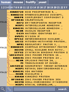
7.1.1 Handheld Browser Prototype
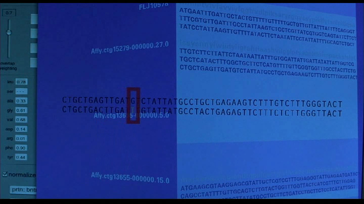
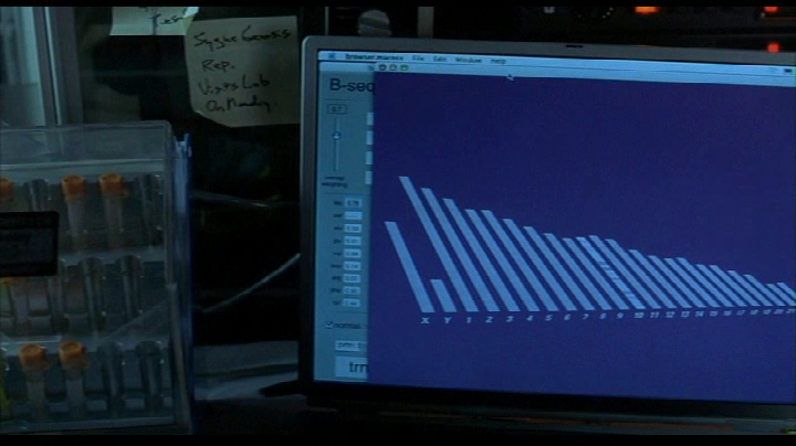
This handheld browser is a simplification of typical online browsers such as those from the ncbi, Ensembl, and ucsc. Focussed in particular on education, it was created in response to the notion that “A cd-rom containing the entire human genome can be included with every textbook.” The data on a compact disc is worthless without a means to interact with it, so the handheld serves as a kind of “biologist’s calculator.” Similar to an everyday calculator, it can perform basic useful functions, but is seens as a complement to less limited tools that can be run from a desktop workstation.
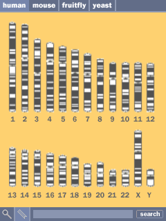
The design presented here is a series of screens that were created as an interaction prototype to consider how such a device would be designed. Much research went into building the backend for such a device, however this was left aside in favor of devloping how the product works as opposed to the actual implementation. Once the design has been worked out, and the backend has been tested for feasability, only software development time is needed for its completion. As such, the screens shown here are not showing live data.
Shown on adjacent, the series of chromosomes, colored according to their cytogenetic banding is shown in the center as a method for selecting a chromosome.
At the top, the user can select between multiple genomes, providing a way to compare and place the data in context. A search function at the bottom provides a method for running a blast-style searches or looking for specific search terms.
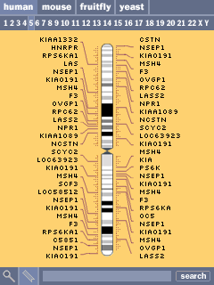
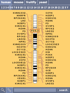
Selecting a chromsome (the fifth chromosome is shown here) shows an abbreviated set of the genes along the chromosome. Similar to online browsers, the listed genes are chosen based on size, number of exons, and amount known about each. At right, the result of clicking one of the cytogenetic bands reveals its name. Clicking the numbers along the top allows the user to jump to another chromosome.
Clicking within a particular area takes the user to a zoomed-in view listing all of the genes inside that region. The chromosome band is moved to the lefthand side of the screen.
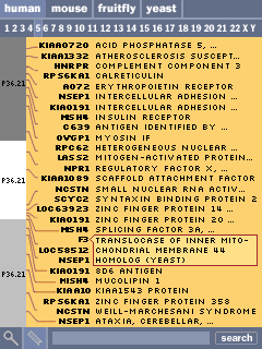
Gene names are shown in bold, and a short description is shown to their right. At the right, clicking on a description reveals the full text in cases where it is too long to fit on the line.
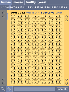
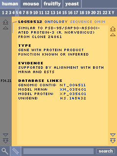
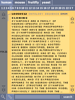
Clicking on a gene shows a basic description of the gene’s features. Tabs above the content area allow the user to select between different data views for that gene, in this case the sequence view, the ontology description, or text from the omim (Online Mendelian Inheritance in Man) database.
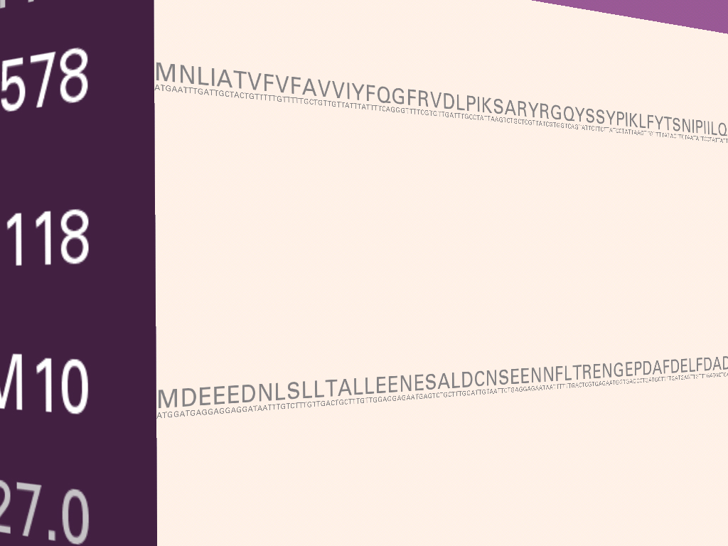
Below and to the left, the sequence view of the gene. Above the letters of genetic code are its amino acid translation (for exonic regions), and a scrollbar at the right allows the user to page through the data.
At the right, a page from the omim database is shown, describing the biological & medical significance of what’s known about this gene.

7.1.2 Genome Valence
With several genome projects nearing states of completion, a primary use of the data for biologists is to search for a sequence of letters and see if it’s found in the genome of another organism. If the sequence is found, it is then possible, based on what’s known about the sequence as it’s found in the other organism, to guess the function of that sequence of letters.
This piece is a visual representation of the algorithm (called blast) most commonly used for genome searches. The genome of an organism is made up of thousands of genes (34,000 for the human, 20,000 for the mouse, and 14,000 for the fruitfly). A gene is made up of a sequence of a, c, g and t letters that average one to two thousand letters apiece. In order to handle this amount of information, the blast algorithm breaks each sequence of letters into nine letter parts. Every unique nine letter set is represented as a point on screen. The points are arranged from the center, with the most common sets on the outside, the less common towards the middle.
Across the top, a sequence to be searched for is read from an organism. For each set of 9 letters found in the sequence, an arc is drawn between its point in the space and the point representing the next set of nine letters.
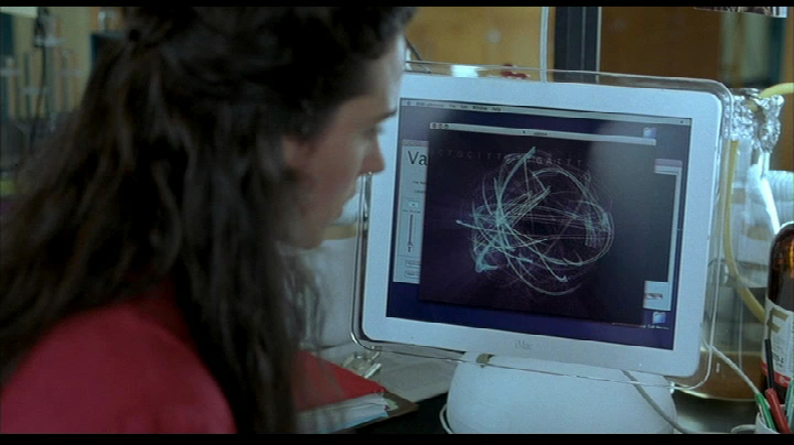
Meanwhile, the same sequence as above can be seen moving through the space as a ribbon of text, wrapping itself between the points that it connects.
For most nine letter sets, there are three points, corresponding to the three organisms and how frequently that set is found in each. The three points are connected by the three lines on each arc, one for each of the organisms being represented. The outer ring is usually the human, the inner is the fruitfly.
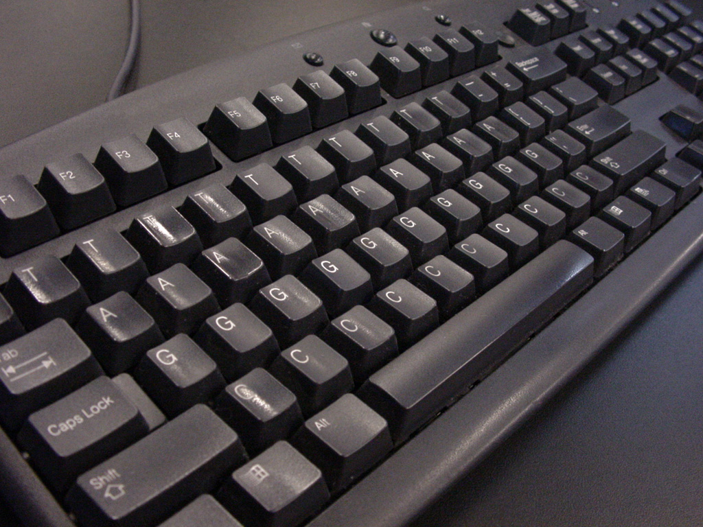
Developed specifically for this project, the acgt keyboard makes it possible to input a sequence for a search. The keyboard is intended as part joke, part practical means to allow exhibition visitors to be able to hit any key (this is the tendency of the public) and have something happen.The result is another ribbon that weaves through the space to highlight the sequence of selected letters.
Genome Valence originated with the Valence project from my master’s thesis [Fry, 2000], and was developed as part of the request for its inclusion in the Whitney Biennial in 2002.
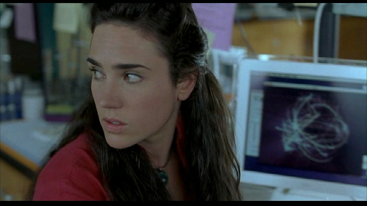
It also made a brief appearance in in Ang Lee’s Hulk, in 2003, finding use in the laboratory of lead actress Jennifer Connelly.
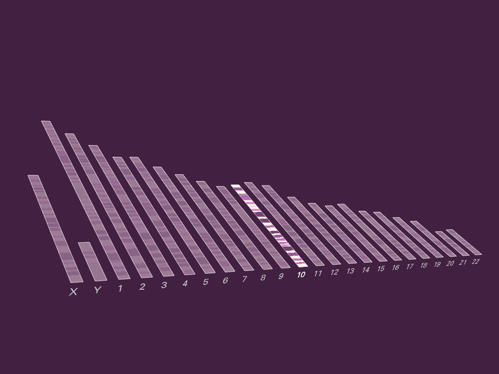
7.1.3 Chromosome 21
A study in the scale of the human genome, the image below depicts thirteen million letters of genetic code from chromosome 21. Similar to the image a gene in chapter four, the darker color depicts sequences of code (exons) that are known to be used by a cell as the set of instructions for building a protein. These instructions are interrupted by unused pieces of code (introns) which here have a medium coloring. The gray areas that might be regulatory region, or simply have no currently known function.
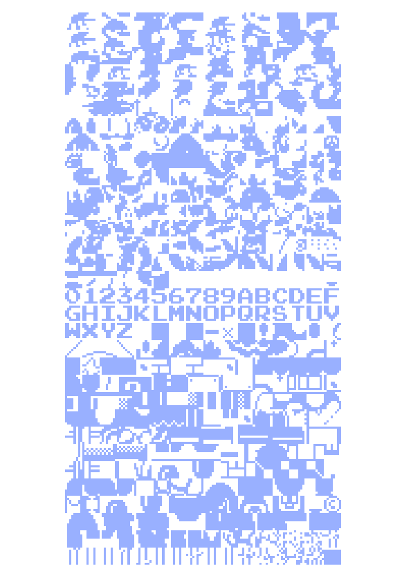
The image below was part of the exhibition “How Human” at the International Center for Photography in New York City. The size of the installation was eight feet square, and used a specially designed font that occupies only three pixels in either direction, with one pixel of space between each letter. The image is printed at 150 pixels per inch, meaning 37.5 letters to the inch in either direction (a detail is shown below).
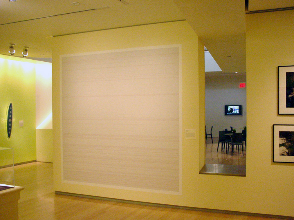
Chromosome 21 is one of the shortest human chromosomes, yet this image is only one quarter of the roughly 50 million letters of which it is composed. It would take 250 images of this size to depict the genetic code in the entire human genome, which is 3.1 billion letters.

7.1.4 Axonometric Introns & Exons
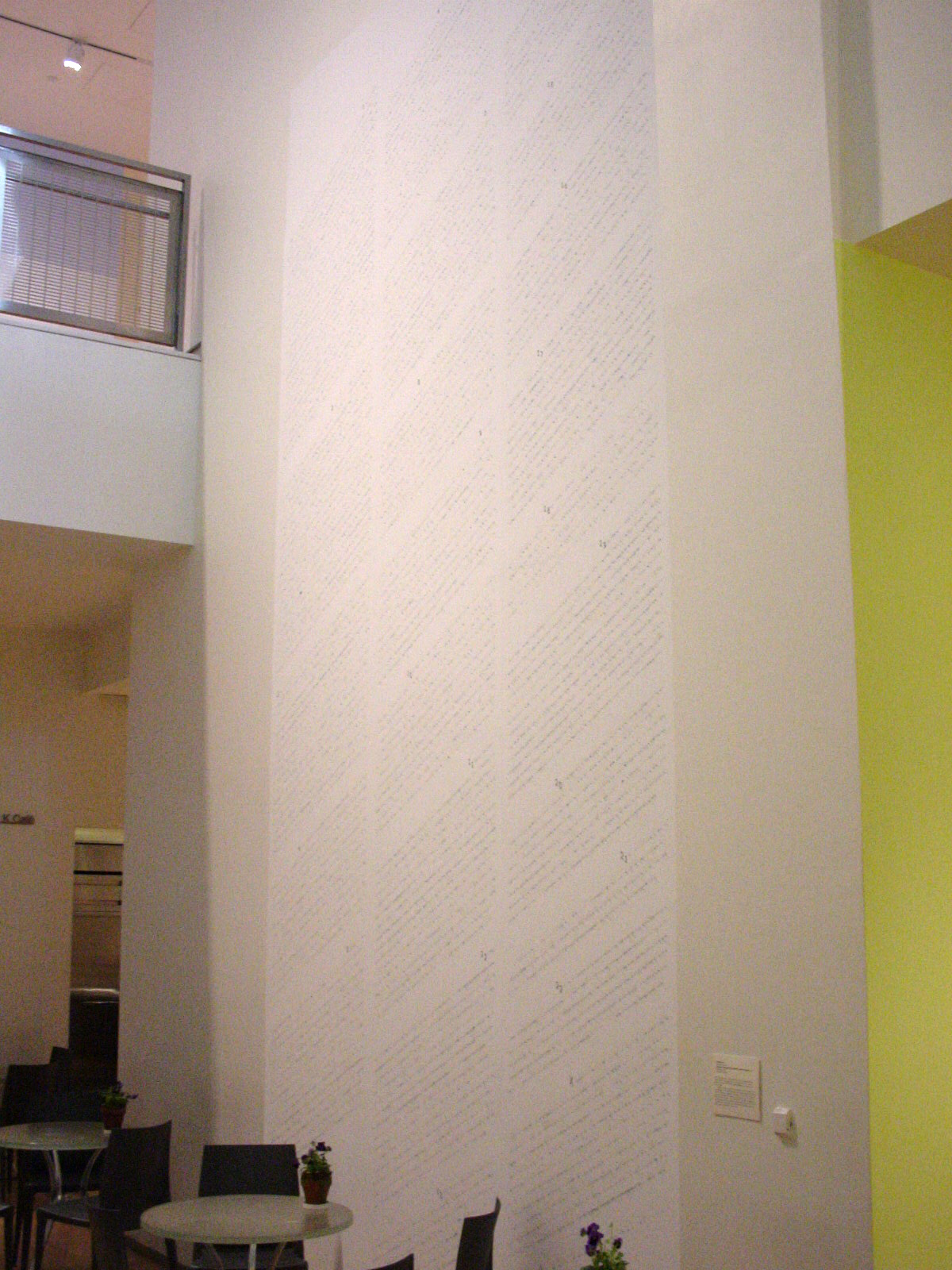
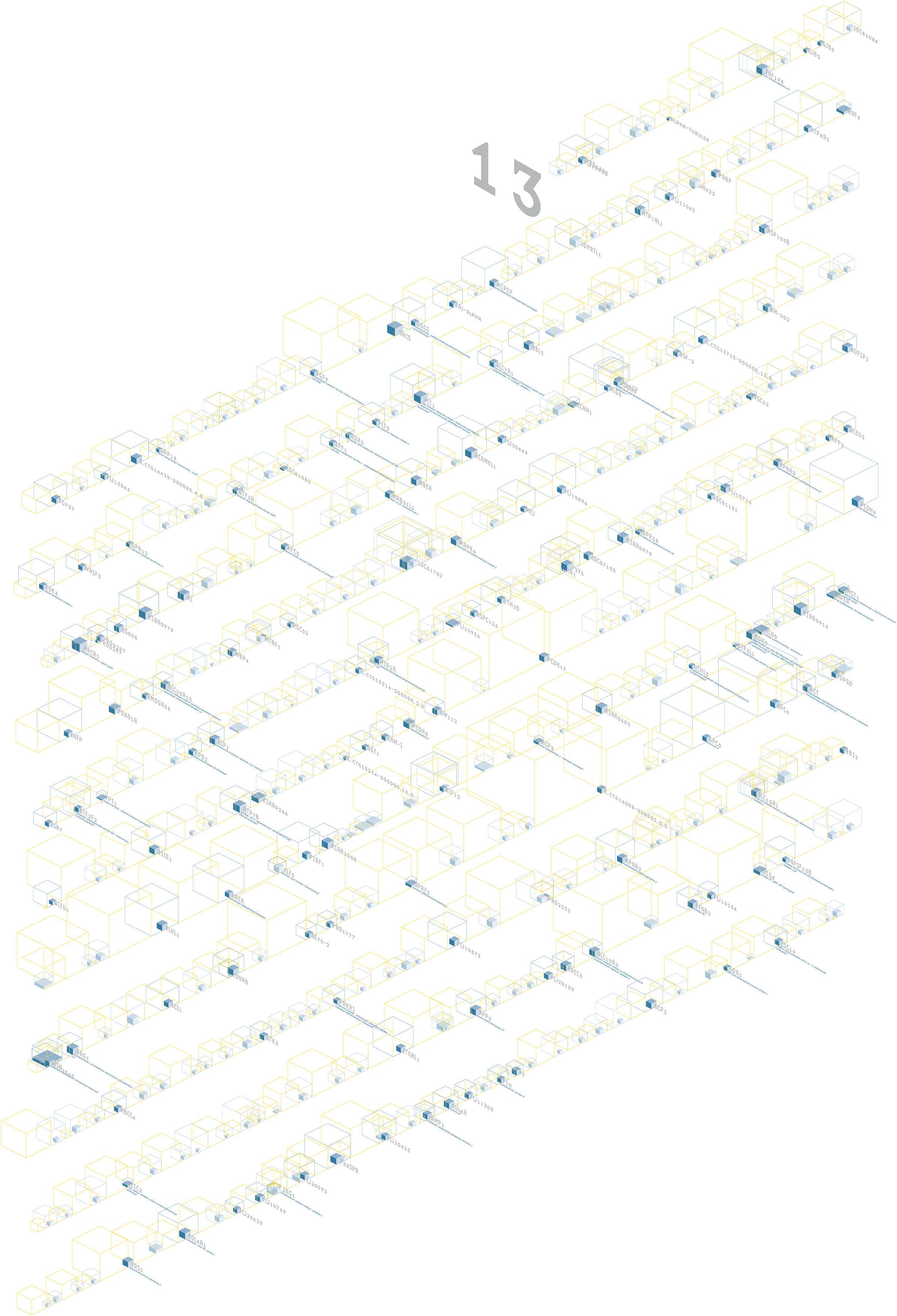
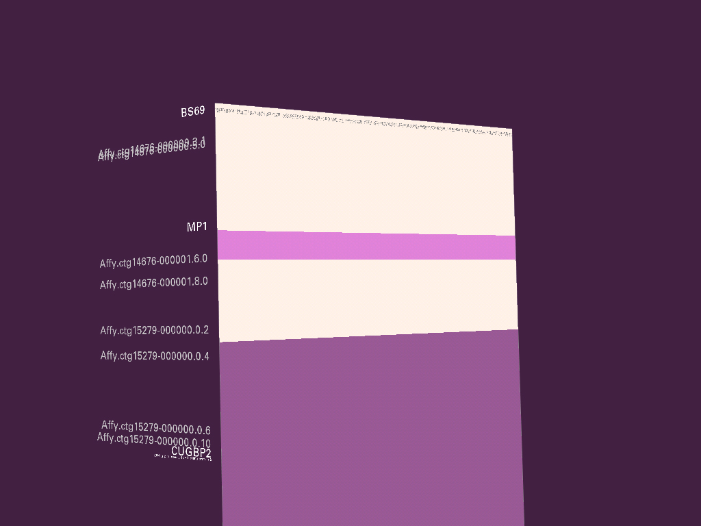
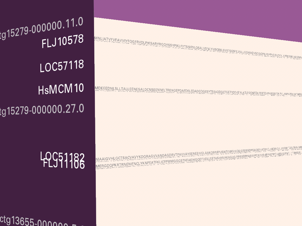
The human genome is believed to be made up of approximately 35,000 genes, each of which have a specific task in cells of the human body. This image depicts two-thirds of those genes, the ones publicly catalogued by scientists by the middle of 2002. The adjacent photograph shows a depiction of this data, two stories tall (9 feet wide and 18 feet tall) at the International Center for Photography in 2003. The output from the original version of this software, which was for a single chromosome, is shown below (the image with the 13 at the top). Because the visualization is software-based, it is possible to change the underlying data to the entire genome without the need for a complete rewrite.
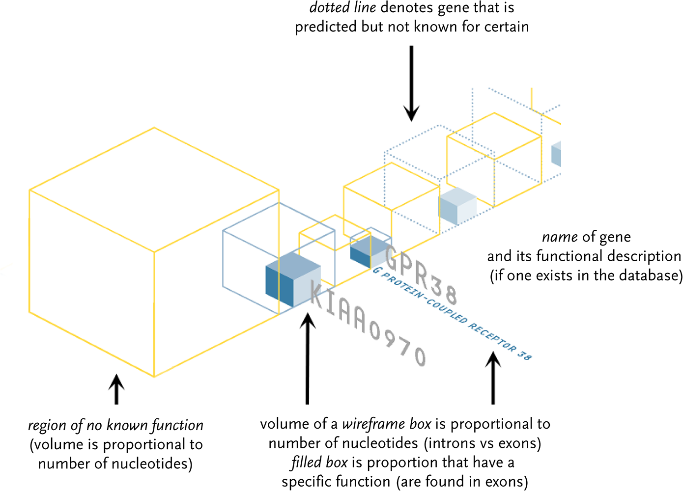
Genes known to exist are shown as blue wireframe boxes, with their name name and a description. Genes thought to hypothetically exist have a dotted blue wireframe. The size of the box is proportional to the amount of genetic code (a, c, g, and t letters) that make up the gene. The solid blue boxes inside the wireframes depict the proportion of code that is actually used by the gene. The yellow boxes show the amount of material between genes that has no known function.
The in-use material is most important, but there is far less in proportion to the unused data. To help even the balance, a semi-3d layout is used because the proportions are more easily compared as a three dimensional volume rather than as a horizontal sequence. Eight letters of in-use material can be shown with a 2 × 2 × 2 box. A set of 27 unused letters are shown 3 × 3 × 3. The volumes maintain the true proportion, but allow a simpler side-by-side comparison of 2:3 instead of 8:27.
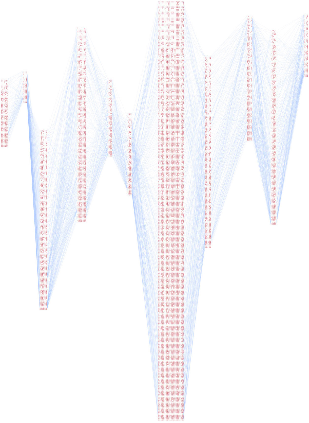
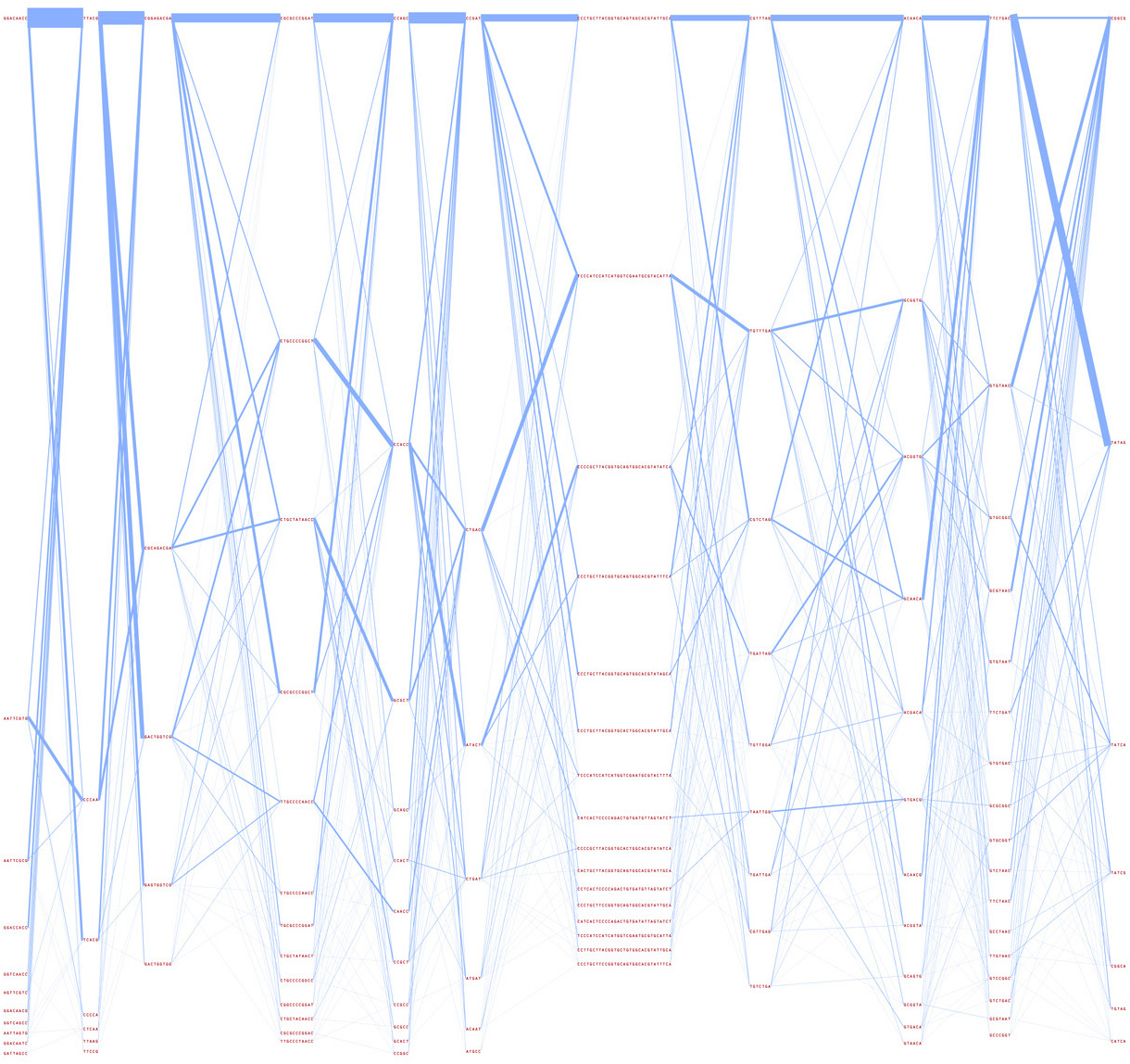
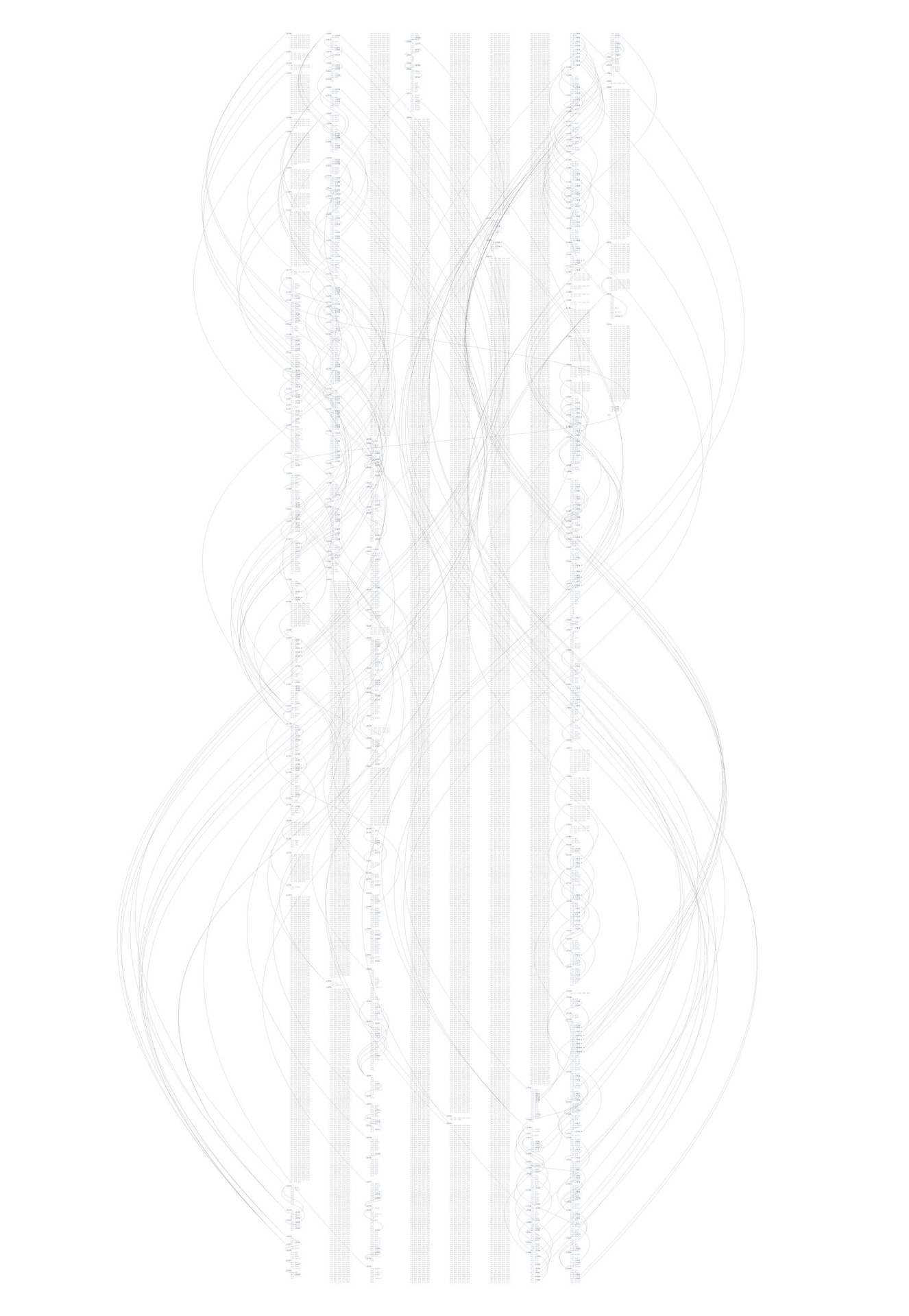
7.1.5 Haplotype Lines
This project preceded the work in understanding haplotype data found in chapter four. These were some of the studies that led up to the final solution.
The earlier representation connects each line of variation to the other lines. The result is the heavily intertwined form of hairlines, with the variations listed in order of relevance, with more relevant data found towards the bottom (the denser sets of letters). While an interesting first attempt, the image isn’t particularly useful in its representation.
The program takes a set of data as input, and can either run as a Java applet to show the representation in a web browser, or output it to PostScript format for high-resolution rendering.
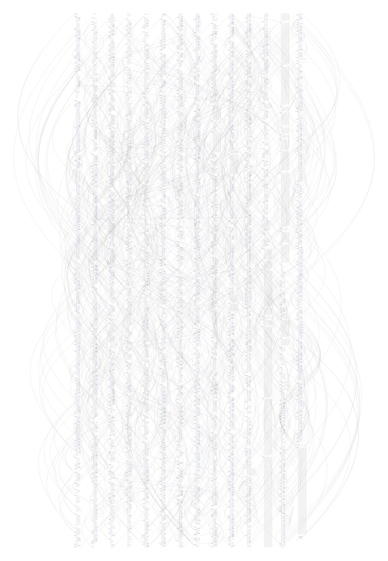
The next representation further condenses the sets of variations, and modifies line weight based on how often the sequences are found adjacent one another. With this representation, it is possible to see major trends. The most common variations are shown with thicker lines, and are sorted top to bottom based on their thickness.
7.1.6 Strippy
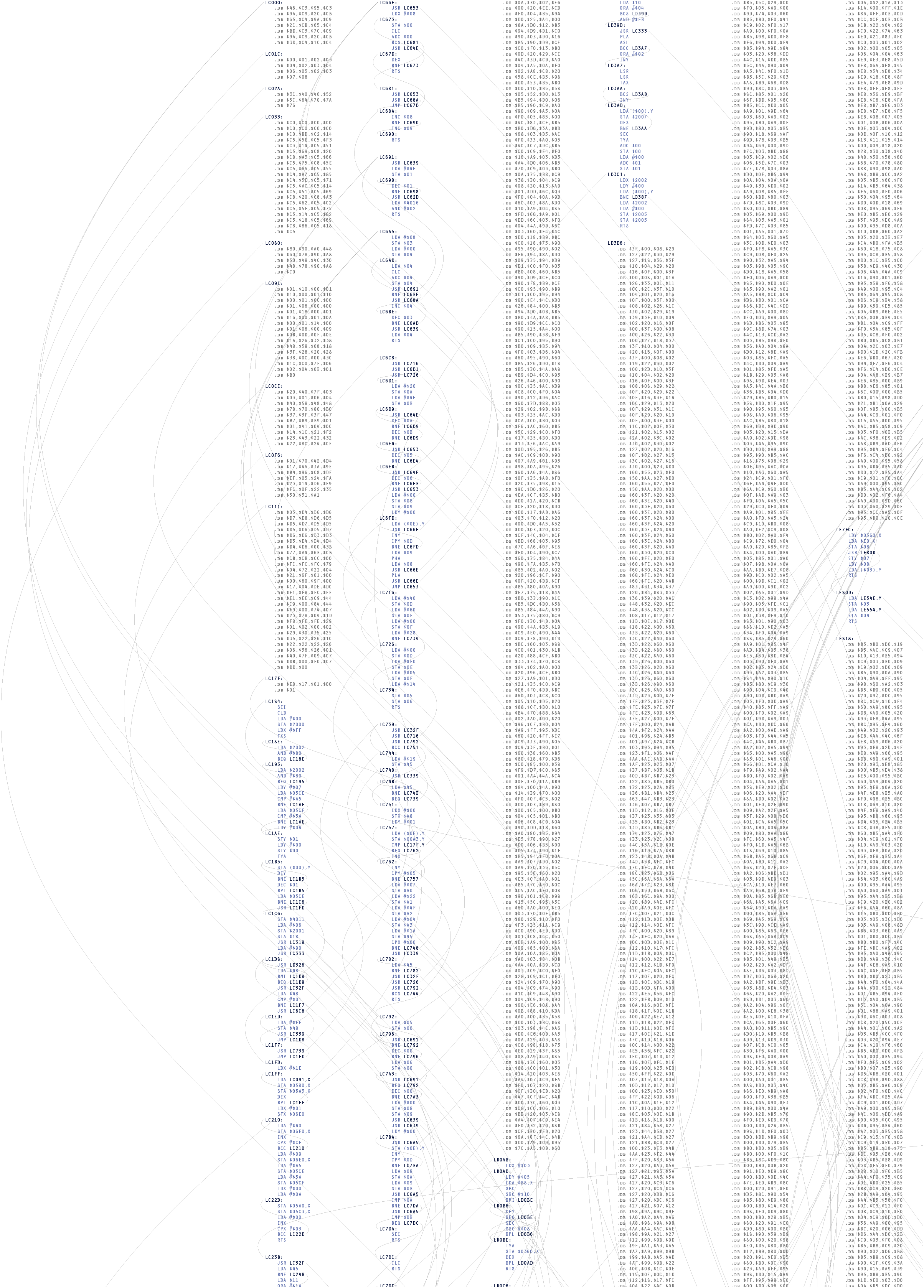
A three dimensional genome browser from spring 2002. It was an attempt at a type of “powers of ten” view of the genome, but I didn’t like where it was going, and discontinued the project. It also never got out of the ugly stage before I dropped it. It was a full browser, however, and all the data shown is real (those are actual genes from chromosome 10 of the human genome).
As it happens, a powers of ten style visualization is problematic because of the scale of data being considered. Given an overview of the chromosomes in the human genome—on average representing 100 million letters apiece, the next most useful step will be a gene on the chromosome, each of which average at around a thousand letters. This difference of 100,000 : 1 means that several orders of magnitude must be animated through before reaching the next most useful point in the visualization. This can be done through a modification in the timing, yet even if the issues of lost context can be worked out, it’s not clear whether this is even a useful mode of representation in such a case.
This project makes a brief appearance in Hulk thanks to John Underkoffler, the film’s Science and Technology Advisor. Nick Nolte’s character uses it for analysis in the earlier part of the film. John is also responsible for the project’s name.
7.1.7 Redesign of gff2ps
The visualization of genetic sequence data is primarily a representation problem. As one of the previously mentioned goals of in information design, diagrams should clearly depict the order of importance of the data they represent. This helps the viewer know what aspects of the diagram deserve the most attention, and by giving prominence to the most important items, those features can be read “at a glance.”
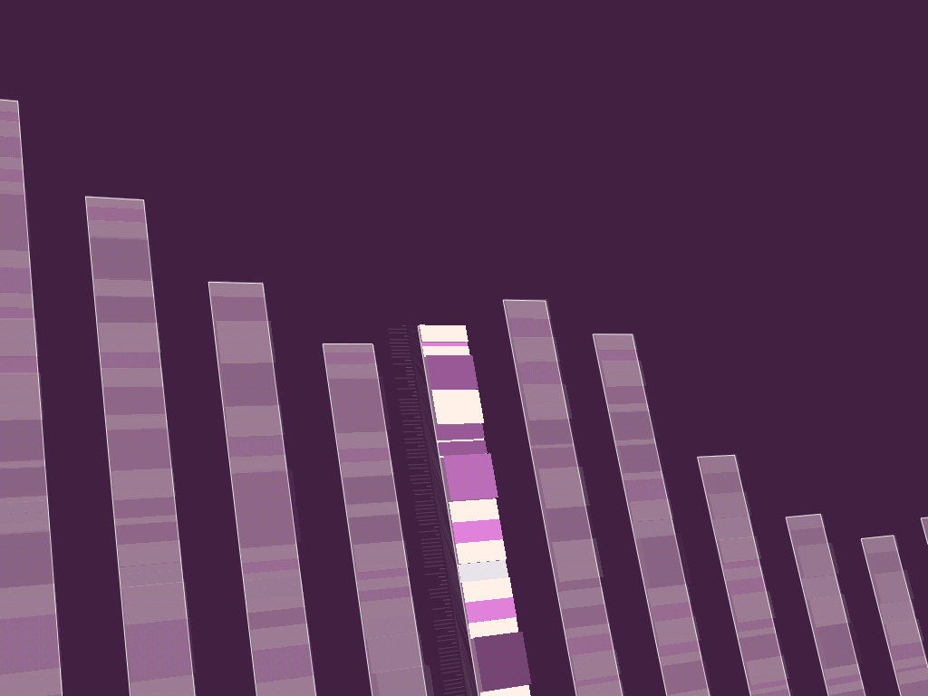
The application gff2ps [Abril and Guigó, 2000] has been used to produce images of the human [Venter et al, 2001], fruitfly [Adams et al, 2000] and mosquito [Holt et al, 2002] genomes for publication. The program reads a generic data file that lists a series of “features,” essentially a short annotation (text or numeric) and the start and stop position of where that feature is found. A section of the resulting image from a recent publication is shown here:
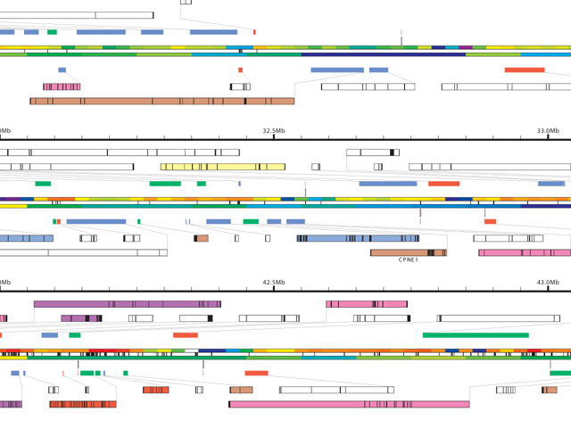
Genomic sequence data is well suited to such a “track” oriented annotation format, but a tendency exists, when all the data is treated in such a generic manner, that the resulting diagram lacks a clear hierarchy of visual importance, and each track is generally given equal area on the page, because the image is driven more by how the data is stored than by considering the relative usefulness of each track to one another—it’s a bulleted list of items rather than a clear paragraph of text narrative.
The solution is to first consider the order of importance for the data in question, and then construct a diagram that places greater emphasis on those elements, while diminishing the visual importance of “background” information like the diagram’s scale, or features of lesser value like the database where each gene was found.
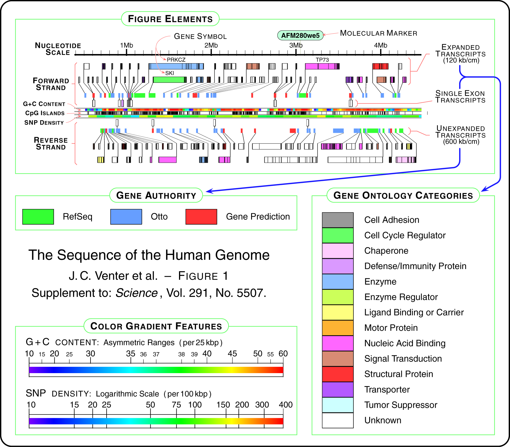
A new design, which includes all the features from the diagram above, is developed in several steps below. The first step of the design begins with just a thick horizontal bar that provides a center point for the diagram, which gives the eye a place to “begin” each line of sequence when several lines are shown next to one another in a publication. Behind that, the nucleotide scale (the number of letters of genetic code) is shown using simple gridlines and small pieces of text. The scale has been moved to the middle of the diagram, rather than the top, also as a way to center the diagram, and because the features above and below are not shown on the same scale.
In the second step, a line graph representing snp density is added. A line graph is appropriate because when reading this feature, the viewer’s primary interest is in the relative (rather than an absolute, numeric value) or trends (upward or downward) in the data.
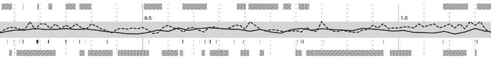
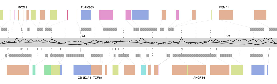
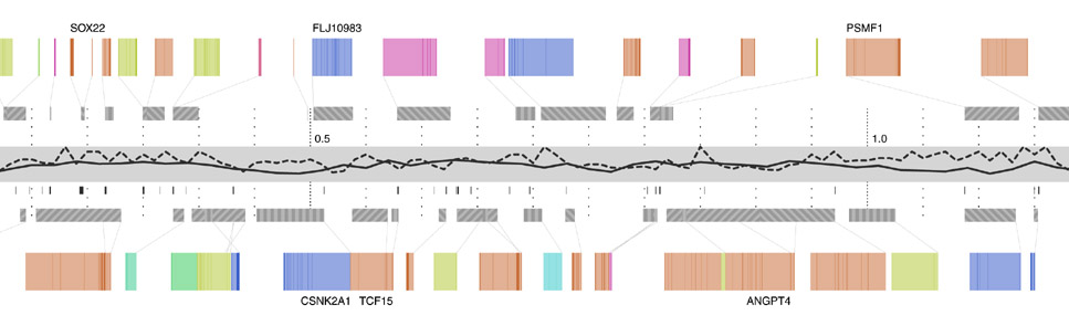
Step three adds g+c content as a second, solid-colored line graph, for the same reasons as snp density. Instances of a related feature, CpG islands (often used to predict the location of genes), are shown just below, using the same color as the line itself. CpG islands are a small tickmark, since their exact location and length is less important than simpy seeing groups of them that are clustered together.
The next step shows the genes, above and below the center track, based on whether they’re read by the cell’s machinery in the forward or reverse direction (identical to the gff2ps layout). One of three line patterns is drawn on top the genes, relating to the “gene authority,” or the database where information about the gene originated. This item of information is of extremely low importance, which is why the pattern is so low contrast and given such little visual priority.
The final step adds an ‘expanded’ gene track (again, in the manner of the gff2ps diagram) showing a series of filled rectangles, each one of five colors for the gene’s ontology category. In keeping with a general rule of using no more than five colors, the ontology categories have been reduced to five, with the hope that even five more general categories will be more informative than twenty poorly distinguished ones.
It is not presented as the best way to show sequence data, but rather provides a useful example of how to address the issue of showing many varieties of data together. In addition, this diagram is considered relevant as it has appeared on multiple occasions in high-profile publications. To properly re-address this diagram from the ground up, it would be necessary to consider more fundamental questions such as “who is the audience?” and “in what context will this diagram be used?” Answering such questions will help better define what data should be included on such a diagram, and how much importance should be given to its constituent tracks.
7.2
visually deconstructing code
These projects were created as part of a series shown in the Ars Electronica 2003 code Exhibition. It consists of short (two days to one week) sketch projects that examine ways of looking at software code.
7.2.1 Revisionist
While it’s unsurprising that the code in a software project changes over time, less obvious is the nature of how the changes have taken place in a broader sense. Projects are typically structured as a collection of files that are added, removed, and reorganized throughout the course of development. The contents of the individual files are modified, line by line or in large pieces for every fix and feature.
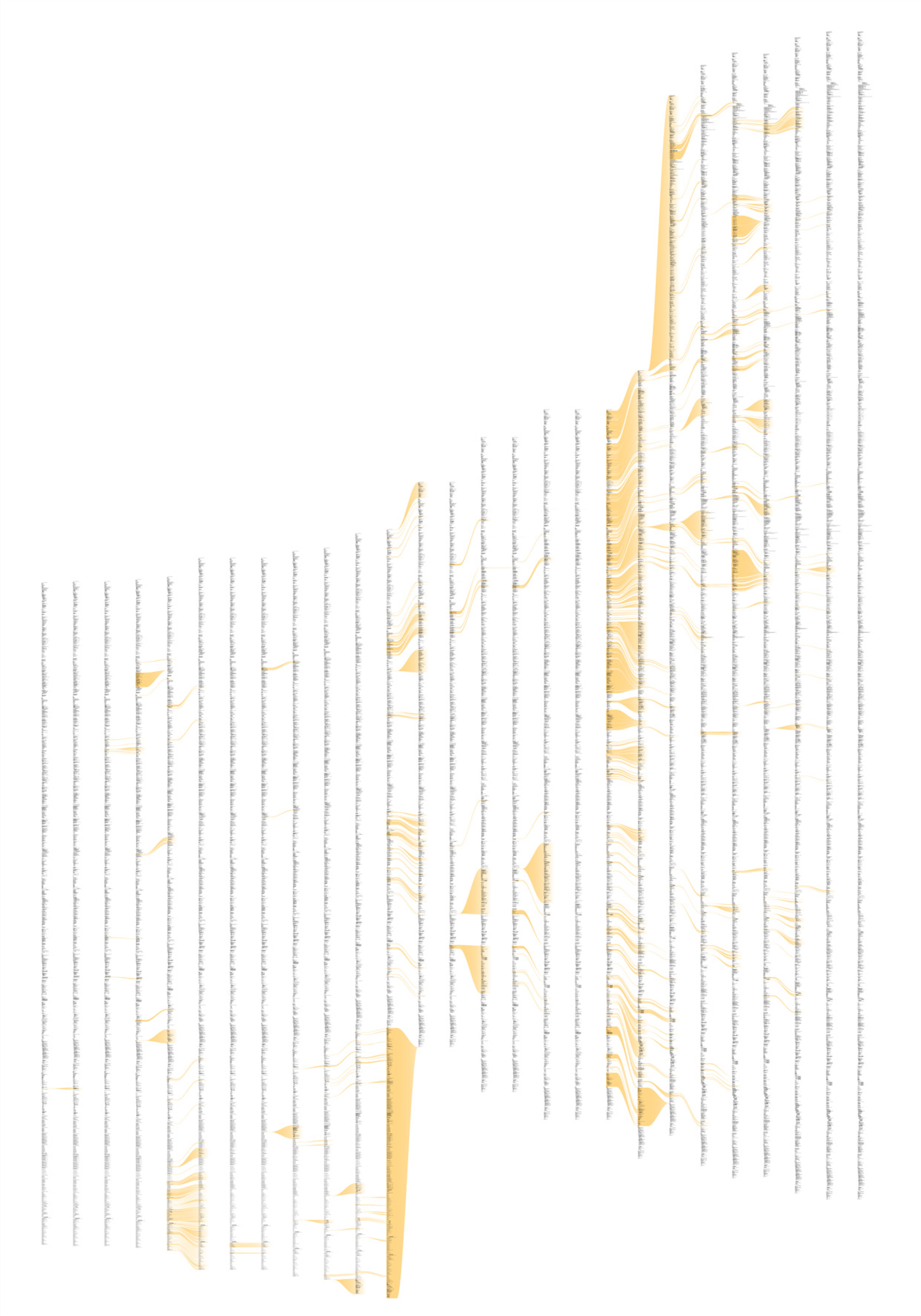
The revisionist software generates an image that shows the evolution of the structure and content of the Processing project over time, from its initial inception through forty releases. The experiment consists of large-format printed pieces to depict broader changes over time. One image shows an overall picture of the changes, with each column representing one version of the software. Lines are drawn between the columns to connect lines that have changed. Notable changes can be seen for the removal of one large file (bottom, middle), and the later addition of a new file (top, right), or a spike in activity (about two-thirds to the right) coinciding with a push for the initial alpha release of the project. The second image shows a detail of the image, zoomed 13x to make the text of one portion of a column legible.
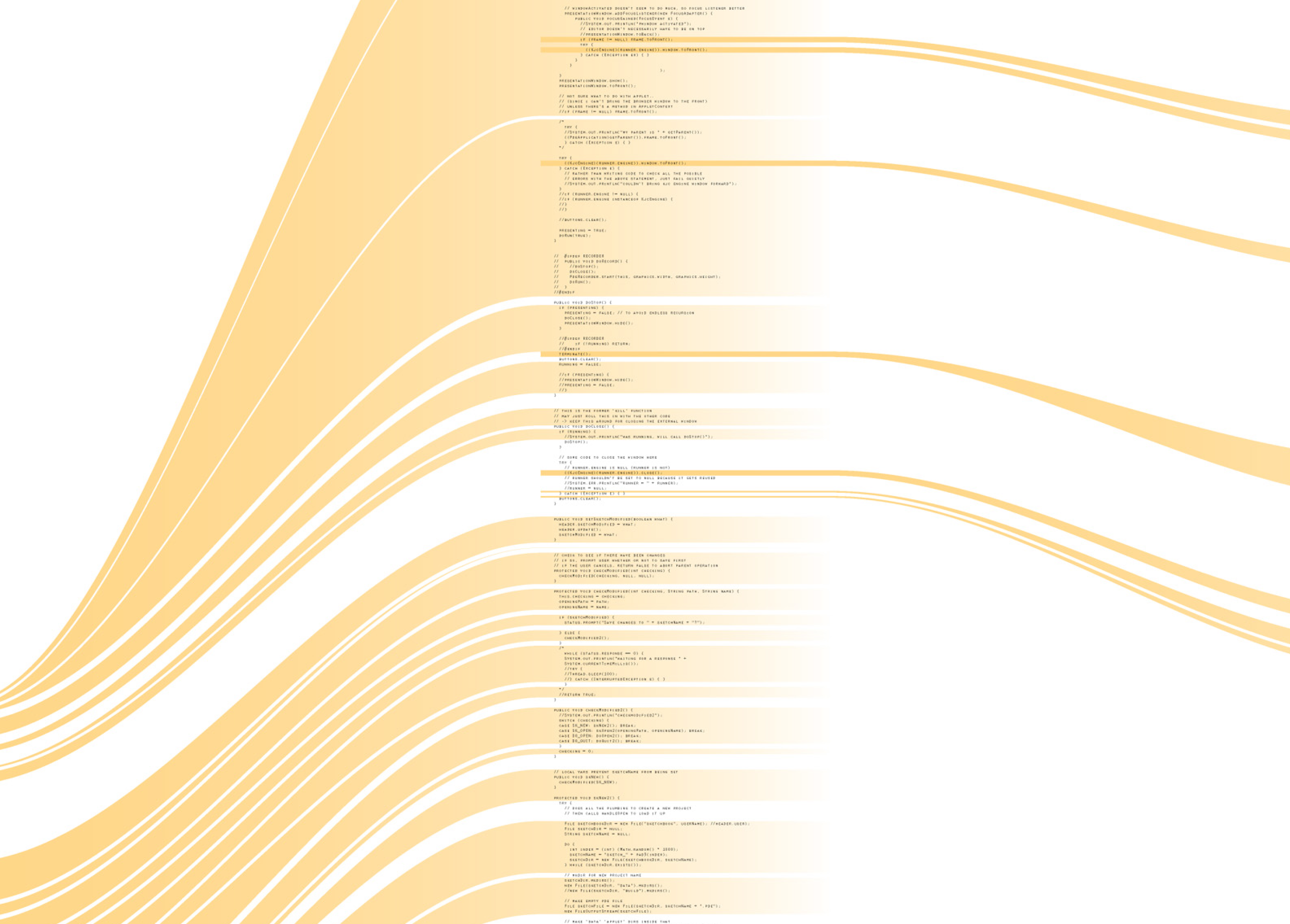
While the method of depicting changes between versions of a file is not new, the representation of many versions in a single instance is less conventional. The result is a depiction of the organic process in which even the smallest pieces of software code become mature through the course of its development, as they are passed between developers, revisited for later refinement, merged, removed, and simplified.
7.2.2 Dismap
Programs on modern computers are eventually compiled into machine language, a series of basic and direct instructions understood by the microprocessor. Programs are flattened from their hierarchical state into a long series of simple mathematical instructions (like multiply or add with carry) and interspersed with commands for jumping to another location in the program.
The simpler of these two diagrams shows the program for the “Excite Bike” game for the original Nintendo (this console was chosen for its simplicity). The blocks of gray text are “data” sections that are used to store images or game scenarios. The curved lines connect locations in the program where “jumps” occur, which can be a function or a conditional choice made by the software. The more complicated image depicts the original “Super Mario Brothers” game. The images were created in appreciation of the elegance in the structure of such software, not so much as a diagnostic tool for understanding their operation.
7.2.3 Deconstructulator
This is a deconstructed Nintendo emulator that shows how sprites and sprite memory are handled while a game is being played. The intent is to show insight for how software and hardware work, given the relatively simple example of a minimal architecture from an old game console system.
The emulator is a modified version of the NESCafe emulator written by David de Niese. David was kind enough to make the source code of his emulator available, which I hacked up a bit to dynamically show aspects of how the machine works.
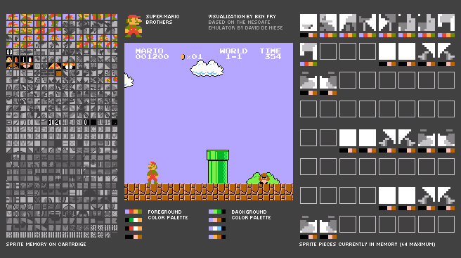
On the left is the sprite memory on the cartridge, a bank of 8 × 8 pixel tiles that are reassembled to create the images used in the game. (See the Mariosoup description in the next section for more about how they work.) The images are stored as four colors, but the colors are only specified as the program is run. While playing a game, the tiles are colored based on the last color set used to draw that image.
Colors are used in sets of four, of which there are four available for the background, and four more assigned to the foreground. The sets are shown just below the game image.
On the right are the 64 sprites (8 × 8 pixel tiles) currently in memory. Beneath each is the four-color set that has been applied to it as it was added to the screen. Only 64 can be active on the screen at any given time. In the case of Mario, he’s assembled from several small tiles which can be seen towards the top.
7.2.4 Mariosoup
Any piece of executable code is also commingled with data, ranging from simple sentences of text for error messages to entire sets of graphics for the application. In older cartridge-based console games, the images for each of the small on-screen images (the “sprites”) were often stored as raw data embedded after the actual program’s instructions. This piece examines the unpacking of a Nintendo game cartridge, decoding the program as a four-color image, revealing a beautiful soup of the thousands of individual elements that make up the game screen.
The images are a long series of 8 × 8 pixel “tiles”. Looking at the cartridge memory directly (with a black pixel for an “on” bit, and a white pixel for an “off”) reveals the sequence of black and white (one bit) 8 × 8 images. Each pair of images is mixed together to produce a two bit (four-color) image. The blue represents the first sequence of image data, the red layer is the second set of data that is read, and seeing them together produces the proper mixed-color image depicting the actual image data.
7.3
tendril
Tendril is a web browser that creates typographic sculptures from the content of web sites. Branches are formed from the text of a web page, each link on the page begins another branch for the linked page.
For instance, the first page of a site is rendered as a column of text. links in the text are colored, and when clicked, the text for the linked page grows from the location of the link.
The visualization is controlled by trackball input, allowing the user to rotate and zoom into and around the structure.
Over time, the result is an enormous branching structure, built purely out of the text that is contained in a set of connected web pages, and guided by the hand of the user as they choose the direction of links that are followed. The project was created as a means to bring form and structure to a large set of raw data, streamed live from a server, that is undergoing continuous change.
7.4
shopactivity
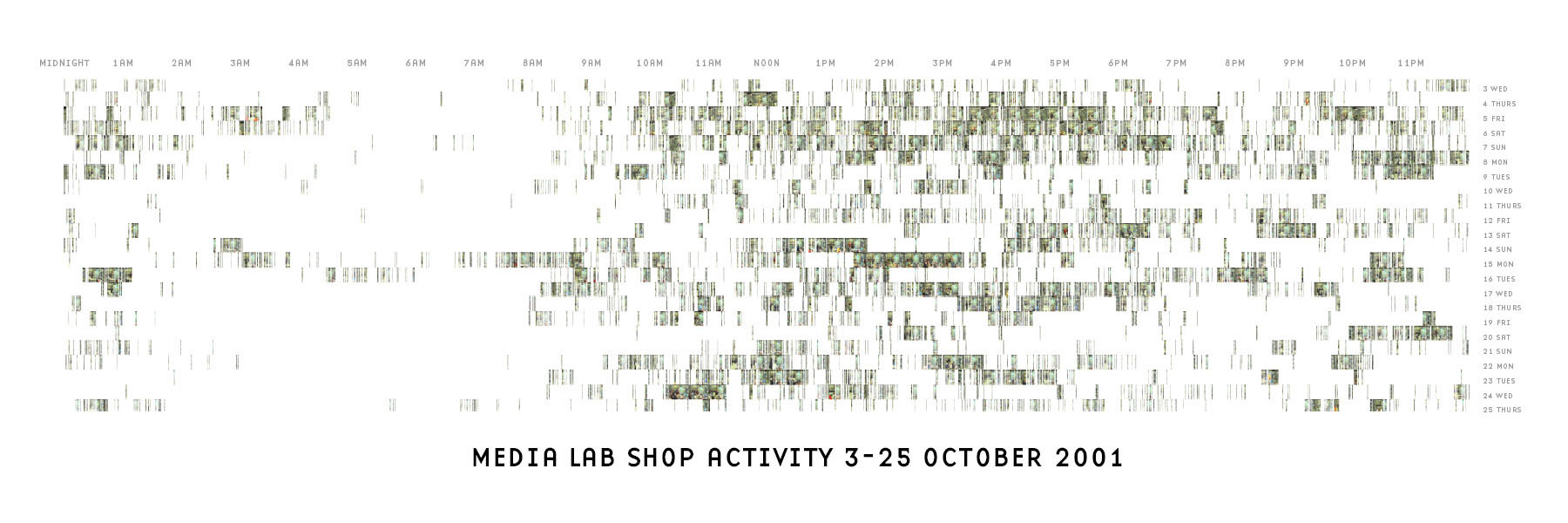
This image depicts activity in the mit Media Lab’s shop for two and a half weeks. Lines depict activity detected on the security camera. With enough activity, the lines coalesce to reveal the image of the people working at that time. It was created with two short programs, one in Java and another in Perl. While this version used just two weeks, it would be possible to run the programs on a larger set of data, or instead run on screen as a dynamic display that shows new images as they are added. A detail is shown below.
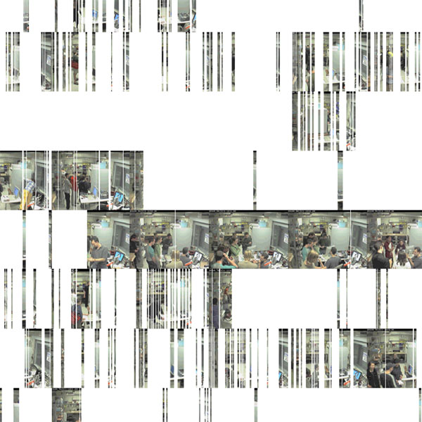
This project was an early example of sketching with software: how to explore a set of data by quickly developing a visual image. part of a set of experiments to create complex and sophisticated information graphics very rapidly (a matter of hours) through the use of short scripts or simple programs. In pursuing such work, a library of useful functionality for sketching data visualization has been created, and influenced the development of Processing.
Actual size of the image is 72 × 24 inches.
7.5
radialsize
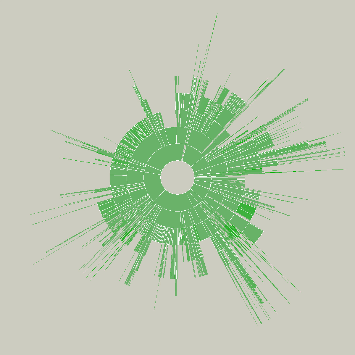
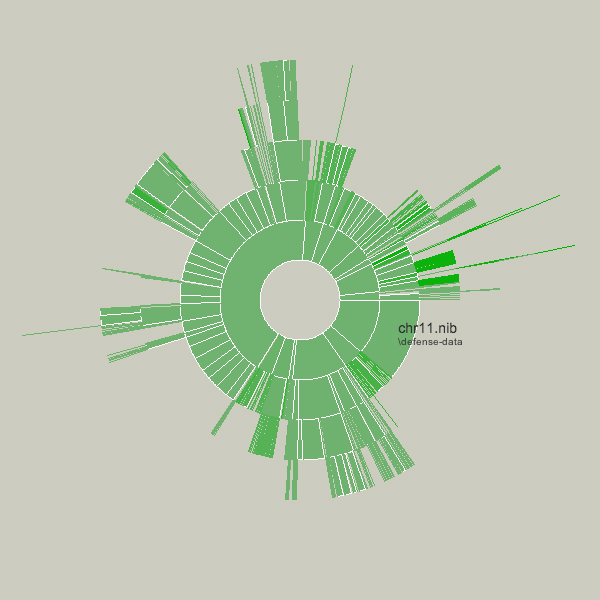
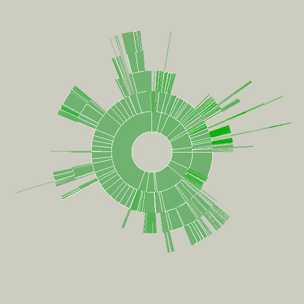
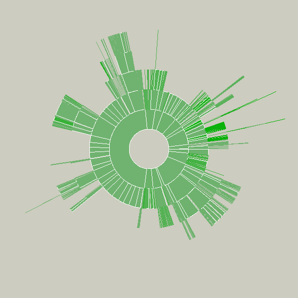
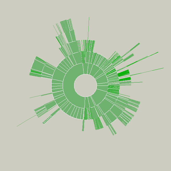
This sketch was created as a means to understand the relative sizes of objects in a hierarchy in a dynamic manner. This example depicts an alternative view of a user’s files, a series of folders and documents within folders.
The image is built from the center, the first inner ring has all the files and folders within a particular folder specified by the user. Each arc wedge is sized according to the size of the file, or if a folder, the total size of its contents. The three animation steps above show the initial traversal of the folder hierarchy, where rings are added as the program finds new folders and files. Placing the mouse over a wedge shows the user the name of the file or folder it represents.
The coloring is based on the relative age of the files, normalized by their standard deviation (see the “Process” chapter). The medium color is for files that fall within the average ranges for the files, brighter colors are further outside the spectrum.
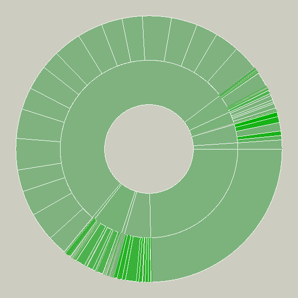
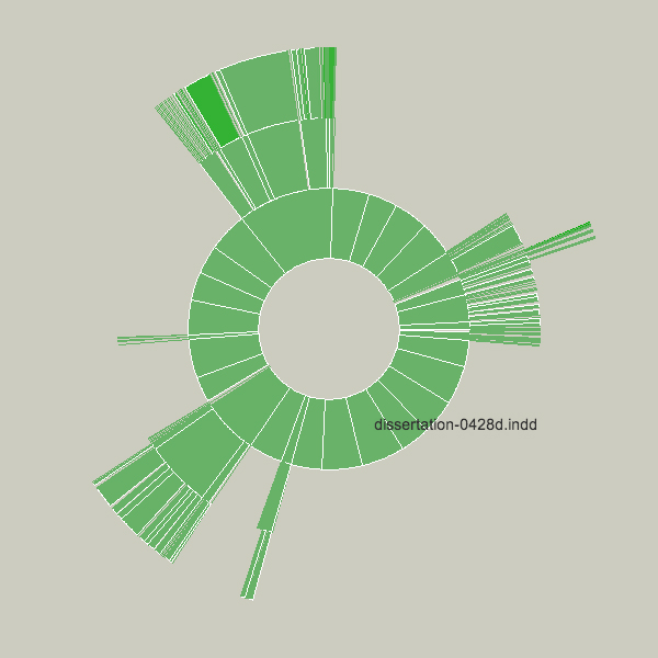
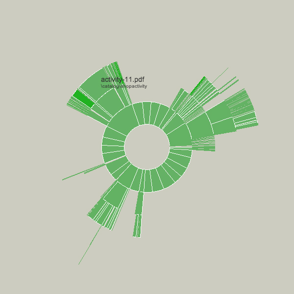
Changes to the folders being displayed will cause radialsize to dynamically update itself. For instance, in the example below, a large file was removed, so its wedge is slowly removed, an animated transition that helps the user to know what has changed.
The files in these examples are mostly of similar dates so there isn’t much variety to the color.
The notion behind this example is providing a bird’s eye view to understand what’s taking up the most room on a disk. Additional features would allow the user to click and drag the pie wedge directly to the user’s ‘trash’ (or ‘recycle bin’), or compess files or entire folders that require too much room.
Key to this piece is the idea of a visualization that adapts as the data underneath it changes. Creating a diagram of a fixed data set is quite simple, but making them update, and demonstrate (through animation, in this case) to the user how they are being updated is often far more useful, but has received far less research attention.
Shown below is an example of a more complicated file hierarchy, covering six gigabytes of data in a total of 3,000 individual folders.