
Handcrafted Data
 Continuing Luddite Monday, a new special feature on benfry.com, an article from the Boston Globe about the prevalence of handcrafted images in reference texts. Dushko Petrovich writes:
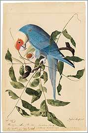
But in fact, nearly two centuries after the publication of his famous folios, it is Audubon’s technique, and not the sharp eye of the modern camera, that prevails in a wide variety of reference books. For bird-watchers, the best guides, the most coveted guides – like those by David Allen Sibley and Roger Tory Peterson – are still filled with hand-painted images. The same is true for similar volumes on fish, trees, and even the human body. Ask any first-year medical student what they consult during dissections, and they will name Dr. Frank H. Netter’s meticulously drafted “Atlas of Human Anatomy.” Or ask architects and carpenters to see their structures, and they will often show you chalk and pencil “renderings,” even after the things have been built and professionally photographed.
This nicely reinforces the case for drawing, and why it’s so powerful. The article later gets to the meat of the issue, which is the same reason that drawing is a topic on a site about data visualization.
Besides seamlessly imposing a hierarchy of information, the handmade image is also free to present its subject from the most efficient viewpoint. Audubon sets a high standard in this regard; he is often at pains to depict the beak in its most revealing profile, the crucial feathers at an identifiable angle, the front leg extended just so. When the nighthawk and the whip-poor-will are pictured in full flight, their legs tucked away, he draws the feet at the side of the page, so we’re not left guessing. If Audubon draws a bird in profile, as he does with the pitch-black rook and the grayer hooded crow, we’re not missing any details a three-quarters view would have shown.
And finally, a reminder:
Confronted with unprecedented quantities of data, we are constantly reminded that quality is what really matters. At a certain point, the quality and even usefulness of information starts being defined not by the precision and voracity of technology, but by the accuracy and circumspection of art. Seen in this context, Audubon shows us that painting is not just an old fashioned medium: it is a discipline that can serve as a very useful filter, collecting, editing, and carefully synthesizing information into a single efficient and evocative image – giving us the information that we really want, information we can use and, as is the case with Audubon, even cherish.
Consider this your constant reminder, because I think it’s actually quite rare that quality is acknowledged. I regularly attend lectures by speakers who boast about how much data they’ve collected and the complexity of their software and hardware, but it’s one in ten thousand who even mention the art of removing or ignoring data in search of better quality.
Looks like the Early Drawings book mentioned in the article will be available at the end of September.
