Writing

Change is always most interesting

The New York Times has a very nicely done election map this year. Amongst its four viewing options is a depiction of counties that voted more Democratic (blue) or Republican (red) in comparison to the 2004 presidential election:

shift-levels-500.jpg

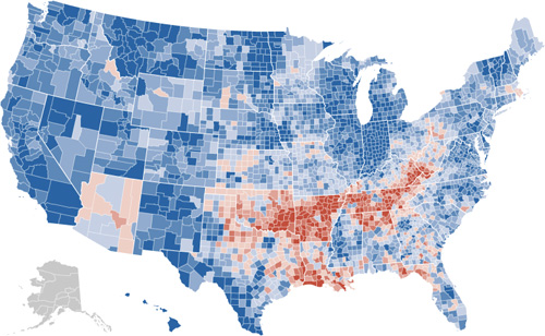
The blue is to be expected, given that the size of the win for Obama, but the red pattern is quite striking.

Also note the shift for candidate home states, in Arizona with McCain on the ticket, and what appears to be the reverse result in parts of Massachusetts, with Kerry no longer on the ticket. (The shift to the Democrats in Indiana is also amazing: without looking at the map closely enough I had assumed that area to be Obama’s home of Illinois.)

I recommend checking out the actual application on the Times site, the interaction lacks some of the annoying ticks that can be found in some of their other work (irritating rollovers that get in the way, worthless zooming, and silly transition animations). It’s useful and succinct, just like an infographic should be. Or just the way Mom used to make. Or whatever.

Thursday, November 6, 2008 | infographics, interact, mapping, politics  
Book

Visualizing Data Book CoverVisualizing Data is my 2007 book about computational information design. It covers the path from raw data to how we understand it, detailing how to begin with a set of numbers and produce images or software that lets you view and interact with information. When first published, it was the only book(s) for people who wanted to learn how to actually build a data visualization in code.

The text was published by O’Reilly in December 2007 and can be found at Amazon and elsewhere. Amazon also has an edition for the Kindle, for people who aren’t into the dead tree thing. (Proceeds from Amazon links found on this page are used to pay my web hosting bill.)

Examples for the book can be found here.

The book covers ideas found in my Ph.D. dissertation, which is the basis for Chapter 1. The next chapter is an extremely brief introduction to Processing, which is used for the examples. Next is (chapter 3) is a simple mapping project to place data points on a map of the United States. Of course, the idea is not that lots of people want to visualize data for each of 50 states. Instead, it’s a jumping off point for learning how to lay out data spatially.

The chapters that follow cover six more projects, such as salary vs. performance (Chapter 5), zipdecode (Chapter 6), followed by more advanced topics dealing with trees, treemaps, hierarchies, and recursion (Chapter 7), plus graphs and networks (Chapter 8).

This site is used for follow-up code and writing about related topics.