Bird Tracks in the Snow
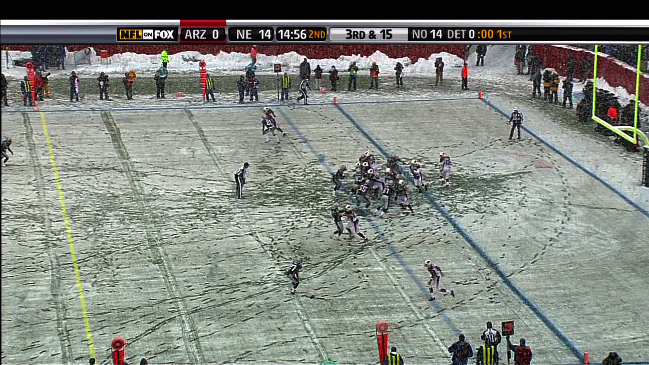
The field in snowy Foxborough, Massachusetts after a running play in Sunday’s football game:
(Click the image for the original version, taken from the broadcast.)
Look at all the footprints in the snow: The previous play began to the right of the white line, where you can see most of the snow was cleared by the players lining up. Just to the left of that is another cleared area, where a group of players began to tackle Sammy Morris. But it’s not until almost ten yards — two more white lines, and the area below where the players are standing in that picture — that he’s finally taken to the ground. For a visual explanation, watch the play:
(Mute the audio and spare yourself the insipid commentary from the FOX booth. And then be thankful that at least it’s not Joe Buck and Tim McCarver.)
The path left behind in the snow explains exactly how the play developed, according to the players’ feet. (And as a running play, feet are important.) Absolutely beautiful.
One of the best things about December is watching football games played in the snow. For instance last year, there was a game between Cleveland and Buffalo last year that looked like it was being played inside a snow globe, with the globe being picked up and shaken during each commercial break.
Boston was a complete mess yesterday with a few inches of snow, sleet, and muck falling from the sky, which made a mess of the field where the New England Patriots were happily hosting the Arizona Cardinals, who are less accustomed to digging out their cars and leaving behind patio furniture.
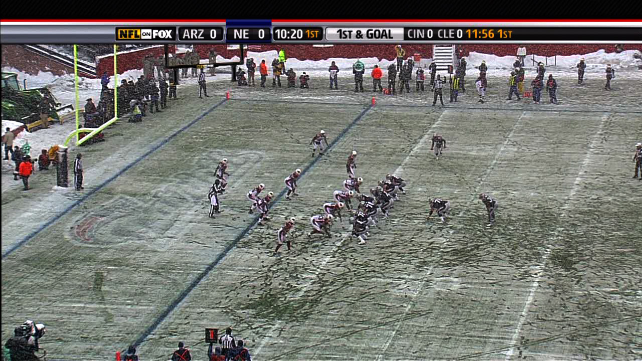
Another image from later in the game, this one instead depicts the substitutions of players as they near the goal line. Note the lines in the snow that begin at the left, and lead to where the players are lined up: