Responding to the Boehner post, Jay Parkinson, M.D. pointed me to this improved chart by designer Robert Palmer, accompanied by an angst-ridden open letter (an ironic contrast to the soft pastels in his diagram) decrying the crimes of visual malfeasance.
 Meanwhile, Ezra Klein over at the Washington Post seems to be thinking along similar lines as my original post, noting this masked artist’s earlier trip to Kinko’s a few weeks ago. Klein writes:
 Whoever is heading the Scary Flowcharts Division of John Boehner’s office is quickly becoming my favorite person in Washington. A few weeks ago, we got this terror-inducing visualization of the process behind “Speaker Pelosi’s National Energy Tax.”
That’s hot!
If I were teaching right now, I’d make all my students do a one day charrette on trying to come up with something worse than the Boehner health care image while staying in the realm of colloquial things you can do with PowerPoint. It’d be a great time, and we’d all learn a lot.
Having spent two posts making fun of the whole un-funny mess around health care, I’ll leave you with the best bit of op-ed I’ve read on the topic, from Harold Meyerson, also at the Washington Post:
Watching the centrist Democrats in Congress create more and more reasons why health care can’t be fixed, I’ve been struck by a disquieting thought: Suppose our collective lack of response to Hurricane Katrina wasn’t exceptional but, rather, the new normal in America. Suppose we can no longer address the major challenges confronting the nation. Suppose America is now the world’s leading can’t-do country.
I agree and find it terrifying. And I don’t think that’s a partisan issue.
Now back to your purposefully apolitical, regularly scheduled blog on making pictures of data.
Passed along by Jane Nisselson, a photo she found in the New Yorker, apropos of my continued fascination with command centers and the selection of information they highlight:
I think it was those clocks and choice of cities that were memorable. It is actually One Police plaza and not the terrorism HQ on Coney Island. The photographer is Eugene Richards.

For New Yorker readers, the original article is here.
An email regarding the last post, answering some of the questions about success and popularity of management games. Andrew Walkingshaw writes:
The short answer to this is “yes” – football (soccer) management games are a very big deal here in Europe. One of the major developers is Sports Interactive, (or at Wikipedia) with their Championship Manager/Football Manager series: they’ve been going over fifteen years now.
And apparently the games have even been popular since the early 80s. I found this bit especially interesting:
Fantasy soccer doesn’t really work – the game can’t really be quantified in the way NFL football or baseball can – so it could be that these games’ popularity comes from filling the same niche as rotisserie baseball does on your side of the Atlantic.
Which suggests a more universal draw to the numbers game or statistics competition that gives rise to fantasy/rotisserie leagues. The association with sports teams gives it broader appeal, but at its most basic, it’s just sports as a random number generator.
Some further digging yesterday also turned up Baseball Mogul 2008 (and the 2009 Edition). The interface seems closer to a bad financial services app (bad in this case just means poorly designed, click the image above for a screenshot), which is the opposite direction of what I’m interested in, but at least gives us another example. Although this one also seems to have reviewed better than the game from the previous post.
Received a note from Vitor Silva, who created the Portuguese-language examples from Visualizing Data using Processing.js:
i created a more “world friendly” version of the initial post. it’s now in english (hopefully in a better translation than babelfish) and it includes a variation on your examples of chapter 3.
The new page can be found here. And will you be shocked to hear that indeed it is far better than Babelfish?
Many thanks to Vitor for the examples and the update.
Just received a helpful note from Nelson Minar, who notes an already redrawn version of the graph from the last post over at Chartjunk. The redraw aims to improve the proportion between the different tax brackets:
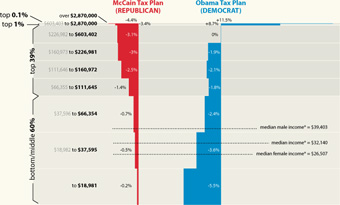
Much better! Read more about their take, and associated caveats here. (Also thanks to Peter Merholz and Andrew Otwell who also wrote, yet were no match for Nelson’s swift fingers.)
In response to the last post, a message from João Antunes:
…you should also read this story about Panic’s old MP3 player applications.
The story includes how they came to almost dominate the Mac market before iTunes, how AOL and Apple tried to buy the application before coming out with iTunes, even recollections of meetings with Steve Jobs and how he wanted them to go work at Apple – it’s a fantastic indie story.
Regarding the Mac ‘indie’ development there’s this recent thesis by a Dutch student, also a good read.
I’d read the story about Audion (the MP3 player) before, and failed to make the connection that this was the same Audion that I rediscovered in the O’Reilly interview from the last post (and took a moment to mourn its loss). It’s sad to think of how much better iTunes would be if the Panic guys were making it — iTunes must be the first MP3 player that feels like a heavy duty office suite. In the story, Cabel Sasser (the other co-founder of Panic) begins:
Is it just me? I mean, do you ever wonder about the stories behind everyday products?
What names were Procter & Gamble considering before they finally picked “Swiffer”? (Springle? Sweepolio? Dirtrocker?) What flavors of Pop-Tarts never made it out of the lab, and did any involve lychee, the devil’s fruit?
No doubt the backstory on the Pop-Tarts question alone could be turned into a syndicated network show to compete with LOST.
Audion is now available as a free download, though without updates since 2002, it’s not likely to work much longer (seemed fine with OS X 10.4, though who knows with even 10.5).
Some additional followup from Robert Simmon regarding the previous post. I asked more about the “amateur Earth observers” and the intermediate data access. He writes:
The original idea was sparked from the success of amateur astronomers discovering comets. Of course amateur astronomy is mostly about making observations, but we (NASA) already have the observations: the question is what to do with them–which we really haven’t figured out. One approach is to make in-situ observations like aerosol optical thickness (haziness, essentially), weather measurements, cloud type, etc. and then correlate them with satellite data. Unfortunately, calibration issues make this data difficult to use scientifically. It is a good outreach tool, so we’re partnering with science museums, and the GLOBE program does this with schools.
We don’t really have a good sense yet of how to allow amateurs to make meaningful analyses: there’s a lot of background knowledge required to make sense of the data, and it’s important to understand the limitations of satellite data, even if the tools to extract and display it are available. There’s also the risk that quacks with and axe to grind will willfully abuse data to make a point, which is more significant for an issue like climate change than it is for the face on Mars, for example. That’s just a long way of saying that we don’t know yet, and we’d appreciate suggestions.
I’m more of a “face on Mars” guy myself. It’s unfortunate that the quacks even have to be considered, though not surprising from what I’ve seen online. Also worth checking out:
Are you familiar with Web Map Service (WMS)?
http://www.opengeospatial.org/standards/wms
It’s one of the ways we distribute & display our data, in addition to KML.
And one last followup:
Here’s another data source for NASA satellite data that’s a bit easier than the data gateway:
http://daac.gsfc.nasa.gov/techlab/giovanni/
and examples of classroom exercises using data, with some additional data sources folded in to each one:
http://serc.carleton.edu/eet/
The EET holds an “access data workshop” each year in late spring, you may be interested in attending next year.
And with regards to guidelines, Mark Baltzegar (of The Cyc Foundation) sent along this note:
Are you familiar with the ongoing work within the W3C’s Linking Open Data project? There is a vibrant community actively exposing and linking open data.
http://richard.cyganiak.de/2007/10/lod/
http://esw.w3.org/topic/SweoIG/TaskForces/CommunityProjects/LinkingOpenData
More to read and eat up your evening, at any rate.
Robert Simmon of NASA caught this post about the NASA Earth Observatory and was kind enough to pass along some additional information.
Regarding the carbon emissions video:
The U.S. carbon emissions data were taken from the Vulcan Project:
http://www.purdue.edu/eas/carbon/vulcan/index.php
They distribute the data here:
http://www.purdue.edu/eas/carbon/vulcan/research.html
In addition to the animation (which was intended to show the daily cycle and the progress of elevated emissions from east to west each morning), we published a short feature about the project and the dataset, including some graphs that remove the diurnal cycle.
http://earthobservatory.nasa.gov/Study/AmericanCarbon/
American Carbon is an example of one of our feature articles, which are published every month or so. We try to cover current research, focusing on individual scientists, using narrative techniques. The visualizations tie in closely to the text of the story. I’m the primary visualizer, and I focus on presenting the data as clearly as possible, rather than allowing free-form investigation of data. We also publish daily images (with links to images at the original resolution), imagery of natural hazards emphasizing current events (fires, hurricanes, and dust storms, for example), nasa press releases, a handful of interactive lessons, and the monthly global maps of various parameters. We’re in the finishing stages of a redesign, which will hopefully improve the navigation and site usability.
Also some details about the difficulties of distributing and handling the data:
These sections draw on data from wide and varied sources. The raw data is extremely heterogeneous, formats include: text files, HDF, matlab, camera raw files, GRADS, NetCDF, etc. All in different projections, at different spatial scales, and covering different time periods. Some of them are updated every five minutes, and others are reprocessed periodically. Trying to make the data available—and current—through our site would be overly ambitious. Instead, we focus on a non-expert audience interested in space, technology, and the environment, and link to the original science groups and the relevant data archives. Look in the credit lines of images for links.
Unfortunately the data formats can be very difficult to read. Here’s the main portal for access to NASA Earth Observing System data:
http://esdis.eosdis.nasa.gov/index.html
and the direct link to several of the data access interfaces:
http://esdis.eosdis.nasa.gov/dataaccess/search.html
And finally, something closer to what was discussed in the earlier post:
With the complexity of the science data, there is a place for an intermediate level of data: processed to a consistent format and readable by common commercial or free software (intervention by a data fairy?). NASA Earth Observations (NEO) is one attempt at solving that problem: global images at 0.1 by 0.1 degrees distributed as lossless-compressed indexed color images and csv files. Obviously there’s work to be done to improve NEO, but we’re getting there. We’re having a workshop this month to develop material for “amateur Earth observers” which will hopefully help us in this area, as well.
This speaks to the audience I tried to address with Visualizing Data in particular (or with Processing in general). There is a group of people who want access to data that’s more low-level than what’s found in a newspaper article, but not as complicated as raw piles of data from measuring instruments that are only decipherable by the scientists who use them.
This is a general theme, not specific to NASA’s data. And I think it’s a little more low-level than requiring that everything be in mashup-friendly XML or JSON feeds, but it seems worthwhile to start thinking about what the guidelines would be for open data distribution. And with such guidelines in place, we can browbeat organizations to play along! Since that would be, uh, a nice way to thank them for making their data available in the first place.
Got an email from Mebane Faber who noted the roughly inverse correlation you currently see in salaryper, and asking about whether I’d done proper year-end analysis. The response follows:
I threw the project together as sort of a fun thing out of curiosity, and haven’t taken the time to do a proper analysis. However you can see in the previous years that the inverse relationship happens each year at the beginning of the season, and then as it progresses, the big market teams tend to mow down the small guys. Or at least those that are successful–the correlation between salary and performance at the end of a season is generally pretty haphazard. In fact, it’s possible that the inverse correlation at the beginning of the season is actually stronger than the positive correlation at the end.
I think the last point is kinda funny, though I’d imagine there’s a less funny statistics term for that phenomenon. Such a fine line between funny and sounding important.
Some thoughtful comments passed along by Alex Hutton regarding the last post:
Part of the problem with point technology solutions is in the policies of implementation. IMHO, we undervalue the subject matter expert, or operate as a denigrated bureaucracy which does not allow the subject matter expert the flexibility to make decisions. When that happens, the decision is left to technology (and as you point out, no technology is a perfect decision maker).
I thought it was apropos that you brought in the Schneier example. I’ve been very much involved in a parallel thought process in the same industry as he, and we (my partner and I) are coming to a solution that attempts to balance technology, point human decision, and the bureaucracy within which they operate.
If you believe the Bayesians, then the right Bayesian network mimics the way the brain processes qualitative information to create a belief (or in the terms of Bayesians, a probability statement used to make a decision). As such, the current way we use the technology (that policy of implementation, above) is faulty because it minimizes that “Human Computational Engine” for a relatively unsophisticated, unthinking technology. That’s not to say that technologies like facial recognition are worthless – computational engines, even less magic ones that aren’t 99.99% accurate, are valid pieces of prior information (data).
Now in the same way, Human Computational Engines are also less than perfectly accurate. In fact, they are not at all guaranteed to work the same way twice – even by the same person unless that person is using framework to provide rigor, rationality, and consistency in analysis.
So ideally, in physical security (or information security where Schneier and I come from) the imperfect computer detection engine is combined with a good Bayesian network and well trained/educated/experienced subject matter experts to create a more accurate probability statement around terrorist/non-terrorist – one that at least is better at identifying cases where more information is needed before a person is prevented from flying, searched and detained. While this method, too, would not be 100% infallible (no solution will ever be), it would create a more accurate means of detection by utilizing the best of the human computational engine.
I believe the Bayesians, just 99.99% of the time.
 A great Unicode in 5 Minutes presentation from Mark Lentczner at Linden Lab. He passed it along after reading this dense post, clearly concerned about the welfare of my readers.
(Searching out the image for the title of this post also led me to a collection of Favourite Unicode Codepoints. This seems ripe for someone to waste more time really tracking down such things and documenting them.)
Mark’s also behind Context Free, one of the “related initiatives” that we have listed on Processing.org.
Context Free is a program that generates images from written instructions called a grammar. The program follows the instructions in a few seconds to create images that can contain millions of shapes.
Grammars are covered briefly in the Parse chapter of vida, with the name of the language coming from a specific variety called Context Free Grammars. The magical (and manic) part of grammars is that their rules tend to be recursive and layered, which leads to a certain kind of insanity as you try to tease out how the rules work. With Context Free, Mark has instead turned this dizziness into the basis for creating visual form.
Updated 14 May 08 to fix the glyph. Thanks to Paul Oppenheim, Spidery Ha Devotee, for the correction.
Got an email over the weekend from Tom Vanderbilt, who had seen the All Streets piece, and was kind enough to point me to this map (PDF) from the USGS that depicts the average distance to the nearest road across the continental 48 states. (He’s currently working on a book titled Traffic: Why We Drive the Way We Do (and What It Says About Us) to be released this fall).
And too bad I just learned the word conterminous, but had I used that in the original project description, we would have missed (or been spared) the Metafilter discussion of whether “lower 48” was accurate terminology.
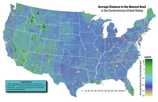
A really interesting map, which of course also shows the difference between something thrown together in a few hours and actual research. In digging around for the map’s source, I found that exactly a year ago, they also published a paper in Science describing their broader work:
Roads encroaching into undeveloped areas generally degrade ecological and watershed conditions and simultaneously provide access to natural resources, land parcels for development, and recreation. A metric of roadless space is needed for monitoring the balance between these ecological costs and societal benefits. We introduce a metric, roadless volume (RV), which is derived from the calculated distance to the nearest road. RV is useful and integrable over scales ranging from local to national. The 2.1 million cubic kilometers of RV in the conterminous United States are distributed with extreme inhomogeneity among its counties.
The publication even includes a response and a response to the response—high scientific drama! Apparently some lads feel that “roadless volume does not explicitly address ecological processes.” So let that be a warning to all you non-explicit addressers.
For those lucky to have access to the journal online, the supplementary information includes a time lapse video of a section of Colorado, and its roadless volume since 1937. As with all things, it’s much more interesting to see how this changes over time. A map of all streets in the lower 48 isn’t nearly as engaging as a sequence of the same area over several years. The latter story is simply far more compelling.


