
Writing

Already checked it in Photoshop, so you don’t have to
I wasn’t going to post this one, but I can’t get it out of my head. In the image below, the squares marked A and B are the same shade of gray.

The image is from Edward H. Adelson at MIT, and you can find my original source here. More details (proof, etc) on Adelson’s site here, which includes this explanation:
The visual system needs to determine the color of objects in the world. In this case the problem is to determine the gray shade of the checks on the floor. Just measuring the light coming from a surface (the luminance) is not enough: a cast shadow will dim a surface, so that a white surface in shadow may be reflecting less light than a black surface in full light. The visual system uses several tricks to determine where the shadows are and how to compensate for them, in order to determine the shade of gray “paint” that belongs to the surface.
The first trick is based on local contrast. In shadow or not, a check that is lighter than its neighboring checks is probably lighter than average, and vice versa. In the figure, the light check in shadow is surrounded by darker checks. Thus, even though the check is physically dark, it is light when compared to its neighbors. The dark checks outside the shadow, conversely, are surrounded by lighter checks, so they look dark by comparison.
A second trick is based on the fact that shadows often have soft edges, while paint boundaries (like the checks) often have sharp edges. The visual system tends to ignore gradual changes in light level, so that it can determine the color of the surfaces without being misled by shadows. In this figure, the shadow looks like a shadow, both because it is fuzzy and because the shadow casting object is visible.
The “paintness” of the checks is aided by the form of the “X-junctions” formed by 4 abutting checks. This type of junction is usually a signal that all the edges should be interpreted as changes in surface color rather than in terms of shadows or lighting.
As with many so-called illusions, this effect really demonstrates the success rather than the failure of the visual system. The visual system is not very good at being a physical light meter, but that is not its purpose. The important task is to break the image information down into meaningful components, and thereby perceive the nature of the objects in view.
(Like the earlier illusion post, this one’s also from my mother-in-law, who should apparently be writing this blog instead of its current—woefully negligent—author.)
Illusive
A terrific set of videos from the “Best Illusion of the Year” contest. Congratulations to all the finalists, in particular first prize winner Koukichi Sugihara whose video is below:
More from Kokichi Sugihara (including an explanation of how this works) can be found here.
(thanks to my mother-in-law, who sent the link)
Human Computation (or “Mechanical Turk” meets “Family Feud”)
 Computers are really good at repetitive work. You can ask a computer to multiply two numbers together seven billion times and not only will it not complain, it’ll probably have seven billion answers for you a few seconds later. Ask a person to do the same thing and they’ll either walk away at the outset, realizing the ridiculousness of the task, or they’ll get through the first few tries and lose interest. But even the fact that a human can recognize the ridiculousness of the task is important. Humans are good at lots of things—like identifying a face in a crowd—that cannot be addressed by computation with the same level of accuracy.
Visualization is about the interface between what humans are good at, and what computers are good at. First, the computer can crunch all seven billion numbers, then present the results in a way that we can use our own perceptual skills to identify what’s important or interesting. (This is also why the design of a visualization is a fundamentally human task, and not something to be left to automation.)
This is also the subject of Luis von Ahn’s work at Carnegie Mellon. You’re probably familiar with CAPTCHA images—usually wavy numbers and letters that you have to discern when signing up for a webmail account or buying tickets from Ticketmaster. The acronym stands for “Completely Automated Public Turing Test to Tell Computers and Humans Apart,” a clever mouthful referring to Alan Turing’s work in discerning man or machine. (I encourage you to read about them, but this is already getting long so I won’t get into it here.)
More interesting than CAPTCHA, however, is the whole notion that’s behind it: that it’s an example of relying on humans to do what they’re best at, though it’s a task that’s difficult for computers. (Sure, in recent weeks, people have actually found ways to “break” CAPTCHAs in specific cases, but that’s not important here.) For instance, the work was extended to the Google Image Labeler, described as follows:
You’ll be randomly paired with a partner who’s online and using the feature. Over a two-minute period, you and your partner will:
- View the same set of images.
- Provide as many labels as possible to describe each image you see.
- Receive points when your label matches your partner’s label. The number of points will depend on how specific your label is.
- See more images until time runs out.
Prior to this, most image labeling systems had to do with getting volunteers to name or tag images individually. As you can imagine, the quality of tags suffer considerably because of everything from differences in how people perceive or describe what they see, to individuals who try to be a little too clever in choosing tags. With the Image Labeler game, that’s turned around backwards, where there is a motivation to use tags that match the other person, thus minimizing the previous problems. (It’s “Mechanical Turk” meets “Family Feud”.) They’ve also applied the same ideas to scanning books—where fragments of text that cannot be recognized by software are instead checked by multiple people.
More recently, von Ahn’s group has expanded these ideas in Games With A Purpose, a site that addresses these “casual games” more directly. The new site is covered in this New Scientist article, which offers additional tidbits (perspective? background? couldn’t think of the right word).
You can also watch Luis’ Google Tech Talk about Human Computation, which if I’m not mistaken, led to the Image Labeler project.
(We met Luis a couple times while at CMU and watched the Superbowl with his awesome fiancée Laura, cheering on her hometown Chicago Bears against those villainous Colts. We were happy when he received a MacArthur Fellowship for his work—just the sort of person you’d like to get such an award that highlights people who often don’t quite fit in their field.)
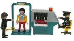 Returning to the earlier argument, algorithms to identify a face in a crowd are certainly improving. But without a significant breakthrough, their usefulness will be significantly limited. One commonly hyped use for such systems is airport security. Bruce Schneier explains the problem:
Suppose this magically effective face-recognition software is 99.99 percent accurate. That is, if someone is a terrorist, there is a 99.99 percent chance that the software indicates “terrorist,” and if someone is not a terrorist, there is a 99.99 percent chance that the software indicates “non-terrorist.” Assume that one in ten million flyers, on average, is a terrorist. Is the software any good?
No. The software will generate 1000 false alarms for every one real terrorist. And every false alarm still means that all the security people go through all of their security procedures. Because the population of non-terrorists is so much larger than the number of terrorists, the test is useless. This result is counterintuitive and surprising, but it is correct. The false alarms in this kind of system render it mostly useless. It’s “The Boy Who Cried Wolf” increased 1000-fold.
Given the number of travelers at Boston Logan in 2006, that would be two “terrorists” identified per day. (And with Schneier’s one in ten million is a terrorist figure, that would be two or three terrorists per year…clearly too generous, which makes the face detection accuracy even worse than how he describes it.) I find myself thinking about the 99.99% accuracy number as I stare at the back of heads lined up at the airport security checkpoint—itself a human problem, not a computational problem.
Book
 Visualizing Data is my 2007 book about computational information design. It covers the path from raw data to how we understand it, detailing how to begin with a set of numbers and produce images or software that lets you view and interact with information. When first published, it was the only book(s) for people who wanted to learn how to actually build a data visualization in code.
The text was published by O’Reilly in December 2007 and can be found at Amazon and elsewhere. Amazon also has an edition for the Kindle, for people who aren’t into the dead tree thing. (Proceeds from Amazon links found on this page are used to pay my web hosting bill.)
Examples for the book can be found here.
The book covers ideas found in my Ph.D. dissertation, which is the basis for Chapter 1. The next chapter is an extremely brief introduction to Processing, which is used for the examples. Next is (chapter 3) is a simple mapping project to place data points on a map of the United States. Of course, the idea is not that lots of people want to visualize data for each of 50 states. Instead, it’s a jumping off point for learning how to lay out data spatially.
The chapters that follow cover six more projects, such as salary vs. performance (Chapter 5), zipdecode (Chapter 6), followed by more advanced topics dealing with trees, treemaps, hierarchies, and recursion (Chapter 7), plus graphs and networks (Chapter 8).
This site is used for follow-up code and writing about related topics.
Much Clicked
- Visualizing Data Examples
- On needing approval for what we create, and losing control over how it’s distributed
- Brains on the Line
- All Streets
- Watching the evolution of the “Origin of Species”
- The Earth at night
- Piet Mondrian Goes to the Super Bowl
- Sustainable Creativity at Pixar
- Surfing, Orgies, and Apple Pie
- Eric Idle on “Scale”
- New for 2010
- Are electronic medical records really about data?