The importance of showing numbers in context
An info graphic from the Boston Globe:


An info graphic from the Boston Globe:

The New York Times this morning documents Major League Baseball’s use of DNA tests to verify the age of baseball prospects:
Dozens of Latin American prospects in recent years have been caught purporting to be younger than they actually were as a way to make themselves more enticing to major league teams. Last week the Yankees voided the signing of an amateur from the Dominican Republic after a DNA test conducted by Major League Baseball’s department of investigations showed that the player had misrepresented his identity.
Some players have also had bone scans to be used in determining age range.
(Why does a “bone scan” sound so painful? “You won’t provide a DNA sample? Well, maybe you’ll change your mind after the bone scan!”)
Kathy Hudson of Johns Hopkins notes the problem with testing:
“The point of [the Genetic Information Nondiscrimination Act, passed last year] was to remove the temptation and prohibit employers from asking or receiving genetic information.”
The article continues and makes note of the fact that such tests are also used to determine whether a player’s parents are his real parents, which can have an upsetting outcome.
But perhaps the broader concern (outside broken homes) and the scarier motivation for expansion of such testing is noted by a scouting director (not named), who comments:
“Can they test susceptibility to cancer? I don’t know if they’re doing any of that. But I know they’re looking into trying to figure out susceptibility to injuries, things like that. If they come up with a test that shows someone’s connective tissue is at a high risk of not holding up, can that be used? I don’t know. I do think that’s where this is headed.”
Injury is perhaps the most significant, yet most random, factor in scouting. If we’re talking about paying someone $27 million, will the threat of a federal discrimination law (wielded by a young player and agent) really be enough to keep teams away from this?
Some combination of internet-fed conspiracy theorists and Google Earthlings (lings that use Google Earth) were abuzz last week with an odd image find, possibly representing the lost city of Atlantis:

These hopes were later dashed (or perhaps only fed further) when the apparition was denied in a post on the Official Google Blog crafted by two of the gentlemen involved in the data collection for Google Ocean. The post is fascinating as it describes much of the process that they use to get readings of the ocean floor. They explain how echosounding (soundwaves bounced into the depths) is used to determine distance, and when that’s not possible, they actually use the sea level itself:
Above large underwater mountains (seamounts), the surface of the ocean is actually higher than in surrounding areas. These seamounts actually increase gravity in the area, which attracts more water and causes sea level to be slightly higher. The changes in water height are measurable using radar on satellites. This allows us to make a best guess as to what the rest of the sea floor looks like, but still at relatively low resolutions (the model predicts the ocean depth about once every 4000 meters). What you see in Google Earth is a combination of both this satellite-based model and real ship tracks from many research cruises (we first published this technique back in 1997).
How great is that? The water actually reveals shapes beneath because of gravity’s rearrangement of the ocean surface.
A more accurate map of the entire ocean would require a bit more effort:
…we could map the whole ocean using ships. A published U.S. Navy study found that it would take about 200 ship-years, meaning we’d need one ship for 200 years, or 10 ships for 20 years, or 100 ships for two years. It costs about $25,000 per day to operate a ship with the right mapping capability, so 200 ship-years would cost nearly two billion dollars.
Holy crap, two billion dollars? That’s real money!
That may seem like a lot of money…
Yeah, no kidding — that’s what I just said!
…but it’s not that far off from the price tag of, say, a new sports stadium.
Oh.
You mean this would teach us more than New Yorkers will learn from the Meadowlands Stadium debacle, beyond “the Jets still stink” and “Eli Manning is still a weenie”? (Excellent Bob Herbert op-ed on a similar topic — the education part, not the Manning part.)
So in the end, this “Atlantis” is the result of the rounding error in the patchwork of data produced by the various measurement and tiling methods. Not as exciting as a waterlogged and trident-wielding civilization, but the remainder of the article is a great read if you’re curious about how the ocean images are collected assembled.
Beneath a pile of 1099s, I found myself distracted still thinking about the logo colors and proportions seen in the previous post. This led to a diversion to extract the colors from the Super Bowl logos and depict them according to their usage. The colors are counted up and laid out using a Treemap.
The result for all 43 Super Bowl logos, using the same layout as the previous image:

A few of the typical pairs, starting with 2001:


See all of the pairings here. Some notes about what’s mildly clever, and the less so:
And finally, I don’t honestly think there’s any relationship between a software algorithm for data visualization and the work of an artist like Piet Mondrian. But I do love the idea of a Dutch painter from the De Stijl movement making his way through the turnstiles at Raymond Jones Stadium.
From The New York Times, a collection of all 43 logos used to advertise the Super Bowl:
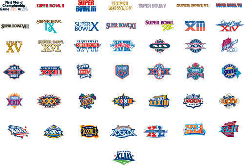
The original article cites how the logos reflect the evolution and growth of the league. Which makes sense, you can see that it was more than fifteen years before it moved from just a logotype to a fully branded extravaganza. Or that in its first year it wasn’t the Super Bowl at all, and instead billed as “The First World Championship Game of the American Football Conference versus the National Football Conference,” a title that sounds great in a late-60s broadcaster voice (try it, you’ll like it), but was still shortened to the neanderthal “First World World Championship Game AFC vs NFC” for the logo, before it was renamed the “Super Bowl” the following year. (You can stop repeating the name in the broadcaster voice now, your officemates are getting annoyed.)
The similarities in the coloring are perhaps more interesting than the differences, though the general Americana obsession of the constant blue/red coloring is unsurprising, especially when you recall that some of the biggest perennial ad buyers (Coke, Pepsi, Budweiser) also share red, white, and blue labels. I’m guessing that the heavy use of yellow in the earlier logos had more to do with yellow looking good against a background when used for broadcast.
Or maybe not — like any good collection, there’s plenty to speculate about and many hypotheses to be drawn — and the investigation is more interesting for the exercise.
An email regarding the last post, answering some of the questions about success and popularity of management games. Andrew Walkingshaw writes:
The short answer to this is “yes” – football (soccer) management games are a very big deal here in Europe. One of the major developers is Sports Interactive, (or at Wikipedia) with their Championship Manager/Football Manager series: they’ve been going over fifteen years now.
And apparently the games have even been popular since the early 80s. I found this bit especially interesting:
Fantasy soccer doesn’t really work – the game can’t really be quantified in the way NFL football or baseball can – so it could be that these games’ popularity comes from filling the same niche as rotisserie baseball does on your side of the Atlantic.
Which suggests a more universal draw to the numbers game or statistics competition that gives rise to fantasy/rotisserie leagues. The association with sports teams gives it broader appeal, but at its most basic, it’s just sports as a random number generator.

Some further digging yesterday also turned up Baseball Mogul 2008 (and the 2009 Edition). The interface seems closer to a bad financial services app (bad in this case just means poorly designed, click the image above for a screenshot), which is the opposite direction of what I’m interested in, but at least gives us another example. Although this one also seems to have reviewed better than the game from the previous post.
Via News.com, the peculiar story of MLB Front Office Manager, a sports simulation game in which you play the general manager of a major league baseball team. Daniel Terdiman writes:
The new game — which is unlike any baseball video game I’ve ever seen — has perhaps the perfect pitchman, Oakland A’s General Manager Billy Beane. For those not familiar with him, the game probably won’t mean much, since as the main subject of Michael Lewis’ hit book, Moneyball, Beane has long been considered the most cerebral and efficient guy putting contending baseball teams on the field.
This caught my eye because of its focus on the numbers, and how you’d pull that off in the context of a console game.
A “first look” review from GameSpot notes:
As you may imagine, FOM’s interface is menu heavy, providing access to the various statistical metrics and trends to keep you apprised as general manager. What is surprising is that FOM manages to bring this depth to the console as well as the PC. While other console-based franchise management titles have struggled to create effective navigation tools, FOB’s vertical menu interface is both clean and intuitive without compromising the depth one would expect from a game in this genre. Top-level categories include submenus (many of which include further submenus) similar to navigating a sports Web site.
Other reviews seem to be less charitable, but I’m less interested in the game itself than the curiosity that it exists in the first place. GameSpot describes the audience:
By 2K’s own admission, the game targets a specific niche: the roughly 3.5 million participants of Fantasy Baseball leagues. It is 2K’s hope that this hardcore baseball audience, many of whom spend two to three hours every day managing their fantasy rosters, will see FOM as a convenient alternative (or even a complement, assuming those individuals forgo sleep).
So it’s a niche, as would be expected. But I’m curious about a handful of issues, a combination of not knowing much about gaming, mixed with a fascination for what gaming means for interfaces:
The combination of having a motivated user who is willing to put up with the numbers suggests that some really interesting things could be done. And because the interface has to be optimized for the limited interaction afforded by a handheld controller (if played on a console) suggests that the implementation would also need to be clever.
If you have any insight, please drop me a line. Or you can continue to speculate for yourself while enjoying the promotional video below with the most fantastically awful background music I’ve heard since Microsoft Songsmith appeared a little while ago.
The field in snowy Foxborough, Massachusetts after a running play in Sunday’s football game:
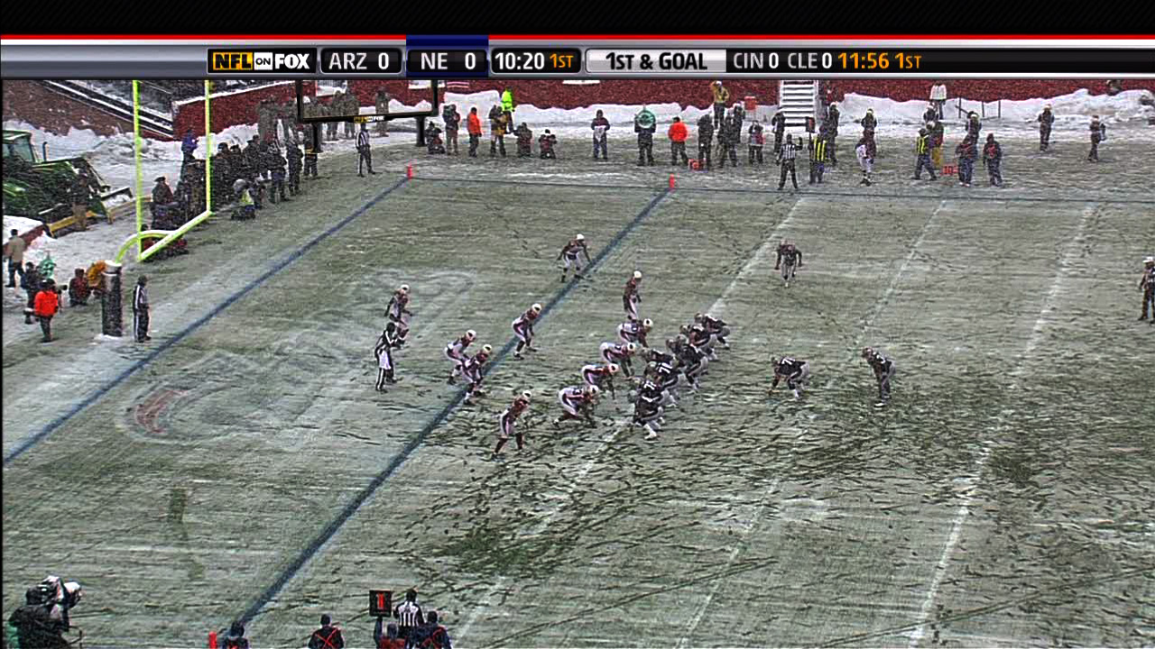
(Click the image for the original version, taken from the broadcast.)
Look at all the footprints in the snow: The previous play began to the right of the white line, where you can see most of the snow was cleared by the players lining up. Just to the left of that is another cleared area, where a group of players began to tackle Sammy Morris. But it’s not until almost ten yards — two more white lines, and the area below where the players are standing in that picture — that he’s finally taken to the ground. For a visual explanation, watch the play:
(Mute the audio and spare yourself the insipid commentary from the FOX booth. And then be thankful that at least it’s not Joe Buck and Tim McCarver.)
The path left behind in the snow explains exactly how the play developed, according to the players’ feet. (And as a running play, feet are important.) Absolutely beautiful.
One of the best things about December is watching football games played in the snow. For instance last year, there was a game between Cleveland and Buffalo last year that looked like it was being played inside a snow globe, with the globe being picked up and shaken during each commercial break.
Boston was a complete mess yesterday with a few inches of snow, sleet, and muck falling from the sky, which made a mess of the field where the New England Patriots were happily hosting the Arizona Cardinals, who are less accustomed to digging out their cars and leaving behind patio furniture.
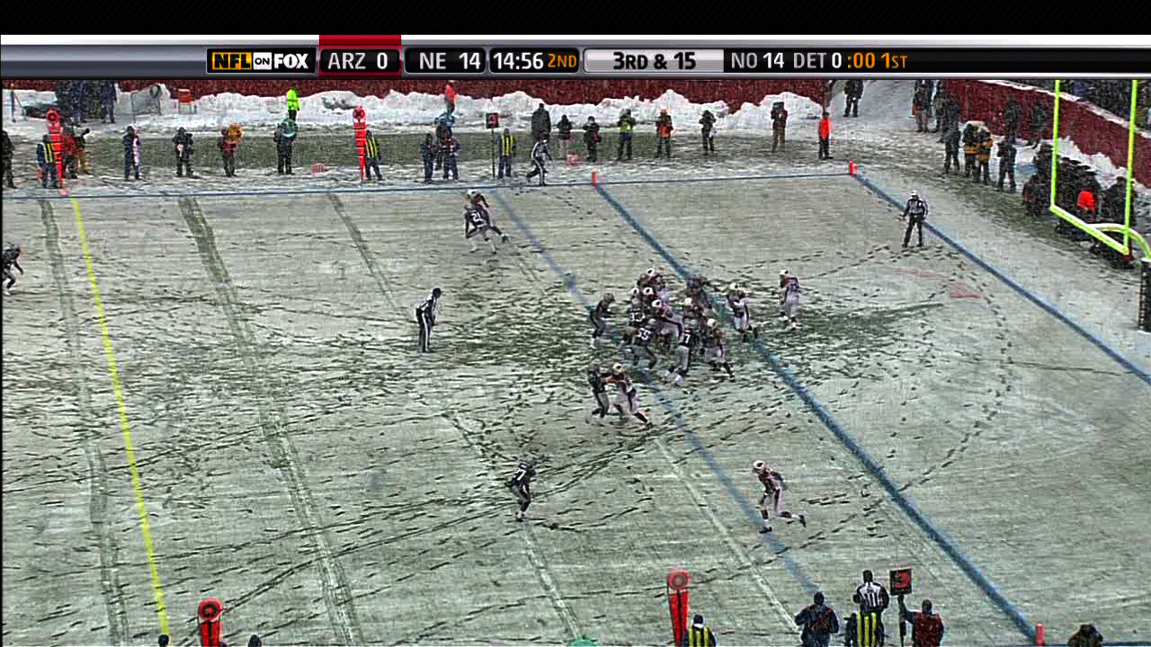
Another image from later in the game, this one instead depicts the substitutions of players as they near the goal line. Note the lines in the snow that begin at the left, and lead to where the players are lined up:
I was reminded this morning that Mario Manningham, a wide receiver who played for Michigan was rumored to have scored a 6 (out of 50) on the Wonderlic, an intelligence test administered in some occupations (and now pro football) to check the mental capability of job candidates. Intelligence tests are strange beasts, but after watching my niece working on similar problems—for fun—during her summer vacation last week, the tests caught my eye more than when I first heard about it.
Manningham was once a promising undergrad receiver for U of M, but has in recent years proven himself to be a knucklehead, loafing through plays and most recently making headlines for marijuana use and an interview on Sirius radio described as “… arrogant and defensive. When asked about the balls he dropped in big spots, he responded, ‘What about the ball I caught?’” So while an exceptionally low score on a standardized test might suggest dyslexia, the guy’s an egotistical bonehead even without mitigating factors.
Most people don’t associate brains with football, but in recent years teams have begun to use a Wonderlic test while scouting, which consists of 50 questions to be completed in 12 minutes. Many of the questions are multiple choice, but the time is certainly a factor when completing the tests. A score of 10 is considered “literate”, while 20 is said to coincide with average intelligence (an IQ of 100, though now we’re comparing one somewhat arbitrary numerically scored intelligence test with another).
In another interesting twist, the test is also administered to players the day of the NFL combine—which means they first spend the day running, jumping, benching, interviewing, and lots of other -ings, before they sit down and take an intelligence test. It’s a bit like a medical student running a half marathon before taking the boards.
Wonderlic himself says that basically, the scores decrease as you move further away from the ball, which is interesting but unsurprising. It’s sort of obvious that a quarterback needs to be on the smarter side, but I was curious to see what this actually looked like. Using this table as a guide, I then grabbed this diagram from Wikipedia showing a typical formation in a football game. I cleaned up the design of the diagram a bit and replaced the positions with their scores:
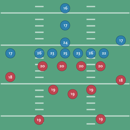
Offense is shown in blue, defense in red. You can see the quarterback with a 24, the center (over 6 feet and around 300 lbs.) averaging higher at 25, and the outside linemen even a little higher. Presumably this is because the outside linemen need to mentally quick (as well as tough) to read the defense and respond to it. Those are the wide receivers (idiot loud mouths) with the 17s on the outside.
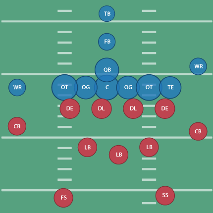
(For people not familiar with American Football, the offense and defense are made up of totally separate sets of players. I once showed this piece to a group who stared at me blankly, wondering how someone's IQ could change mid-game.)
To make the diagram a bit clearer, I scaled each position based on its score:
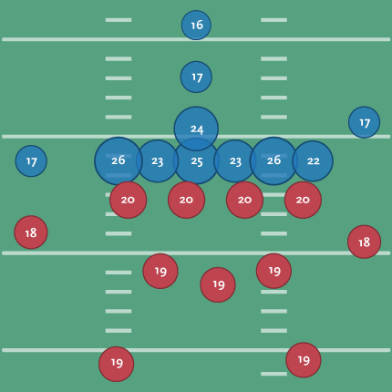
That’s a little better since you can see the huddle around the ball and where the brains need to be for the system of protection around it. With the proportion, I no longer need the numbers, so I’ve switched back to using the initials for each position’s title:
(Don’t tell Tufte that I’ve used the radius, not the proportional area, of the circle as the value for each ellipse! A cardinal sin that I’m using in this case to improve proportion and clarify a point.)
I’ll also happily point out that the linemen for the Patriots all score above average for their position:
| Player | Position | Year | Score |
| Matt Light | left tackle | 2001 | 29 |
| Logan Mankins | left guard | 2005 | 25 |
| Dan Koppen | center | 2003 | 28 |
| Stephen Neal | right guard | 2001 | 31 |
| Nick Kaczur | right tackle | 2005 | 29 |
A position-by-position image for a team would be interesting, but I’ve already spent too much time thinking about this. The Patriots are rumored to be heavy on brains, with Green Bay at the other end of the spectrum.
An ESPN writeup about the test (and testing in general) can be found here, along with a sample test here.
One odd press release from Wonderlic even compares scores per NFL position with private sector job titles. For instance, a middle linebacker scores like a hospital orderly, while an offensive tackle is closer to a marketing executive. Fullbacks and halfbacks share the lower end with dock hands and material handlers.
During the run-up to Super Bowl XXXII in 1998, one reporter even dug up the Wonderlic scores for the Broncos and Packers, showing Denver with an average score of 20.4 compared to Green Bay’s 19.6. As defending champions, the Packers were favored but wound up losing 31-24.
Nobody cited test scores in the post-game coverage.
 Derek Jeter vs. Objective Reality is an entertaining article from Slate regarding a study by Shane T. Jensen at the Wharton School. Nate DiMeo writes:
The take-away from the study, which was presented at the annual meeting of the American Association for the Advancement of Science, was that Mr. Jeter (despite his three Gold Gloves and balletic leaping throws) is the worst-fielding shortstop in the game.
The New York press was unhappy, but the stats-minded baseball types (Sabermetricians) weren’t that impressed. DiMeo continues:
Mostly, though, the paper didn’t provoke much intrigue because Jeter’s badness is already an axiom of [Sabermetric literature]. In fact, debunking the conventional wisdom about the Yankee captain’s fielding prowess has become a standard method of proving the validity of a new fielding statistic. That places Derek Jeter at the frontier of new baseball research.
Well put. Mr. Jeter defended himself by saying:
“Maybe it was a computer glitch”
What I like about the article, aside from a objective and quantitative reason to dislike Jeter (I already have a quantity of subjective reasons) is how the article frames the issue in the broader sports statistics debate. It nicely covers this new piece of information as a microcosm of the struggle between sabermetricians and traditional baseball types, while essentially poking fun at both: the total refusal of the traditional side to buy into the numbers, and the schadenfreude of the geeks going after Jeter since he’s the one who gets the girls. (The article is thankfully not as trite as that, but you get the idea.)
I’m also biased since the metric in the paper places Pokey Reese, one of my favorite Red Sox players of 2004 as #11 amongst second basemen between 2000-2005.
And of course, The Onion does it better:
Experts: ‘Derek Jeter Probably Didn’t Need To Jump To Throw That Guy Out’
BRISTOL, CT—Baseball experts agreed Sunday that Derek Jeter, who fielded a routine ground ball during a regular-season game in which the Yankees were leading by five runs and then threw it to first base using one of his signature leaps, did not have to do that to record the out. “If it had been a hard-hit grounder in the hole or even a slow dribbler he had to charge, that would’ve been one thing,” analyst John Kruk said during a broadcast of Baseball Tonight. “But when it’s hit right to him by [Devil Rays first-baseman] Greg Norton, a guy who has no stolen bases and is still suffering the effects of a hamstring injury sustained earlier this year… Well, that’s a different story.” Jeter threw out Norton by 15 feet and pumped his fist in celebration at the end of the play.
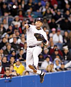
In other news, I can’t believe I just put a picture of Jeter on my site.
A New York Times piece by the Freakonomics guys about Mike Zarren, the 32-year-old numbers guy for the Boston Celtics. While statistics has become more-or-less mainstream for baseball, the same isn’t quite true for basketball or football (though that’s changing too). They have better words for it than me:
This probably makes good sense for a sport like baseball, which is full of discrete events that are easily measured… Basketball, meanwhile, might seem too hectic and woolly for such rigorous dissection. It is far more collaborative than baseball and happens much faster, with players shifting from offense one moment to defense the next. (Hockey and football present their own challenges.)
But that’s not to say that something can be gained by looking at the numbers:
What’s the most efficient shot to take besides a layup? Easy, says Zarren: a three-pointer from the corner. What’s one of the most misused, misinterpreted statistics? “Turnovers are way more expensive than people think,” Zarren says. That’s because most teams focus on the points a defense scores from the turnover but don’t correctly value the offense’s opportunity cost — that is, the points it might have scored had the turnover not occurred.
Of course, the interesting thing about sports is that at their most basic, they cannot be defined by statistics or numbers. Take the Celtics, who just won the first round of the playoffs. Given their ability, the Celtics should have dispensed with the Hawks more quickly, rather than needing all seven games of the series to win the necessary four. The coach in the locker room of any Hoosiers ripoff will tell you it doesn’t matter what’s on the stat sheets, it matters who shows up that day. It’s the same reason that owners cannot buy a trophy even in a sport that has no salary cap. Or, if you’re like some of my in-laws-to-be (all Massachusetts natives), you might suspect that the fix is in (“How much money do those guys make per game?”) Regardless, it’s the human side of the sport, not the numbers, that make it worth watching. (And I don’t mean the soft-focus ESPN “Outside the Lines” version of the “human” side of the sport. Yech.)
In the meantime, maybe the Patriots or the Sox are hiring…
 Visualizing Data is my 2007 book about computational information design. It covers the path from raw data to how we understand it, detailing how to begin with a set of numbers and produce images or software that lets you view and interact with information. When first published, it was the only book(s) for people who wanted to learn how to actually build a data visualization in code.
The text was published by O’Reilly in December 2007 and can be found at Amazon and elsewhere. Amazon also has an edition for the Kindle, for people who aren’t into the dead tree thing. (Proceeds from Amazon links found on this page are used to pay my web hosting bill.)
Examples for the book can be found here.
The book covers ideas found in my Ph.D. dissertation, which is the basis for Chapter 1. The next chapter is an extremely brief introduction to Processing, which is used for the examples. Next is (chapter 3) is a simple mapping project to place data points on a map of the United States. Of course, the idea is not that lots of people want to visualize data for each of 50 states. Instead, it’s a jumping off point for learning how to lay out data spatially.
The chapters that follow cover six more projects, such as salary vs. performance (Chapter 5), zipdecode (Chapter 6), followed by more advanced topics dealing with trees, treemaps, hierarchies, and recursion (Chapter 7), plus graphs and networks (Chapter 8).
This site is used for follow-up code and writing about related topics.