I’ve been hesitant to post this video of Keith Olbermann’s 17-minute timeline connecting the shifting terror alert level to the news cycle and administration at the risk of veering too far into politics, but I’m reminded again of it with Tom Ridge essentially admitting to it in his book:
In The Test of Our Times: America Under Siege, Ridge wrote that although Rumsfeld and Ashcroft wanted to raise the alert level, “There was absolutely no support for that position within our department. None. I wondered, ‘Is this about security or politics?'”
Only to recant and be taken to task by Rachel Maddow:
Ridge went on to say that “politics was not involved” and that “I was not pressured.” Maddow then read to Ridge directly from his book’s jacket: “‘He recounts episodes such as the pressure that the DHS received to raise the security alert on the eve of of the ’04 presidential election.’ That’s wrong?”
As Seth Meyers put it, “My shock level on manipulation of terror alerts for political gain is green, or low.”
At any rate, whether there is in fact correlation, causation, or simply a conspiracy theory that gives far too much credit to the number of people who would have to be involved, I think it’s an interesting look at 1) message control 2) using the press (or a clear example of the possibilities) 3) the power of assembling information like this to produce such a timeline, and 4) actual reporting (as opposed to tennis match commentary) done by a 24-hour news channel.
Of course, I was disappointed that it wasn’t an actual visual timeline, though somebody has probably done that as well.
I’ve just posted a new piece that depicts changes between the multiple editions of Darwin’s “On the Origin of Species:

To quote myself, because it looks important:
We often think of scientific ideas, such as Darwin’s theory of evolution, as fixed notions that are accepted as finished. In fact, Darwin’s On the Origin of Species evolved over the course of several editions he wrote, edited, and updated during his lifetime. The first English edition was approximately 150,000 words and the sixth is a much larger 190,000 words. In the changes are refinements and shifts in ideas — whether increasing the weight of a statement, adding details, or even a change in the idea itself.
The idea that we can actually see change over time in a person’s thinking is fascinating. Darwin scholars are of course familiar with this story, but here we can view it directly, both on a macro-level as it animates, or word-by-word as we examine pieces of the text more closely.
This is hopefully the first of multiple pieces working with this data. Having worked with it since last December, I’ve been developing a larger application that deals with the information in a more sophisticated way, but that’s continually set aside because of other obligations. This simpler piece was developed for Emily King’s “Quick Quick Slow” exhibition opening next week at Experimenta Design in Portugal. As is often the case, many months were spent to try to create something monolithic, then in a very short time, an offshoot of all that work is developed that makes use of that infrastructure.
Oddly enough, I first became interested in this because of a discussion with a friend a few years ago, who had begun to wonder whether Darwin had stolen most of his better ideas from Alfred Russel Wallace, but gained the notoriety and credit because of his social status. (This appealed to the paranoid creator in me.) She cited the first edition of Darwin’s text as incoherent, and that it gradually improved over time. Interestingly (and happily, I suppose), the process of working on this piece has instead shown the opposite, and I have far greater appreciation for Darwin’s ideas than I had in the past.
Beneath a pile of 1099s, I found myself distracted still thinking about the logo colors and proportions seen in the previous post. This led to a diversion to extract the colors from the Super Bowl logos and depict them according to their usage. The colors are counted up and laid out using a Treemap.
The result for all 43 Super Bowl logos, using the same layout as the previous image:
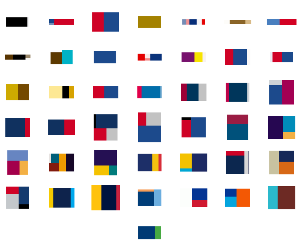
A few of the typical pairs, starting with 2001:

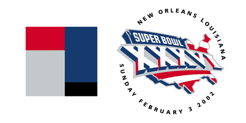
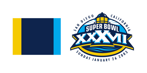
See all of the pairings here. Some notes about what’s mildly clever, and the less so:
- The empty space (white areas or transparent background) is subtracted from the logo, and the code tries to size the Treemap according to the aspect ratio of the original image, so that when seen adjacent the logo, things look balanced (kinda).
- The code is a simple adaptation of the Treemap project in Chapter 7 of Visualizing Data.
- Unfortunately, I could not find vector images (for all of the games, at least), which means the colors in the original images are not pure. For instance, edges of a solid blue color will have light blue edges because of smoothing (anti-aliasing). This makes it difficult to accurately figure out what’s a real color and what isn’t. Sometimes the fuzzy edge colors are correctly removed, other times not so much. Even worse, it may even remove legitimate colors that are used in less than 4-5% of the image.
- The color quantization isn’t good. On a few, it’s bad, and causes a few similar colors to disappear.
- All the above could be fixed, but taxes are more important than non-representational art. (That’s not a blanket statement — just for me this evening.)
And finally, I don’t honestly think there’s any relationship between a software algorithm for data visualization and the work of an artist like Piet Mondrian. But I do love the idea of a Dutch painter from the De Stijl movement making his way through the turnstiles at Raymond Jones Stadium.
From The New York Times, a collection of all 43 logos used to advertise the Super Bowl:
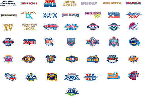
The original article cites how the logos reflect the evolution and growth of the league. Which makes sense, you can see that it was more than fifteen years before it moved from just a logotype to a fully branded extravaganza. Or that in its first year it wasn’t the Super Bowl at all, and instead billed as “The First World Championship Game of the American Football Conference versus the National Football Conference,” a title that sounds great in a late-60s broadcaster voice (try it, you’ll like it), but was still shortened to the neanderthal “First World World Championship Game AFC vs NFC” for the logo, before it was renamed the “Super Bowl” the following year. (You can stop repeating the name in the broadcaster voice now, your officemates are getting annoyed.)
The similarities in the coloring are perhaps more interesting than the differences, though the general Americana obsession of the constant blue/red coloring is unsurprising, especially when you recall that some of the biggest perennial ad buyers (Coke, Pepsi, Budweiser) also share red, white, and blue labels. I’m guessing that the heavy use of yellow in the earlier logos had more to do with yellow looking good against a background when used for broadcast.
Or maybe not — like any good collection, there’s plenty to speculate about and many hypotheses to be drawn — and the investigation is more interesting for the exercise.
A video depicting all the edits for the OpenStreetMap project for 2008.
OpenStreetMap is a wiki-style map of the world and this animation displays a white flash each time a way is entered or updated. Some edits are a result of a physical local survey by a contributor with a GPS unit and taking notes, other edits are done remotely using aerial photography or out-of-copyright maps, and some are bulk imports of official data.
Simple idea but really elegant execution. Created by ITO.

