|
A reformatted/updated version of this post can be found here.
This text is from a short (ten minute) talk that I gave as part of Alice Rawsthorne's panel for Experimenta Design in Lisbon, Portugal. For the panel, we were to choose "an individual, movement, technology, whatever - whose importance has been overlooked" and follow that with "two themes that [we] believe will define the future of design and architecture." In that context, I chose Lombardi's work, and how it highlights a number of themes that are important to the future of design, particularly in working with data. That said, this is not a comprehensive look at Mark Lombardi's work, nor is it especially scholarly, intelligent, or insightful. It's mostly a rough first draft that I'm using to work out some ideas. For more about Lombardi's work, I strongly recommend Mark Lombardi: Global Networks, which is from the 2003 exhibition I describe here. The book is fantastic, and authored by Robert Hobbs, who kindly fielded my questions as I was preparing this text. Vitamin D: New Perspectives in Drawing also contains a couple of spreads devoted to Mark's work. 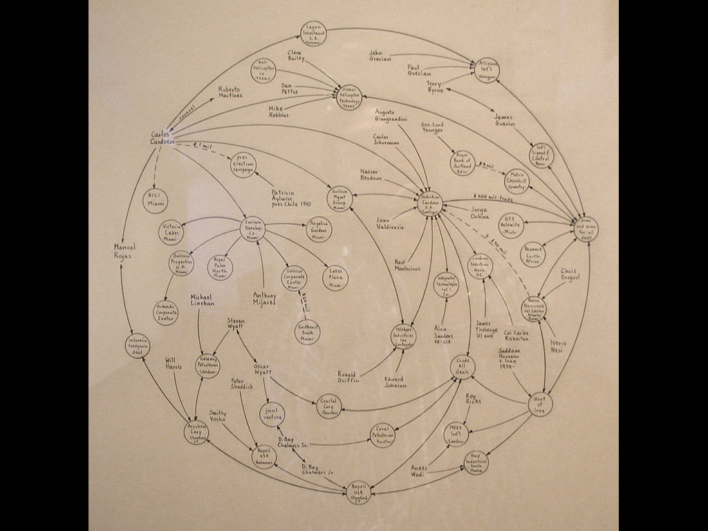
Learning from Lombardi I first became familiar with Mark Lombardi's work in April, 2000 while in the midst of finishing my masters thesis at the MIT Media Lab. Lombardi began as a painter who was also deeply interested in research, with a natural bent toward reading and absorbing large amounts of information. In 1994, he began to create drawings such as this one to depict the complex narratives he would uncover through his curiosity about anything from failed banks to corruption in government to organized crime. Deven Golden, a gallerist, describes how Lombardi began creating these works: [He was] talking to a friend of his, a lawyer, in California. Mark was telling him about a couple of banks that had closed in Texas, and the lawyer said, “Yeah, and because of that, these Savings and Loans closed in California.” And his friend proceeded to tell him how a series of byzantine corporate connections tied the various financial institutions together. It was very convoluted, and so Mark made some notes—he obviously was predisposed to thinking about this sort of thing. As Mark told it to me, it was kind of like how some artists . . . do the New York Times crossword puzzle in their studios to help them clear their minds. Anyway, every couple of days, after going over his notes and diagrams, he would call his friend back and ask him more questions, which would lead him to make more diagrams. Then, one day, after what I understood to be a couple of months of working on these diagrams to “relax,” Mark had this “aha!” moment . . . The diagrams were more visually interesting than his paintings. And, perhaps just as importantly, they pulled together everything Mark was interested in—drawing, social/commercial interactions and their hierarchies, and politics—into a single pursuit. 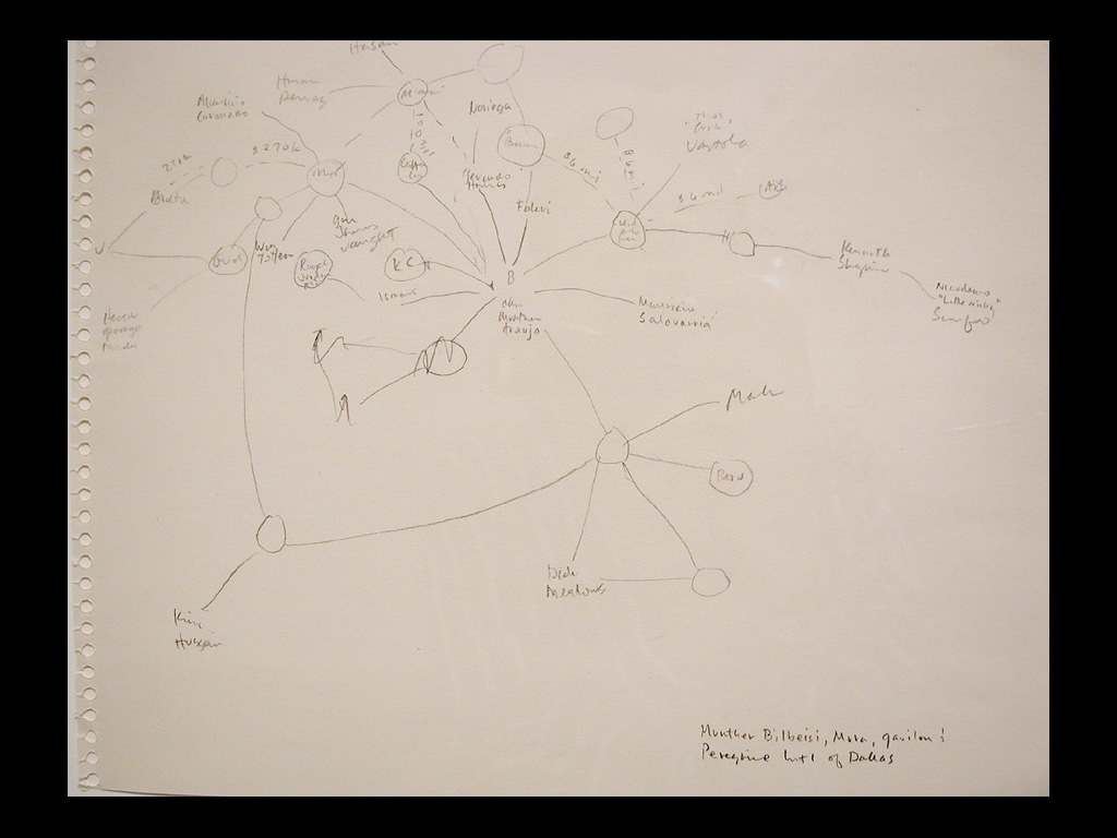
Lombardi had not originally planned for his sketches to become actual artworks, instead they were intended as a means for him to work out the connections for himself, while preparing to perhaps write stories or articles about them. In the years that followed, the images grew into sophisticated networks that told an exceptionally detailed story. The picture above is an early sketch for one of his works. The sketch itself is informative in understanding his thinking process, and the early messiness involved in assembling such a story. 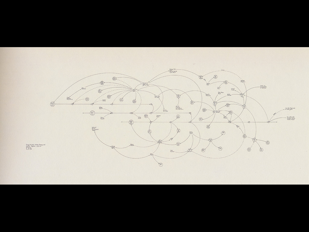
This piece is titled “George W. Bush, Harken Energy, and Jackson Stephens. 1979-90” In it, Lombardi created a drawing that depicts a story about George W. Bush, before he was governor of Texas, much less the President. In those days, he received $4.7 million from about 50 different family members to start an energy company. The company did poorly, posting enormous losses, sometimes in the hundreds of thousands of dollars. Further down the line, this company was eventually sold to individuals with connections to the Bush family, with George W. himself receiving millions of dollars in stock in spite of the obvious failure of the venture. The head-scratching story is difficult to believe but even harder to tell if you have to rely only on words in a newspaper article instead of an image such as this one. 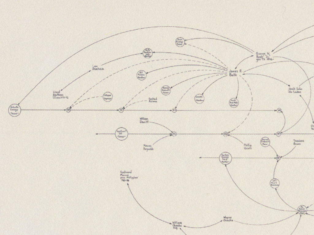
The actual piece is 4 feet wide and 2 feet tall, here we have a detail of one small section. Lombardi's image lays bare the complexity of the story, making it accessible even to an audience with neither the inclination, nor the mental capacity to understand such a mess. In his artist statement for a show in the late 90s, Mark described his work as follows: In 1994 I began a series of drawings I refer to as "narrative structures." Most were executed in graphite or pen and ink on paper. Some are quite large, measuring up to 5 x 12 feet. 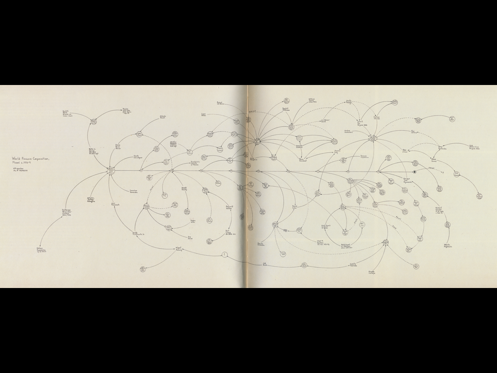
My purpose throughout is to interpret the material by juxtaposing and assembling the notations into a unified, coherent whole. In some cases I use a set of stacked, parallel lines to establish a time frame. Hierarchical relationships, the flow of money and other key details are then indicated by a system of radiating arrows, broken lines and so forth. Some of the drawings consist of two different layers of information—one denoted in black, the other, red. Black represents the essential elements of the story while the major lawsuits, criminal indictments or other legal actions taken against the parties are shown in red. Every statement of fact and connection depicted in the work is true and based on information culled entirely from the public record.The image above is a more complicated example titled “World Finance Corporation, Miami, ca. 1970-84.” It was a series of works that relate the story of a global banking conglomerate thought to have a role in the Colombian drug trade and money laundering of drug money. 
That's a detail of the fourth version in that series, which measured 60 inches across and 30 inches tall. 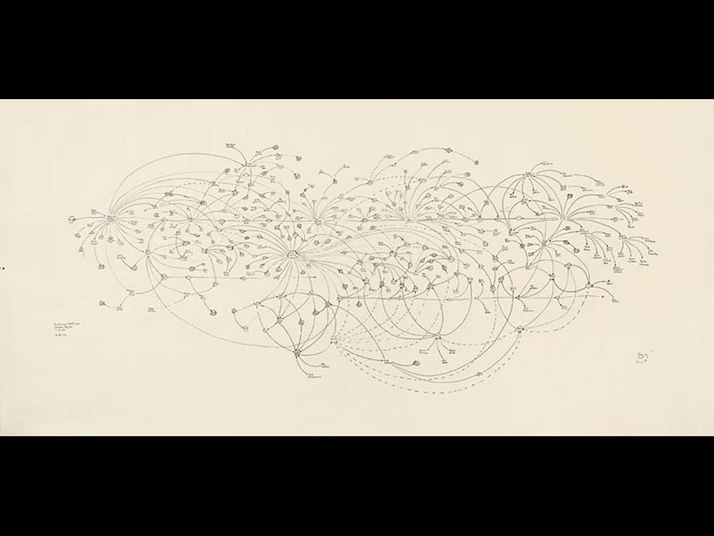
In another drawing, Lombardi created a timeline, moving left to right, covering fifty years of organized crime in Chicago. Starting with Al Capone at the left, it follows the network of his associates and how their activities evolve from bootlegging to racketeering and gambling, then as they expand their reach into other major cities with more gambling, prostitution, and money laundering. Many of the reviews of Mark's work referred heavily to “conspiracy,” though this seems a disservice brought by a New York Times writer covering the show in 2003, who mentioned conspiracy in the title of the article. A conspiracy theory usually implies the work of a naïve crank with an agenda, and a subjectivity that is thankfully absent from Mark's work. As historian Robert Hobbs notes, Lombardi himself made light of the idea, printing on his business card “Death-defying acts of Art and Conspiracy.” He considered it a good icebreaker when meeting people. 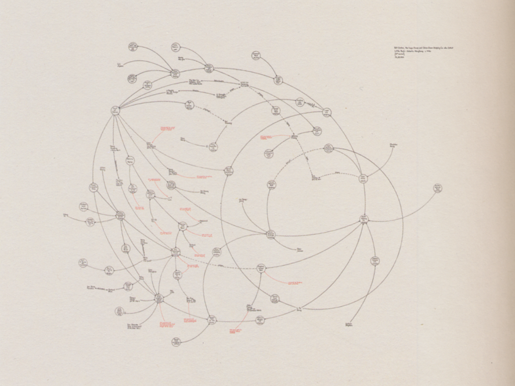
To the theme of the panel for which this was prepared, I don't think that Lombardi's work has been “unfairly neglected,” per se, but I think we're only beginning to appreciate why his contribution is important. Following his untimely passing in 2000, Lombardi's work saw a resurgence as part of a traveling exhibition in 2003 that was curated by historian Robert Hobbs. In just the few years since his exhibitions in the late 90s, the audience had widened considerably. Perhaps this was due in part to an increase in the awareness of networks of interaction between people. On one hand, the evening news in the United States had for two years been talking about “terrorist networks” and loose associations of individuals on a global scale. On the other, social networking by way of sites like MySpace and Friendster (this is 2003) had grown past their early adopter phase and become more common, so the idea of having one or two degrees of separation to a network of people was understood much more broadly. I think Lombardi's work encapsulates two themes that are important for the future of design. First is that we must maintain a humanist view of data, relying on our own faculties to tell a story. Second, to improve the discourse surrounding data, we must disavow our fascination with the intricate and complicated by learning how to throw things out. To provide some background, my own work is focused on visualization of complex data sets, whether the human genome, millions of words of text, or truly important things like showing which American baseball teams are over-paying for star players. But my assumption is that whether you think it's relevant or not, working with ever-larger data sets will remain the domain of design for years to come, as we continue to be inundated with more sources of information, and proportionally fewer ways to handle and understand them. In the past few years, data visualization has seen far more exposure amongst the design community. One one hand, it's a natural progression from the information design examples found in books by people like Edward Tufte. On the other, data visualization exists as an emerging aesthetic that relies on intricate diagrams and complex visual images. A potential client recently provided my firm a series of images showing us the type of work they had in mind. In this case, the client was purely in search of the visualization “aesthetic,” and wanted it to convey just how technically advanced their product was. Unfortunately, this is, of course, the opposite of design. 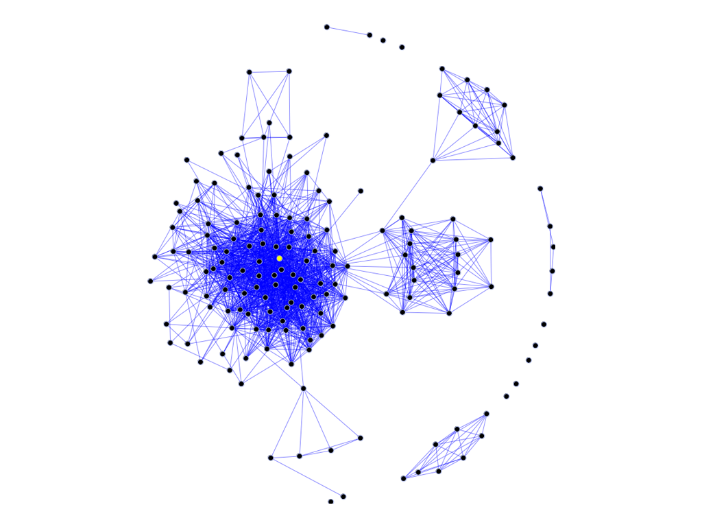
But that sort of complexity isn't limited to high-gloss info graphics. Above is an image from the Wikipedia entry on social networks, and is typical of projects like it that deal with data similar to Lombardi's. It is created by starting with a long list of names and links, and then running a piece of software to sort them into an image. 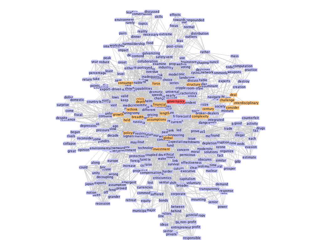
This is another social network visualization, clearly too complicated to understand, but typical in its overuse of elements. (Rather than picking on particular individuals, this is a strawman to prove a point — a large body of social network data run using default settings from a set of visualization software.) 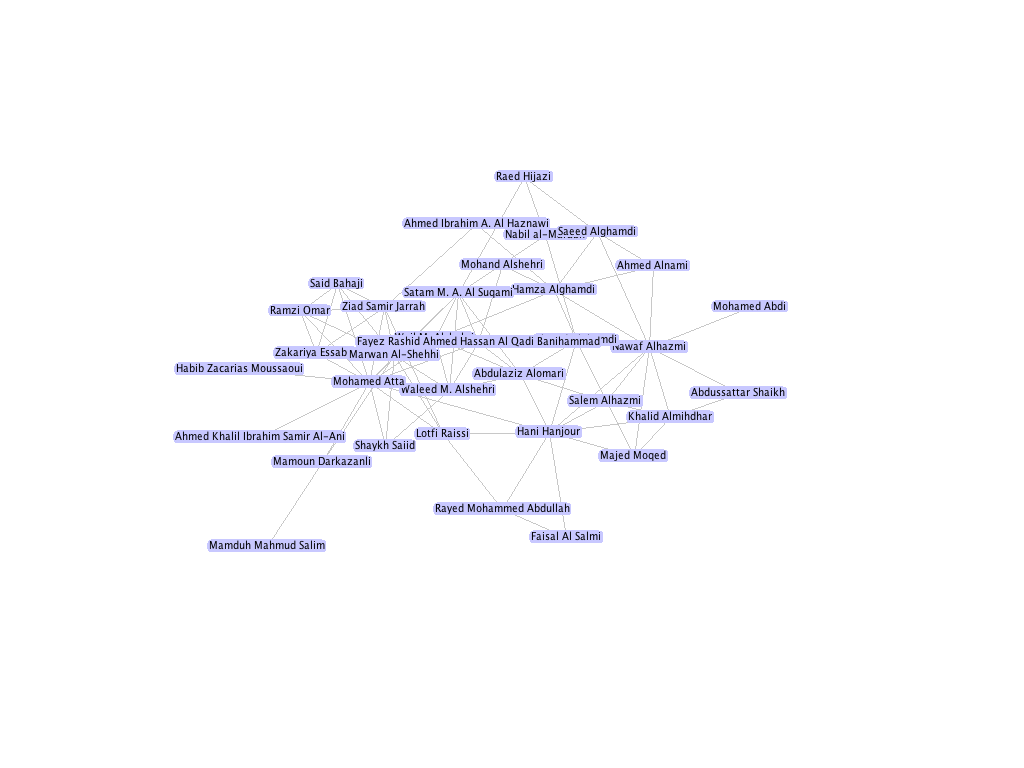
This is another using the same software, that depicts part of the Al Qaeda terrorist network. This one shows that even with fewer elements, you cannot magically create insight. 
By relying too much on a computer algorithm to lay out the position of individual nodes in the network, we're presented with what might be charitably considered a mess, or worse, that the image actually obfuscates the meaning of the data it depicts. This is a mixture of two things. First, that the creator gave up before they tried to really understand the information. And second, that they pushed no further because they were sated by the subjective beauty and intricacy of the image, even if meaningless. This map of the internet made headlines in the 90s and was printed in Wired magazine, but offered little insight besides “the internet is made of lots of connections between lots of things” or simply “the internet is complicated.” 
In Lombardi's case, even his early scribbles on a project are more informative, because they show a fundamentally human thought process, of trying to draw the story out of the mass of data he had collected. This is the opposite of many computational approaches that begin with a mass of data, followed by an often failed attempt to simplify it. As part of the research for his drawings, Lombardi assembled some 14,000 index cards, which are now part of the permanent collection at the Museum of Modern Art in New York. Each 3 by 5 inch card referenced a person or other entity. In the computational pieces that I just showed, it's as if we're looking at all 14,000 index cards at once. Having completed the research and data collection process, Mark knew that he must first synthesize that information into something useful. Too often, we try to make the machines synthesize for us, but in fact, synthesis—from the Greek and then Latin meaning “to place together”—is a fundamentally human task. It's what separates us from Google. Too much work in visualization, or even at the more complicated end of information design is just showing us the index cards. This would never be accepted in the field of writing, for instance. What author would rely on the computer to organize their notes and produce a finished story? Fact of the matter is, understanding information is difficult. And the most difficult parts rely on the sort of thoughtfulness and focus that is the hallmark of Lombardi's work. 
In closing, Lombardi's drawings walk the fine line of the informative and the aesthetic, but even more important, his projects give us an eye into the possibility, and the depth to which we can understand complicated information. Ben Fry, September 2009 Again, you can see more pictures (and a more thorough explanation and analysis of Lombardi's work) in Mark Lombardi: Global Networks, by Robert Hobbs. |