
What is ProcessingAOL ?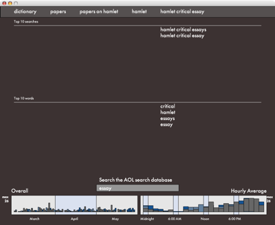
ProcessingAOL is a project that arose out of the question “How are web searches related to each other?” It is an attempt to help visualize and navigate around through the vast amount of information of three months of AOL search data through the use of related words and similar searches.
The Problem
The problem with this project was figuring out how to create an easy way to navigate through a large amount of data and at the same time using the information in order to make meaningful comparisons between the data
The AOL Data
Over the summer of 2006, AOL released a series to text files that contained ALL the search information of their users in order to back a paper that they worked on with an outside group. The information that they gave out resulted in over 2 Gigabytes of text which contained 36,389,569 searches done by their 500,000 members. The information given out contained a user id number (randomized in an attempt to protect the privacy of the user), what the search term was, when they searched it, and if so, what page they clicked on to from that search.
How it Works
The program that I built pings a server over the internet and requests for information back and then visually graphs it over the three month period and in a 24 hour period averaged over all the days. In order to use it, just start typing in a search term you want to see and hit enter in order to start the search. It will take some time before you get a response, this is normal. In fact, the more common of a term you search, the longer it usually takes to get back with the results.
Once you have the results, it will be split up into the top 10 search terms that included that term, as well as the top 10 individual words that were with the searched term.
Sketches
Here are some sketches from the start to the end of the project.
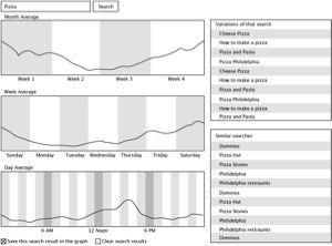
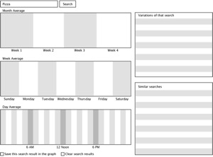 Original plan
A series of sketches of where I originally wanted to head in the project. Entering in “Pizza” as a search term.
Returned search results
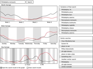
When “Philadelphia restaurants” were clicked on in the right side column.
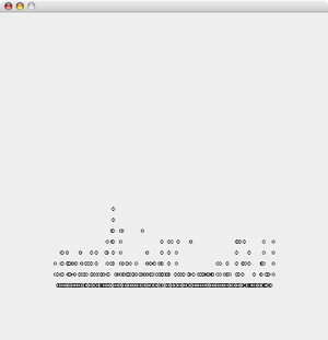
Beginnings
One of the first sketches with the search for “torrent” hand coded in.
Midpoint
Further along in the project when I had three graphs. From top to bottom, all days, monthly average, and a hourly average.
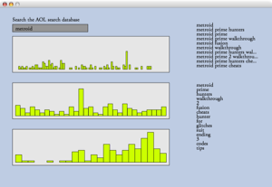
Finished Piece
I had removed the monthly average because there was no useful information averaging a month. I added in two sections where people could click on either one of the top 10 searches (which narrows down the results) or one of the top 10 words (which branch out into a different area and can possibly expand the results). The graphs at the bottom now show the most current search on top, with the ability to go back to a previous search (and thus getting rid of that graph) by selecting a previously searched term from the top bar.
I feel that this way a user can freely move not only forward and explore, but can also backtrack and take a different path to see where it leads.

About Me
James Soracco
Carnegie Mellon University
Senior in Communication Design and Human-Computer Interaction
If you want to see the documentation blog as I was working through this project, please visit http://processingaol.blogspot.com/
If you want to see more of my work, please visit my website.
ProcessingAOL