
What have I been listening to?
I started with this question as it has been something that's very interesting to me. About a year and a half ago I joined the service Last.fm, which serves many functions but most specifically logs all music that you listen to in real time. This creates a great amount of interesting statistics. Including top artist rankings averaged over the past week.
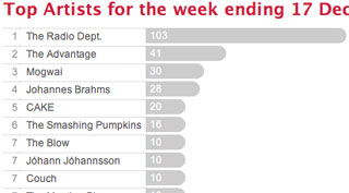
This is all very interesting briefly, however Last.fm only provides a few mediocre methods of visualizing this vast amount of rich information.
The significant missing dimension of the Last.fm visualizations is time. You can see an average over a time, but cannot see how listening habits change over time, perhaps the most interesting view into the information.
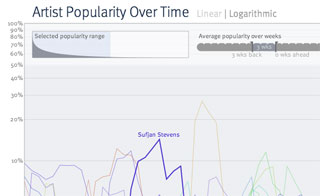
I started by searching on this data by creating a sketch which creates a histogram for each artist. By providing filters and transformations, it was possible to manipulate and navigate the data, looking for interesting layouts and trends.
Using a combination of a logarithmic transformation and averaging data points to make histograms with a larger bin size, the interesting trends evolved from the data.
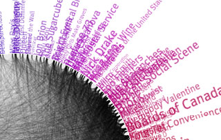
The next task was deciding how to use color to enhance the data. The most common suggestion was to use genre as a method of deciding color, however genre is a very debatable attribute and difficult to create hard data on.
My approach was similar. By using Last.fm's similar artists metric, I connected springs between artists in a physically balanced one-dimensional loop graph and let it work itself out. I mapped this to hue. However it seems artist relationships are more complicated and the information here was more or less junk.
After thinking about how I could show this whole sum in a presentable form, I decided on a sort of layered histogram. Each colored sliver represents a different artist listened to in the last 18 months. The sliver moves through time left to right growing thicker where it was more popular and thinner where it was less. The color indicates the first time the artist was listened to, warmer colors being more recent and cooler being further back. As a new artist is listened to it is put onto the outsides of the graph. The result is a wiggling tour through your listening history past.
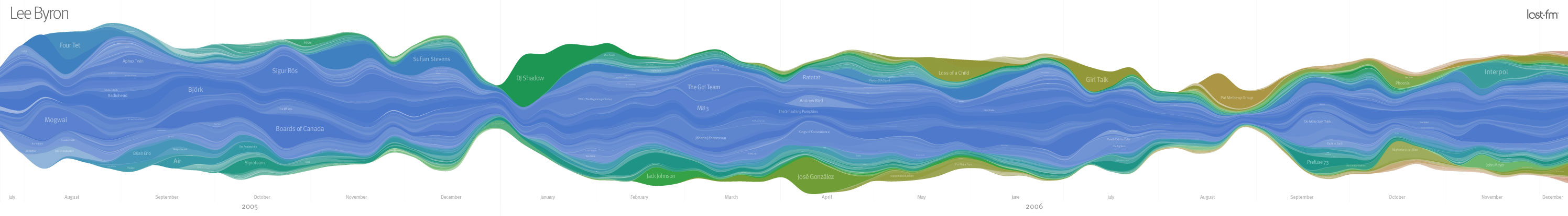
While this is interesting to look at, it is more significant on a personal level. When viewing your own music listening history you are reminded of past events that caused the trends to emerge.
This piece was printed as a series of 12" by 85" posters, and given as gifts to the listeners. A fair number of friends have now signed up for the Last.fm service, requesting posters in a year.
| Lee Byron Junior Industrial Design & HCI Carnegie Mellon University |
Computational Informational Design Ben Fry Fall 2006 |