
Making fun of movie infographics only gets you so far
As much as snickering about computers in movies might make me feel smart, I’ve since become fascinated by how software, and in particular information, is portrayed in film. There are many layers at work:
- Film is visual storytelling. As such, you have to be able to see everything that’s happening. Data is not visual, which is why you see symbols that represent data used more often: It’s 2012 but they’re still storing data on physical media because at some point, showing the data being moved is important. (Nevermind that it can be transmitted thousands of kilomteters in a fraction of a second.) This is less interesting, since it means a sort of dumbing-down of the technology, and presents odd contradictions. It can also make things ugly: progress bars are often full screen interface elements, or how many technology-heavy action flicks have included the pursuit of a computer disk? (On the other hand, the non-visual aspect can be a positive one: a friend finishing film school at NYU once pursued a nanotechnology thriller as his final film because “you can’t see it.” It would allow him to tackle a technical subject without needing the millions of dollars in props.)
- Things need to “feel” like a computer. When this piece appeared in the Hulk, they added extra gray interface elements in and around it so that it didn’t look too futuristic. Nevermind that it was a real, working piece of software for browsing the human genome. To the consternation of a friend who worked on Minority Report, on-screen “windows” in the interface all had borders around them. If you have a completely fluid interface with hands, motion, and accessing piles of video being output from three people in a tank, do we really need…title bars?
- It’s not just computers—anything remotely complicated is handled in this manner. Science may be worse off than software, though I don’t think scientists complain as loudly as the geeks did when they heard “This is UNIX, I know this!” (My personal favorite in that one was a scene where a video phone discussion was actually an actor talking to a QuickTime movie—you could see the progress bar moving left to right as the scene wore on.)
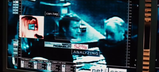
- There’s a lot of superfluous gimmickery that goes on too. There’s just no way you’re gonna show important information in a film without random numbers twitching or counting down. Everything is more important when we have know the current time with millisecond accuracy (that’s three digits after the decimal point for seconds). Or maybe some random software code (since that’s incomprehensible but seems significant). This is obvious and sometimes painful to watch, except in the case of a talented visual designer who makes it look compelling.
- Finally, the way that computers are represented in film has something to do with how we (society? lay people? them?) think that computers should work.
It’s that last one that is the fascinating point for me: by virtue of the intent to reach a large audience, a movie streamlines the way that information is handled and interfaces behave. A their best, it suggests where we need to go (at their worst, they blink “Access Denied”). It’s easy to point out the ridiculousness of the room full of people hunched over computers at CIA headquarters and the guy saying “give me all people with last name Jones in the Baltimore area” and in the next scene that’s tallied against satellite video (which of course can be enhanced ad infinitum). But think about how ridiculous those scenes looked twenty years ago, and the parts of that scenario that are no longer far-fetched as the population at large gets used to Google and having satellite imagery available for the price of typing a query. Even the most outrageous—the imagery enhancement—has had breakthroughs associated with it, some of which can be done by anyone using Photoshop, like the case of people trying to figure out if Bush was wearing a wire at the debates in 2004. (Contradicting their earlier denials, Bush’s people later admitted that he was wearing a bulletproof vest.)
That’s the end of today’s lecture on movie graphics, so I’ll leave you with a link to Mark Coleran, a visual designer who has produced many such sequences for film.
I recommend the large version of his demo reel, and I’ll be returning to this topic later with more designers. Drop me an email if you have favorite designer or film sequence.
