Computational Information Design
3 Background
The visualization of information gains its importance for its ability to help us ‘see’ things not previously understood in abstract data. It is both a perceptual issue, that the human brain is so wired for understanding visual stimuli but extends to the notion that our limited mental capacity is aided by methods for “externalizing” cognition. One of the few seminal texts covering information visualization, “Information Visualization: Using Vision to Think” [Card, 1999] recognizes this notion in its title, and spends much of its introduction explaining it, perhaps most clearly in their citation of [Norman, 1993] who says:
The power of the unaided mind is highly overrated. Without external aids, memory, thought, and reasoning are all constrained. But human intelligence is highly flexible and adaptive, superb at inventing procedures and objects that overcome its own limits. The real powers come from devising external aids that enhance cognitive abilities. How have we increased memory, thought, and reasoning? By the invention of external aids: It is things that make us smart.
norman, 1993
As an example of external cognition [Card, 1999] describes how a task like multiplication is made far easier by simply doing performing it on paper, rather than completely in one’s head.
The idea of externalizing ideas too difficult to understand is carried out in many disciplines and is remarkably prevalent. As an example, this recent passage found in the New York Times:
“Since our theories are so far ahead of experimental capabilities, we are forced to use mathematics as our eyes,” Dr. Brian Greene, a Columbia University string theorist, said recently. “That’s why we follow it where it takes us even if we can’t see where we’re going.”
overbye, 2003
With external cognition through visual means as a basis, the process of Computational Information Design draws on the fields of Perception, Graphic Design, Information Visualization, Statistics, Data Mining, and Cartography in an attempt to bring them together as a unified approach for the effective handling of complex data.
3.1
psychology of perception
Colin Ware, an expert in the psychology of perception, makes the case for visualization by pointing out the powerful capabilities of the human visual system for understanding patterns, and by extension, data:
Why should we be interested in visualization? Because the human visual system is a pattern seeker of enormous power and subtlety. The eye and the visual cortex of the brain form a massively parallel processor that provides the highest-bandwidth channel into human cognitive centers. At higher levels of processing, perception and cognition are closely interrelated, which is the reason why the words “understanding” and “seeing” are synonymous.
ware, 2000
A simple example of this point is seen in the following image from [Bertin 1983]. The image compares two methods for representing a set of sociographic data sampled from a few hundred regions of France:
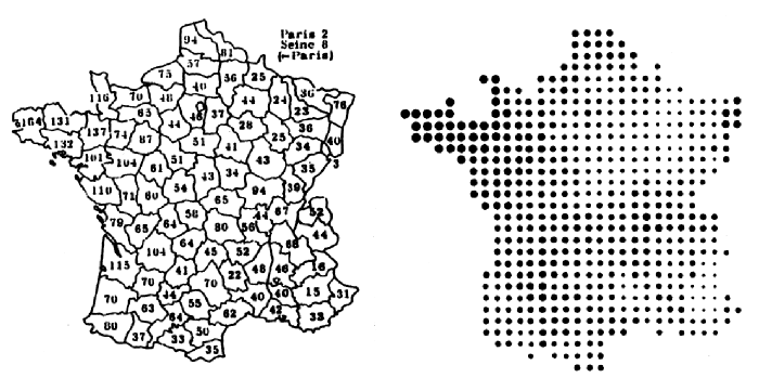
Reading the left-hand image requires the viewer to search the image for the lowest and highest values, and the short-term memorization of the general layout of the numbers. On the right, a qualitative understanding of the image is immediately conveyed—that something is important in the Northwest corner, and to a lesser extent in a small region on the Eastern edge. This information is conveyed without any active viewing, meaning that it is “pre-attentive.” The term is assigned to objects that are processed faster than 10 milliseconds; as compared to non-pre-attentive features requiring 40 milliseconds or more [Triesman, 1988 via Ware, 2000]. It is only one of many important aspects of perception, but is highlighted here for its importance.
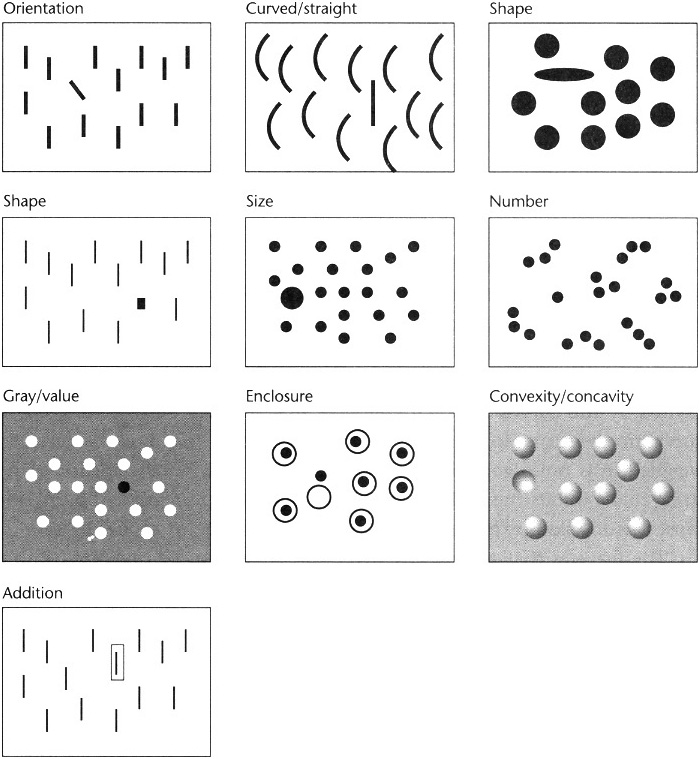
The diagram above (taken from Ware’s text) demonstrates several pre-attentive features, he continues further, listing them as:
Form – line orientation, line length, line width, line collinearity, size, curvature, spatial grouping, added marks, luminosity.
Color – hue, intensity
Motion – flicker, direction of motion
Spatial position – 2d position, stereoscopic depth, convex/concave shape from shading.
The task is to make the most relevant aspects of the data apparent through pre-attentive features (along with consideration to other aspects of perception). However it is not enough to haphazardly assign one such feature to each variable of interest. Instead, the field of graphic design can be employed, which provides the skills to weigh the variables against one another in the context of the overall data set, and to handle the resulting image as a whole.
3.2
graphic design and data graphics
Given the abilities of the human visual system, it next becomes necessary to consider how to best present the data visually. Graphic design is the broad title for the field that addresses this issue, and data graphics (also called information design) is a subset that is specifically focused on representation of data, as opposed to projects like a corporate logo.
William Playfair is widely held to be the father of data graphics. His text, The Commercial and Political Atlas [Playfair, 1786] was a series of 44 charts of time-series data that sought to explain the increasingly complicated economy of the day. One such example is below, which places a perspective on the trade balance “to and from England, from the year 1700 to 1782.”
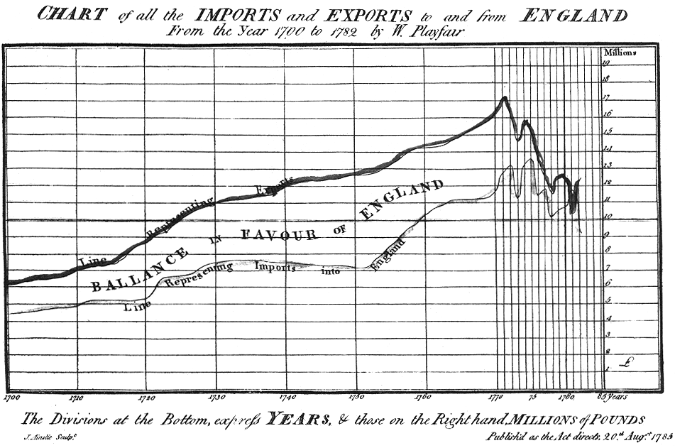
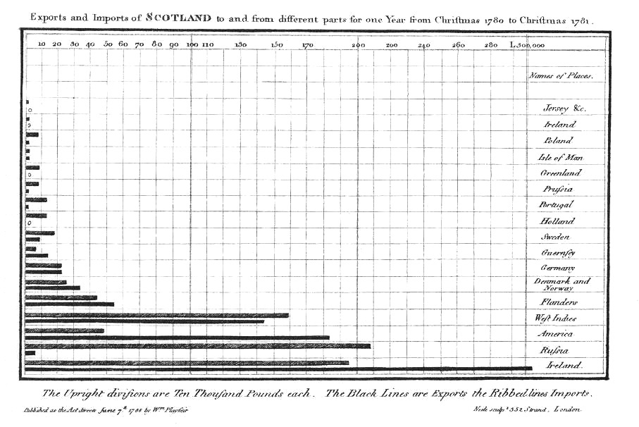
He is also believed to be the inventor of the bar chart, which he created because one year’s data was missing from another diagram, and he did not want to show continuity where there was none [Tufte, 1983, p. 33]
Edward Tufte is often cited as the modern day standards-bearer with regard to data graphics, primarily for his three texts [Tufte, 1983, 1990 and 1997] on the subject. These books enjoy a best-selling status and much acclaim perhaps most significantly for their ability to convey the principles of proper design to an exceptionally wide audience. The books are easy to read and visually appealing with specific rules (such as “reduce non-data ink”) for proper design. Such rule sets are comforting for an unfamiliar audience, and a useful introduction to the field.
The principles are a well-ordered compendium of the contemporary knowledge of codified as a series of proper practices for the design of data. Contemporary graphic designers, for instance, will often have procured identical knowledge simply because it was embedded in their training (though one could argue that the texts themselves have had their impact on design training as well).
One of the most important points made in Tufte’s texts are his clear articulation of the importance of visual design for understanding data, noting that “graphical excellence consists of complex ideas communicated with clarity, precision, and efficiency,” a divergence from the expectation that somehow visual design serves to make data pretty or entertaining.
The example above from [Tufte, 1997] shows the redesign of a visualization of storm cloud formation. While the final image is generally considered more attractive, more importantly it’s far easier to read through the addition of actual scale of the units in use (answering the questions “by how much?” and “in comparison to what?”). Grid lines, used to depict size are decreased in their importance so that they no longer dominate the image. A less dramatic use of lighting model is used, meaning that the cloud actually looks like a cloud. The final diagram is engaging and likely to draw in even viewers who might not be interested in the subject in question.
The books fall short in addressing three important aspects of contemporary information design problems. Notably absent are situations in which the data in question is undergoing continual change. In addition, none of the examples have the complexity of something as vast as the human genome. And finally, the texts have little to say of methods for interacting with the data as a way to learn about it. Information Visualization attempts to deal with some of these aspects, however there is often little regard to the visual design principles espoused by Tufte and the design community.
3.3
information visualization
Visualization as a sub-field of science, statistics, and graphics has only been recognized as its own entity since the mid- to late-80s. The depth of seminal work is in line with that of a young field, but finds its strength in background drawn from years of statistics and graphic design.
A succinct definition of Visualization is found in [Card et al, 1999]
Visualization – the use of computer-supported, interactive, visual representations of data to amplify cognition.
Visualization is concerned with non-abstract data sets, for example imagery from weather data or an animation describing the movement of a fluid. For this kind of data, representations or physical analogues already exist. When studying scientific phenomena, this is sometimes called scientific visualization (although that term tends to be poorly defined, since it can apply to the next case as well).
Information Visualization – the use of computer-supported, interactive, visual representations of abstract data to amplify cognition.
Information Visualization, by contrast, is concerned with making an abstract set of information visible, usually in circumstances where no metaphor exists in the physical world. It is also sometimes called data visualization, referring to the raw material used to create the image. This thesis is concerned solely with information visualization.
An emphasis on the quality of visual design is notably absent from the generally accepted definition above, and this is born out in the majority of work in the field. Perhaps visual design is generally considered to be of lower importance, as it is often perceived as a non-quantifiable and endeavor to make the representation more subjectively attractive. While that may be a side effect, the issue is not that the visual design should be “prettier”. Rather, that the approach of the visual designer solves many common problems in typical information visualization. In addition, what are commonly considered cosmetic tweaks may be less important for a simple diagram (tens or hundreds of elements), but for a complex data set (thousands of elements) they become extremely important, because what were minor problems in the diagram of a smaller data set are vastly magnified in a larger one.
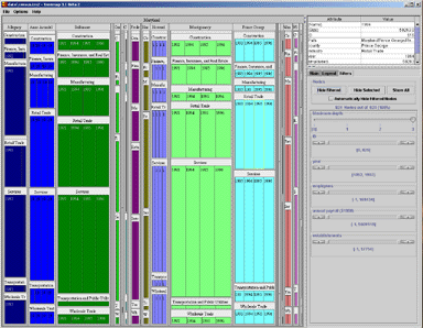
A simple example comes from the TreeMap project [Bederson, 2002 and www.cs.umd.edu/hcil/treemap/] at the University of Maryland. Ben Shneiderman’s Human-Computer Interaction Laboratory (now run by Bederson) has been a standards-bearer for the Information Visualization field for having popularized “dynamic queries” [Shneiderman, 1994], tree maps, and others. The image that follows is taken from a recent version of the TreeMap software.
The representation suffers from overall layout issues, as well as minute details combine to create a larger problem. Too much of the screen is taken with a series of sliders on the right, rather than focusing on the data itself (including a large gap of dead space in the bottom right), so instead the narrow sliders could easily be moved to the bottom of the screen for better space economy—meaning that the data itself could take up an additional ten to twenty percent of the screen.
At the micro level, details like the frame around each block of data, and the method used for drawing the heading, cause a great deal of visual noise. The borders around the smaller blocks wind up larger than the data itself, which is confusing for the user. The labels, having the same rectangular shape as the data itself, creates additional confusion. Removing the labels and reversing their text out of the colored blocks would be an improvement in clarity, allowing each block (the data itself, the most important thing in the image) to recover more screen area.
The issue is about diagrams that are accurate, versus those that are understandable (or subjectively, those that viewers prefer to look at). An image under the Information Visualization definition may properly represent all aspects of the data set (such as the example above), while failing to be as effective as possible in helping the viewer understand the data in question.
3.4
data analysis and statistics
Data Analysis, is something of an extension to Statistics. The statistician John Tukey developed Exploratory Data Analysis largely in response to what he saw as a field that had become too attached to the application of specific methods to data rather than the original intention of the field, which was to come to an understanding about the data in question.
For a long time, I have thought that I was a statistician, interested in inferences from the particular to the general. But as I have watched mathematical statistics evolve, I have had cause to wonder and to doubt. And when I have pondered about why such techniques as the spectrum analysis of time series have proved so successful, it has become clear that their ‘dealing with fluctuations’ aspects are, in many circumstances, of lesser importance than the aspects that would already have been required to deal effectively with the simpler case of very extensive data, where fluctuations would no longer be a problem. All in all, I have come to feel that my central interest is in data analysis, which I take to include, among other things: procedures for analyzing data, techniques for interpreting the results of such procedures, ways of planning the gathering of data to make analysis easier, more precise or more accurate, and all the machinery and results of (mathematical) statistics which apply to analyzing data.
tukey, 1962
The quote shows Tukey’s return to what initially made him curious about statistics—analysis, interpretation, as well as simplification and improvement of the methods therein. This focus on curiosity about the data, rather than the field itself, drove Tukey’s many accomplishments (including the co-invention of the fast fourier transform), and laid the groundwork for the field of Exploratory Data Analysis. (He is also credited with coining the terms “hardware”, “software”, and “bit”). True to form, he introduces his seminal “Exploratory Data Analysis” book as:
…looking at data to see what it seems to say. It concentrates on simple arithmetic and easy-to-draw pictures. It regards whatever appearances we have recognized as partial descriptions, and tries to look beneath them for new insights. Its concern is with appearance, not with confirmation.
tukey, 1977
This is perhaps best exemplified by his “stem and leaf” plots, an example taken from the same text is shown below.
Consider 17 used car prices: $250, 150, 795, 895, 695, 1699, 1499, 1099, 1693, 1166, 688, 1333, 895, 1775, 895, 1895, and 795. To see what these data “look” like, a stem and leaf plot can be used. The four steps below show how the plot is constructed. The plot is constructed by first ordering the numbers by their leading digits (signifying 1 for 100 through 18 for 1800). The second image shows those trailing digits being removed from the diagram because they’re redundant. Next, the right most digit is removed, since they’re less important than the others (the difference in price between $1490 and $1495 is irrelevant to understanding the overall trends in the data set).
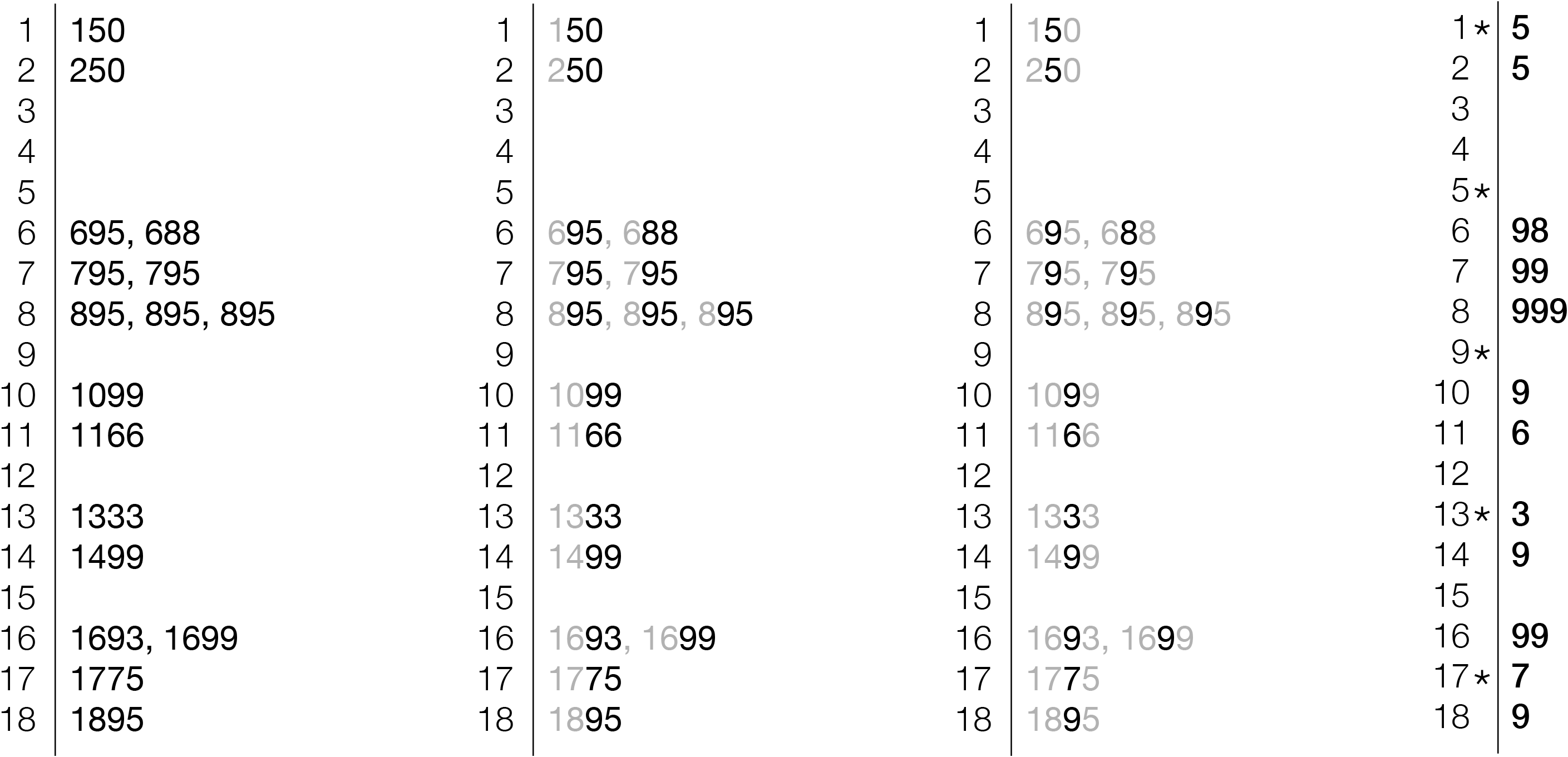
Finally, the right most image is the stem & leaf plot, a compact representation of the data set. The left-hand side are the leading digits of the numbers, the right-hand side is the second-to-last digit, since the plot uses increments of $10. So the first line is for $150, since the leading digit is 1, the next is 5, meaning 15, which is multiplied by the $10 increment (signified by the asterisk) to make $150. While not immediately intuitive, it can be learned in a matter of minutes, and is a powerful tool for understanding numbers by scratching them down on paper.
So for the series of numbers that took two lines, they can now be seen as a distribution, with the digits at right signifying how many of each value are present. Immediately, a clustering can be seen around $600, $700, and $800. In addition, a glance down the column tells us that 9s are prevalent in the pricing (looking at the original prices will verify the fact that there are several prices ending 95 and 99).
Even this simple representation reveals much about the data. This is fascinating for two reasons. First, that an image so basic can be both quickly created and rapidly understood. The method is perhaps non-obvious on initial observation, but the learning curve is brief and worth the payoff. Second, the diagram itself shows that the representation of the data need not be visually intricate or over-designed in order to convey the data. The latter point is important to be consider with the emphasis on graphic design—that the design is not a matter of fancy graphics or visual tricks, rather that it is a means to an end for creating the cleanest, most understandable diagram possible.
3.5
data mining
Data mining is essentially statistics mixed with computational methods for handling large data sets, in particular, it is a combination of theory and application between statistics and databases. “The science of extracting useful information from large data sets or databases is known as data mining.” [Hand, 2001] The field concerns itself with a large-scale version of the type of exploratory data analysis pioneered by Tukey, and backed with databases and additional software. However, in the process it often loses the visual aspect of Tukey’s foraging through numbers. For instance, when confronted with a database, one might want the computational equivalent of an interactive “stem and leaf” diagram, so that the user could quickly become familiar with the contents of the database before engaging in more specific analysis. An offshoot of Tukey’s work in “Exploratory Data Analysis” is centered on such ideas, but falls short of the simplicity of what can be observed from his common-sense focus to statistics and data.
Computational Information Design takes the strength of data mining for handling large data sets and mixes the analysis methods back in, while also placing an emphasis on information visualization and graphic design.
3.6
information visualization and
data mining
data mining
In one of the rare crossover events between the fields, a collection of articles “Information Visualization in Data Mining and Knowledge Discovery” [Fayyad, Grinstein, & Ward, 2002] was published. One of its editors, Georges Grinstein, describe it as “the result of two workshop whose goals were to open up the dialog between researchers in visualization and data mining, two key areas involved in data exploration.” The text itself is “a collection of papers, some of which are tutorial, some idealized positions, some seminal in nature, and some provocative.” It is notable that this sort of collaboration between the members of the two fields was considered “new” or “different” from regular practice, as both fields are at the forefront of data understanding, yet in their respective disciplines.
In one of the introductory papers [Grinstein & Ward, 2002], Grinstein describes a set of steps that are quite similar to the process I was developing as Computational Information Design:
data select – get a subset of the data
data manipulate – smooth, filter, interpolate
representation – choose what dimension is assigned to what variable, or change the colormap
image operations -– changing orientation and viewing
visual interactions – navigate & manipulate elements
This covers much of what is considered in this thesis, however notably absent is the aspect of visual refinement, as espoused for instance by Tufte, that proper tuning of the graphical aspects of the image are essential to understanding data.
This covers much of what is considered in this thesis, however notably absent is the aspect of visual refinement, as espoused for instance by Tufte, that proper tuning of the graphical aspects of the image are essential to understanding data.
3.7
cartography
Additional background can be found in mapping and cartography. It also encompasses several of the fields already discussed. Data for geographic features is notoriously voluminous, and the resulting representation extremely dense. Yet cartographers have mastered the ability to successfully organize geographic data in a manner that communicates effectively. Cartography is a useful model because it synthesizes illustration, information design, statistics, and most often employs technological tools for implementation.


There are two general categories of maps. One is used to gain an understanding of high-level geographic features like the location of mountains in the United States or comparing the size of New England to the rest of the country. Conceivably, this is the goal of the current genomic maps, to understand a broad overview of the data, and perhaps pick up a few interesting parts. For instance, in the recently published mouse genome, one of the findings was a remarkable similarity to the human genome, with a few exceptions that were mostly related to ‘mouse like’ features, i.e. an improved sense of smell. The goal would be well made maps of the human and mouse genomes that could be visually compared and such differences quickly revealed.
A second type of map, such as a street atlas, has a more specific purpose, in being useful to provide navigation. Genome maps could also be treated in such a way, having a more directed purpose than simply showing all the data. It is necessary here to consider what kind of task, if not navigation, is being supported. This directs the pursuit of a more relevant picture.
3.8
the visible language workshop
The Visible Language Workshop (vlw), founded by Muriel Cooper, operated from roughly 1976 until she passed away in 1994. The group embraced the collision of visual design and computer science and sought out how the combination would change the field of design.
Their work studied themes of automatic layout, programmatic generation of design alternatives, kinetic information display, and a range of other themes. Such work highlights the fact that the idea of a mixture of disciplines as in Computational Information Design is not a new idea, so much as a natural evolution of where the fields are headed.
3.8.1 Financial Viewpoints
Typical of this work was the Financial Viewpoints project by Lisa Strausfeld [Strausfeld, 1995]. The project examined mutual fund data, juxtaposing several spreadsheets together in three dimensional space. The planes were essentially those of a standard two dimensional spreadsheet, intersecting one another where they linked, for comparison and analysis. The project was both a step forward in information graphics, particularly as employed on the computer, but also touched on aspects of interaction and visual refinement in a thorough way. It is an example of what could be considered Computational Information Design, where the many stages of the process are linked together tightly.
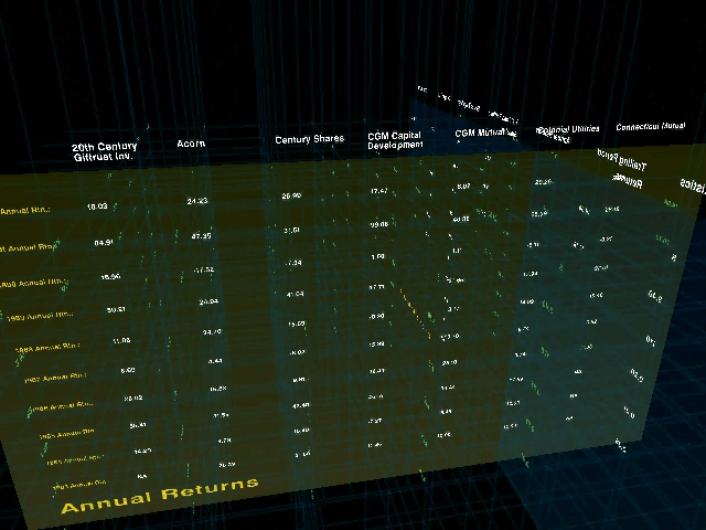
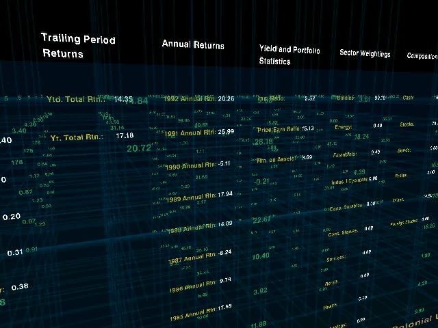
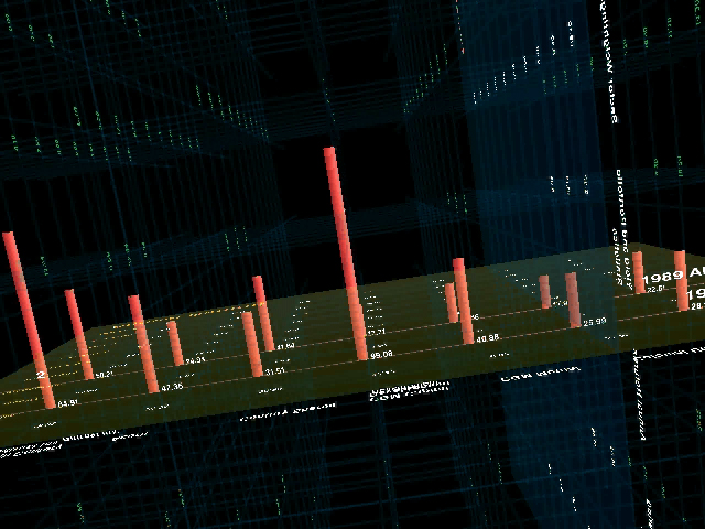
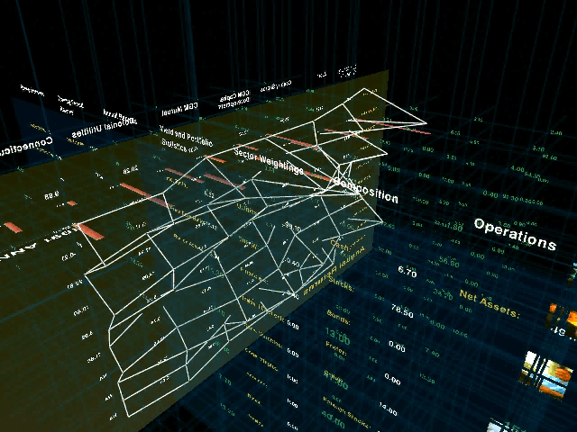
One missing factor, however, was the fact that the tools to create this work were expensive graphics workstations and complex programming languages and support libraries. An opening for such work in current day practice is that such a project can now be built on an inexpensive PC, and work is being done (such as the Processing system described in chapter six), to bring the necessary programming skills to a wider audience. By widening the field, the focus can switch from the vlw-era questions regarding what does the computer mean for graphic design, to a critical discourse about what type of work is interesting and relevant in the context of the computational media. Three dimensional spreadsheet systems have not yet taken hold as a standard means of understanding multiple layers of data as implemented in Financial Viewpoints, perhaps because while an interesting concept, it diverged too far from standard modes of understanding data employed by the target audience. Where at the time the interesting aspect of the project was the implementation (previously no such thing existed), rather than the practicality of use, more contemporary discourse can instead push forward based on such lessons because the implementation is far less of an issue.
3.8.2 Improvisational Design
Another notable product of the Visible Language Workshop is the work of Suguru Ishizaki, whose Ph.D. thesis [Ishizaki, 1995, later published as Ishizaki, 2003] described a process of design for dynamic media that used the metaphor of improvisational performance. Ishizaki describes the need for such a model because a designer cannot address every single design task in an era of always-on internet connections and ever-changing information.
The thesis describes the computational designer as more of a choreographer, whose task is to order and move the elements of a continually changing space. He addressed the process because:
…in digital media, designers often find it impossible to design a solution to a particular problem. Instead, they must design a way of designing, or a process, in the form of a computer program that can generate design solutions at run time.
ishizaki, 2003
But such solutions are fraught with problems, because of a tendency for a breakdown between artifacts generated by machines versus humans: “automatic is a bad word for design, implying average quality products.” To clarify, he notes that the computer is acting “on behalf of,” not “instead of” the designer. He balances the automation of the computer against the reasoned hand of the designer to build systems that, rather than replacing designers, augment the abilities of the designer or open possibilities where there were none before. This distinction is important, because it provides more a realistic attribution to the abilities of machines (primarily to reduce repetitive tasks) versus those of human beings (ability to reason and make complex decisions). Without a major breakthrough in artificial intelligence, this distinction will hold for many years to come.