Computational Information Design
4 Advanced Example
This chapter describes a study of methods to understand the differences in the genomes of multiple people. The text first covers the scientific background of research in genetic variation, along with a survey of previous approaches for representation of the data, and then describes how to use Computational Information Design to develop a more in-depth approach for analysis and visualization.
4.1
introduction to genetic data
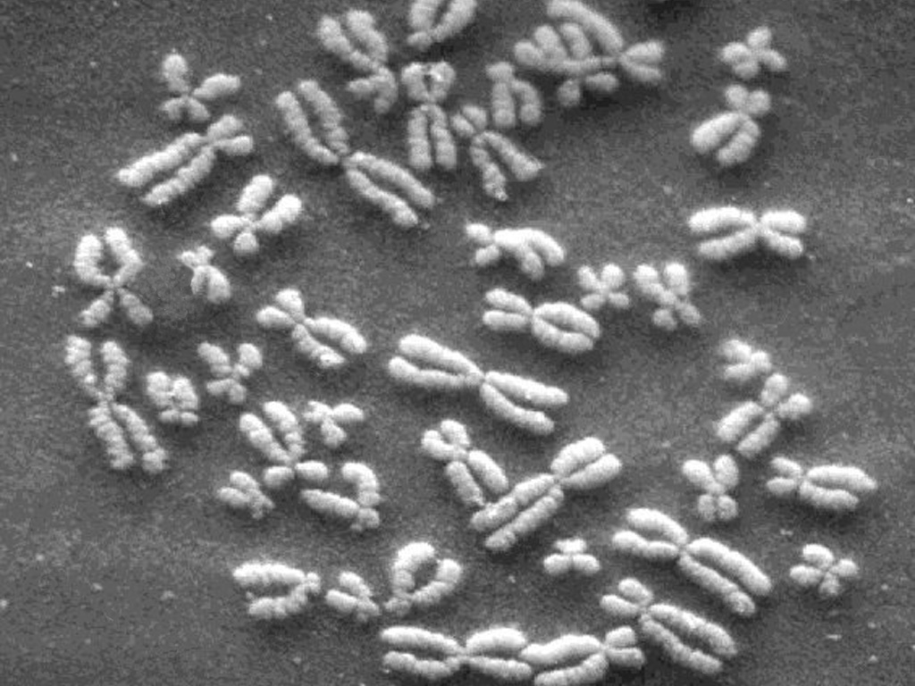
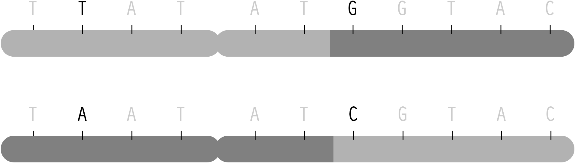
Inside the nucleus of every cell of the human body, 3.1 billion letters of genetic code can be found. The information is stored on 23 pairs of tightly wound chromosomes (shown above), long chains of the nucleotide bases adenine, cytosine, thymine, and guanine. These four bases are commonly depicted using long strings of a, c, g, and t letters, and contain the entire set of instructions for the biological construction of that individual. This blueprint is known as the human genome.
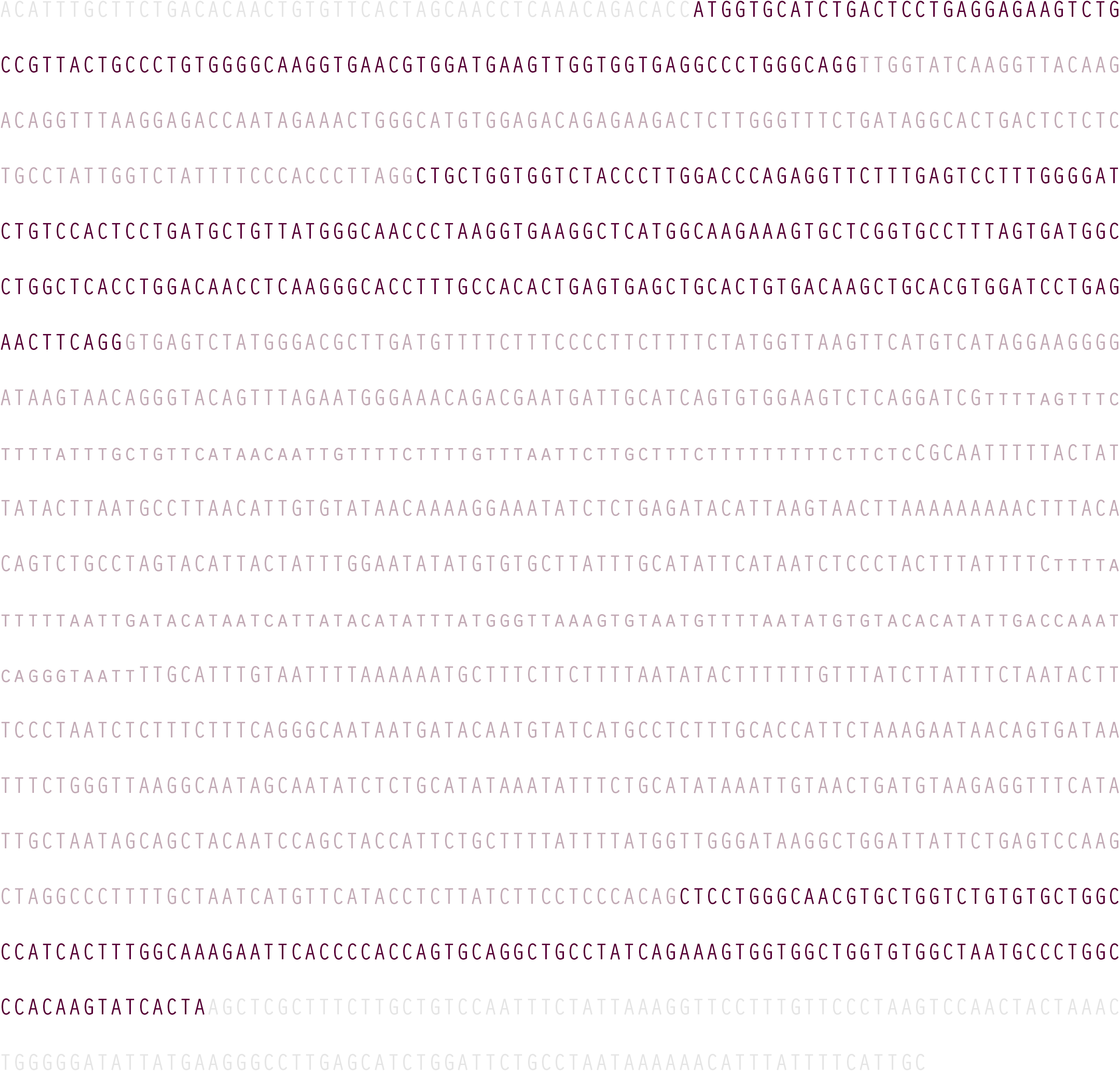
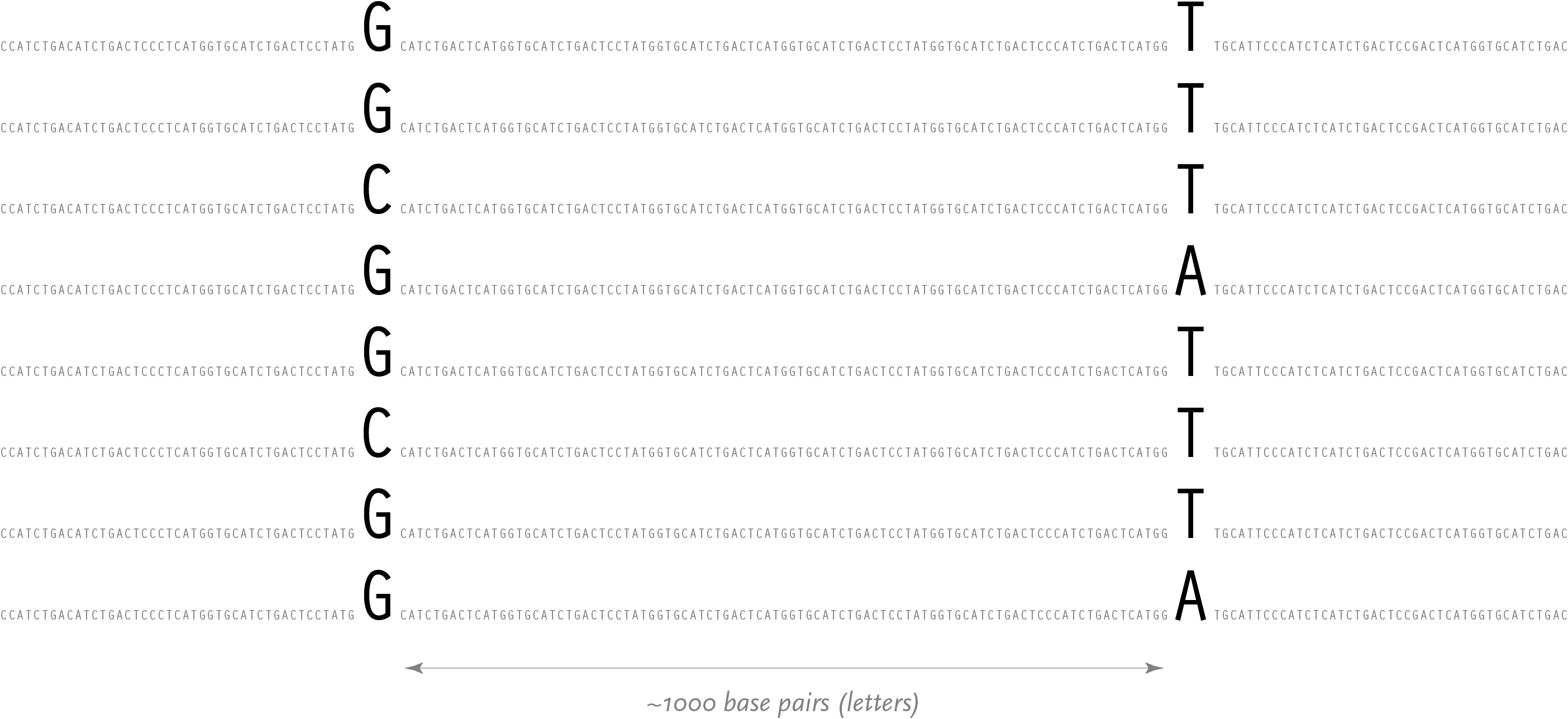
Amongst the billions of letters are some 35,000 genes [International Genome Sequencing Consortium, 2001], which are subsections known to contain a specific set of instructions for building proteins (or other materials that handle how proteins are used). A typical gene, approximately 1600 letters in length, is shown below:
Even within the gene, commonly all not all the letters are used to code for the protein. The coding regions, shown here in a darker color, are known as exons, and are mixed with other material that might regulate or provide no additional function, called introns.
4.2
coding sequences and transcription
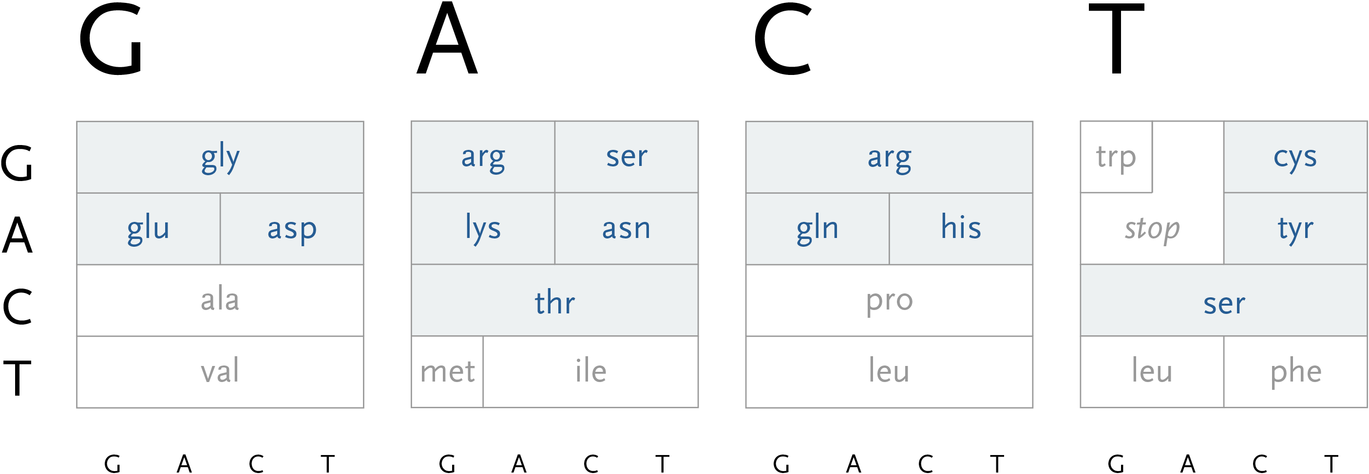
During the process of transcription, a gene is copied by the cell’s machinery, and everything but the exons are clipped out of the copy. The result for this gene is that the three exons are placed in succession to one another. The transcription process reads the a, c, g, and t letters, every three of which specify a particular amino acid. The table shown here shows the amino acid produced for every possible three letter set (called codons). For instance, when the cell reads a, c, and then g, the amino acid “threonine” will be produced.
The amino acid that is chosen depends on each of the letters in succession, a three-dimensional problem where the outcome is dependent on the successive refinement of possible amino acids, based on the order in which the letters are used. Each letter affects the number of possible choices for the next, each having slightly less importance than the letter before it, and the final letter has the least importance because the amino acid is often chosen based on the first two, a situation known as four-fold degenerate. This nuanced ordering of the letters is a difficult concept to describe in words, but a diagram makes the patterns immediately obvious.
With that in mind, the design of the diagram should be focused on revealing the pattern of how the letters affect one another, because the pattern will be easier to discern (and remember) than simply memorizing the 64 possible mappings to the 20 amino acids. In the design below, the viewer selects the first letter from the top, which will restrict the remaining choices among one of the four blocks.
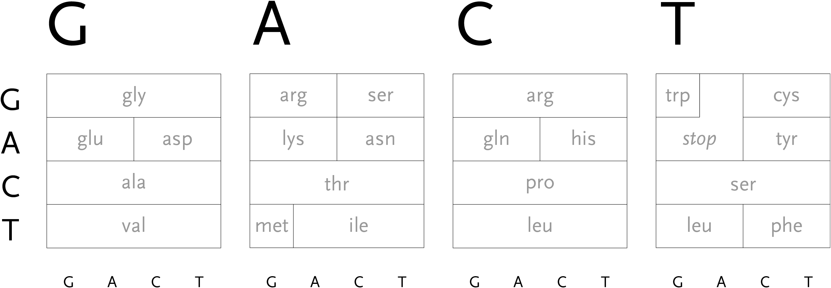
The second letter is chosen from the left-hand side, which limits the remaining choices to a specific row. The third letter is selected from the bottom, which determines the column within the row. However, as can be seen above, the row often extends across all four letters (a four-fold degenerate), meaning the third letter won’t have an effect in determining the amino acid used. In other cases, only two possibilities exist (such pairs are called two-fold degenerates). This subtle rearrangement attempts to be simpler than common versions of this table, which tend to be cluttered with all choices for each letter or can be disorienting for a viewer because they require forward and backwards reading. Most important, it focuses on revealing what’s interesting about the data—the weighted importance of each letter, and employs that to create a clear diagram. Few data sets are rigid and generic, there is almost always something interesting that can be pulled from them, so the role of the designer is to find that pattern and reveal it.
In addition, a small amount of color can be employed in the diagram to reveal the hydrophilic amino acids being grouped at the top, with the hydrophobic found primarily on the bottom. If not using color, the same could be achieved with a gray pattern or other visual device.
Adding the chemical structures of the amino acids would expose more patterns that would go even further to explain why amino acid translation works the way it does.
An interactive version of the diagram allows the user to select letters in succession, and observe the selections that remain. A three dimensional drawing is used to emphasize the selection.
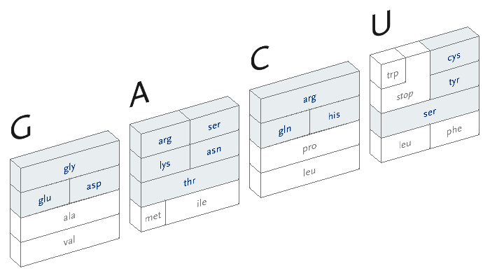
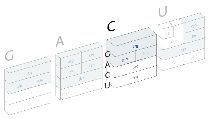
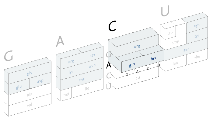
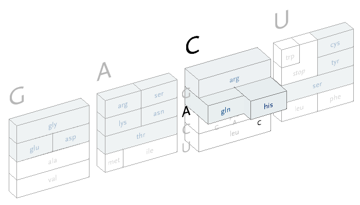
This version only shows the letters in question at each stage, extending the block of each sub-selection forward until the final amino acid is chosen. The starting position is at the left, the second image is just after C has been chosen as the first letter, followed by A and in the final frame, C is chosen for the third letter, bringing forward the amino acid histidine. The interactivity helps the user to learn how the relationships work through experimentation.
4.3
changes to coding sequences
Changes can occur in the genetic sequence, either due to copy errors or other outside effects, resulting in a letter that changes which may in turn alter the amino acid produced. In the case of the HBB gene shown earlier, the first few amino acids are as follows:
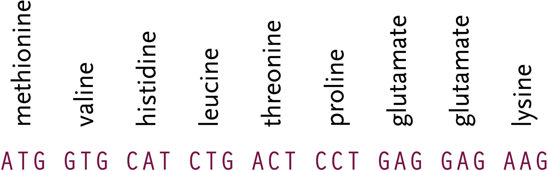
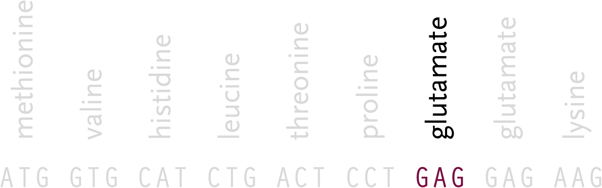
Sickle-cell disorder involves a change in the first glutamate in the sequence:
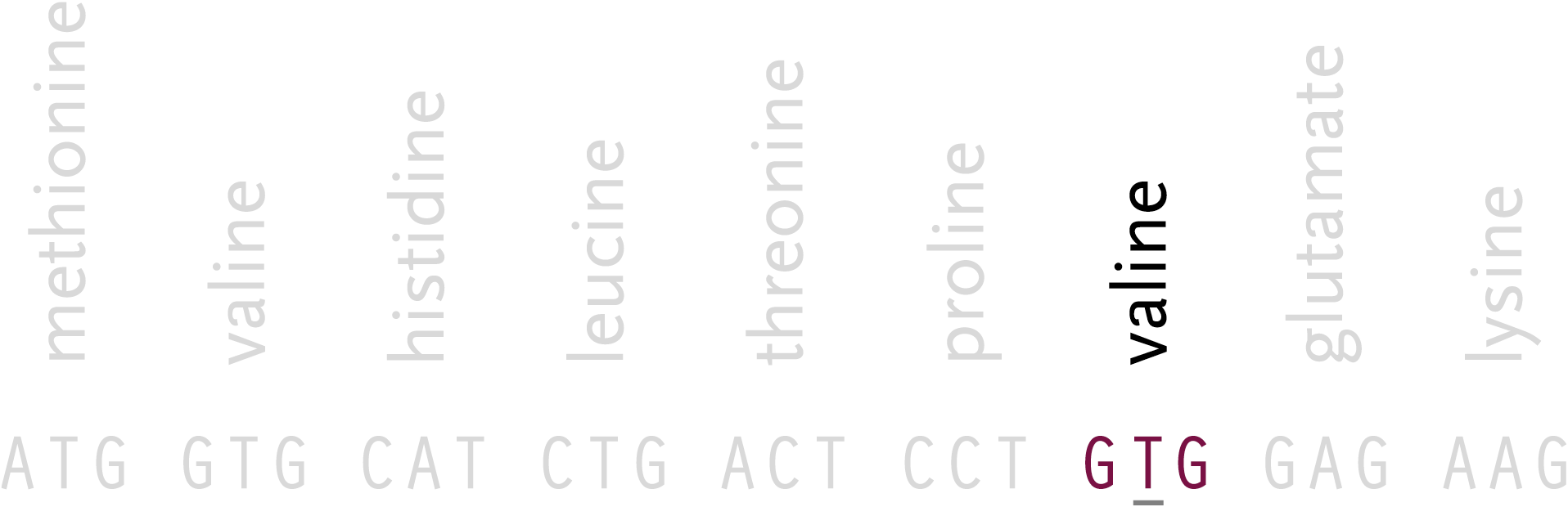
The second letter of the codon changes from an A to a T, which in turn produces the amino acid valine, instead of glutamate:
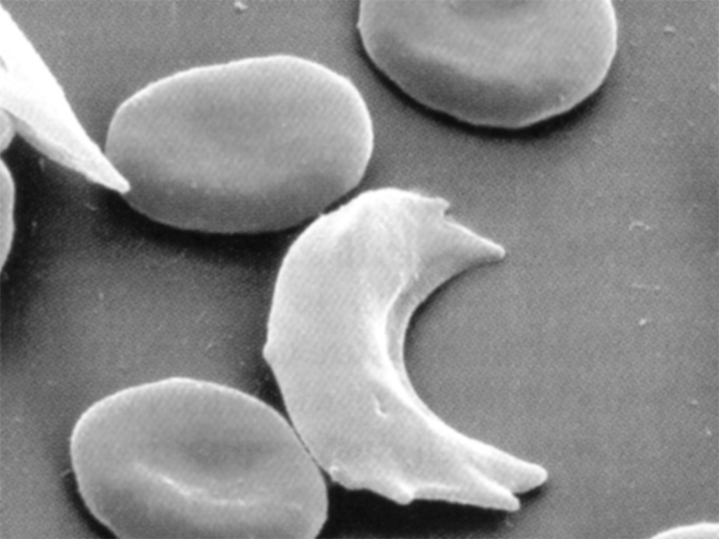
The change disrupts the amino acid chain by changing its shape, causing detrimental effects to the body:
When the mutated hemoglobin delivers oxygen to the tissues, the red blood cell collapses, resulting in a long, flat sickle-shaped cell. These cells clog blood flow, resulting in a variety of symptoms including pain, increased infections, lung blockage, kidney damage, delayed growth and anemia (low blood cell count).
gslc.genetics.utah.edu/units/newborn/
The characteristic shape of sickle cell can be seen in this image, where the collapsed cell forms a “sickle” shape:
As noted in the amino acid table, not all changes will alter the character of the instruction set. Not all changes cause deleterious effects like susceptibility for a disease, they might simply modify something basic like one’s eye or skin color.
4.4
tracking genetic variation
While it’s rare that a single letter change will be responsible for something as dramatic as a disorder like sickle cell, they are still a powerful means for understanding and tracking change in individuals and populations.

Such a change is called a snp (pronounced “snip”, and an acronym for single nucleotide polymorphism). When the genomes for two unrelated people are compared, a snp can be observed roughly every thousand bases. It is possible to find other single-letter changes in the code that are simply random, but snps are unique in that they are seen in an identical position across multiple people. A snp is a result of some random effect, such as an error during meiosis, where the genetic data of a cell is copied during the process of creating a second identical cell.
Each snp is one of two letters (variations), and several projects have both taken place [snp.cshl.org] and are underway to produce a comprehensive catalog of all the variations that are found in the human genome [www.hapmap.org], along with a representative percentage of how often each of the two variations are found. It is believed that a full catalog of all such variations would show one every 300 letters.
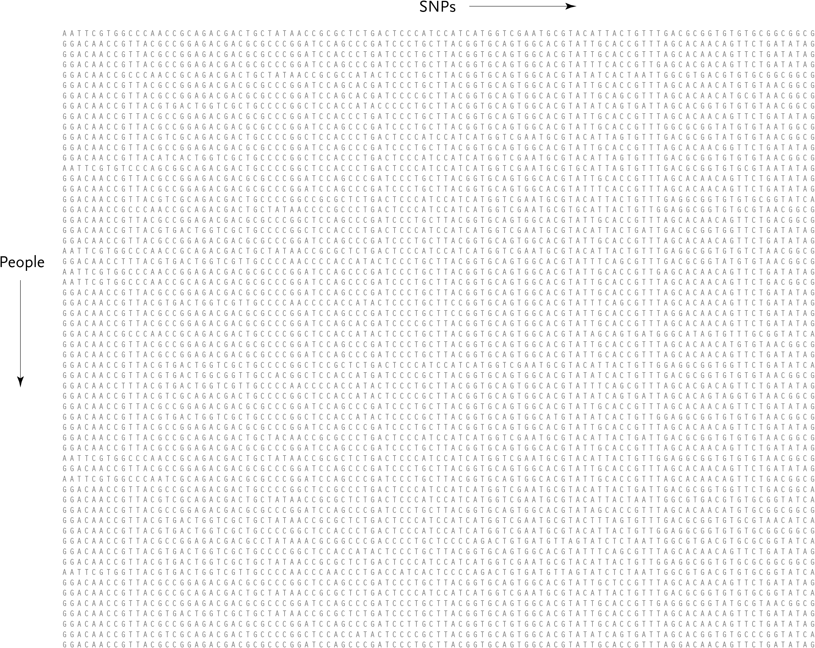
Typically, this data will be studied with a few dozen or hundreds of individuals representing a population. A set of a few dozen to a hundred or more snps are observed across the group, forming a large table of the raw data:
Because every individual has two sets of chromosomes, the snp on each chromosome may be different from the snp in the identical position in the second chromosome. This situation is called heterozygous, as opposed to homozygous, where the same snp is found on both chromosomes.
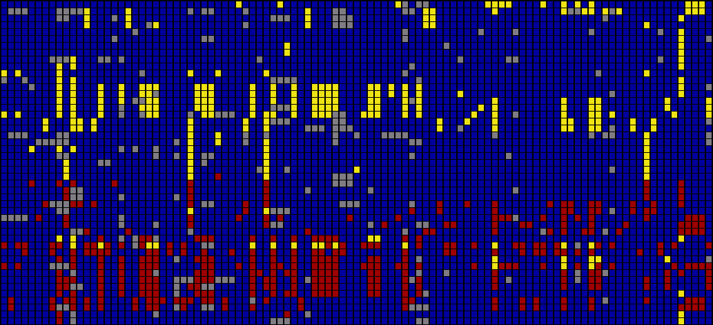
As a way of representing this raw data for populations, the Visual Genotype program has been developed by the Nickerson Lab at University of Washington. It colors each entry in the table of people versus snps based on whether it is heterozygous, homozygous for the most commonly occurring snp, or homozygous for the rare variation of the snp.
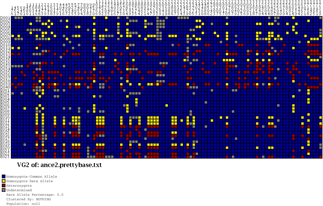
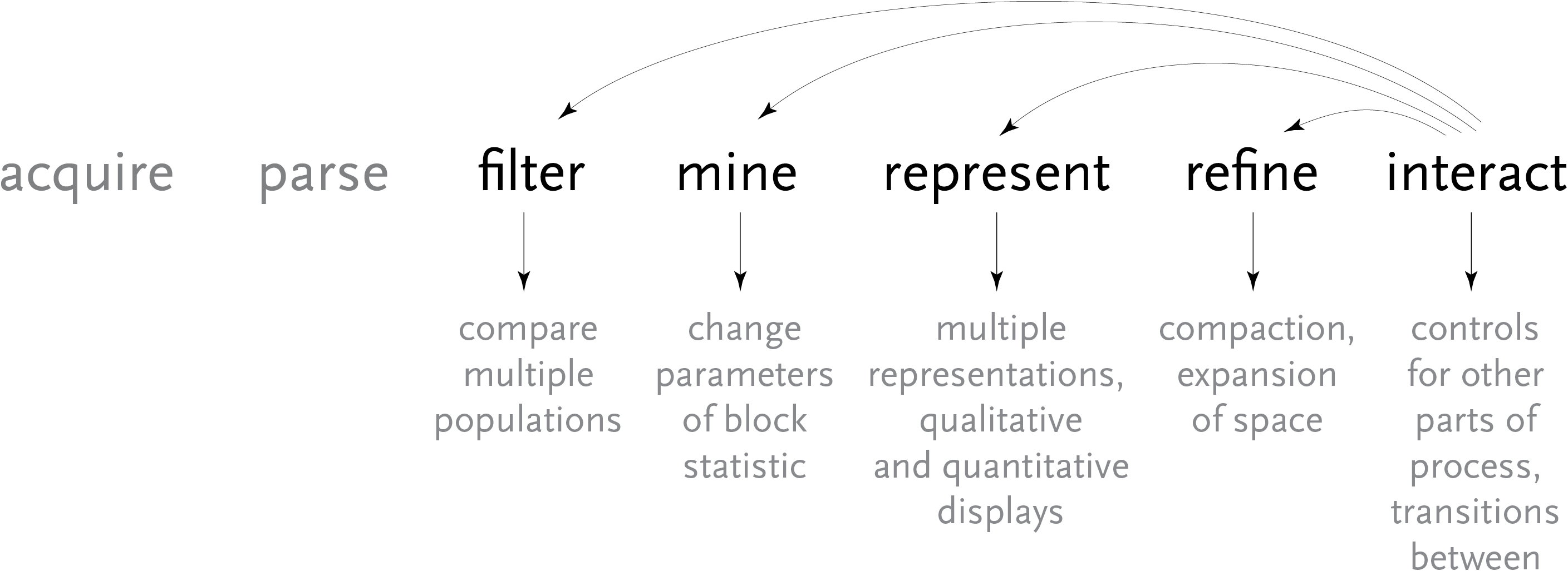
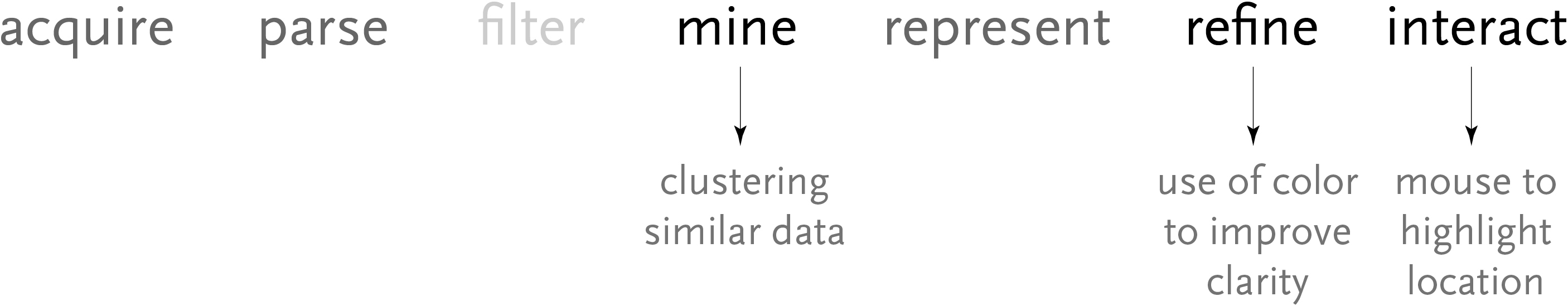
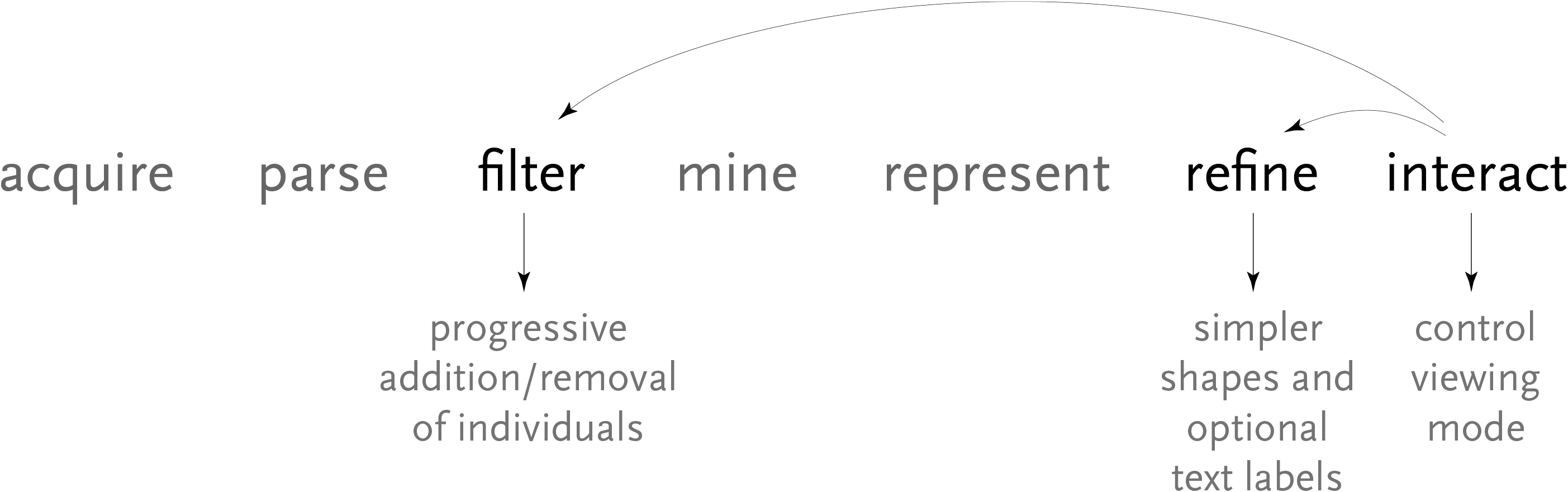
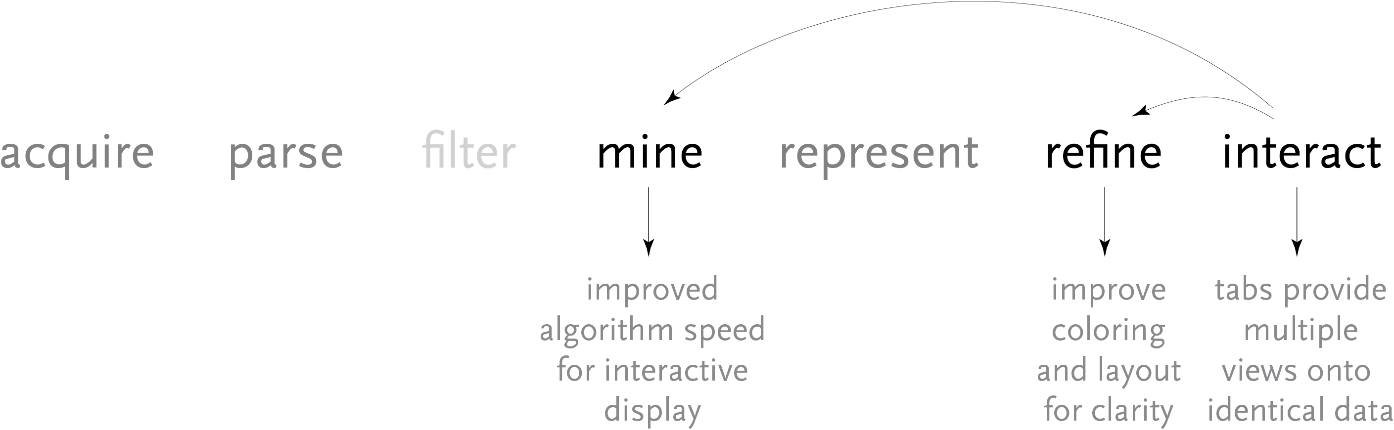
Above, the image output from Visual Genotype shows a series of data for the ace2 Angiotensin I converting enzyme [Nickerson et al, 1998 and Rieder et al, 1999]. The image seems to convey a great deal of variation in the data set, yet makes no attempt to clarify it or highlight what kind of variations actually exist. When considered in terms of the Computational Information Design process, it’s clear that the data is being acquired, parsed and represented in a very basic way, without regard for filtering or mining the data, much less given care of visual refinement or adding the use of interaction to improve how the data set can be explored.

To address these issues, a ‘mining’ step is added, where the data is clustered into useful groupings based on the rows that are most similar. This way the viewer can see both the rows that are similar, while it highlights the differences between those similar rows by placing them adjacent to one another, aiding the eye to understand what’s inside the data set:
For an image to be useful, the relevant or key results should be immediately obvious, so that the viewer need not spend a great deal of time first trying to understand what might be important. Diagrams can themselves be complex, requiring some time of study before they’re understood, but the basic idea being expressed needs to immediately apparent. It is similar to hearing someone speak in a foreign language, where even if it’s not possible to understand the language (the specifics of the diagram) it’s generally possible to tell whether they’re angry or happy (what parts of the diagram are relevant and require further inspection). The original image fails such a test, partly due to the deep coloring of the image, creating an overall muddy appearance. Taking this into account, a new set of colors were chosen for the image seen below.
In the previous version of the image, the dark blue boxes, which stood for ‘homozygous common’ are given a lighter gray color, to place them further in the background. The gray color that was previously used to denote ‘missing’ data is simply set to white, so that the data is simply missing from the diagram, rather than calling attention to itself. The two colors for the ‘rare’ genotypes are set to a pair of opposing but equal colors, and given greater importance than the background information in the diagram.
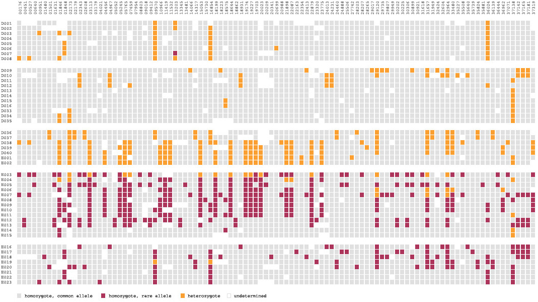
Small breaks are made in the table to further the sense of visual grouping between the ‘clusters’ of data rows. The goal of a diagram like this one is to help reveal patterns in a data set, so the representation should also emphasize those patterns. The groupings help the viewer break the large data into smaller pieces mentally, making it simpler to learn.
As a minor point, as compared to the original, the text at the top of the redesigned version has been oriented at a rotation, and the shorter numbers made to the same as the others so that they don’t attract additional attention to themselves. In addition, as the user moves the mouse around the diagram, the row and column heading is highlighted for better clarity, and the associated data type is highlighted in the legend. This simple interaction helps associate each entry with its label.
The resulting product makes the case for Computational Information Design through a more complete depiction of the process used:
4.5
bifurcation plots
Another method of looking at variation data is to examine how the data differs between individuals, as it bifurcates from a center point of one or several snps.
This diagram plots bifurcation and was introduced in [Sabeti et al, 2002] as a way to depict stretches of particular regions were conserved, often a sign of natural selection, meaning that the region is perhaps advantageous to the individual and is therefore more likely to survive and pass that set of variations on to its offspring (because of the region having impact on the survival rate of the organism).
A redesign of this diagram seeks to clarify it further by eliminating the blobby effect that can obscure the exact data. In addition, interaction is used to allow the user to add or remove individuals from the image, so that it’s easier to understand where the shifts happen and the origins of the shapes found in the diagram. The following sequence shows just one individual, then the separation as a second individual is added. Changes are shown as they happen from a snp roughly in the center. This sequence shows one, two, three, then several individuals having been added:


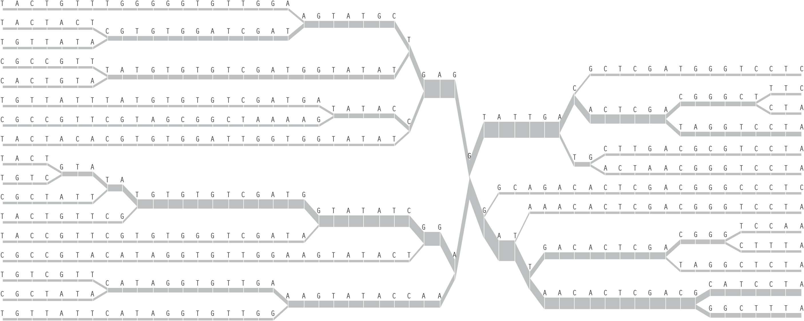
Once the diagram has reached many individuals, it might be appropriate to remove the text, so that a more compact, overall picture can be seen of the data:
The steps for the redesigned version are shown below, and highlights some of the inter-working between the how interaction can be used to affect other parts of the process.
By pressing keys in the program, the user can add or remove individuals, altering the filtering used for the data. The user can also control the viewing mode, offering a way to refine the representation dynamically, optionally disabling the text to avoid a cluttered appearance when a large amount of data is in use.
4.6
haplotypes
Many diseases (i.e. diabetes) are at least influenced by genetics, so by tracking differences in the genetic data of those who are and are not affected by a disease, it’s possible to figure out what area of the genome might be influencing that disease. Simply put, if one, or a group of related snps (called a “haplotype”) is more common in a group of people with the disease in question, then there is a likelihood that those changes contribute to the cause or associated effects of the disease.
snps are often found in groups, which are called haplotypes. The haplotypes are groups of snps that most commonly change together, because of how the chromosomes are inherited from one’s parents.
The letters of genetic code are found along 23 pairs of chromosomes. Through conception, one set are passed along from a person’s mother, the other half from the father. Each parent has two sets of chromosomes from their own parents. As the chromosomes are copied to be passed on, crossover occurs, where the beginning of one chromosome is linked to the end of another. The myriad of possible combinations drive the diversity that comes from genetic variation.
But in spite of the many variables involved, the predictable elements of this process mean that one can determine, with some degree of certainty, what traits came from one parent or the other through combinatorics and probability. This becomes useful for disease studies because given the letters read from several randomly placed snps from mother, father, and child, a researcher must be able to reconstruct the two chromosomes passed on to the child. The process of reading snps from each individual happens only in terms of position—it is not physically possible (with current methods) to separate one chromosome from the other and read them individually. Instead, the mathematical methods (called phasing) are used, because it is necessary to know which variation for the snps are found on each chromosome. The ordering is important in determining how closely related snps are to one another, so that a general structure (a set of haplotypes) can be determined from each chromosome.
The goal of the human genome project was to produce a consensus version of the 3.1 billion letters of code, though less focus was placed on understanding how the genome varies between people. With that structure in place, the penultimate project of population genetics is the hapmap project [www.hapmap.org], which is an attempt to catalog the variation data from several people across multiple populations. The hope is that this data set will provide insight into how the genome has evolved over time (is it random? or are we remarkably similar?), as well as patterns of inheritance for many types of diseases (why does this disease occur? why has it not disappeared through natural selection?). The hapmap catalog will include thirty child/mother/father sets (called trios), across three distinct populations (Europeans, Africans, and Asians) that can be used as a reference set for answering such research questions.
The methods described here form the background for population genetics [Hartl & Clark, 1997] which is the study of how genetic data varies between groups of people and larger populations. And although this chapter will focus on snps, it is only one type of variation in the genome.
What follows are some of the methods used to visualize data from Haplotype and Linkage Disequilibrium testing. The techniques themselves have emerged out of necessity during the last few years, but have yet to be addressed with regards to the effectiveness of their representations in communicating the nature of the data they seek to describe.
4.6.1 Linkage Disequilibrium
C C
A G
A C
A G
C C
A G
A G
C C
A C
A G
C C
A G
C C
C C
A G
A G
C C
C C
C G
C C
Two locations from the first twenty individuals used in the data set in the next section.
(for easier
(counting)
C C
C C
C C
C C
C C
C C
C C
C C
C C
C G
A G
A G
A G
A G
A G
A G
A G
A G
A C
A C
A powerful tool for understanding variation in genetic data is linkage disequilibrium (ld) testing, where genetic data is scanned for statistically relevant patterns. Linkage is the connection between the occurrence of a feature, in this case snps. Disequilibrium simply refers to an upward or downward change that deviates from what might normally be expected if the snps were to appear at random (no correlation to one another).
One such method for testing ld is the D´ statistic, which originated from Leowontin’s D statistic [Leowontin, 1964]. D is calculated given snps from two locations (or loci), multiplies the probability that both snps are observed together (PAB), and subtracts the frequency of each (pA and pB) multiplied by one another. The function reads as:
D = PAB – pApB
For instance, to calculate D for the data set at right, one first counts the how often C appears in the first column, and divide by 20, the number of rows. The result will be pA, the probability that C will appear. In this case, there are ten Cs, meaning:
pA = 10 / 20 = 0.50
On the other hand, pB is the probability for C, the major allele, to appear in the second column:
pB = 11 / 20 = 0.55
Finally, PAB is the frequency with which the major allele appears in both columns, meaning the number of times C appears in the first and C also appears in the second:
PAB = 9 / 20 = 0.45
So to calculate D for this data set, the result would be:
D = PAB – pApB
D = 0.45 – (0.50 × 0.55)
D = 0.45 – 0.275
D = 0.175
The D´ statistic is calculated by dividing D by its maximum value, which is calculated as:
min(pApb, pApB) if D > 0, or
max(pApB, pApb) if D < 0
The value of pa is the probability that the opposite snp (A instead of C) appears in the first column. In the same manner, pb will be the probability of G appearing in the second column:
pa = 10 / 20 = 0.50
pb = 9 / 20 = 0.45
Because D is greater than zero, min(pApb, papB) will be used:
D´ = 0.175 / min(0.50 × 0.45, 0.55 × 0.50)
D´ = 0.175 / min(0.225, 0.275)
D´ = 0.175 / 0.225
D´ = 0.777...
This value is not very high, and would fail the “block” definition found in the next section.
4.6.2 Haplotype Blocks
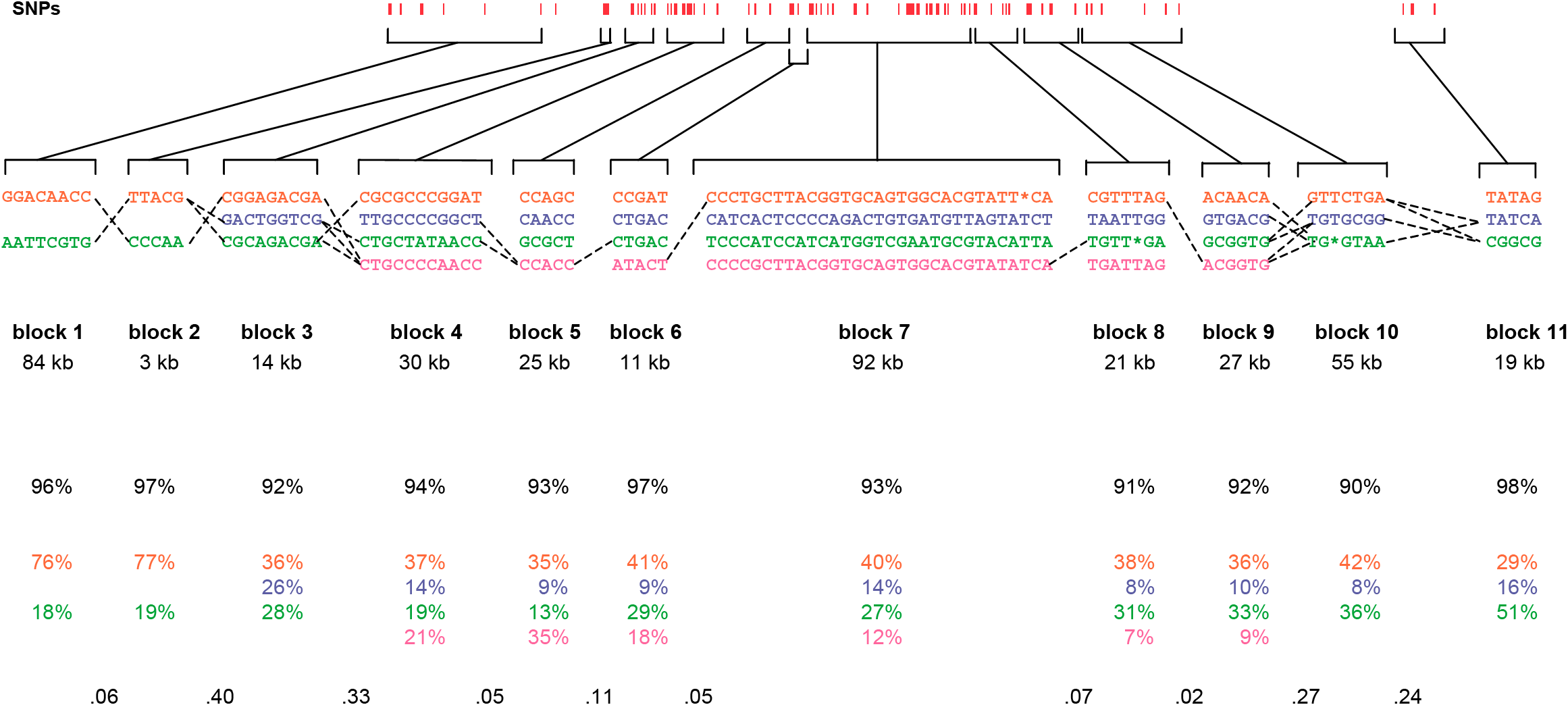
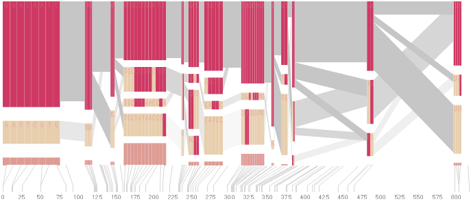
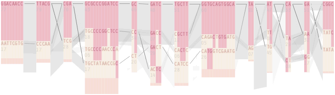
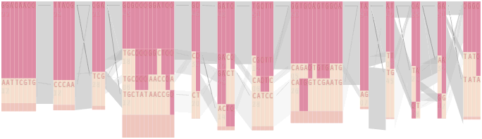
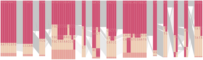
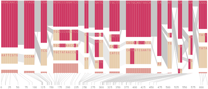
Studying populations tends to be difficult because of the amount of diversity found in the data. In the course of studying ld data from a group of individuals for connections to Crohn’s disease [Daly et al, 2001 and Rioux et al, 2001], the data was found to be more structured than previously thought, showing a distinct pattern:
The results show a picture of discrete haplotype blocks (of tens to hundreds of kilobases), each with limited diversity punctuated by apparent sites of recombination.
daly, 2001
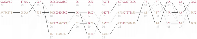
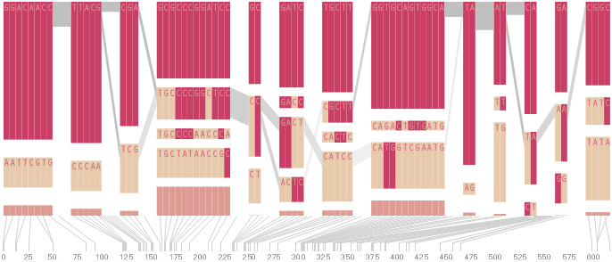
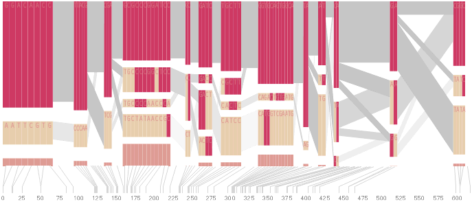
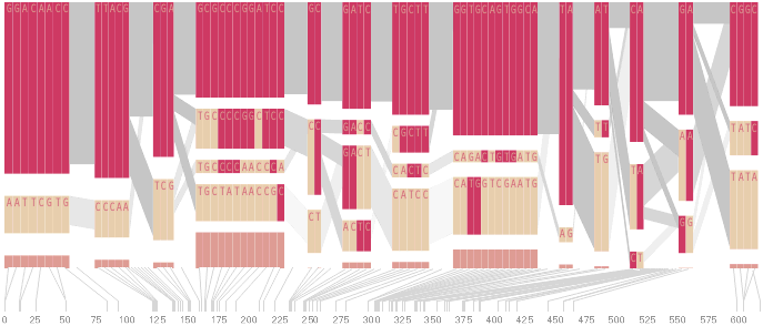
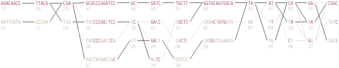
The paper included the following diagram (reproduced here in its entirety) to demonstrate how the block structure worked with the ibd5 data set studied for the Crohn’s disease research:
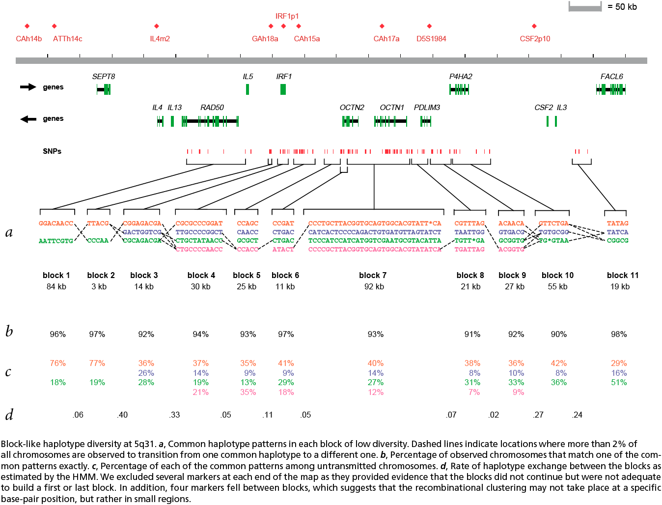
The first column shows a block made of ggacaacc, and a second variation of exactly the opposite letters, aattcgtg. By matching the red color of this text against the percentages shown lower, it can be seen that the first combination appears in 76% and 18% (respectively) of the individuals studied.
Simply put, the blocks are constructed by finding spans of markers that are in “strong” ld, meaning a series of snps where values of D´ are consistently above a threshold, in the original case, values above 0.8. Series of markers with D´ greater than 0.8 were added to a list, then sorted to find subgroups. This method, referred to as finding a “strong spine of ld” provided a means to find areas that where the signal was especially strong, but proved too rigid for minor fluctuations that might cause D´ to dip slightly lower.
The block method was completed in greater detail for [Gabriel et al, 2002], which presented a slightly more refined version of the block algorithm developed by S. Schaffner. This took into additional parameters of a confidence interval and a LOD score. This definition uses a combination of the parameters to produce a more robust characterization of the block structure in a region.
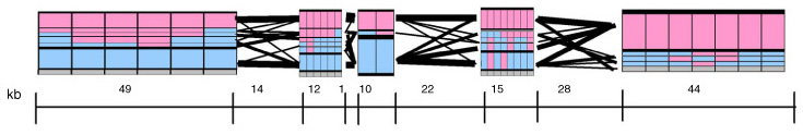
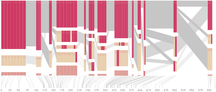
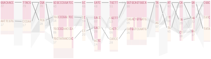
In addition, a draft version of the Gabriel paper included another possible representation of block data (shown above), which used a series of rectangles that spanned along the block boundaries, where the height of each correlated to the percentage of individuals with that block structure. This presents an interesting starting point for a more qualitative representation of the data, where a glance provides the viewer with an immediate overall picture of the data set, without requiring additional study of percentages or other notation in a table.
4.6.3 HaploView
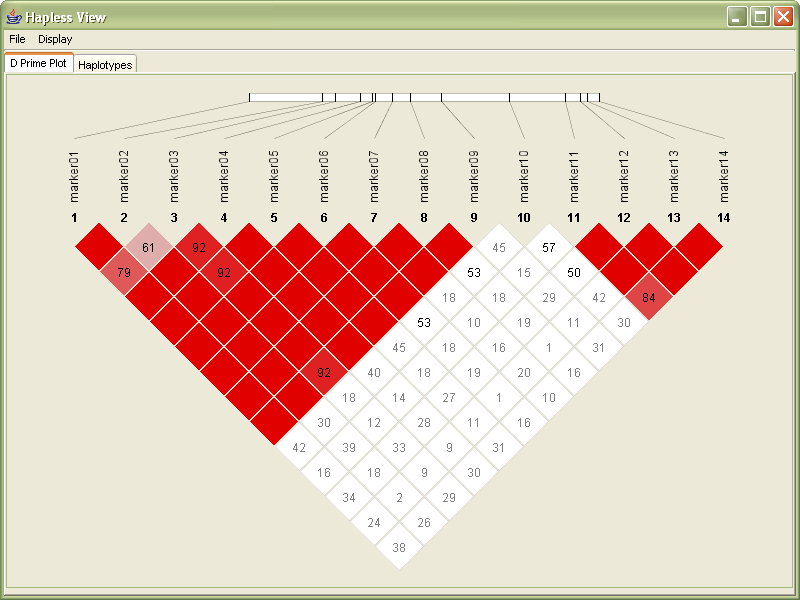
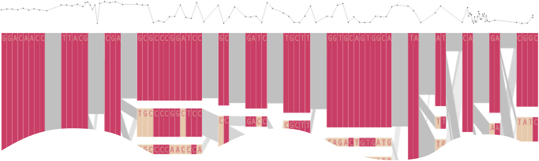
The study of haplotype blocks were the basis for the development of a software project from Daly’s lab titled “HaploView,” which can be used to examine haplotype data in a similar manner. A screen shot from its initial release appears below:
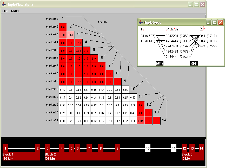
The large triangular plot shows the values for D´, each snp compared against the others. The inset diagram are the haplotype blocks, calculated via a menu option that runs one of the algorithms described in the previous section.
The interface was built more of necessity as a step towards an end-user tool—a means to combine several of the analysis tools that were in use for the two publications and other research and was beginning to influence other current projects.
However it can be further enhanced by additional visual refinement that would place more focus on the data and improve its readability.
The coloring of the D´ plot provides a useful qualitative understanding of what’s inside the data set. The reading of markers and their individual location is fairly clear (the diagonal line with others connected to it). The individual D´ readings are perhaps the most difficult to understand. Part of this is that such a small font size is required to fit three numbers and a decimal in a small space. This becomes especially problematic when dealing with large data sets, such as the ibd5 data, that includes more than a hundred markers instead of the fourteen shown in the sample image at the left.
The inset block diagram is useful for its simplicity, but could be clearer from an initial glance. Part of the problem is that numbers, mostly of identical size are used for many different kinds of features: percentages, weights, marker numbers, and the 1, 2, 3, 4 (representing a, c, g and t) for the individual genotypes themselves. A well designed diagram provides visual cues for ways to ‘learn’ the image. Applying such reasoning in this image means that numbers should either be used less or differentiate themselves better so that the intention is clearer.
The red colored numbers at the top are used to signify ‘tag’ snps, markers that can be used to uniquely identify the block, even in absence of the others. This feature is extremely useful because just that small number of such snps need to be typed, and the others guessed, with a significant degree of accuracy. A red coloring is poorly chosen as it more commonly represents an error or some other type of problem, as opposed to highlighting the most useful of the information.
At the bottom of the screen is an additional device to both show the block ranges and manually modify them. This is disengaged from the other parts of the interface, making it confusing to understand what part of the data it relates to; particularly when all aspects of the data being shown have a strong relationship to one another.
4.6.4 Redesign of HaploView
The design of these diagrams was first developed manually to work out the details, but in interest of seeing them implemented, it was clear that HaploView needed to be modified directly in order to demonstrate the improvements in practice. Two images of the redesigned version are seen below. The redesigned version was eventually used as the base for a subsequence ‘version 2.0’ of the program, which has since been released to the public and is distributed as one of the analysis tools for the HapMap [www.hapmap.org] project.
Since the values for D´ range from 0.00 to 1.00, in the following redesign they are multiplied by 100. Through a glance, it’s easy to see where numbers are large and small (one, two, or three digits)
Next, values of 100 are not shown, reducing clutter in the image. Very little is lost by not showing the 100s (or 1.00 values) since they already have the strongest coloring, and the absence of a number is sufficiently striking.
The plot is rotated 45º, to better align with the more familiar horizontal ordering of sequence data with which it is associated. The modified orientation is commonly employed in other uses of this diagram.
A small band is used to show the row of sequence data, which is slightly smaller than the long line used in the original image. With the markers slightly closer together on the line, it’s easier to compare their relative positions.
The rotation also helps the placement of the marker number and titles to be less ambiguous. In the original image, the markers sit at the end of the row, and there is some confusion for an untrained viewer as to whether the markers are connected to either the row or the column.
The coloring in the redesign is toned down slightly, with a slightly deeper red color to make the colors slightly more ‘natural’ (more on this in the color subsection of the ‘process’ chapter). More consideration could be given to color in this image, where in some cases, slightly blueish colors are used for outlaying data points. Because the image shows not just D´ but is also mixed with the LOD score.
With the redesigned version, the image’s size can be made much smaller than the previous image, while still retaining far more readability. While many of these features are small cosmetic fixes, these become increasingly important when considering a much larger data set. The contribution of the individual fixes would be magnified when considering a data set with several hundred markers.
In addition, the interface was modified to use a series of tabbed panels, to further convey a sense of multiple ‘views’ of the same data.
The second tabbed panel of the interface shows the block diagram.
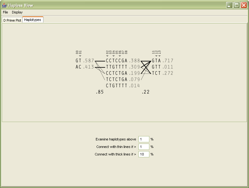
In order to help the user differentiate between multiple types of data in the image (which were previously all numeric), the 1-4 numbering of the genotypes are replaced instead with the letters they represent, reducing the overall number count.
The percentages, since all are less that 1.0, have their decimal place removed, and are shown in a gray color because they are a secondary level of information in comparison to the genotypes.
The two percentages between the blocks (the multi-allelic D´) are shown in black so that it’s clear they’re different from the other percentages. The box around them is removed because it was unnecessary, and made the numbers more difficult to read.
The markers across the top are shown with a smaller font, and padded with zeroes so that a change from single to multiple digit marker numbers (from 9 to 10) doesn’t distract by attracting attention to itself.
The tag snps in the original image were shown in red, and instead shown with a small triangle glyph that gives a better feeling of ‘tagging’, rather than the red coloring which might be used to imply a problem with the snps.
Towards the bottom of the display, the user can modify the parameters for how the image is drawn, in order to change the criteria for what should be drawn as a thick line, or as a thin line, between the blocks themselves.
Relating the new software back to the original process, this redesign covers the mining, refinement, and interaction steps. The changes to the mining step were improvements to the algorithms used by the program for its calculations, to make them run more quickly for the interface that was now more interactive.
The interaction step involves re-working of the program to clarify how data is used. Through changes to the interface layout (and internal features like automatically loading additional ‘support’ data files), the number of menu options was decreased as well, in order to make the program easier to learn and therefore its feature set more clear.
The refinement step was discussed at length already, and results in a clearer, more compact way of looking at the data, making it easier to study larger data sets without the appearance becoming too overwhelming.
4.6.5 ld Units
Another means of analysis for identical data is a system of “ld units” proposed in [Zhang et al, 2002]. The system relies on similar mathematics as other tests of Linkage Disequilibrium, and provides an alternate perspective that would appear to support the “haplotype block” model described in section 4.6.2.
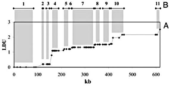
Shown above is a plot of ld units versus distance along a chromosome (in kilobases, or thousands of letters of code) for the ibd5 data set used depicted by the diagram in section 4.6.2 and duplicated here:
A rough correlation can be seen between the stair-stepping of the ldu plot versus the positions and lengths of the individual blocks. This is examined further in the next section.
4.7
combination
The goal for this project was to develop a single software piece that combines aspects of many of the preceding analysis and visualization tools for haplotype and ld data. By mixing the methods in an interactive application, one can compare how each of them relate to one another in a way that maintains context between each, and serves as a useful tool for comparison.
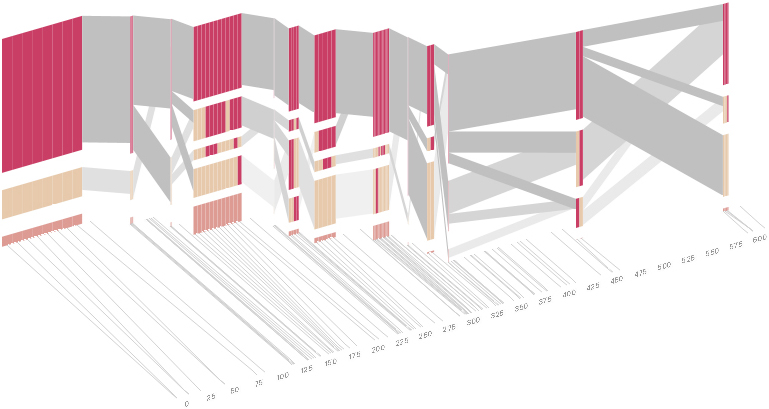
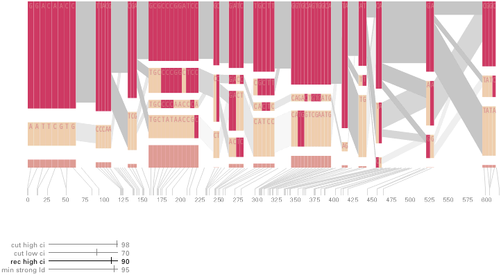
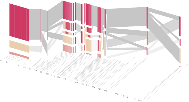
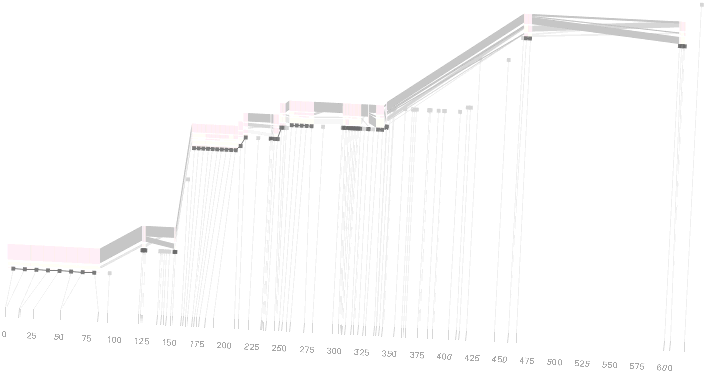
The diagram below depicts the block structure for a section of 5q31 from [Daly, 2001] for 103 snps in a population of around 500 individuals. The colors in each row depict one of (only) two variations possible for each snp, the most common in dark red, less common in a paler color. At the bottom of each column, a category for those variations occurring in less than 5% of the population. At a glance, this diagram can be used to quickly discern the general structure of the population in question, with roughly 70% of those studied exhibiting the haplotype block shown in the first column, and others that continue towards the right. Such an image is used in contrast to simply showing a chart with percentages, which requires the viewer to consider the relative importance of each percentage, rather than simply “seeing” it. Because size information can be processed pre-attentively (described in section 3.1), the mind processes the basic structure of the diagram before conscious thought is given to it.
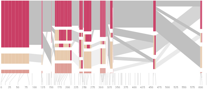
One difficulty, however is that the diagram above is shown with each snp having a width equal to the distance to the next snp, causing markers that are close together to be lost, and the frequency of transitions between each block (the gray bars) predominating, when they’re only secondary information.
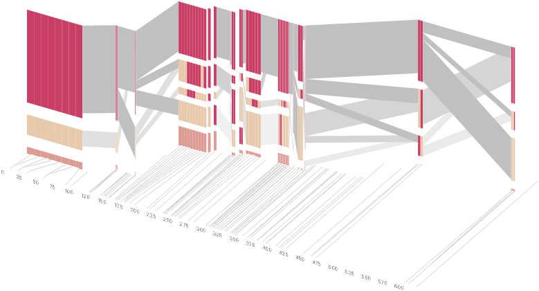
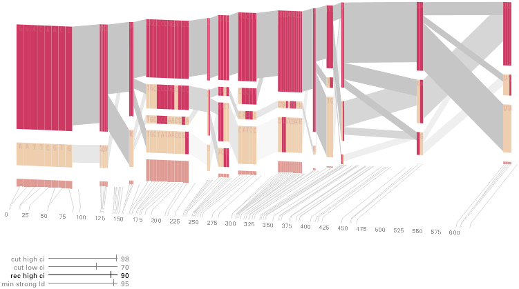
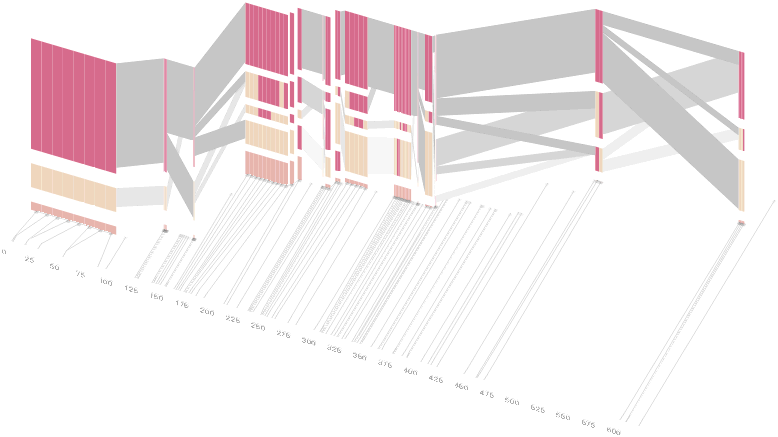
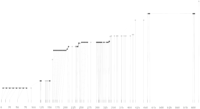
An alternative approach is to give each snp (and each transition between the blocks) equal spacing, while maintaining a connection to the “real” scale using lines at the bottom of the image:
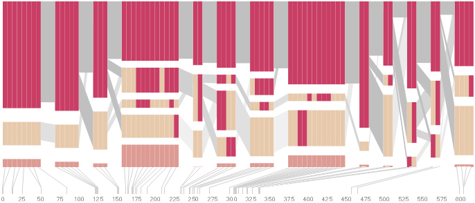
This version of the graphic can be more informative, and via an interactive software, this transition can be made dynamically, triggered by a single command, allowing the viewer to rapidly compare between the two without losing context.
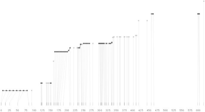
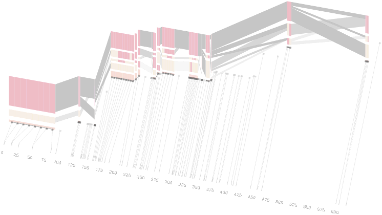
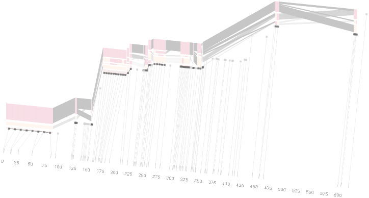
Some find the block definition controversial [Couzin, 2002], so the use of an interactive software program that allows one to modify the parameters of the mathematics used to set boundaries on the blocks helps reinforce the notion that the blocks are themselves not meant as rigidly as might be implied by their name. For instance, an alteration to the parameters of the block definition produces the following:
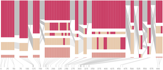
a view that shows wider block groupings. Moving the parameters in the opposite direction would produce a far more mixed picture than the original. This method of directly manipulating the values helps reinforce for the user how the algorithm itself works. The rapid feedback of simply manipulating the cutoff rate as an on-screen slider allows changes to be made in a way that is non-destructive, allowing the viewer to test different values but easily return to a previous state by a ‘reset’ function.
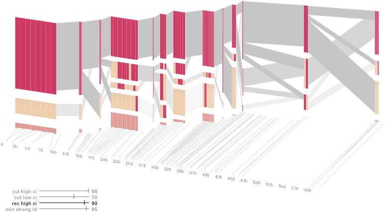
As another alternative, the block diagram can be shown in 3d, where each block offsets slightly in the z-axis, so that the lines depicting the transitions between blocks can be seen more clearly:
The view helps expose the transitions between blocks that are immediately adjacent one another. A “false” 3d isometric projection is employed that allows the data to be shown while preserving the linear scaling of the nucleotide scale in the horizontal axis.
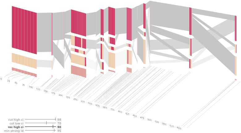
However, it is likely placing too much emphasis on a few lost transitions to assign an additional spatial dimension to them. To make better use of the z-axis, the software can instead superimpose the ldu plot from the previous section, mixing the block diagram with an additional level of confirmation for the block structure. This works well because the stair stepping seen in the ldu map is reminiscent of the block structure shown above. When the user enables this mode, the software slowly moves each bar to its new position, so that the transition can be seen. An additional keypress moves back to the original layout so that the two views can quickly be compared.
The user can easily transition between each type of view, enabling or disabling the three dimensional view if not needed, or modifying the block definition as appropriate, to see how it might match the ld map. Viewing the block image from the top will correspond exactly to the ldu plot, which can be seen by rotating the diagram in the software:
This type of exploration provides many different perspectives into the data, relying on the fact that users may have different goals in mind when observing the data, and personal preferences as to how they prefer to see the data represented.
To this end, an additional display can be added which simply shows the raw letters of the data and the percentage for each, the quantitative description to what’s seen in the more qualitative visual block diagram:
The software is built to morph between the representations, providing a tight coupling between the qualitative—useful for an initial impression and getting a “feel” for that data, with the quantitative—necessary for determining specific frequencies of haplotypes of interest for specific study.
Additional perspectives on this data can be achieved through other user interaction, clicking on a particular block varies the line weights of the transitions to show how many of the transitions are related to the highlighted block, a dynamic version of the bifurcation plots that were discussed back in section 4.5.
Clicking an individual snp shows the degree of linkage (D´) relative to every other snp as a line graph across the top:
From actual snp positions to evenly-spaced positions
From 2d to 3d, to emphasize transitions between blocks
View from above reveals ldu plot in 2d
Quantitative view with exact values, and then the transition back
This provides a far more compact view than a full D´plot, which takes up far too much space for the amount of information that can usefully be extracted from it.
Another option allows the user to switch between populations (i.e. affected versus unaffected individuals), showing how the frequency of particular haplotypes increases or decreases.
The many dimensions in genetic variation data necessitate multiple perspectives for how it is viewed, and an interactive software visualization provides a means to transition between these views in an informative manner, showing how the many views are related, yet at the same time highlight different aspects of the data set.
Relating back to the process diagram, this project shows a broader set of the steps in use. For interaction, the application makes considerable use of transitions between its multiple states. In terms of refinement, a number of means with which to expand and compress data in spatial terms are employed. The representation provides several modes of display. The mining and filtering steps allow different data sets to be read, or parameters of the algorithm to be modified, presenting the results of the modification to the user in real time.