Process
Sketch, Illustrate, Sketch, Code, Ask Ben, Code, Ask Ben... (repeat)

The first problem became to determine what information was actually important: Is the house making energy, using energy, or both? Must both be shown all the time? Are actual numbers of kilowatt hours necessary? What other information is important? Where to display this information?

The house has a dedicated computer that constantly monitors the houses' production and consumption, along with a variety of other factors. This computer located in the main classroom/main room of the house, currently runs a standard screen saver when in 'sleep' mode. Given budget and time constraints, it was determined that this computer monitor would be an ideal means of displaying the project.
Given the dry nature of the data, the information was originally intended to be displayed in a sort of ambient display, subconsciously telling the house occupant if the house was making or using energy. The problem with this solution is that users wanted more information (how much energy is made? used? what's the difference?) than could easily or elegantly be displayed in a 'ambient' or artistic display.
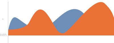
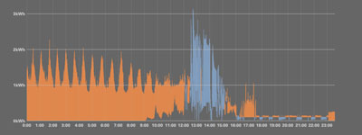
Going back to the data (using 20 plus days worth of saved data from the house's sensors) and seeing what it actually looked like, resulted in a realization: While both the production and consumption values were important, users ultimately were concerned with the net energy gain/loss of the house. After attempting to display all three types of data in one display (production value, consumption value and net value), a solution emerged that could do just that.
If kilowatt hours are the Y axis and time is the X axis, the program graphs the production value and the consumption value (both as positive values). A line is then drawn between the two values, visualizing the net difference. If production is greater, the line is blue. If consumption is greater, the line is orange. Long blue lines are a good sign mean lots of energy production and little consumption, while long orange lines means little energy production and great amounts of consumption. If the two values are equal, it is seen as a good value and rendered as a blue dot.