Solutions
Live Radial Display and Traditional Graphs showing Historical Data

For the live read and display on the house's monitor, the solution evolved into a clock display, reading the hour and the minutes, changing color based on whether the house was producing or consuming energy at that moment. The two clusters of circles each have five circles, representing the max 5 kWh the house can make at any one point in time. The small cluster shows an hours worth of data, while the larger cluster shows twelve hours worth of data. When the hour finishes, that current set of data fades into the background, leaving of a ghost of the last hour's data. The same occurs with the 12 hour cluster. When the house has any sun hitting it, a blue circle radiates out from the small cluster, pulsing each 10 seconds. This shows if the house is producing any energy, even if consumption is greater than energy production.
Run the Radial Program Using Saved Data
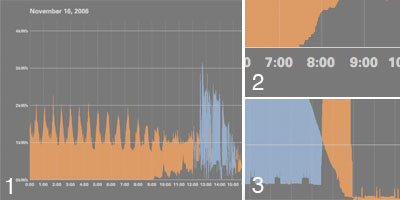
The radial displays make it difficult to easily see a whole day's worth of information, nor quickly compare different points in time. Instead, a traditional line graph showing the net values between production and consumption over 24 hours makes it easier to see this information as an overview. The data begins to tell more of a story, such as when the sun first hit's the house's PV panels (image #2) and when a group enters the house and turns systems on/up (image #3). For the class final, some of the days of saved data were graphed and displayed vertically on a 16 inch by 56 inch poster, so one could more easily compare points in time between the days. Although this type of data display is not currently present into the radial live display, the plan is to integrate this information into the live radial interface.