Writing

Cake Versus Pie: A Scientific Approach

Allie Brosh, who appears to be some sort of genius, brings us definitive arguments in the cake versus pie debate. Best to read the entire treatise, but here are a few highlights on how clearly pie defeats cake:

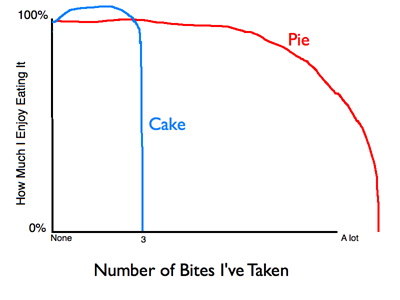
Ability of enjoyment to be sustained over time

what am i doing?

Couldn’t agree more: it always seems like a good idea on the first bite, and then I catch myself. What am I doing? I hate cake. Another graphic:

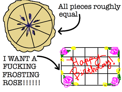
Unequal frosting distribution is a problem

mommy says don't swear about your dessert

I grew up requesting pie for my birthday (strawberry rhubarb, thank you very much) instead of cake. This resonates. More importantly (for this site), Brosh cites the enormous impact of pie vs. cake for information design and visualization:

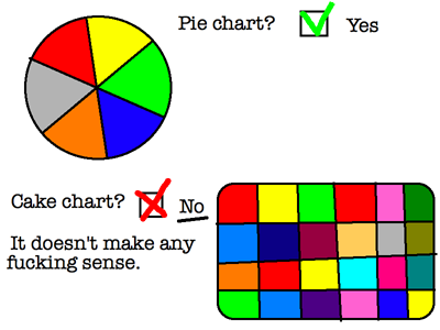
Pie is more scientifically versatile:

eat your heart out, tufte. no pun intended.

Again, you really should read the full post, or the rest of her site for that matter. Her piece on the Alot is alone worth the price of admission.

Friday, May 7, 2010 | infographics, represent  
Book

Visualizing Data Book CoverVisualizing Data is my 2007 book about computational information design. It covers the path from raw data to how we understand it, detailing how to begin with a set of numbers and produce images or software that lets you view and interact with information. When first published, it was the only book(s) for people who wanted to learn how to actually build a data visualization in code.

The text was published by O’Reilly in December 2007 and can be found at Amazon and elsewhere. Amazon also has an edition for the Kindle, for people who aren’t into the dead tree thing. (Proceeds from Amazon links found on this page are used to pay my web hosting bill.)

Examples for the book can be found here.

The book covers ideas found in my Ph.D. dissertation, which is the basis for Chapter 1. The next chapter is an extremely brief introduction to Processing, which is used for the examples. Next is (chapter 3) is a simple mapping project to place data points on a map of the United States. Of course, the idea is not that lots of people want to visualize data for each of 50 states. Instead, it’s a jumping off point for learning how to lay out data spatially.

The chapters that follow cover six more projects, such as salary vs. performance (Chapter 5), zipdecode (Chapter 6), followed by more advanced topics dealing with trees, treemaps, hierarchies, and recursion (Chapter 7), plus graphs and networks (Chapter 8).

This site is used for follow-up code and writing about related topics.