The growth of the Processing project
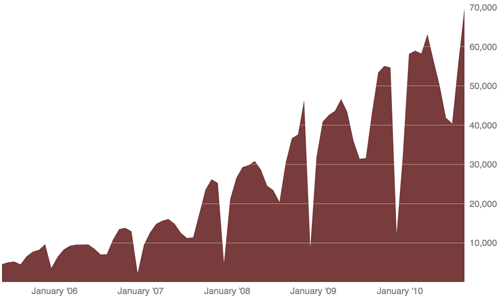
Number of Processing users, every four weeks, since 2005:

Long version: this is a tally of the number of unique users who run the Processing environment every four weeks, as measured by the number of machines checking for updates.
Of note:
- In spite of the frequently proclaimed “death of Java” or “death of Java on the desktop,” we’re continuing to grow. This isn’t to say that Java on the desktop is undead, but this frustrating contradiction presents a considerable challenge for us… I’ll write more about that soon.
- There’s a considerable (even comical) dip each January, when people decide that the holidays and drinking with their family is more fun than coding (or maybe that’s only my household). Things also tail off during the summer into August. These two trends are amplified due to the number of academic users, however other data I’ve seen (web traffic, etc) suggests that the rest of the world actually operates on something like the academic calendar as well.
About the data:
- This is a very conservative estimate of the number of Processing users out there. Our software is free — we don’t have a lot to gain by inflating the numbers.
- This covers only unique users — we don’t double count the same person in each 4-week period. Otherwise our numbers would be much higher.
- This is not downloads, which are also significantly higher.
- This is every four weeks, not every month. Unless there are 13 months in a year. Wait, how many months are in a year?
- This only covers people who are using the actual Processing Development Environment — no Eclipse users, etc.
- Use of processing.js or spinoff projects are not included.
- This doesn’t include anyone who has disabled checking for updates.
- This doesn’t include anyone not connected to the net.
- The unique ID is stored in the preferences.txt file, so if a single login is used on a machine, that’s counting multiple people. Conversely, if you have multiple machines, you’ll be counted more than once.
- Showing the data by day, week, or year all show the same overall trend.
This is a pretty lame visualization of the numbers, and I’m not even showing other interesting tidbits like what OS, version, and so on are in use. Maybe we can release the data if we can figure out an appropriate way to do so.

