Writing

Iron Woman

Apropos of the recent film graphics post, Jessica Helfand at Design Observer writes about the recently released Iron Man:

Iron Man is the fulfillment of all the computer-integrated movies were ever meant to be, and by computer-integrated, I mean just that: beyond the technical wizardry of special effects, this is a film in which the computer is incorporated, like a cast member, into the development of the plot itself.

I’ve not seen the movie but the statement appears to be provocative enough to elicit cheers and venom from the scribes in the comments section. (This seems to be common at Design Observer, are designers really this angry and unhappy? How ’bout them antisocial personal attacks! I take back what I wrote in the last post about wanting to be a designer when I grow up. Some thick skin or self-fashioned military grade body armor over at DO.)

On the other hand, a more helpful post linked to the lovely closing title sequence, designed by Danny Yount of Prologue.

endtitles-500.jpg

I wish they didn’t use Black Sabbath. Is that really the way it’s done in the film? Paranoid is a great album (even if Iron Man is my least favorite track) but the titles and the music couldn’t have less to do with each other. Enjoy the music or enjoy the video; just don’t do ’em together.

Saturday, June 14, 2008 | motion, movies  

All the water in the world

From a post by Dan Phiffer, an image by Adam Nieman and the Science Photo Library.

All the water in the world (1.4087 billion cubic kilometers of it) including sea water, ice, lakes, rivers, ground water, clouds, etc. Right: All the air in the atmosphere (5140 trillion tonnes of it) gathered into a ball at sea-level density. Shown on the same scale as the Earth.

label-moved-and-resaved.jpg

More information at the original post. (Thanks to Eugene for the link.)

Saturday, June 14, 2008 | infographics, scale  

Rick Astley & Ludacris

Someday I want to write like Ludacris, but for now I’ll enjoy info graphics of his work. Luda not only knows a lot of young ladies, but can proudly recite the range of area codes in which they live. Geographer (and feminist) Stefanie Gray took it upon herself to make a map:

finalareacodes-500px.jpg

You’ll need background music while taking a look; and I found a quick refresher of the lyrics also informative. More discussion and highlights of her findings can be found on Strange Maps, who first published Stefanie’s image.

In related news, someone else has figured out Rick Astley:

composite-500px.jpg

I’ve added the album cover at left so that you can look into his eyes and see his honest face for yourself. If you’re not a proud survivor of the 80s (or perhaps if you are), the single can be had for a mere 99¢. Or if that only gets you started, you can pick up his Greatest Hits. Someone also made another version of the graphic using the Google chart API (mentioned earlier), though it appears less analytically sound (accurate).

More from song charts at this earlier post.

Saturday, June 14, 2008 | infographics, music  

Paola Antonelli on Charlie Rose

This is from May, and the Design and the Elastic Mind show has now finished, but Paola Antonelli’s interview with Charlie Rose is well worth watching.

Paola’s incredibly sharp. Don’t turn it off in the first few minutes, however; I found that it wasn’t until about five or even ten minutes into the show that she began to sound like herself. I guess it takes a while to get past the requisite television pleasantries and the basic design-isms.

The full transcript doesn’t seem to be available freely, however some excerpts:

And I believe that design is one of the highest forms of human creative expression.

I would never dare say that! But I’ll secretly root for her making her case.

And also, I believe that designers, when they’re good, take revolutions in science and in technology, and they transform them into objects that people like us can use.

Doesn’t that make you want to be a designer when you grow up?

Regarding the name of the show, and the notion of elasticity:

…it was about showing how we need to adapt to different conditions every single day. Just work across different time zones, go fast and slow, use different means of communication, look at things at different scales. You know, some of us are perfectly elastic. And instead, some others get a little bit of stretch marks. And some others just cannot deal with it.

And designers help us cope with all these changes.

Her ability to speak plainly and clearly reinforces her point about designers and their role in society. (And if you don’t agree, consider what sort of garbage she could have said, or rather that most would have said, speaking about such a trendy oh-so-futuristic show.)

In the interest of full disclosure, she does mention my work (very briefly), but that’s not until about halfway through, so it shouldn’t interfere with your enjoyment of the rest of the interview.

Thursday, June 12, 2008 | iloveme, speaky  

Spying on teenagers: too much information

Excellent article from the Boston Globe Sunday Magazine on how parents of teenagers are handling their over-connected kids. Cell phones, text messaging, instant messaging, Facebook, MySpace, and to a lesser extent (for this age group) email mean that a lot of information and conversation is shared and exchanged. And as with all new technologies, it can all be tracked and recorded, and more easily spied upon. (More easily meaning that a parent can read a day worth of IM logs in a fairly quick sitting—something that couldn’t be done with a day’s worth of telephone conversations.) There are obvious and direct parallels to the U.S. government monitoring its own citizens, but I’ll return to that in a later post.

The article starts with a groan:

One mom does her best surveillance in the laundry room. Her teenage son has the habit of leaving his cellphone in the pocket of his jeans, so in between sorting colors and whites, she’ll grab his phone and furtively scroll through his text messages from the past week to see what he’s said, whom he’s connected with, and where he’s been.

While it’s difficult to say what this parent was specifically hoping to find (or what they’d do with the information), it worsens as it sinks to a level of cattiness:

Sometimes, she’ll use her own phone to call another mom she’s friendly with and share her findings in hushed tones.

Further in, some insight from Sherry Turkle:

MIT professor Sherry Turkle is a leading thinker on the relationship between human beings and technology. She’s also the mother of a teenage girl. So she knows what she’s talking about when she says, “Parents were not built to know the kinds of things that technology makes possible.”

(Emphasis mine.) This doesn’t just go for parents, it’s a much bigger issue of spying on the day-to-day habits and ramblings of someone else. This is the same reason why you should never read someone’s email, like a significant other, a spouse, a friend. No matter how well you know the sender and recipient, you’re still not them. You don’t think like them. You don’t see the world the way they do. You simply don’t have proper context, nor the understanding of their relationship with one another. You probably don’t even have the entire thread of even just this one email conversation. I’ve heard from friends who read an email belonging to their significant other, only to wind up in tears and expecting the worst.

This scenario never ends well: you can either keep it in and remain upset, or you can confront the person. In which case, one of two things will happen. One, that your worst fear will be true (“he’s cheating!”) and you’ll be partially indicted in the mess because you’ve spied (“how could you read my email?”), and you’ve lost the moral high ground you might otherwise have had (“I can’t believe you didn’t trust me”). Or two, that you’ve blown something out of proportion, and destroyed the trust of that person: someone that you cared about enough to be concerned to the point of reading their private email.

Returning to the article, one of the scenarios I found notable:

…there’s a natural desire, and a need, for teenagers to have their own parent-free zone as they get older.

As a graduating senior at Cambridge Rindge and Latin, Sam McFarland is grateful his parents trusted him to make the right decisions once he had established himself as worthy of the trust. A few of his friends had parents who were exceedingly vigilant. The result? “You don’t hang out at those kids’ houses as much,” Sam says.

So there’s something fascinating about this—that not only is it detrimental to your kid’s development to be overly involved, but that it presents a socialization problem for them because they become ostracized (even if mildly) because of your behavior.

And when parents confront?

When one of his friends was 14, the kid’s parents reprimanded him for something he had talked about online. Immediately, he knew they had been spying on him, and it didn’t take long for him to determine they’d been doing it for some time.” He was pretty angry,” Sam says, “He felt kind of invaded.” At first, his friend behaved, conscious that his parents were watching his every move.” But then it reached a tipping point,” Sam says. “He became so fed up about it that, not only didn’t he care if they were watching, but he began acting out, hoping they were watching or listening so he could upset them.”

I’m certain that this would have been my response if my parents had done something like this. (As if teenagers need something to fuel their adversarial attitude toward their parents.) But now you have a situation where a reasonably good kid has made an active decision to behave worse in response to his parents’ mistrust and attempt to rein him in.

The article doesn’t mention what he had done, but how bad could it have been? And that is the crux of the situation: What do these parents really expect to find, and how can that possibly be outweighed by breaking that bond of trust?

It’s also easy to spy, so one (technology savvy) parent profiled goes with what he calls his “fear of God” speech:

Greg warned them, “I can know everything you’re doing online. But I’m not going to invade your privacy unless you give me a reason to.”

By relying on the threat of intervention rather than intervention itself, Greg has been able to avoid the drawbacks that several friends of mine told me they experienced after monitoring their teenagers’ IM and text conversations. These are all great, involved parents who undertook limited monitoring for the right reasons. But they found that, in their hunt for reassurance that their teenager was not engaging in dangerously bad behavior, they were instead worn down by the little disappointments – the occasional use of profanities or mean-spirited name-calling – as well as the mind-numbing banality of so much teen talk.

And that’s exactly it—tying together the points of 1) you’re not in their head and 2) what did you expect to find? As you act out in different ways (particularly as a teenager), you’re trying to figure out how things fit. Nobody’s perfect, and they need some room to be their own age, particularly with their friends. Which made me particularly interested in this quote:

Leysia Palen, the University of Colorado professor, says the work of social theorist Erving Goffman is instructive. Goffman talked about how we all have “front-stage” and “backstage” personas. For example, ballerinas might seem prim and perfect while performing, only to let loose by smoking and swearing as soon as they are behind the curtain. “Everyone needs to be able to retreat to the backstage,” Palen says. “These kids need to learn. Maybe they need to use bad language to realize that they don’t want to use bad language.

Unfortunately the article also goes astray with its glorification of the multitasking abilities of today’s teenagers:

On an average weeknight, Tim has Facebook and IM sharing screen space on the Mac outside his bedroom as he keeps connected with dozens of friends simultaneously. His Samsung Slider cellphone rests nearby, ready to receive the next text message…Every once in a while, he’ll strum his guitar or look up at the TV to catch some Ninja Warrior on the G4 network. Playing softly in the background is his personal soundtrack that shuffles between the Beatles and a Swedish techno band called Basshunter. Amid all this, he is doing his homework.

Yes, in truly amazing fashion, the human race has somehow evolved in the last ten years to be capable of effectively multitasking between this many different things at once. I don’t understand why people (much less parents) buy this. We have a finite attention span, and technology suggests ways to carve it up into ever-smaller slices. I might balance email, phone calls, writing, and watching a Red Sox game in the background, but there’s no way I’m gonna claim that I’m somehow performing all those things at 100%, or even that as I focus in on one of them, I’m truly 100% at that task. Those will be my teenagers in the sensory deprivation tank while they work on Calculus and U.S. History.

And to close, a more accurate portrayal of multitasking:

It’s not uncommon to see two teenage pals riding in the back of a car, each one texting a friend somewhere else rather than talking to the friend sitting next to them. It’s a throwback to the toddler days, when kids engage in parallel play before they’re capable of sustained interaction.

Thursday, June 12, 2008 | overload, privacy  

You’ve never actually known what the question is

Douglas Adams addresses “What is the Question?”, the mantra of Visualizing Data, my Ph.D. dissertation, and hopefully haunts any visualization student I’ve ever taught:

The answer to the Great Question…?
Yes…!
Is…
Yes…!
Is…
Yes…!!!…?
“Forty-two,” said Deep Thought with infinite majesty and calm.
“Forty-two!” yelled Loonquawl, “Is that all you’ve got to show for seven and a half million years of work?”
“I checked it very thoroughly,” said the computer, “and that quite definitely is the answer. I think the problem, to be quite honest with you, is that you’ve never actually known what the question is.”

The Hitchhiker’s Guide to the Galaxy

(Found at the FontForge FAQ)

Monday, June 9, 2008 | question, vida  

Making fun of movie infographics only gets you so far

As much as snickering about computers in movies might make me feel smart, I’ve since become fascinated by how software, and in particular information, is portrayed in film. There are many layers at work:

  1. Film is visual storytelling. As such, you have to be able to see everything that’s happening. Data is not visual, which is why you see symbols that represent data used more often: It’s 2012 but they’re still storing data on physical media because at some point, showing the data being moved is important. (Nevermind that it can be transmitted thousands of kilomteters in a fraction of a second.) This is less interesting, since it means a sort of dumbing-down of the technology, and presents odd contradictions. It can also make things ugly: progress bars are often full screen interface elements, or how many technology-heavy action flicks have included the pursuit of a computer disk? (On the other hand, the non-visual aspect can be a positive one: a friend finishing film school at NYU once pursued a nanotechnology thriller as his final film because “you can’t see it.” It would allow him to tackle a technical subject without needing the millions of dollars in props.)
  2. Things need to “feel” like a computer. When this piece appeared in the Hulk, they added extra gray interface elements in and around it so that it didn’t look too futuristic. Nevermind that it was a real, working piece of software for browsing the human genome. To the consternation of a friend who worked on Minority Report, on-screen “windows” in the interface all had borders around them. If you have a completely fluid interface with hands, motion, and accessing piles of video being output from three people in a tank, do we really need…title bars?
  3. It’s not just computers—anything remotely complicated is handled in this manner. Science may be worse off than software, though I don’t think scientists complain as loudly as the geeks did when they heard “This is UNIX, I know this!” (My personal favorite in that one was a scene where a video phone discussion was actually an actor talking to a QuickTime movie—you could see the progress bar moving left to right as the scene wore on.)
  4. There’s a lot of superfluous gimmickery that goes on too. There’s just no way you’re gonna show important information in a film without random numbers twitching or counting down. Everything is more important when we have know the current time with millisecond accuracy (that’s three digits after the decimal point for seconds). Or maybe some random software code (since that’s incomprehensible but seems significant). This is obvious and sometimes painful to watch, except in the case of a talented visual designer who makes it look compelling.
  5. Finally, the way that computers are represented in film has something to do with how we (society? lay people? them?) think that computers should work.

It’s that last one that is the fascinating point for me: by virtue of the intent to reach a large audience, a movie streamlines the way that information is handled and interfaces behave. A their best, it suggests where we need to go (at their worst, they blink “Access Denied”). It’s easy to point out the ridiculousness of the room full of people hunched over computers at CIA headquarters and the guy saying “give me all people with last name Jones in the Baltimore area” and in the next scene that’s tallied against satellite video (which of course can be enhanced ad infinitum). But think about how ridiculous those scenes looked twenty years ago, and the parts of that scenario that are no longer far-fetched as the population at large gets used to Google and having satellite imagery available for the price of typing a query. Even the most outrageous—the imagery enhancement—has had breakthroughs associated with it, some of which can be done by anyone using Photoshop, like the case of people trying to figure out if Bush was wearing a wire at the debates in 2004. (Contradicting their earlier denials, Bush’s people later admitted that he was wearing a bulletproof vest.)

That’s the end of today’s lecture on movie graphics, so I’ll leave you with a link to Mark Coleran, a visual designer who has produced many such sequences for film.

coleran-510.jpg

I recommend the large version of his demo reel, and I’ll be returning to this topic later with more designers. Drop me an email if you have favorite designer or film sequence.

Monday, June 9, 2008 | infographics, movies  

Somewhere between graffiti and terrorism

boy-noshadow.jpgMatt Mullenweg, creator of WordPress, speaking at the “Future of Web Apps” conference in February:

Spammers are “the terrorists of Web 2.0,” Mullenweg said. “They come into our communities and take advantage of our openness.” He suggested that people may have moved away from e-mail and toward messaging systems like Facebook messaging and Twitter to get away from spam. But with all those “zombie bites” showing up in his Facebook in-box, he explained, the spammers are pouncing on openness once again.

I don’t think that “terrorists” is the right word—they’re not taking actions with an intent to produce fear that will prevent people from using online communities (much less killing bloggers or kidnapping Facebook users). What I like about this quote is the idea that “they take advantage of openness,” which puts it well. There needs to be a harsher way to describe this situation than “spamming” which suggests a minor annoyance. There’s nothing like spending a Saturday morning cleaning out the Processing discussion board, or losing an afternoon modifying the bug database to keep it safer from these losers. It’s a bit like people who crack machines out of maliciousness or boredom—it’s incredibly time consuming to clean up the mess, and incredibly frustrating when it’s something done in your spare time (like Processing) or to help out the group (during grad school at the ACG).

So it’s somewhere between graffiti and terrorism, but it doesn’t match either because the social impact at either end of that scale is incredibly different (graffiti can be a positive thing, and terrorism is a real world thing where people die).

On a more positive note, and for what it’s worth, I highly recommend WordPress. It’s obvious that it’s been designed and built by people who actually use it, which means that the interface is pleasantly intuitive. And not surprising that it was initially created by such a character.

Monday, June 9, 2008 | online, social  

The cloud over the rainforest brings a thunderstorm

And now, the opposite of the Amazon plot posted yesterday. No sooner had I finished writing about their online aptitude that they have a major site outage, greeting visitors with a Http/1.1 Service Unavailable message.

amazon-down-500.jpg

Plot from this article on News.com.

Friday, June 6, 2008 | goinuptotheserverinthesky, notafuturist  

Proper Analysis of Salary vs. Performance?

Got an email from Mebane Faber who noted the roughly inverse correlation you currently see in salaryper, and asking about whether I’d done proper year-end analysis. The response follows:

I threw the project together as sort of a fun thing out of curiosity, and haven’t taken the time to do a proper analysis. However you can see in the previous years that the inverse relationship happens each year at the beginning of the season, and then as it progresses, the big market teams tend to mow down the small guys. Or at least those that are successful–the correlation between salary and performance at the end of a season is generally pretty haphazard. In fact, it’s possible that the inverse correlation at the beginning of the season is actually stronger than the positive correlation at the end.

I think the last point is kinda funny, though I’d imagine there’s a less funny statistics term for that phenomenon. Such a fine line between funny and sounding important.

Friday, June 6, 2008 | feedbag, salaryper  

Distribution of the foreign customers at a particular youth hostel

Two pieces representing youth hostel data from Julien Bayle. Both adaptations of the code found in Visualizing Data. The first a map:

bayle-worldmap.jpg

The map looks like most maps of data connected to a world map, but the second representation uses a treemap, which is much more effective (meaning that it answers his question much more directly).

bayle-treemap.jpg

The image as background is a nice technique, since if you’re not using colors to differentiate individual sectors, the treemap tends to be dominated by the outlines around the squares (search for treemap images and you’ll see what I mean). The background image lets you use the border lines, but the visual weight of the image prevents them from being in the foreground.

Anyone else with adaptations? Pass them along.

Thursday, June 5, 2008 | adaptation, vida  

I Think Somebody Needs A Hug

I tend to avoid reading online comments since they’re either overly negative or overly positive (neither is healthy), but I laughed out loud after happening across this comment from a post about salaryper on the Freakonomics blog at the New York Times site:

How do I become a “data visualization guru?”
Seems like a pretty sweet gig. But you probably need a degree in Useless Plots from Superficial Analysis School.

– Ben D.

No my friend, it takes a Ph.D. in Useless Plots from Superficial Analysis School. (And if you know this guy, please take him out for a drink — I’m concerned he’s been indoors too long.)

Thursday, June 5, 2008 | reviews, salaryper  

Obama Limited to 16 Bits

I guess I never thought I’d read about the 16-bit limitations of Microsoft Excel in mainstream press (or at least outside the geek press), but here it is:

Obama’s January fundraising report, detailing the $23 million he raised and $41 million he spent in the last three months of 2007, far exceeded 65,536 rows listing contributions, refunds, expenditures, debts, reimbursements and other details.

Excel has since its inception been limited to 65,536 rows, the maximum number you get when you represent the row number using two bytes. Mr. Millionsfromsmallcontributions has apparently flown past this limit in his FEC reports, forcing poor reporters to either use Microsoft Access (a database program) or pray for the just-released Excel 2007, where in fact the row restriction has been lifted.

In the past the argument against fixing the restriction had always been a mixture of “it’s too messy to upgrade something like that” and “you shouldn’t have that many rows of data in a spreadsheet anyway, you should use a database.” Personally I disagree with the latter; and as silly as the former sounds, it’s been the case for a good 20 years (or was the row limit even lower back then?)

The OpenOffice project, for instance, has an entire page dedicated to fixing the issue in OpenOffice Calc, where they’re limited to 30,000 rows—the limit being tied to 32,768, or the number you get with 15 bits instead of 16 (use the sixteenth bit as the sign bit indicating positive or negative, and you can represent numbers from -32768 to 32767 instead of unsigned 16 bit values that range from 0 to 65535).

Bottoms up for the first post tagged both “parse” and “politics”.

Thursday, June 5, 2008 | parse, politics  

What’s that big cloud over the rainforest?

As the .com shakeout loomed in the late 90s, I always assumed that:

  1. Most internet-born companies would disappear.
  2. Traditional (brick & mortar) stores would eventually get their act together and have (or outsource) a proper online presence. For instance Barnes & Noble hobbling toward a usable site, and Borders just giving up and turning over their online presence to Amazon. The former comical, the latter brilliant, though Borders has just returned with their own non-Amazonian presence. (Though I think the humor is now gone from watching old-school companies trying to move online.)
  3. Finally, a few new names—namely the biggest ones, like Amazon—would be left that didn’t disappear with the others from point #1.

Basically, that not much would change. A couple new brands would emerge, but that there wasn’t really room in people’s heads for that many new retailers or services. (It probably didn’t help that all their logos were blue and orange, and had names like Flooz, Boo and Kibu that feel natural on the tongue and inspire buyer loyalty and confidence.)

aws_bandwidth.gifBut not only did more companies stick around, some seem to be successfully pivoting into other areas. From Amazon:

In January of 2008 we announced that the Amazon Web Services now consume more bandwidth than do the entire global network of Amazon.com retail sites.

This from a blog post with this plot of the bandwidth use for both sides of the business.

Did you imagine that the site where you could buy books cheaper than anywhere else in 1998 would ten years later exceed the bandwidth from that with services for data storage and cloud computing? Of course, this announcement doesn’t say anything about their profits at this point, but I don’t think anyone expected Steve Jobs to turn Apple into a toy factory and start turning out music players and cell phones to have it become half their business within just a few years. (That’s half as in, “beastly silver PCs and shiny black and white laptops seem important and all, but those take real work…why bother?”)

But the point (aside from subjecting you to a long-winded description of .com history and my shortcomings as a futurist) has more to do with Amazon becoming a business that’s dealing purely in information. The information economy is all about people moving bits and ideas around (abstractions of things), instead of silk, furs, and spices (actual physical things). And while books are information, the growth of Amazon’s data services business—as evidenced by that graph—is one of the strongest indicators I’ve seen of just how real the non-real information economy has become. Not that the information economy is something new; but that the groundwork has been laid in the preceding decades where something like Amazon Web Services can be successful.

And since we’re on the subject of Amazon, I’ll close with more from Jeff Bezos from “How the Web Was Won” in this month’s Vanity Fair:

When we launched, we launched with over a million titles. There were countless snags. One of my friends figured out that you could order a negative quantity of books. And we would credit your credit card and then, I guess, wait for you to deliver the books to us. We fixed that one very quickly.

Or showing his genius early on:

When we started out, we were packing on our hands and knees on these cement floors. One of the software engineers that I was packing next to was saying, You know, this is really killing my knees and my back. And I said to this person, I just had a great idea. We should get kneepads. And he looked at me like I was from Mars. And he said, Jeff, we should get packing tables.

Thanks to Eugene for passing along the links.

Thursday, June 5, 2008 | goinuptotheserverinthesky, infographics, notaneconomist  

Movies, Mapping, and Motion Graphics

Elegantly done, and some of the driest humor in film titles you might ever see, the opening sequence from Death at a Funeral.

Excellent (and appropriate) music, color, and type; does a great job of setting up the film. IMDB description:

Chaos ensues when a man tries to expose a dark secret regarding a recently deceased patriarch of a dysfunctional British family

Or the tagline:

From director Frank Oz comes the story of a family that puts the F U in funeral.

Tuesday, June 3, 2008 | mapping, motion, movies  

Mark in Madrid

Mark Hansen is one of the nicest and most intelligent people you’ll ever meet. He was one of the speakers at the symposium at last Fall’s Visualizar workshop in Madrid, and Medialab Prado has now put the video of Mark’s talk (and others) online. Check it out:

Mark has a Ph.D. in Statistics and along with his UCLA courses like Statistical Computing and Advanced Regression, has taught one called Database Aesthetics, which he describes a bit in his talk. You might also be familiar with his piece Listening Post, which he created with Ben Rubin.

Tuesday, June 3, 2008 | speaky  

Goodbye 15 minutes: 1.5 seconds is the new real time

As cited on Slashdot, Google has announced that they’ll be providing real-time stock quotes from NASDAQ. As referred to in the title, this “real time” isn’t likely the same “real time” that financial institutions get for their “quotes,” since they still need to process the data and serve it up to you somehow. But for an old internet codger who thought quotes delayed by 15 minutes back in 1995 was pretty nifty, this is just one more sign of the information apocalypse.

wastler_a_100x100b.jpg

The Wall Street Journal is also in on the gig, and Allen Wastler from CNBC crows that they’re also a player. Interestingly, the data will be free from the WSJ at their Markets Data Center page—one more sign of a Journal that’s continuing to open up its grand Oak doors to give us plebes a peek inside their exclusive club.

An earlier post from the Google blog has some interesting details:

As a result, we’ve worked with the SEC, the New York Stock Exchange (NYSE) and our D.C. trade association, NetCoalition, to find a way to bring stock data to Google users in a way that benefits users and is practical for all parties. We have encouraged the SEC to ensure that this data can be made available to our users at fair and reasonable rates, and applaud their recent efforts to review this issue. Today, the NYSE has moved the issue a great step forward with a proposal to the SEC which if approved, would allow you to see real-time, last-sale prices…

The NYSE hasn’t come around yet, but the move by NASDAQ should give them the additional competitive push to make it happen soon enough. As it appears, this had more to do with getting SEC approval than the exchanges themselves. Which, if you think about it, makes sense—and if you think about it more, makes one wonder what sort of market-crashing scenario might be opened by millions having access to the live data. Time to write that movie script.

At right: CNBC’s publicity photo of Allen Wastler, which appears to have been shot in the 1930s and later hand-colorized. Upon seeing this, Wastler was then heard to say to the photo and paste-up people, “That’s amazing, can you also give me a stogie?” Who doesn’t want that coveted fat cat, robber baron blogger look.

Tuesday, June 3, 2008 | acquire  

Melting Ants for Science (or, Solenopsis invicta as Dross)

Another visualization from the see-through fish category, a segment from Sunday Morning about Dr. Walter Tschinkel who studies the structure of ant colonies using aluminum casts. Three easy steps: Heat aluminum to 1200 degrees, pour it down an ant hole, and dig away carefully to reveal the intricate structure of the interior:

What amazing structures! Whenever you think you’ve made something that looks “good,” you can count on nature to dole out humility. Maybe killing the ants in the process is a little way to get the control back. Um, or something.

Thursday, May 29, 2008 | physical, science  

Summerschool in Wiesbaden

sv-summerschool.jpg

Scholz & Volkmer is running a Summerschool program this July and is looking for eight students from USA and Europe. (Since “summer school” is one word, you may have already guessed that it’s based in Germany.) This is the group behind the SEE Conference that I spoke at in April. (Great conference, and the lectures are online, check ’em out.)

The program is run by their Technical Director (Peter), who is a great guy. They’re looking for topics like data visualization, mobile applications, interaction concepts, etc. and are covering flight and accomodations plus a small stipend during your four week stay. Should be a great time.

Tuesday, May 27, 2008 | opportunities  

Schneier, Terrorists and Accuracy

Some thoughtful comments passed along by Alex Hutton regarding the last post:

Part of the problem with point technology solutions is in the policies of implementation. IMHO, we undervalue the subject matter expert, or operate as a denigrated bureaucracy which does not allow the subject matter expert the flexibility to make decisions. When that happens, the decision is left to technology (and as you point out, no technology is a perfect decision maker).

I thought it was apropos that you brought in the Schneier example. I’ve been very much involved in a parallel thought process in the same industry as he, and we (my partner and I) are coming to a solution that attempts to balance technology, point human decision, and the bureaucracy within which they operate.

If you believe the Bayesians, then the right Bayesian network mimics the way the brain processes qualitative information to create a belief (or in the terms of Bayesians, a probability statement used to make a decision). As such, the current way we use the technology (that policy of implementation, above) is faulty because it minimizes that “Human Computational Engine” for a relatively unsophisticated, unthinking technology. That’s not to say that technologies like facial recognition are worthless – computational engines, even less magic ones that aren’t 99.99% accurate, are valid pieces of prior information (data).

Now in the same way, Human Computational Engines are also less than perfectly accurate. In fact, they are not at all guaranteed to work the same way twice – even by the same person unless that person is using framework to provide rigor, rationality, and consistency in analysis.

So ideally, in physical security (or information security where Schneier and I come from) the imperfect computer detection engine is combined with a good Bayesian network and well trained/educated/experienced subject matter experts to create a more accurate probability statement around terrorist/non-terrorist – one that at least is better at identifying cases where more information is needed before a person is prevented from flying, searched and detained. While this method, too, would not be 100% infallible (no solution will ever be), it would create a more accurate means of detection by utilizing the best of the human computational engine.

I believe the Bayesians, just 99.99% of the time.

Thursday, May 15, 2008 | bayesian, feedbag, mine, security  

Human Computation (or “Mechanical Turk” meets “Family Feud”)

richard_dawson.jpgComputers are really good at repetitive work. You can ask a computer to multiply two numbers together seven billion times and not only will it not complain, it’ll probably have seven billion answers for you a few seconds later. Ask a person to do the same thing and they’ll either walk away at the outset, realizing the ridiculousness of the task, or they’ll get through the first few tries and lose interest. But even the fact that a human can recognize the ridiculousness of the task is important. Humans are good at lots of things—like identifying a face in a crowd—that cannot be addressed by computation with the same level of accuracy.

Visualization is about the interface between what humans are good at, and what computers are good at. First, the computer can crunch all seven billion numbers, then present the results in a way that we can use our own perceptual skills to identify what’s important or interesting. (This is also why the design of a visualization is a fundamentally human task, and not something to be left to automation.)

This is also the subject of Luis von Ahn’s work at Carnegie Mellon. You’re probably familiar with CAPTCHA images—usually wavy numbers and letters that you have to discern when signing up for a webmail account or buying tickets from Ticketmaster. The acronym stands for “Completely Automated Public Turing Test to Tell Computers and Humans Apart,” a clever mouthful referring to Alan Turing’s work in discerning man or machine. (I encourage you to read about them, but this is already getting long so I won’t get into it here.)

More interesting than CAPTCHA, however, is the whole notion that’s behind it: that it’s an example of relying on humans to do what they’re best at, though it’s a task that’s difficult for computers. (Sure, in recent weeks, people have actually found ways to “break” CAPTCHAs in specific cases, but that’s not important here.) For instance, the work was extended to the Google Image Labeler, described as follows:

You’ll be randomly paired with a partner who’s online and using the feature. Over a two-minute period, you and your partner will:

  • View the same set of images.
  • Provide as many labels as possible to describe each image you see.
  • Receive points when your label matches your partner’s label. The number of points will depend on how specific your label is.
  • See more images until time runs out.

Prior to this, most image labeling systems had to do with getting volunteers to name or tag images individually. As you can imagine, the quality of tags suffer considerably because of everything from differences in how people perceive or describe what they see, to individuals who try to be a little too clever in choosing tags. With the Image Labeler game, that’s turned around backwards, where there is a motivation to use tags that match the other person, thus minimizing the previous problems. (It’s “Mechanical Turk” meets “Family Feud”.) They’ve also applied the same ideas to scanning books—where fragments of text that cannot be recognized by software are instead checked by multiple people.

More recently, von Ahn’s group has expanded these ideas in Games With A Purpose, a site that addresses these “casual games” more directly. The new site is covered in this New Scientist article, which offers additional tidbits (perspective? background? couldn’t think of the right word).

You can also watch Luis’ Google Tech Talk about Human Computation, which if I’m not mistaken, led to the Image Labeler project.

(We met Luis a couple times while at CMU and watched the Superbowl with his awesome fiancée Laura, cheering on her hometown Chicago Bears against those villainous Colts. We were happy when he received a MacArthur Fellowship for his work—just the sort of person you’d like to get such an award that highlights people who often don’t quite fit in their field.)

Mommy can we play infringing on my civil liberties?Returning to the earlier argument, algorithms to identify a face in a crowd are certainly improving. But without a significant breakthrough, their usefulness will be significantly limited. One commonly hyped use for such systems is airport security. Bruce Schneier explains the problem:

Suppose this magically effective face-recognition software is 99.99 percent accurate. That is, if someone is a terrorist, there is a 99.99 percent chance that the software indicates “terrorist,” and if someone is not a terrorist, there is a 99.99 percent chance that the software indicates “non-terrorist.” Assume that one in ten million flyers, on average, is a terrorist. Is the software any good?

No. The software will generate 1000 false alarms for every one real terrorist. And every false alarm still means that all the security people go through all of their security procedures. Because the population of non-terrorists is so much larger than the number of terrorists, the test is useless. This result is counterintuitive and surprising, but it is correct. The false alarms in this kind of system render it mostly useless. It’s “The Boy Who Cried Wolf” increased 1000-fold.

Given the number of travelers at Boston Logan in 2006, that would be two “terrorists” identified per day. (And with Schneier’s one in ten million is a terrorist figure, that would be two or three terrorists per year…clearly too generous, which makes the face detection accuracy even worse than how he describes it.) I find myself thinking about the 99.99% accuracy number as I stare at the back of heads lined up at the airport security checkpoint—itself a human problem, not a computational problem.

Thursday, May 15, 2008 | cs, games, human, perception, security  

Gender and Information Graphics

Just received this in a message from a journalism grad student studying information graphics:

I have looked at 2 years worth of Glamour (and Harper’s Bazaar too) magazines for my project and it shows that Glamour and other women’s magazines have less amount of information graphics in the magazines compared to men’s magazines, such as GQ and Esquire. Why do you think that is? Do you think that is gender-related at all?

I hadn’t really thought about it much. For the record, my reply:

My fiancée (who knows a lot more about being female than I do) pointed out that such magazines have much less practical content in general, so it may have more to do with that than a specific gender thing. Though she also pointed out that, for instance, in today’s news about the earthquake in China, she felt that women might be more inclined to read a story with the faces of those affected than one with information graphics tallying or describing the same.

I think you’d need to find something closer to a male equivalent of Glamour so that you can cover your question and remove the significant bias you’re getting for the content. Though, uh, a male equivalent of Glamour may not really exist… But perhaps there are better options.

And as I was writing this, she responded:

Finding a male equivalent of Glamour is hard but they actually do have some hard-hitting stories near the back in every issue that sometimes might be overshadowed by all the fashion and beauty stuff. Actually, finding a female equivalent of GQ or Esquire is also hard because they sort of have a niche of their own too. I have to agree with your fiancée too, because, I studied Oprah’s magazines a little in my previous study and sometimes it is really about what appeals to their audience.

Well, my study does not imply causality and it sometimes might be hard to differentiate if the result was due to gender differences or content. So, it’s interesting to find all these out, and actually men’s magazines have about 5 times more information graphics than women’s magazines which is amazing.

Wow—five times more. (At least amongst the magazines that she mentioned.)

My hope in posting this (rather than just sharing the contents of my inbox…can you tell that I’m answering mail today?) is that someone else out there knows more about the subject. Please drop me a line if you do; I’d like to know more and to post a follow-up.

Monday, May 12, 2008 | gender, inbox, infographics  

Glagolitic Capital Letter Spidery Ha

spidery-170x205.pngA great Unicode in 5 Minutes presentation from Mark Lentczner at Linden Lab. He passed it along after reading this dense post, clearly concerned about the welfare of my readers.

(Searching out the image for the title of this post also led me to a collection of Favourite Unicode Codepoints. This seems ripe for someone to waste more time really tracking down such things and documenting them.)

Mark’s also behind Context Free, one of the “related initiatives” that we have listed on Processing.org.

Context Free is a program that generates images from written instructions called a grammar. The program follows the instructions in a few seconds to create images that can contain millions of shapes.

Grammars are covered briefly in the Parse chapter of vida, with the name of the language coming from a specific variety called Context Free Grammars. The magical (and manic) part of grammars is that their rules tend to be recursive and layered, which leads to a certain kind of insanity as you try to tease out how the rules work. With Context Free, Mark has instead turned this dizziness into the basis for creating visual form.

Updated 14 May 08 to fix the glyph. Thanks to Paul Oppenheim, Spidery Ha Devotee, for the correction.

Monday, May 12, 2008 | feedbag, languages, parse, unicode  

Average Distance to the Nearest Road in the Conterminous United States

Got an email over the weekend from Tom Vanderbilt, who had seen the All Streets piece, and was kind enough to point me to this map (PDF) from the USGS that depicts the average distance to the nearest road across the continental 48 states. (He’s currently working on a book titled Traffic: Why We Drive the Way We Do (and What It Says About Us) to be released this fall).

And too bad I just learned the word conterminous, but had I used that in the original project description, we would have missed (or been spared) the Metafilter discussion of whether “lower 48” was accurate terminology.

roadproximity2.jpg

A really interesting map, which of course also shows the difference between something thrown together in a few hours and actual research. In digging around for the map’s source, I found that exactly a year ago, they also published a paper in Science describing their broader work:

Roads encroaching into undeveloped areas generally degrade ecological and watershed conditions and simultaneously provide access to natural resources, land parcels for development, and recreation. A metric of roadless space is needed for monitoring the balance between these ecological costs and societal benefits. We introduce a metric, roadless volume (RV), which is derived from the calculated distance to the nearest road. RV is useful and integrable over scales ranging from local to national. The 2.1 million cubic kilometers of RV in the conterminous United States are distributed with extreme inhomogeneity among its counties.

The publication even includes a response and a response to the response—high scientific drama! Apparently some lads feel that “roadless volume does not explicitly address ecological processes.” So let that be a warning to all you non-explicit addressers.

For those lucky to have access to the journal online, the supplementary information includes a time lapse video of a section of Colorado, and its roadless volume since 1937. As with all things, it’s much more interesting to see how this changes over time. A map of all streets in the lower 48 isn’t nearly as engaging as a sequence of the same area over several years. The latter story is simply far more compelling.

Tuesday, May 6, 2008 | allstreets, feedbag, mapping  

Unicode, character encodings, and the declining dominance of Western European character sets

Computers know nothing but numbers. As humans we have varying levels of skill in using numbers, but most of the time we’re communicating with words and phrases. So in the early days of computing, the earliest software developers had to find a way to map each character—a letter Q, the character #, or maybe a lowercase b—into a number. A table of characters would be made, usually either 128 or 256 of them, depending on whether data was stored or transmitted using 7 or 8 bits. Often the data would be stored as 7 bits, so that the eighth bit could be used as a parity bit, a simple method of error correction (because data transmission—we’re talking modems and serial ports here—was so error prone).

Early on, such encoding systems were designed in isolation, which meant that they were rarely compatible with one another. The number 34 in one character set might be assigned to “b”, while in another character set, assigned to “%”. You can imagine how that works out over an entire message, but the hilarity was lost on people trying to get their work done.

In the 1960s, the American National Standards Institute (or ANSI) came along and set up a proper standard, called ASCII, that could be shared amongst computers. It was 7 bits (to allow for the parity bit) and looked like:

  0 nul    1 soh    2 stx    3 etx    4 eot    5 enq    6 ack    7 bel
  8 bs     9 ht    10 nl    11 vt    12 np    13 cr    14 so    15 si
 16 dle   17 dc1   18 dc2   19 dc3   20 dc4   21 nak   22 syn   23 etb
 24 can   25 em    26 sub   27 esc   28 fs    29 gs    30 rs    31 us
 32 sp    33  !    34  "    35  #    36  $    37  %    38  &    39  '
 40  (    41  )    42  *    43  +    44  ,    45  -    46  .    47  /
 48  0    49  1    50  2    51  3    52  4    53  5    54  6    55  7
 56  8    57  9    58  :    59  ;    60  <    61  =    62  >    63  ?
 64  @    65  A    66  B    67  C    68  D    69  E    70  F    71  G
 72  H    73  I    74  J    75  K    76  L    77  M    78  N    79  O
 80  P    81  Q    82  R    83  S    84  T    85  U    86  V    87  W
 88  X    89  Y    90  Z    91  [    92  \    93  ]    94  ^    95  _
 96  `    97  a    98  b    99  c   100  d   101  e   102  f   103  g
104  h   105  i   106  j   107  k   108  l   109  m   110  n   111  o
112  p   113  q   114  r   115  s   116  t   117  u   118  v   119  w
120  x   121  y   122  z   123  {   124  |   125  }   126  ~   127 del

The lower numbers are various control codes, and the characters 32 (space) through 126 are actual printed characters. An eagle-eyed or non-Western reader will note that there are no umlauts, cedillas, or Kanji characters in that set. (You’ll note that this is the American National Standards Institute, after all. And to be fair, those were things well outside their charge.) So while the immediate character encoding problem of the 1960s was solved for Westerners, other languages would still have their own encoding systems.

As time rolled on, the parity bit became less of an issue, and people were antsy to add more characters. Getting rid of the parity bit meant 8 bits instead of 7, which would double the number of available characters. Other encoding systems like ISO-8859-1 (also called Latin-1) were developed. These had better coverage for Western European languages, by adding some umlauts we’d all been missing. The encodings kept the first 0–127 characters identical to ASCII, but defined characters numbered 128–255.

However this still remained a problem, even for Western languages, because if you were on a Windows machine, there was a different definition for characters 128–255 than there was on the Mac. Windows used what was called Windows 1252, which was just close enough to Latin-1 (embraced and extended, let’s say) to confuse everyone and make a mess. And because they like to think different, Apple used their own standard, called Mac Roman, which had yet another colorful ordering for characters 128–255.

This is why there are lots of web pages that will have squiggly marks or odd characters where em dashes or quotes should be found. If authors of web pages include a tag in the HTML that defines the character set (saying essentially “I saved this on a Western Mac!” or “I made this on a Norwegian Windows machine!”) then this problem is avoided, because it gives the browser a hint at what to expect in those characters with numbers from 128–255.

Those of you who haven’t fallen asleep yet may realize that even 200ish characters still won’t do—remember our Kanji friends? Such languages usually encode with two bytes (16 bits to the West’s measly 8), providing access to 65,536 characters. Of course, this creates even more issues because software must be designed to no longer think of characters as a single byte.

In the very early 90s, the industry heavies got together to form the Unicode consortium to sort out all this encoding mess once and for all. They describe their charge as:

Unicode provides a unique number for every character,
no matter what the platform,
no matter what the program,
no matter what the language.

They’ve produced a series of specifications, both for a wider character set (up to 4! bytes) and various methods for encoding these character sets. It’s truly amazing work. It means we can do things like have a font (such as the aptly named Arial Unicode) that defines tens of thousands of character shapes. The first of these (if I recall correctly) was Bitstream Cyberbit, which was about the coolest thing a font geek could get their hands on in 1998.

The most basic version of Unicode defines characters 0–65535, with the first 0–255 characters defined as identical to Latin-1 (for some modicum of compatibility with older systems).

One of the great things about the Unicode spec is the UTF-8 encoding. The idea behind UTF-8 is that the majority of characters will be in that standard ASCII set. So if the eighth bit of a character is a zero, then the other seven bits are just plain ASCII. If the eighth bit is 1, then it’s some sort of extended format. At which point the remaining bits determine how many additional characters (usually two) are required to encode the value for that character. It’s a very clever scheme because it degrades nicely, and provides a great deal of backward compatibility with the large number of systems still requiring only ASCII.

Of course, assuming that ASCII characters will be most predominant is to some repeating the same bias as back in the 1960s. But I think this is an academic complaint, and the benefits of the encoding far outweigh the negatives.

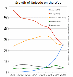
Anyhow, the purpose of this post was to write that Google reported yesterday that Unicode adoption on the web has passed ASCII and Western European. This doesn’t mean that English language characters have been passed up, but rather that the number of pages encoded using Unicode (usually in UTF-8 format), has finally left behind the archaic ASCII and Western European formats. The upshot is that it’s a sign of us leaving the dark ages—almost 20 years since the internet was made publicly available, and since the start of the Unicode consortium, we’re finally starting to take this stuff seriously.

The Processing book also has a bit of background on ASCII and Unicode in an Appendix, which includes more about character sets and how to work with them. And future editions of vida will also cover such matters in the Parse chapter.

Tuesday, May 6, 2008 | parse, unicode, updates, vida  

Another delegate calculator

Wonderfully simple delegate calculator from the New York Times. Addresses a far simpler question than the previously mentioned Slate calculator, but bless the NYT for realizing that something that complicated was no longer necessary.

delegate-5101.jpg

Good example of throwing out extraneous information to tell a story more directly: a quick left and right drag provides a more accurate depiction than the horse race currently in the headlines.

Monday, May 5, 2008 | election, politics, scenarios  

Doin’ stats for the C’s

A New York Times piece by the Freakonomics guys about Mike Zarren, the 32-year-old numbers guy for the Boston Celtics. While statistics has become more-or-less mainstream for baseball, the same isn’t quite true for basketball or football (though that’s changing too). They have better words for it than me:

This probably makes good sense for a sport like baseball, which is full of discrete events that are easily measured… Basketball, meanwhile, might seem too hectic and woolly for such rigorous dissection. It is far more collaborative than baseball and happens much faster, with players shifting from offense one moment to defense the next. (Hockey and football present their own challenges.)

But that’s not to say that something can be gained by looking at the numbers:

What’s the most efficient shot to take besides a layup? Easy, says Zarren: a three-pointer from the corner. What’s one of the most misused, misinterpreted statistics? “Turnovers are way more expensive than people think,” Zarren says. That’s because most teams focus on the points a defense scores from the turnover but don’t correctly value the offense’s opportunity cost — that is, the points it might have scored had the turnover not occurred.

Of course, the interesting thing about sports is that at their most basic, they cannot be defined by statistics or numbers. Take the Celtics, who just won the first round of the playoffs. Given their ability, the Celtics should have dispensed with the Hawks more quickly, rather than needing all seven games of the series to win the necessary four. The coach in the locker room of any Hoosiers ripoff will tell you it doesn’t matter what’s on the stat sheets, it matters who shows up that day. It’s the same reason that owners cannot buy a trophy even in a sport that has no salary cap. Or, if you’re like some of my in-laws-to-be (all Massachusetts natives), you might suspect that the fix is in (“How much money do those guys make per game?”) Regardless, it’s the human side of the sport, not the numbers, that make it worth watching. (And I don’t mean the soft-focus ESPN “Outside the Lines” version of the “human” side of the sport. Yech.)

In the meantime, maybe the Patriots or the Sox are hiring…

(Passed along by Andy Oram, my editor for vida)

Monday, May 5, 2008 | sports  

Flash file formats opened?

Via Slashdot, word that Adobe is opening the SWF and FLV file formats through the Open Screen Project. On first read this seemed great—Adobe essentially re-opening the SWF spec. It was released under a less onerous license by Macromedia ca. 1998, but then closed back up again once it became clear that the other vector graphics for the web proposals from Microsoft and others would not be an actual competitor. At the time, Microsoft had submitted a binary format called VML to the W3C, and the predecessor to SVG (called PGML) had also been proposed by then-rival Adobe and friends.

On second read it looks like they’re trying to kill Android before it has a chance to get rolling. So history rhymes ten years later. (Shannon informs me that this may qualify as a pantoum).

But to their credit (I’m shocked, actually), both specs are online already:

The SWF (Flash file format) specification

The FLV (Flash video file format) specification

….and more important, without any sort of click-through license. (“By clicking this button you pledge your allegiance to Adobe Systems and disavow your right to develop for products and platforms not controlled or approved by Adobe or its partners. The aforementioned transferral of rights also applies to your next of kin as well as your extended network of business partners and/or (at Adobe’s discretion) lunch dates.”)

I’ve never been nuts about using “open” as prefix for projects, especially as it relates to big companies hyping what do-gooders they are. It makes me think of the phrase “compassionate conservatism”. The fact that “compassionate” has to be added is more telling than anything else. They doth protest too much.

Thursday, May 1, 2008 | parse  
Book

Visualizing Data Book CoverVisualizing Data is my 2007 book about computational information design. It covers the path from raw data to how we understand it, detailing how to begin with a set of numbers and produce images or software that lets you view and interact with information. When first published, it was the only book(s) for people who wanted to learn how to actually build a data visualization in code.

The text was published by O’Reilly in December 2007 and can be found at Amazon and elsewhere. Amazon also has an edition for the Kindle, for people who aren’t into the dead tree thing. (Proceeds from Amazon links found on this page are used to pay my web hosting bill.)

Examples for the book can be found here.

The book covers ideas found in my Ph.D. dissertation, which is the basis for Chapter 1. The next chapter is an extremely brief introduction to Processing, which is used for the examples. Next is (chapter 3) is a simple mapping project to place data points on a map of the United States. Of course, the idea is not that lots of people want to visualize data for each of 50 states. Instead, it’s a jumping off point for learning how to lay out data spatially.

The chapters that follow cover six more projects, such as salary vs. performance (Chapter 5), zipdecode (Chapter 6), followed by more advanced topics dealing with trees, treemaps, hierarchies, and recursion (Chapter 7), plus graphs and networks (Chapter 8).

This site is used for follow-up code and writing about related topics.