
Writing

Electric Avenues
That’s right, I’m trying to ruin your Friday by planting Eddy Grant in your head.
A very nicely done visualization from NPR of the U.S. Electrical Grid:

I mostly find this fascinating having not seen it properly depicted, but the interactive version shows more about locations of power plants, plus maps of solar and wind power along with their relative capacities.
I love the craggy beauty of the layered lines, and appreciate the restraint of the map’s creators to simply show us this amazing data set.
And if you find yourself toe tapping and humming “we gonna rock down to…” later this afternoon, then I’m really sorry. I’m already beginning to regret it.
(Thanks, Eugene)
The Lost City of Atlantisnt
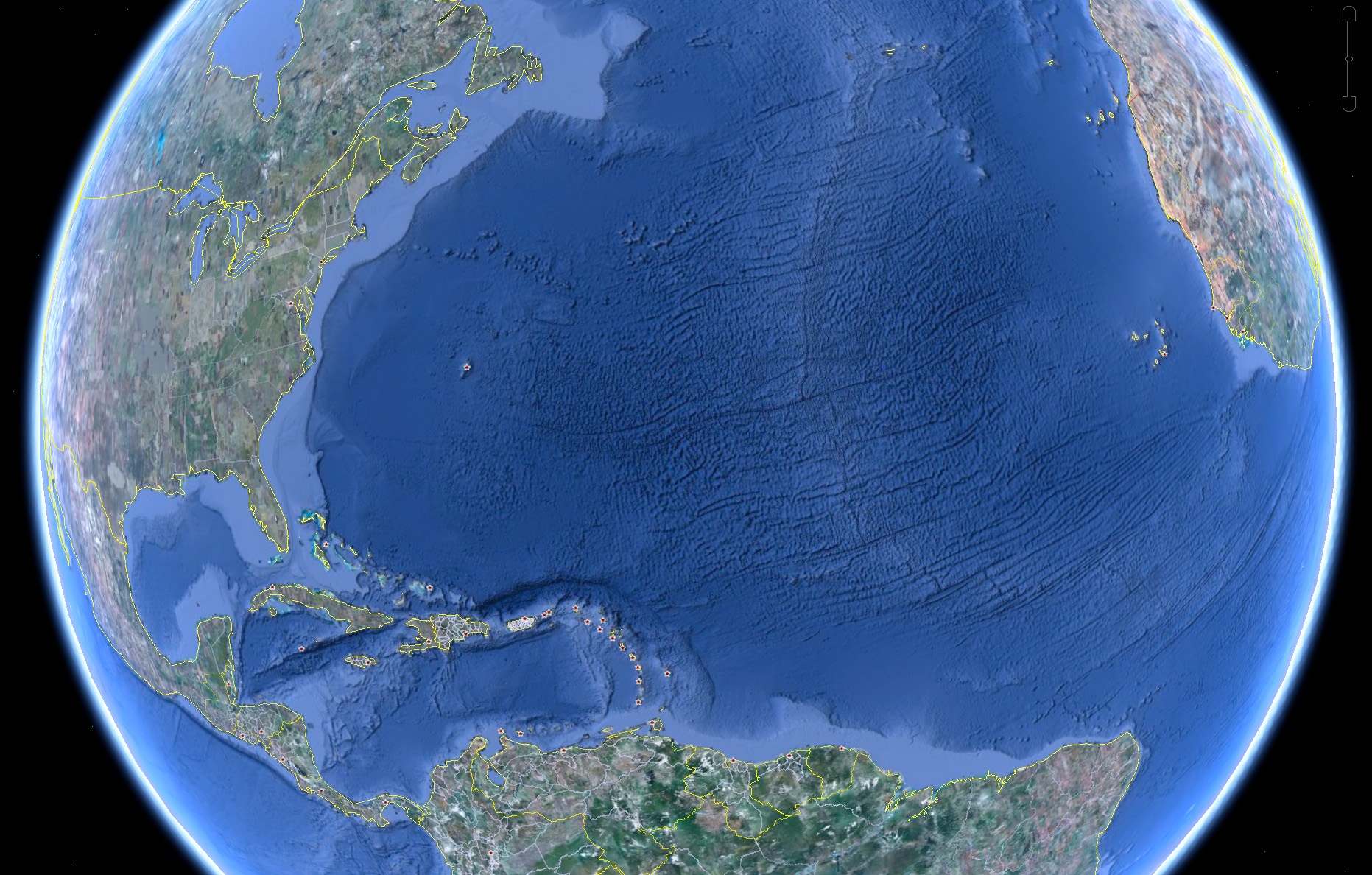
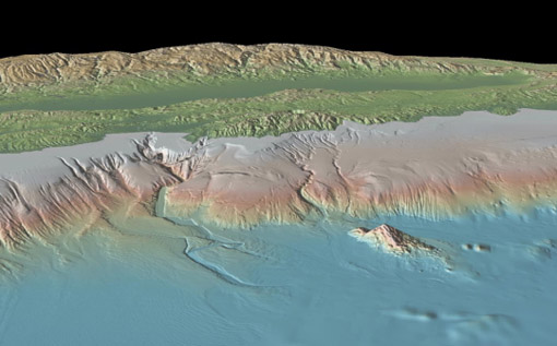
Some combination of internet-fed conspiracy theorists and Google Earthlings (lings that use Google Earth) were abuzz last week with an odd image find, possibly representing the lost city of Atlantis:

These hopes were later dashed (or perhaps only fed further) when the apparition was denied in a post on the Official Google Blog crafted by two of the gentlemen involved in the data collection for Google Ocean. The post is fascinating as it describes much of the process that they use to get readings of the ocean floor. They explain how echosounding (soundwaves bounced into the depths) is used to determine distance, and when that’s not possible, they actually use the sea level itself:
Above large underwater mountains (seamounts), the surface of the ocean is actually higher than in surrounding areas. These seamounts actually increase gravity in the area, which attracts more water and causes sea level to be slightly higher. The changes in water height are measurable using radar on satellites. This allows us to make a best guess as to what the rest of the sea floor looks like, but still at relatively low resolutions (the model predicts the ocean depth about once every 4000 meters). What you see in Google Earth is a combination of both this satellite-based model and real ship tracks from many research cruises (we first published this technique back in 1997).
How great is that? The water actually reveals shapes beneath because of gravity’s rearrangement of the ocean surface.
A more accurate map of the entire ocean would require a bit more effort:
…we could map the whole ocean using ships. A published U.S. Navy study found that it would take about 200 ship-years, meaning we’d need one ship for 200 years, or 10 ships for 20 years, or 100 ships for two years. It costs about $25,000 per day to operate a ship with the right mapping capability, so 200 ship-years would cost nearly two billion dollars.
Holy crap, two billion dollars? That’s real money!
That may seem like a lot of money…
Yeah, no kidding — that’s what I just said!
…but it’s not that far off from the price tag of, say, a new sports stadium.
Oh.
You mean this would teach us more than New Yorkers will learn from the Meadowlands Stadium debacle, beyond “the Jets still stink” and “Eli Manning is still a weenie”? (Excellent Bob Herbert op-ed on a similar topic — the education part, not the Manning part.)
So in the end, this “Atlantis” is the result of the rounding error in the patchwork of data produced by the various measurement and tiling methods. Not as exciting as a waterlogged and trident-wielding civilization, but the remainder of the article is a great read if you’re curious about how the ocean images are collected assembled.
Under The Sea
I wrote about my excitement over the rumor that Google was going under back in April, but now it has officially happened — the Ocean has arrived as part of Google Earth:
Look at those trenches! And now you can use the Google Earth software to fly through the area in the middle of the Atlantic where some god has decided to begin peeling the globe like an orange.
I’m waiting for the day (presumably a few years from now) that this feature includes other major bodies of water, revealing the hidden shapes beneath the surface of lakes or rivers that you know well from above. The physical relief version, that is. I’ll pass on the underwater Google Street View with their privacy-invading minisubs sticking their nose in everyone’s business.
Just when you thought the world revolved around you
Eugene Kuo sends a link to the Wikipedia article on center of population, an awkward term for the middlin’ place of all the people in a region. Calculation can be tricky because the Earth is round (what!?) and the statistical hooey that goes into determining a proper distance metric. The article includes a heat map of world population:

From a cited article, Wikipedia notes that:
…the world’s center of population is found to lie “at the crossroads between China, India, Pakistan and Tajikistan”, with an average distance of 5,200 kilometers (3,200 mi) to all humans…
Though sadly, the map also uses a strange color scale for the heat map, with blue the area of greatest density, and red (traditionally the “important” end of the scale) as the least populated area. Even shifting the colors helps a bit, at least in terms of highlighting the correct area:
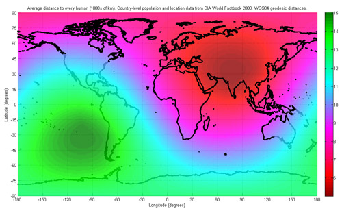
Though the shift is of questionable accuracy, and the bright green still draws too much attention, as does the banding in the middle of the Atlantic.
Outside of musing for your own edification, practical applications of calculating a population’s center include:
…locating possible sites for forward capitals, such as Brasilia, Astana or Austin. Practical selection of a new site for a capital is a complex problem that depends also on population density patterns and transportation networks.
Check the article for more about centers of various countries, including the United States:
The mean center of United States population has been calculated for each U.S. Census since 1790. If the United States map were perfectly balanced on a point, this point would be its physical centroid. Currently this point is located in Phelps County, Missouri, in the east-central part of the state. However, when Washington, D.C. was chosen as the federal capital of the United States in 1790, the center of the U.S. population was in Kent County, Maryland, a mere 47 miles (76 km) east-northeast of the new capital. Over the last two centuries, the mean center of United States population has progressed westward and, since 1930, southwesterly, reflecting population drift.
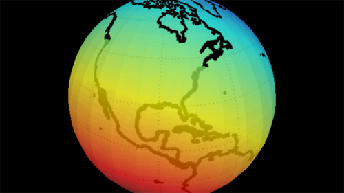
For added fun, I’ve created an interactive version of the map, based on a Processing example. (Though it took me longer to write the credits for the adaptation than to actually assemble it — thanks for all those who contributed little bits to it.)
Mapping Over Time
A video depicting all the edits for the OpenStreetMap project for 2008.
OpenStreetMap is a wiki-style map of the world and this animation displays a white flash each time a way is entered or updated. Some edits are a result of a physical local survey by a contributor with a GPS unit and taking notes, other edits are done remotely using aerial photography or out-of-copyright maps, and some are bulk imports of official data.
Simple idea but really elegant execution. Created by ITO.
Can a bunch of mathematicians make government more representative?
An interesting article from Slate about a session at the Joint Mathematics Meeting that discussed mathematical solutions and proposals to undo the problem of gerrymandered congressional districts. That is, politicians in congress having the ability to draw an outline around the group of people they want to represent (which is based on how likely they are to vote for said politician’s re-election). The resulting shapes are often comical, insofar as you’re willing to be cheerful in a “politics is perpetually broken and corrupt” kind of way. Chris Wilson writes:
It’s tough to find many defenders of the status quo, in which a supermajority of House seats are noncompetitive. (Congressional Quarterly ranked 324 of the 435 seats as “safe” for one party or the other in 2008.) The mathematicians—and social scientists and lawyers—who gathered to discuss the subject Thursday are certain there’s a better way to do it. They just haven’t quite figured out what it is.
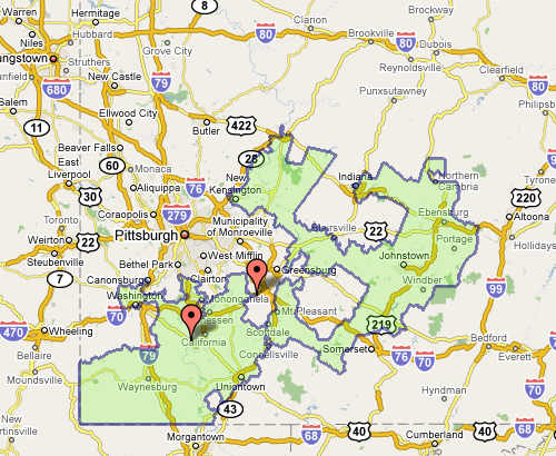
The meeting also seemed to include a contest (knock down, drag out, winner take pocket protector) between the presenters each trying to one-up each other for worst district. For instance, Florida’s 23rd, provided by govtrack.us:
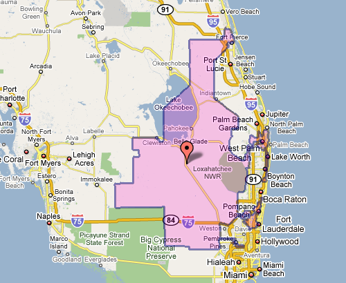
Which doesn’t seem awful at first, until you see the squiggle up the coast. Or Pennsylvania’s 12th, which Wilson describes as “an anchor glued to a sea anemone.”
Fixing the problem is difficult, but sometimes there are elegant and straightforward metrics that get you closer to a solution:
The most interesting proposal of the afternoon came from a Caltech grad student named Alan Miller, who proposed a simple test: If you take two random people in a district, what are the odds that one can walk in a straight line to the other without ever leaving the district? (Actually, it’s without leaving the district while remaining in the state, so as not to penalize districts like Maryland’s 6th, which has to account for Virginia’s hump.) This rewards neat, simple shapes. But it penalizes districts like Maryland’s 3rd, which looks like something out of Kandinsky’s Improvisation 31.
This turns the issue into something directly testable (two residents and their path) for which we can calculate a probability — the sort of thing statisticians love (because it can be measured). Given this criteria (and others like it) for congressional district godliness, another proposal was a kind of Netflix Prize for redistricting, where groups could compete to develop the best redistricting algorithm. Such an algorithm would seek to remove the (bipartisan) mischief by limiting human intervention.
The original article also includes a slide show of particularly heinous district shapes. And as an aside, the images above, while enormously useful, illustrate part of my beef with mash-ups: Google Maps was designed as a mapping application, not a mapping-with-stuff-on-it application. So when you add data to the map image — itself a completed design —you throw off that balance. It’s difficult to read the additional information (the district area), and the information that’s there (the map coloring, specific details of the roads) is more than necessary for this purpose.
Change is always most interesting
The New York Times has a very nicely done election map this year. Amongst its four viewing options is a depiction of counties that voted more Democratic (blue) or Republican (red) in comparison to the 2004 presidential election:
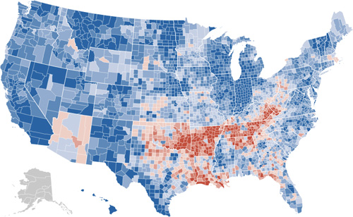
The blue is to be expected, given that the size of the win for Obama, but the red pattern is quite striking.
Also note the shift for candidate home states, in Arizona with McCain on the ticket, and what appears to be the reverse result in parts of Massachusetts, with Kerry no longer on the ticket. (The shift to the Democrats in Indiana is also amazing: without looking at the map closely enough I had assumed that area to be Obama’s home of Illinois.)
I recommend checking out the actual application on the Times site, the interaction lacks some of the annoying ticks that can be found in some of their other work (irritating rollovers that get in the way, worthless zooming, and silly transition animations). It’s useful and succinct, just like an infographic should be. Or just the way Mom used to make. Or whatever.
National Traffic Scorecard
The top 100 most congested metropolitan areas, visualized as a series of tomato stems:

Includes links to PDF reports for each area which detail overall congestion and the worst bottlenecks.
Typography Grab Bag: Berlow, Carter, and Indiana Jones
 Indiana Jones and the Fonts on the Maps – Mark Simonson takes on historical accuracy of the typography used in the Indiana Jones movies:
For the most part, the type usage in each of the movies is correct for the period depicted. With one exception: The maps used in the travel montages.
My theory is that this is because the travel maps are produced completely outside the standard production team. They’re done by some motion graphics house, outside the purview of the people on-set who are charged with issues of consistency. A nastier version of this theory might indict folks who do motion graphics for not knowing their typography and its time period—instead relying on the “feel” of the type when selecting. The bland version of this theory is that type history is esoteric, and nobody truly cares.
(Also a good time to point out how maps are used as a narrative device in the film, to great effect. The red line extending across the map is part of the Indiana Jones brand. I’d be curious to hear the story behind the mapping—who decided it needed to be there, who made it happen, who said “let’s do a moving red line that tracks the progress”—which parts were intentional, and which unintentional.)
Identifying the period for the faces reminded me of a 2005 profile of Matthew Carter, which described his involvement in court cases where date was in doubt, but typography of artifacts in question gave away their era. Sadly the article cannot be procured from the web site of The New Yorker, though you may have better luck if you possess a library card. Matthew Carter designed the typefaces Verdana and Bell Centennial (among many others). Spotting his wispy white ponytail around Harvard Square is a bit like seeing a rock star, if you’re a Cantabridgian typography geek.
From A to Z, font designer knows his type – a Boston Globe interview with type designer David Berlow (one of the founders of Font Bureau), some of the questions are unfortunate, but a few interesting anecdotes:
Playboy magazine came to me; they were printing with two printing processes, offset and gravure. Gravure (printing directly from cylinder to paper), gives a richer, smoother texture when printing flesh tones and makes the type look darker on the page than offset (indirect image transfer from plates). So if you want the type to look the same, you have to use two fonts. We developed two fonts for Playboy, but they kept complaining that the type was still coming out too dark or too light. Finally, I got a note attached to a proof that said, “Sorry. It was me. I needed new glasses. Thanks for all your help. Hef.” That was Hugh Hefner, of course.
Or speaking about his office:
From Oakland, Calif., to Delft, Holland, all the designers work from home. I have never been to the office. The first time I saw it was when I watched the documentary “Helvetica,” which showed our offices.

The strange allure of making your own fonts – Jason Fagone describes FontStruct, a web-based font design tool from FontShop:
FontStruct’s interface couldn’t be more intuitive. The central metaphor is a sheet of paper. You draw letters on the “sheet” using a set of standard paint tools (pencil, line, box, eraser) and a library of what FontStruct calls “bricks” (squares, circles, half-circles, crescents, triangles, stars). If you keep at it and complete an entire alphabet, FontStruct will package your letters into a TrueType file that you can download and plunk into your PC’s font folder. And if you’re feeling generous, you can tell FontStruct to share your font with everybody else on the Internet under a Creative Commons license. Every font has its own comment page, which tends to fill with praise, practical advice, or just general expressions of devotion to FontStruct.
Though I think my favorite bit might be this one:
But the vast majority of FontStruct users aren’t professional designers, just enthusiastic font geeks.
I know that because I’m one of them. FontStruct brings back a ton of memories; in college, I used to run my own free-font site called Alphabet Soup, where I uploaded cheapie fonts I made with a pirated version of a $300 program called Fontographer. Even today, when I self-Google, I mostly come up with links to my old, crappy fonts. (My secret fear is that no matter what I do as a reporter, the Monko family of fonts will remain my most durable legacy.)
The proliferation of bad typefaces: the true cost of software piracy.
Movies, Mapping, and Motion Graphics
Elegantly done, and some of the driest humor in film titles you might ever see, the opening sequence from Death at a Funeral.
Excellent (and appropriate) music, color, and type; does a great job of setting up the film. IMDB description:
Chaos ensues when a man tries to expose a dark secret regarding a recently deceased patriarch of a dysfunctional British family
Or the tagline:
From director Frank Oz comes the story of a family that puts the F U in funeral.
Average Distance to the Nearest Road in the Conterminous United States
Got an email over the weekend from Tom Vanderbilt, who had seen the All Streets piece, and was kind enough to point me to this map (PDF) from the USGS that depicts the average distance to the nearest road across the continental 48 states. (He’s currently working on a book titled Traffic: Why We Drive the Way We Do (and What It Says About Us) to be released this fall).
And too bad I just learned the word conterminous, but had I used that in the original project description, we would have missed (or been spared) the Metafilter discussion of whether “lower 48” was accurate terminology.
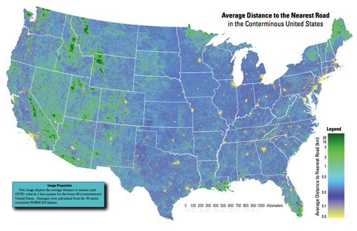
A really interesting map, which of course also shows the difference between something thrown together in a few hours and actual research. In digging around for the map’s source, I found that exactly a year ago, they also published a paper in Science describing their broader work:
Roads encroaching into undeveloped areas generally degrade ecological and watershed conditions and simultaneously provide access to natural resources, land parcels for development, and recreation. A metric of roadless space is needed for monitoring the balance between these ecological costs and societal benefits. We introduce a metric, roadless volume (RV), which is derived from the calculated distance to the nearest road. RV is useful and integrable over scales ranging from local to national. The 2.1 million cubic kilometers of RV in the conterminous United States are distributed with extreme inhomogeneity among its counties.
The publication even includes a response and a response to the response—high scientific drama! Apparently some lads feel that “roadless volume does not explicitly address ecological processes.” So let that be a warning to all you non-explicit addressers.
For those lucky to have access to the journal online, the supplementary information includes a time lapse video of a section of Colorado, and its roadless volume since 1937. As with all things, it’s much more interesting to see how this changes over time. A map of all streets in the lower 48 isn’t nearly as engaging as a sequence of the same area over several years. The latter story is simply far more compelling.
Google Underwater
So that might not be the awesome name that they’ll be using, but CNET is rumormongering about Google cooking up something oceanographic along the lines of Maps or Earth. Their speculation includes this lovely image from the Lamont-Doherty Earth Observatory (LDEO) of Columbia University.
Unlike most people with a heartbeat, I didn’t find Google Maps particularly interesting on arrival. I was a fan of the simplicity of Yahoo Maps at the time (but no longer, eek!) and Microsoft’s Terraserver had done satellite imagery for a few years. But the same way that Google Mars shows us something we’re even less familiar with than satellite imagery of Earth, there’s something really exciting about possibility of seeing beneath the oceans.
The Earth at night
Via mailing list, Oswald Berthold passes along images and a short article of the Earth from space as compiled by NASA, highlighting city lights in particular.
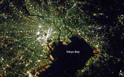
The collection is an update to the Earth Lights image developed a few years ago (and which made its way ’round the interwebs at the time).
For the more technical, a presentation from the NOAA titled Low Light Imaging of the Earth at Night provides greater detail about the methods used to produce such images. Also includes a couple interesting historical examples (such as the first image they created) as well as comparisons of city growth over time based on changes in the data.
Of course many conclusions can be drawn from seeing map data such as this. Look at the difference between North and South Korea, for instance (original image from globalsecurity.org).
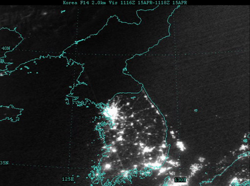
Apparently this is a favorite of former U.S. Secretary of Defense Donald Rumsfeld:
Mr Rumsfeld showed the picture to illustrate how backward the northern regime really is – and how oppressed its people are. Without electricity there can be none of the appliances that make life easy and that we take for granted, he said.
“Except for my wife and family, that is my favourite photo,” said Mr Rumsfeld.
“It says it all. There’s the south, the same people as the north, the same resources north and south, and the big difference is in the south it’s a free political system and a free economic system.
I’ve vowed to myself not to make this page be about politics so I won’t get into the fatuous arguments of a warmonger (oops), but I think the fascinating thing is that
- This image, this “information graphic,” would be of such great importance to a person that he would see fit to even mention it in reference to photos of his wife and children. This is a strong statement for any image, even if he is being dramatic.
- The use of images to make or score political points. There’s some great stuff buried in recent Congressional testimony about the Iraq War, for instance, that I want to get to soon.
In regards to #1, I’m trying to think of other images to which people maintain such a personal relationship (particularly those whose job is not info graphics—Tufte’s preoccupation with Napoleon’s March doesn’t count.)
As for #2, hopefully we’ll get to that a bit later.
Wal-Mart states and Starbucks states
Comparing the number of Starbucks and Wal-Marts per capita across the United States (the lower 48 at least).
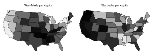
Read more Statistical Modeling, Causal Inference, and Social Science from Andrew Gelman’s lab at Columbia.
(thx, jason)
Can we just agree never to use the word “surge”… in any context?
Somewhere between the “most important” and “only useful” thing about the wide availability map data, GPS systems, and the sort 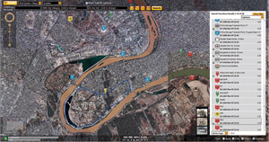 of mash-up type things that are all the rage is the ability to actually annotate map information in a useful way by combining these features.
An unfortunately titled article from the Technology Review describes a system being used in Iraq to help soldiers with their counterinsurgency efforts.
The new technology … is a map-centric application that … officers … can study before going on patrol and add to upon returning. By clicking on icons and lists, they can see the locations of key buildings, like mosques, schools, and hospitals, and retrieve information such as location data on past attacks, geotagged photos of houses and other buildings (taken with [GPS-equipped] cameras), and photos of suspected insurgents and neighborhood leaders. They can even listen to civilian interviews and watch videos of past maneuvers. It is just the kind of information that soldiers need to learn about Iraq and its perils.
It’s a wonder that such systems aren’t the norm, and the software described seems quite straightforward. But a step further, I found this quote intriguing:
“It is a bit revolutionary from a military perspective when you think about it, using peer-based information to drive the next move … Normally we are used to our higher headquarters telling the patrol leader what he needs to think.”
Not so much the cliché of technology being an enabler or democratizer (that can’t be a word, can it?) Rather, there’s something interesting about how the strength of a military structure (in discipline and rote effectiveness) is derived in part from top-down control, but that lies in direct contradiction to how information—of any kind, really—needs to move around this organization for it to be effective. What does it mean an approach like this one works in such contrast to tradition?
Book
 Visualizing Data is my 2007 book about computational information design. It covers the path from raw data to how we understand it, detailing how to begin with a set of numbers and produce images or software that lets you view and interact with information. When first published, it was the only book(s) for people who wanted to learn how to actually build a data visualization in code.
The text was published by O’Reilly in December 2007 and can be found at Amazon and elsewhere. Amazon also has an edition for the Kindle, for people who aren’t into the dead tree thing. (Proceeds from Amazon links found on this page are used to pay my web hosting bill.)
Examples for the book can be found here.
The book covers ideas found in my Ph.D. dissertation, which is the basis for Chapter 1. The next chapter is an extremely brief introduction to Processing, which is used for the examples. Next is (chapter 3) is a simple mapping project to place data points on a map of the United States. Of course, the idea is not that lots of people want to visualize data for each of 50 states. Instead, it’s a jumping off point for learning how to lay out data spatially.
The chapters that follow cover six more projects, such as salary vs. performance (Chapter 5), zipdecode (Chapter 6), followed by more advanced topics dealing with trees, treemaps, hierarchies, and recursion (Chapter 7), plus graphs and networks (Chapter 8).
This site is used for follow-up code and writing about related topics.
Much Clicked
- Visualizing Data Examples
- On needing approval for what we create, and losing control over how it’s distributed
- Brains on the Line
- All Streets
- Watching the evolution of the “Origin of Species”
- The Earth at night
- Piet Mondrian Goes to the Super Bowl
- Sustainable Creativity at Pixar
- Surfing, Orgies, and Apple Pie
- Eric Idle on “Scale”
- New for 2010
- Are electronic medical records really about data?