
Piet Mondrian Goes to the Super Bowl
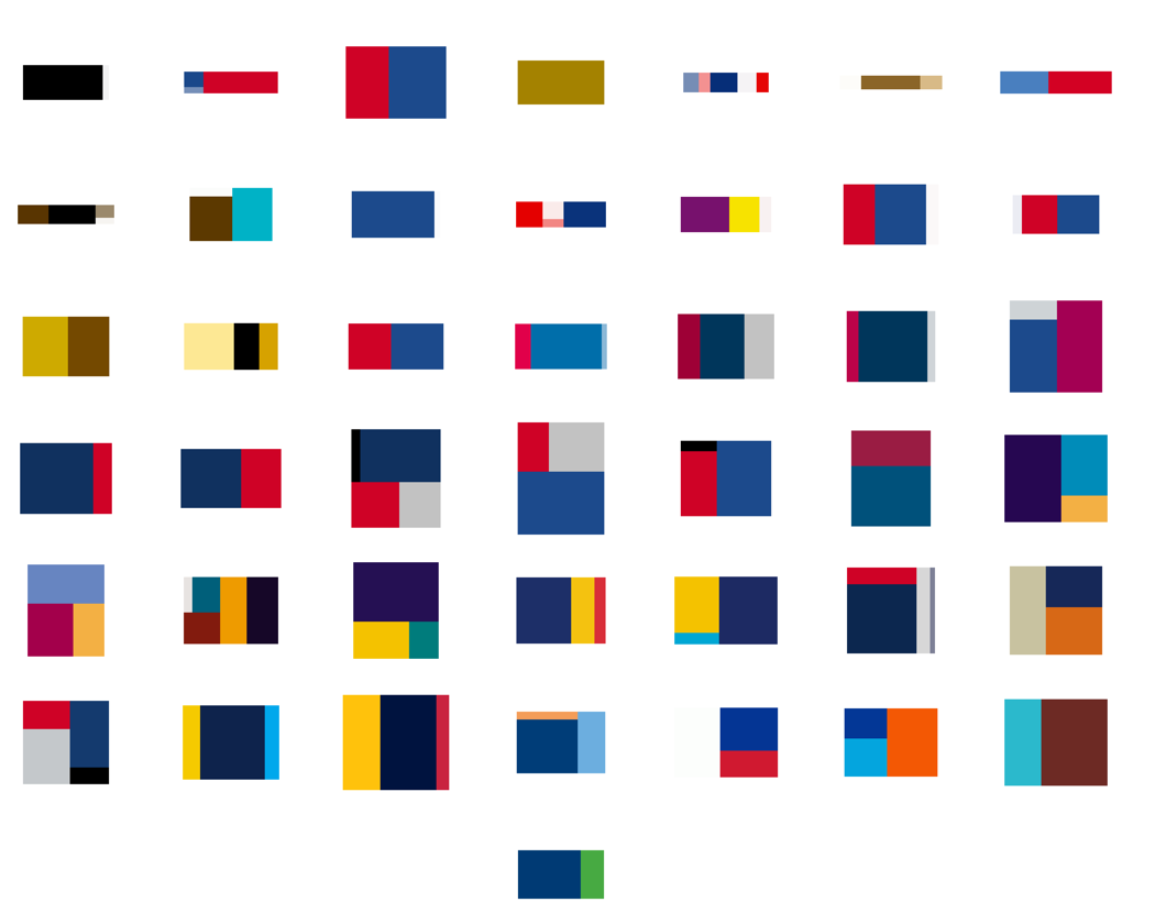
Beneath a pile of 1099s, I found myself distracted still thinking about the logo colors and proportions seen in the previous post. This led to a diversion to extract the colors from the Super Bowl logos and depict them according to their usage. The colors are counted up and laid out using a Treemap.
The result for all 43 Super Bowl logos, using the same layout as the previous image:
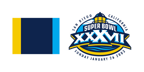
A few of the typical pairs, starting with 2001:


See all of the pairings here. Some notes about what’s mildly clever, and the less so:
- The empty space (white areas or transparent background) is subtracted from the logo, and the code tries to size the Treemap according to the aspect ratio of the original image, so that when seen adjacent the logo, things look balanced (kinda).
- The code is a simple adaptation of the Treemap project in Chapter 7 of Visualizing Data.
- Unfortunately, I could not find vector images (for all of the games, at least), which means the colors in the original images are not pure. For instance, edges of a solid blue color will have light blue edges because of smoothing (anti-aliasing). This makes it difficult to accurately figure out what’s a real color and what isn’t. Sometimes the fuzzy edge colors are correctly removed, other times not so much. Even worse, it may even remove legitimate colors that are used in less than 4-5% of the image.
- The color quantization isn’t good. On a few, it’s bad, and causes a few similar colors to disappear.
- All the above could be fixed, but taxes are more important than non-representational art. (That’s not a blanket statement — just for me this evening.)
And finally, I don’t honestly think there’s any relationship between a software algorithm for data visualization and the work of an artist like Piet Mondrian. But I do love the idea of a Dutch painter from the De Stijl movement making his way through the turnstiles at Raymond Jones Stadium.
