Writing

Is Processing a Language?

This question is covered in the FAQ on Processing.org, but still tends to reappear on the board every few months (most recently here). Someone once described Processing syntax as a dialect of Java, which sounds about right to me. It’s syntax that we’ve added on top of Java to make things a little easier for a particular work domain (roughly, making visual things). There’s also a programming environment that significantly simplifies what’s found in traditional IDEs. Plus there’s a core API set (and a handful of core libraries) that we’ve built to support this type of work. If we did these in isolation, none would really stick out:

  • The language changes are pretty minimal. The big difference is probably how they integrate with the IDE that’s built around the idea of sitting down and quickly writing code (what we call sketching). We don’t require users to first learn class definitions or even method declarations before they can show something on the screen, which helps avoid some of the initial head-scratching that comes from trying to explain “public class” or “void” or beginning programmers. For more advanced coders, it helps Java feel a bit more like scripting. I use a lot of Perl for various tasks, and I wanted to replicate the way you can write 5-10 lines of Perl (or Python, or Ruby, or whatever) and get something done. In Java, you often need double that number of lines just to set up your class definitions and a thread.
  • The API set is a Java API. It can be used with traditional Java IDEs (Eclipse, Netbeans, whatever) and a Processing component can be embedded into other applications. But without the rest of it (the syntax and IDE), Processing (API or otherwise) it would not be as widely used as it is today. The API grew out of Casey and I’s work, and our like/dislike of various approaches used by libraries that we’ve used: Postscript, QuickDraw, OpenGL, Java AWT, even Applesoft BASIC. Can we do OpenGL but still have it feel as simple as writing graphics code on the Apple ][? Can we simplify current graphics approaches so that they at least feel simpler like the original QuickDraw on the Mac?
  • The IDE is designed to make Java-style programming less wretched. Check out the Integration discussion board to see just how un-fun it is to figure out how the Java CLASSPATH and java.library.path work, or how to embed AWT and Swing components. These frustrations and complications sometimes are even filed as bugs in the Processing bugs database by users who have apparently become spoiled by not having to worry about such things.

If pressed, perhaps the language itself is probably the easiest to let go of—witness the Python, Ruby and now JavaScript versions of the API, or the C++ version that I use for personal work (when doing increasingly rare C++ projects). And lots of people build Processing projects without the preprocessor and PDE.

In some cases, we’ve even been accused of not being clear that it’s “just Java,” or even that Processing is Java with a trendy name. Complaining is easier than reading, so there’s not much we can do for people who don’t glance at the FAQ before writing their unhappy screeds. And with the stresses of the modern world, people need to relieve themselves of their angst somehow. (On the other hand, if you’ve met either of us, you’ll know that Casey and I are very trendy people, having grown up in the farmlands of Ohio and Michigan.)

However, we don’t print “Java” on every page of Processing.org for a very specific reason: knowing it’s Java behind the scenes doesn’t actually help our audience. In fact, it usually causes more trouble than not because people expect it to behave exactly like Java. We’ve had a number of people who copy and pasted code from the Java Tutorial into the PDE, and are confused when it doesn’t work.

(Edit – In writing this, I don’t want to understate the importance of Java, especially in the early stages of the Processing project. It goes without saying that we owe a great deal to Sun for developing, distributing, and championing Java. It was, and is, the best language/environment on which to base the project. More about the choice of language can be found in the FAQ.)

But for as much trouble as the preprocessor and language component of Processing is for us to develop (or as irrelevant it might seem to programmers who already code in Java), we’re still not willing to give that up—damned if we’re gonna make students learn how to write a method declaration and “public class Blah extends PApplet” before they can get something to show up on the screen.

I think the question is a bit like the general obsession of people trying to define Apple as a hardware or software company. They don’t do either—they do both. They’re one of the few to figure out that the distinction actually gets in the way of delivering good products.

Now, whether we’re delivering a good product is certainly questionable—the analogy with Apple may, uh, end there.

Wednesday, August 27, 2008 | languages, processing, software  

Mapping Iran’s Online Public

mapping-iran-public-200px.jpg“Mapping Iran’s Online Public” is a fascinating (and very readable) paper from a study by John Kelly and Bruce Etling at Harvard’s Berkman Center. From the abstract:

In contrast to the conventional wisdom that Iranian bloggers are mainly young democrats critical of the regime, we found a wide range of opinions representing religious conservative points of view as well as secular and reform-minded ones, and topics ranging from politics and human rights to poetry, religion, and pop culture. Our research indicates that the Persian blogosphere is indeed a large discussion space of approximately 60,000 routinely updated blogs featuring a rich and varied mix of bloggers.

In addition to identifying four major poles (Secular/Reformist, Conservative/Religious, Persian Poetry and Literature, and Mixed Networks.) A number of surprising findings include details like the nature of discourse (such as the prominence of the poetry and literature category) or issues of anonymity:

…a minority of bloggers in the secular/reformist pole appear to blog anonymously, even in the more politically-oriented part of it; instead, it is more common for bloggers in the religious/conservative pole to blog anonymously. Blocking of blogs by the government is less pervasive than we had assumed.

They also produced images to represent the nature of the networks, seen in the thumbnail at right. The visualization is created with a force-directed layout that iteratively groups data points closer based on their content. It’s useful for this kind of study, where the intent is to represent or identify larger groups. In this case, the graphic supports what’s laid out in the text, but to me the most interesting thing about the study is the human-centered tasks of the project, such as the work done by hand in reviewing and categorizing such a large number of sites. It’s this background work that sets it apart from many other images like it which tend to rely too heavily on automation.

(The paper is from April 6, 2008 and I first heard about after being contacted by John in June. Around 1999, our group had hosted students that he was teaching in a summer session for a visit to the Media Lab. And now a few months later, I’m digging through my writing todo pile.)

Tuesday, August 26, 2008 | forcelayout, represent, social  

Panicky Addition

In response to the last post, a message from João Antunes:

…you should also read this story about Panic’s old MP3 player applications.

The story includes how they came to almost dominate the Mac market before iTunes, how AOL and Apple tried to buy the application before coming out with iTunes, even recollections of meetings with Steve Jobs and how he wanted them to go work at Apple – it’s a fantastic indie story.

Regarding the Mac ‘indie’ development there’s this recent thesis by a Dutch student, also a good read.

I’d read the story about Audion (the MP3 player) before, and failed to make the connection that this was the same Audion that I rediscovered in the O’Reilly interview from the last post (and took a moment to mourn its loss). It’s sad to think of how much better iTunes would be if the Panic guys were making it — iTunes must be the first MP3 player that feels like a heavy duty office suite. In the story, Cabel Sasser (the other co-founder of Panic) begins:

Is it just me? I mean, do you ever wonder about the stories behind everyday products?

What names were Procter & Gamble considering before they finally picked “Swiffer”? (Springle? Sweepolio? Dirtrocker?) What flavors of Pop-Tarts never made it out of the lab, and did any involve lychee, the devil’s fruit?

No doubt the backstory on the Pop-Tarts question alone could be turned into a syndicated network show to compete with LOST.

Audion is now available as a free download, though without updates since 2002, it’s not likely to work much longer (seemed fine with OS X 10.4, though who knows with even 10.5).

Tuesday, August 19, 2008 | feedbag, software  

Mangled Tenets and Exasperation: the iTunes App Store

By way of Darling Furball, a blog post by Steven Frank, co-founder of Panic, on his personal opinion of Apple’s gated community of software distribution, the iTunes App Store:

Some of my most inviolable principles about developing and selling software are:

  1. I can write any software I want. Nobody needs to “approve” it.
  2. Anyone who wants to can download it. Or not.
  3. I can set any price I want, including free, and there’s no middle-man.
  4. I can set my own policies for refunds, coupons and other promotions.
  5. When a serious bug demands an update, I can publish it immediately.
  6. If I want, I can make the source code available.
  7. If I want, I can participate in a someone else’s open source project.
  8. If I want, I can discuss coding difficulties and solutions with other developers.

The iTunes App Store distribution model mangles almost every one of those tenets in some way, which is exasperating to me.

But, the situation’s not that clear-cut.

The entire post is very thoughtful and well worth reading, it’s also coming from a long-time Apple developer rather than some crank from an online magazine looking to stir up advertising hits. Panic’s software is wonderful: Transmit is an application that singlehandedly makes me want to use a Mac (yet it’s only, uh, an SFTP client). I think his post nicely sums up the way a lot of developers (including myself) feel about the App Store. He concludes:

I’ve been trying to reconcile the App Store with my beliefs on “how things should be” ever since the SDK was announced. After all this time, I still can’t make it all line up. I can’t question that it’s probably the best mobile application distribution method yet created, but every time I use it, a little piece of my soul dies. And we don’t even have anything for sale on there yet.

Reading this also made me curious to learn more about Panic, which led me to this interview from 2004 with Frank and the other co-founder. He also has a number of side projects, including Spamusement, a roughly drawn cartoon depicting spam headlines (Get a bigger flute, for instance).

Tuesday, August 19, 2008 | mobile, software  

Data as Dairy

As a general tip, keep in mind that any data looks better as a wheel of Gouda.

delicious cheese

You say “market share,” I say “wine pairing.”

(Via this article, passed along by a friend looking for ways to make pie charts with more visual depth.)

Tuesday, August 19, 2008 | refine, represent  

History of Predictive Text Swearing

Wonderful commentary on being nannied by your mobile, and head-in-the-sand text prediction algorithms.

There’s lots more to be said about predictive text, but in the meantime, this also brings to mind Jonathan Harris’ QueryCount, which I found to be a more interesting followup to his WordCount project. (WordCount tells us something we already know, but QueryCount lets us see something we suspect.)

Monday, August 18, 2008 | text  

“Hello Kettle? Yeah, hi, this is the Pot calling.”

Wired’s Ryan Singel reports on a spat between AT&T and Google regarding their privacy practices:

Online advertising networks — particularly Google’s — are more dangerous than the fledgling plans and dreams of ISPs to install eavesdropping equipment inside their internet pipes to serve tailored ads to their customers, AT&T says.

Even more fun than watching gorillas fight (you don’t have to pick a side—it’s guaranteed to be entertaining) is when they bring up accusations that are usually reserved for the security and privacy set (or borderline paranoids who write blogs that cover information and privacy). Or their argument boils down to “but we’re less naughty than you.” Ask any Mom about the effectiveness of that argument. AT&T writes:

Advertising-network operators such as Google have evolved beyond merely tracking consumer web surfing activity on sites for which they have a direct ad-serving relationship. They now have the ability to observe a user’s entire web browsing experience at a granular level, including all URLs visited, all searches, and actual page-views.

Deep Packet Inspection is an important sounding way to say that they’re just watching all your traffic. It’s quite literally the same as the post office opening all your letters and reading them, and in AT&T’s case, adding additional bulk mail (flyers, sweepstakes, and other junk) that seems appropriate to your interests based on what they find.

Are you excited yet?

Monday, August 18, 2008 | privacy  

The Importance of Failure

This segment from CBS Sunday Morning isn’t particularly groundbreaking or profound (and perhaps a bit hokey), but is a helpful reminder on the importance of failure. (Nevermind the failure to post anything new for two weeks.)

Duke University professor Henry Petroski has made a career studying design failures, which he says are far more interesting than successes.

“Successes teach us very little,” Petroski said.

Petroski’s talking about bridges, but it holds true for any creative endeavor.

Also cited are J.K. Rowling bottoming out before her later success, van Gogh who sold just one painting before his death, Michael Jordan not making his high school basketball team, and others. (You’ve heard of these, but like I said, it’s about the reminder.)

It also notes that the important part is also how you handle failure, citing Chipper Jones, who leads baseball with a .369 batting average, which is impressive but also means that he’s only getting a hit one in three times he has a chance:

“Well, most of the time it’s not [going your way] and that’s why you have to be able to accept failure,” Jones said. “[…] a lot of work […] here in the big league is how you accept failure.”

Which is another important reminder: the standout difference in “making it” has to do with bouncing back from failure.

And if nothing else, watch it for footage of the collapse of the Tacoma Narrows Bridge in 1940. Such a beautiful (if terrifying) picture of cement and metal oscillating in the wind. Also linked from the Wikipedia article are a collection of still photographs (including the collapse) and links to newsreel footage from the Internet Archive.

Friday, August 15, 2008 | failure  

More NASA Observations Acquire Interest

Some additional followup from Robert Simmon regarding the previous post. I asked more about the “amateur Earth observers” and the intermediate data access. He writes:

The original idea was sparked from the success of amateur astronomers discovering comets. Of course amateur astronomy is mostly about making observations, but we (NASA) already have the observations: the question is what to do with them–which we really haven’t figured out. One approach is to make in-situ observations like aerosol optical thickness (haziness, essentially), weather measurements, cloud type, etc. and then correlate them with satellite data. Unfortunately, calibration issues make this data difficult to use scientifically. It is a good outreach tool, so we’re partnering with science museums, and the GLOBE program does this with schools.

We don’t really have a good sense yet of how to allow amateurs to make meaningful analyses: there’s a lot of background knowledge required to make sense of the data, and it’s important to understand the limitations of satellite data, even if the tools to extract and display it are available. There’s also the risk that quacks with and axe to grind will willfully abuse data to make a point, which is more significant for an issue like climate change than it is for the face on Mars, for example. That’s just a long way of saying that we don’t know yet, and we’d appreciate suggestions.

I’m more of a “face on Mars” guy myself. It’s unfortunate that the quacks even have to be considered, though not surprising from what I’ve seen online. Also worth checking out:

Are you familiar with Web Map Service (WMS)?
http://www.opengeospatial.org/standards/wms
It’s one of the ways we distribute & display our data, in addition to KML.

And one last followup:

Here’s another data source for NASA satellite data that’s a bit easier than the data gateway:
http://daac.gsfc.nasa.gov/techlab/giovanni/

and examples of classroom exercises using data, with some additional data sources folded in to each one:
http://serc.carleton.edu/eet/

The EET holds an “access data workshop” each year in late spring, you may be interested in attending next year.

And with regards to guidelines, Mark Baltzegar (of The Cyc Foundation) sent along this note:

Are you familiar with the ongoing work within the W3C’s Linking Open Data project? There is a vibrant community actively exposing and linking open data.
http://richard.cyganiak.de/2007/10/lod/
http://esw.w3.org/topic/SweoIG/TaskForces/CommunityProjects/LinkingOpenData

More to read and eat up your evening, at any rate.

Thursday, July 31, 2008 | acquire, data, feedbag, parse  

NASA Observes Earth Blogs

Robert Simmon of NASA caught this post about the NASA Earth Observatory and was kind enough to pass along some additional information.

Regarding the carbon emissions video:

The U.S. carbon emissions data were taken from the Vulcan Project:
http://www.purdue.edu/eas/carbon/vulcan/index.php

They distribute the data here:
http://www.purdue.edu/eas/carbon/vulcan/research.html

In addition to the animation (which was intended to show the daily cycle and the progress of elevated emissions from east to west each morning), we published a short feature about the project and the dataset, including some graphs that remove the diurnal cycle.
http://earthobservatory.nasa.gov/Study/AmericanCarbon/

American Carbon is an example of one of our feature articles, which are published every month or so. We try to cover current research, focusing on individual scientists, using narrative techniques. The visualizations tie in closely to the text of the story. I’m the primary visualizer, and I focus on presenting the data as clearly as possible, rather than allowing free-form investigation of data. We also publish daily images (with links to images at the original resolution), imagery of natural hazards emphasizing current events (fires, hurricanes, and dust storms, for example), nasa press releases, a handful of interactive lessons, and the monthly global maps of various parameters. We’re in the finishing stages of a redesign, which will hopefully improve the navigation and site usability.

Also some details about the difficulties of distributing and handling the data:

These sections draw on data from wide and varied sources. The raw data is extremely heterogeneous, formats include: text files, HDF, matlab, camera raw files, GRADS, NetCDF, etc. All in different projections, at different spatial scales, and covering different time periods. Some of them are updated every five minutes, and others are reprocessed periodically. Trying to make the data available—and current—through our site would be overly ambitious. Instead, we focus on a non-expert audience interested in space, technology, and the environment, and link to the original science groups and the relevant data archives. Look in the credit lines of images for links.

Unfortunately the data formats can be very difficult to read. Here’s the main portal for access to NASA Earth Observing System data:
http://esdis.eosdis.nasa.gov/index.html

and the direct link to several of the data access interfaces:
http://esdis.eosdis.nasa.gov/dataaccess/search.html

And finally, something closer to what was discussed in the earlier post:

With the complexity of the science data, there is a place for an intermediate level of data: processed to a consistent format and readable by common commercial or free software (intervention by a data fairy?). NASA Earth Observations (NEO) is one attempt at solving that problem: global images at 0.1 by 0.1 degrees distributed as lossless-compressed indexed color images and csv files. Obviously there’s work to be done to improve NEO, but we’re getting there. We’re having a workshop this month to develop material for “amateur Earth observers” which will hopefully help us in this area, as well.

This speaks to the audience I tried to address with Visualizing Data in particular (or with Processing in general). There is a group of people who want access to data that’s more low-level than what’s found in a newspaper article, but not as complicated as raw piles of data from measuring instruments that are only decipherable by the scientists who use them.

This is a general theme, not specific to NASA’s data. And I think it’s a little more low-level than requiring that everything be in mashup-friendly XML or JSON feeds, but it seems worthwhile to start thinking about what the guidelines would be for open data distribution. And with such guidelines in place, we can browbeat organizations to play along! Since that would be, uh, a nice way to thank them for making their data available in the first place.

Thursday, July 31, 2008 | acquire, data, feedbag  

Processing 0143 and a status report

Just posted Processing 0143 to the download page. This is not yet the stable release, so please read revisions.txt, which describes the signficant changes in the releases since 0135 (the last “stable” release, and the current default download).

I’ve also posted a status report:

Some updates from the Processing Corporation’s east coast tower high rise offices in Cambridge, MA.

We’re working to finish Processing 1.0. The target date is this Fall, meaning August or September. We’d like to have it done as early as possible so that Fall classes can make use of it. In addition to the usual channels, we have a dozen or so people who are helping out with getting the release out the door. We’ll unmask these heros at some point in the future.

I’m also pleased to announce that I’m able to focus on Processing full time this Summer with the help of a stipend provided by Oblong Industries. They’re the folks behind the gesture-controlled interface you see in Minority Report. (You can find more about them with a little Google digging.) They’re funding us because of their love of open source and they feel that Processing is an important project. As in, there are no strings attached to the funding, and Processing is not being re-tooled for gesture interfaces. We owe them our enormous gratitude.

The big things for 1.0 include the Tools menu, better compile/run setup (what you see in 0136+), bringing back P2D, perhaps bringing back P3D with anti-aliasing, better OpenGL support, better library support, some major bug fixes (outstanding threading problems and more).

If you have a feature or bug that you want fixed in time for 1.0, now is the time to vote by making sure that it’s listed at http://dev.processing.org/bugs.

I’ll try to post updates more frequently over the next few weeks.

Monday, July 28, 2008 | processing  

Wordle me this, Batman

I’ve never really been fond of tag clouds, but Wordle, by MacGyver of software (and former drummer for They Might Be Giants) Jonathan Feinberg gives the representation an aesthetic nudge lacking in most representations. The application creates word clouds from input data submitted by users. I was reminded of it yesterday by Eugene, who submitted Lorem Ipsum:

lorem-500.png

I had first heard about it from emailer Bill Robertson, who had uploaded Organic Information Design, my master’s thesis. (Which was initially flattering but quickly became terrifying when I remembered that it still badly needs a cleanup edit.)

organic-500.jpg

A wonderful tree shape! Can’t decide which I like better: “information” as the stem or “data” as a cancerous growth in the upper-right.

Mr. Feinberg is also the reason that Processing development has been moving to Eclipse (replacing emacs, some shell scripts, two packages of bazooka bubble gum and the command line) because of his donation of a long afternoon helping set up the software in the IDE back when I lived in East Cambridge, just a few blocks from where he works at IBM Research.

Wednesday, July 23, 2008 | inbox, refine, represent  

Blood, guts, gore and the data fairy

The O’Reilly press folks passed along this review (PDF) of Visualizing Data from USENIX magazine. I really appreciated this part:

My favorite thing about Visualizing Data is that it tackles the whole process in all its blood, guts, and gore. It starts with finding the data and cleaning it up. Many books assume that the data fairy is going to come bring you data, and that it will either be clean, lovely data or you will parse it carefully into clean, lovely data. This book assumes that a significant portion of the data you care about comes from some scuzzy Web page you don’t control and that you are going to use exactly the minimum required finesse to tear out the parts you care about. It talks about how to do this, and how to decide what the minimum required finesse would be. (Do you do it by hand? Use a regular expression? Actually bother to parse XML?)

Indeed, writing this book was therapy for that traumatized inner child who learned at such a tender young age that the data fairy did not exist.

Wednesday, July 23, 2008 | iloveme, parse, reviews, vida  

NASA Earth Observatory

carbon.jpgSome potentially interesting data from NASA passed along by Chris Lonnen. The first is the Earth Observatory, which includes images of things like Carbon Monoxide, Snow Cover, Surface Temperature, UV Exposure, and so on. Chris writes:

I’m not sure how useful they would be to novices in terms of usable data (raw numbers are not provided in any easy to harvest manner), but the information is
still useful and they provide for a basic, if clunky, presentation that follows the basic steps you laid out in your book. They data can be found here, and they occasionally compile it all into interesting visualizations. My favorite being the carbon map here.

The carbon map movie is really cool, though I wish the raw data were available since the strong cyclical effect seen in the animation needs to be separated out. The cycles dominates the animation to such an extent that it’s nearly the only takeaway from the movie. For instance, each cycle is a 24 hour period. Instead of showing them one after another, show several days adjacent one another, so that we can compare 3am with one day to 3am the next.

For overseas readers, I’ll note that the images and data are not all U.S.-centric—most cover the surface of the Earth.

I asked Chris about availability for more raw data, and he did a little more digging:

The raw data availability is slim. From what I’ve gathered you need to contact NASA and have them give you clearance as a researcher. If you were looking for higher quality photography for a tutorial NASA Earth Observations has a newer website that I’ve just found which offers similar data in the format of your choice at up to 3600 x 1800. For some sets it will also offer you data in CSV or CSV for Excel.

If you needed higher resolutions that that NASA’s Visible Earth offers some TIFF’s at larger sizes. A quick search for .tiff gave me an 16384 x 8192 map of the earth with city lights shining, which would be relatively easy to filter out from the dark blue background. These two websites are probably a bit more helpful.

Interesting tidbits for someone interested in a little planetary digging. I’ve had a few of these links sitting in a pile waiting for me to finish the “data” section of my web site; in the meantime I’ll just mention things here.

Update 31 July 2008: Robert Simmon from NASA chimes in.

Saturday, July 19, 2008 | acquire, data, inbox, science  

Brains on the Line

I was reminded this morning that Mario Manningham, a wide receiver who played for Michigan was rumored to have scored a 6 (out of 50) on the Wonderlic, an intelligence test administered in some occupations (and now pro football) to check the mental capability of job candidates. Intelligence tests are strange beasts, but after watching my niece working on similar problems—for fun—during her summer vacation last week, the tests caught my eye more than when I first heard about it.

Manningham was once a promising undergrad receiver for U of M, but has in recent years proven himself to be a knucklehead, loafing through plays and most recently making headlines for marijuana use and an interview on Sirius radio described as “… arrogant and defensive. When asked about the balls he dropped in big spots, he responded, ‘What about the ball I caught?’” So while an exceptionally low score on a standardized test might suggest dyslexia, the guy’s an egotistical bonehead even without mitigating factors.

Most people don’t associate brains with football, but in recent years teams have begun to use a Wonderlic test while scouting, which consists of 50 questions to be completed in 12 minutes. Many of the questions are multiple choice, but the time is certainly a factor when completing the tests. A score of 10 is considered “literate”, while 20 is said to coincide with average intelligence (an IQ of 100, though now we’re comparing one somewhat arbitrary numerically scored intelligence test with another).

In another interesting twist, the test is also administered to players the day of the NFL combine—which means they first spend the day running, jumping, benching, interviewing, and lots of other -ings, before they sit down and take an intelligence test. It’s a bit like a medical student running a half marathon before taking the boards.

Wonderlic himself says that basically, the scores decrease as you move further away from the ball, which is interesting but unsurprising. It’s sort of obvious that a quarterback needs to be on the smarter side, but I was curious to see what this actually looked like. Using this table as a guide, I then grabbed this diagram from Wikipedia showing a typical formation in a football game. I cleaned up the design of the diagram a bit and replaced the positions with their scores:

positions1.png

Offense is shown in blue, defense in red. You can see the quarterback with a 24, the center (over 6 feet and around 300 lbs.) averaging higher at 25, and the outside linemen even a little higher. Presumably this is because the outside linemen need to mentally quick (as well as tough) to read the defense and respond to it. Those are the wide receivers (idiot loud mouths) with the 17s on the outside.

(For people not familiar with American Football, the offense and defense are made up of totally separate sets of players. I once showed this piece to a group who stared at me blankly, wondering how someone's IQ could change mid-game.)

To make the diagram a bit clearer, I scaled each position based on its score:

positions2.png

That’s a little better since you can see the huddle around the ball and where the brains need to be for the system of protection around it. With the proportion, I no longer need the numbers, so I’ve switched back to using the initials for each position’s title:

positions3.png

(Don’t tell Tufte that I’ve used the radius, not the proportional area, of the circle as the value for each ellipse! A cardinal sin that I’m using in this case to improve proportion and clarify a point.)

I’ll also happily point out that the linemen for the Patriots all score above average for their position:

Player Position Year Score
Matt Light left tackle 2001 29
Logan Mankins left guard 2005 25
Dan Koppen center 2003 28
Stephen Neal right guard 2001 31
Nick Kaczur right tackle 2005 29

A position-by-position image for a team would be interesting, but I’ve already spent too much time thinking about this. The Patriots are rumored to be heavy on brains, with Green Bay at the other end of the spectrum.

An ESPN writeup about the test (and testing in general) can be found here, along with a sample test here.

One odd press release from Wonderlic even compares scores per NFL position with private sector job titles. For instance, a middle linebacker scores like a hospital orderly, while an offensive tackle is closer to a marketing executive. Fullbacks and halfbacks share the lower end with dock hands and material handlers.

During the run-up to Super Bowl XXXII in 1998, one reporter even dug up the Wonderlic scores for the Broncos and Packers, showing Denver with an average score of 20.4 compared to Green Bay’s 19.6. As defending champions, the Packers were favored but wound up losing 31-24.

Nobody cited test scores in the post-game coverage.

Wednesday, July 16, 2008 | football, sports  

Eric Idle on “Scale”

Scale is one of the most important themes in data visualization. In Monty Python’s The Meaning of Life, Eric Idle shares his perspective:

The lyrics:

Just remember that you’re standing on a planet that’s evolving
And revolving at nine hundred miles an hour,
That’s orbiting at nineteen miles a second, so it’s reckoned,
A sun that is the source of all our power.
The sun and you and me and all the stars that we can see
Are moving at a million miles a day
In an outer spiral arm, at forty thousand miles an hour,
Of the galaxy we call the ‘Milky Way’.

Our galaxy itself contains a hundred billion stars.
It’s a hundred thousand light years side to side.
It bulges in the middle, sixteen thousand light years thick,
But out by us, it’s just three thousand light years wide.
We’re thirty thousand light years from galactic central point.
We go ’round every two hundred million years,
And our galaxy is only one of millions of billions
In this amazing and expanding universe.

The universe itself keeps on expanding and expanding
In all of the directions it can whizz
As fast as it can go, at the speed of light, you know,
Twelve million miles a minute, and that’s the fastest speed there is.
So remember, when you’re feeling very small and insecure,
How amazingly unlikely is your birth,
And pray that there’s intelligent life somewhere up in space,
‘Cause there’s bugger all down here on Earth.

Wednesday, July 16, 2008 | music, scale  

Postleitzahlen in Deutschland

germany-contrast-small.pngMaximillian Dornseif has adapted Zipdecode from Chapter 6 of Visualizing Data to handle German postal codes. I’ve wanted to do this myself since hearing about the OpenGeoDB data set which includes the data, but thankfully he’s taken care of it first and is sharing it with the rest of us along with his modified code.

(The site is in German…I’ll trust any of you German readers to let me know if the site actually says that Visualizing Data is the dumbest book he’s ever read.)

Also helpful to note that he used Python for preprocessing the data. He doesn’t bother implementing a map projection, as done in the book, but the Python code is a useful example of using another language when appropriate, and how the syntax differs from Processing:

# Convert opengeodb data for zipdecode
fd = open('PLZ.tab')
out = []
minlat = minlon = 180
maxlat = maxlon = 0

for line in fd:
    line = line.strip()
    if not line or line.startswith('#'):
        continue
    parts = line.split('\t')
    dummy, plz, lat, lon, name = parts
    out.append([plz, lat, lon, name])
    minlat = min([float(lat), minlat])
    minlon = min([float(lon), minlon])
    maxlat = max([float(lat), maxlat])
    maxlon = max([float(lon), maxlon])

print "# %d,%f,%f,%f,%f" % (len(out), minlat, maxlat, minlon, maxlon)
for data in out:
    plz, lat, lon, name = data
    print '\t'.join([plz, str(float(lat)), str(float(lon)), name])

In the book, I used Processing for most of the examples (with a little bit of Perl) for sake of simplicity. (The book is already introducing a lot of new material, why hurt people and introduce multiple languages while I’m at it?) However that’s one place where the book diverges from my own process a bit, since I tend to use a lot of Perl when dealing with large volumes of text data. Python is also a good choice (or Ruby if that’s your thing), but I’m tainted since I learned Perl first, while a wee intern at Sun.

Tuesday, July 15, 2008 | adaptation, vida, zipdecode  

Parsing Numbers by the Bushel

While taking a look at the code mentioned in the previous post, I noticed two things. First, the PointCloud.pde file drops directly into OpenGL-specific code (rather than Processing API) for sake of speed to draw thousands and thousands of points. It’s further proof that I need to finish the PShape class for Processing 1.0, which will automatically handle this sort of thing automatically.

Second is a more general point about parsing. This isn’t intended as a nitpick on Aaron’s code (it’s commendable that he put his code out there for everyone to see—and uh, nitpick about). But seeing how it was written reminded me that most people don’t know about the casts in Processing, particularly when applied to whole arrays, and this can be really useful when parsing data.

To convert a String to a float (or int) in Processing, you can use a cast, for instance:

String s = "667.12";
float f = float(s);

This also in fact works with String[] arrays, like the kind returned by the split() method while parsing data. For instance, in SceneViewer.pde, the code currently reads:

String[] thisLine = split(raw[i], ",");
points[i * 3] = new Float(thisLine[0]).floatValue() / 1000;
points[i * 3 + 1] = new Float(thisLine[1]).floatValue() / 1000;
points[i * 3 + 2] = new Float(thisLine[2]).floatValue() / 1000;

Which could be written more cleanly as:

String[] thisLine = split(raw[i], ",");
float[] f = float(thisLine);
points[i * 3 + 0] = f[0] / 1000;
points[i * 3 + 1] = f[1] / 1000;
points[i * 3 + 2] = f[2] / 1000;

However, to his credit, Aaron may have have intentionally skipped it in this case since he don’t need the whole line of numbers.

Or if you’re using the Processing API with Eclipse or some other IDE, that means that the float() cast won’t work for you. You can substitute float() with the parseFloat() method:

String[] thisLine = split(raw[i], ",");
float[] f = parseFloat(thisLine);
points[i * 3 + 0] = f[0] / 1000;
points[i * 3 + 1] = f[1] / 1000;
points[i * 3 + 2] = f[2] / 1000;

The same can be done for int, char, byte, and boolean. You can also go the other direction by converting float[] or int[] arrays to String[] arrays using the str() method. (The method is named str() because a String() cast would be awkward, a string() cast would be error prone, and it’s not really parseStr() either.)

When using parseInt() and parseFloat() (versus the int() and float() casts), it’s also possible to include a second parameter that specifies a “default” value for missing data. Normally, the default is Float.NaN for parseFloat(), or 0 with parseInt() and the others. When parsing integers, 0 and “no data” often have a very different meaning, in which case this can be helpful.

Tuesday, July 15, 2008 | parse  

Radiohead – House of Cards

Radiohead’s new video for “House of Cards” built using a laser scanner and software:

Aaron Koblin, one of Casey’s former students was involved in the project and also made use of Processing for the video. He writes:

A couple of hours ago was the release of a project I’ve been working on with Radiohead and Google. Lots of laser scanner fun.

I released some Processing code along with the data we captured to make the video. Also tried to give a basic explanation of how to get started using Processing to play with all this stuff.

The project is hosted at code.google.com/radiohead, where you can also download all the data for the point clouds captured by the scanner, as well as Processing source code to render the points and rotate Thom’s head as much as you’d like. This is the download page for the data and source code.

They’ve also posted a “making of” video:

(Just cover your ears toward the end where the director starts going on about “everything is data…”)

Sort of wonderful and amazing that they’re releasing the data behind the project, opening up the possibility for a kind of software-based remixing of the video. I hope their leap of faith will be rewarded by individuals doing interesting and amazing things with the data. (Nudge, nudge.)

Aaron’s also behind the excellent Flight Patterns as well as The Sheep Market, both highly recommended.

Tuesday, July 15, 2008 | data, motion, music  

Derek Jeter Probably Didn’t Need To Jump To Throw That Guy Out

05jeterderek14.jpg
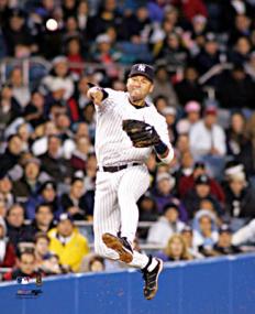
Derek Jeter vs. Objective Reality is an entertaining article from Slate regarding a study by Shane T. Jensen at the Wharton School. Nate DiMeo writes:

The take-away from the study, which was presented at the annual meeting of the American Association for the Advancement of Science, was that Mr. Jeter (despite his three Gold Gloves and balletic leaping throws) is the worst-fielding shortstop in the game.

The New York press was unhappy, but the stats-minded baseball types (Sabermetricians) weren’t that impressed. DiMeo continues:

Mostly, though, the paper didn’t provoke much intrigue because Jeter’s badness is already an axiom of [Sabermetric literature]. In fact, debunking the conventional wisdom about the Yankee captain’s fielding prowess has become a standard method of proving the validity of a new fielding statistic. That places Derek Jeter at the frontier of new baseball research.

Well put. Mr. Jeter defended himself by saying:

“Maybe it was a computer glitch”

What I like about the article, aside from a objective and quantitative reason to dislike Jeter (I already have a quantity of subjective reasons) is how the article frames the issue in the broader sports statistics debate. It nicely covers this new piece of information as a microcosm of the struggle between sabermetricians and traditional baseball types, while essentially poking fun at both: the total refusal of the traditional side to buy into the numbers, and the schadenfreude of the geeks going after Jeter since he’s the one who gets the girls. (The article is thankfully not as trite as that, but you get the idea.)

I’m also biased since the metric in the paper places Pokey Reese, one of my favorite Red Sox players of 2004 as #11 amongst second basemen between 2000-2005.

And of course, The Onion does it better:

Experts: ‘Derek Jeter Probably Didn’t Need To Jump To Throw That Guy Out’

BRISTOL, CT—Baseball experts agreed Sunday that Derek Jeter, who fielded a routine ground ball during a regular-season game in which the Yankees were leading by five runs and then threw it to first base using one of his signature leaps, did not have to do that to record the out. “If it had been a hard-hit grounder in the hole or even a slow dribbler he had to charge, that would’ve been one thing,” analyst John Kruk said during a broadcast of Baseball Tonight. “But when it’s hit right to him by [Devil Rays first-baseman] Greg Norton, a guy who has no stolen bases and is still suffering the effects of a hamstring injury sustained earlier this year… Well, that’s a different story.” Jeter threw out Norton by 15 feet and pumped his fist in celebration at the end of the play.

In other news, I can’t believe I just put a picture of Jeter on my site.

Monday, July 14, 2008 | baseball, mine, sports  

Storyboarding with the Coen Brothers

0805ande1_533x600_4.jpgWonderful article about the work of J. Todd Anderson, who storyboards the Coen Brothers’ movies:

Anderson’s drawings have a jauntiness that seems absent from the more serious cinematic depiction; Anderson says he is simply trying to inject as much of a sense of action as possible into each scene.

Anderson describes the process of meeting about a new film:

“It’s like they’re making a movie in front of me,” he says. “They tell me the shots. I do fast and loose drawings on a clipboard with a Sharpie pen—one to three drawings to a sheet of regular bond paper. I try to establish the scale, trap the angle, ID the character, get the action.”

More in the article

Friday, June 27, 2008 | drawing, movies  

National Traffic Scorecard

The top 100 most congested metropolitan areas, visualized as a series of tomato stems:

scorecard-500.png

Includes links to PDF reports for each area which detail overall congestion and the worst bottlenecks.

Thursday, June 26, 2008 | mapping, traffic  

Paternalism at the state level and the definition of “advice”

Following up on an earlier post, The New York Times jumps in with more about California (and New York before it) shutting down personal genomics companies, including this curious definition of advice:

“We think if you’re telling people you have increased risk of adverse health effects, that’s medical advice,” said Ann Willey, director of the office of laboratory policy and planning at the New York State Department of Health.

The dictionary confirmed my suspicion that advice refers to “guidance or recommendatios concerning prudent future action,” which doesn’t coincide with telling people they have increased risk for a disease. If they told you to take medication based on that risk, it would most certainly be advice. But as far as I know, the extent of the advice given by these companies is to consult a doctor for…advice.

As in the earlier post, the health department in California continues to sound nutty:

“We started this week by no longer tolerating direct-to-consumer genetic testing in California,” Karen L. Nickel, chief of laboratory field services for the state health department, said during a June 13 meeting of a state advisory committee on clinical laboratories.

We will not tolerate it! These tests are a scourge upon our society! The collapse of the housing loan market, high gas prices, and the “great trouble or suffering” brought on by this beast that preys on those with an excess of disposable income. Someone has to save these people who have $1000 to spare on self-curiosity! And the poor millionaires spending $350,000 to get their genome sequenced by Knome. Won’t someone think of the millionaires!?

I wish I still lived in California, because then I would know someone was watching out for me.

For the curious, the letters sent to the individual companies can be found here, sadly they aren’t any more insightful than the comments to the press. But speaking of scourge—the notices are all Microsoft Word files.

One interesting tidbit closing out the Times article:

Dr. Hudson [director of the Genetics and Public Policy Center at Johns Hopkins University] said it was “not surprising that the states are stepping in, in an effort to protect consumers, because there has been a total absence of federal leadership.” She said that if the federal government assured tests were valid, “paternalistic” state laws could be relaxed “to account for smart, savvy consumers” intent on playing a greater role in their own health care.

It’s not clear whether this person is just making a trivial dig at the federal government
or whether this is the root of the problem. In the previous paragraph she’s being flippant about “Genes R Us” so it might be just a swipe, but it’s an interesting point nonetheless.

Thursday, June 26, 2008 | genetics, government, privacy, science  

Surfing, Orgies, and Apple Pie

Obscenity law in the United States is based on Miller vs. California, a precedent set in 1973:

“(a) whether the ‘average person, applying contemporary community standards’ would find that the work, taken as a whole, appeals to the prurient interest,

(b) whether the work depicts or describes, in a patently offensive way, sexual conduct specifically defined by the applicable state law, and

(c) whether the work, taken as a whole, lacks serious literary, artistic, political, or scientific value.”

Of course, the definition of an average person or community standards isn’t quite as black and white as most Supreme Court decisions. In a new take, the lawyer defending the owner of a pornography site in Florida is using Google Trends to produce what he feels is a more accurate definition of community standards:

In the trial of a pornographic Web site operator, the defense plans to show that residents of Pensacola are more likely to use Google to search for terms like “orgy” than for “apple pie” or “watermelon.” The publicly accessible data is vague in that it does not specify how many people are searching for the terms, just their relative popularity over time. But the defense lawyer, Lawrence Walters, is arguing that the evidence is sufficient to demonstrate that interest in the sexual subjects exceeds that of more mainstream topics — and that by extension, the sexual material distributed by his client is not outside the norm.

Below, “surfing” in blue, “orgy” in red, and “apple pie” in orange:

viz-500.png

A clever defense. The trends can also be localized to roughly the size of a large city or county, which arguably might be considered the “community.” The New York Times article continues:

“Time and time again you’ll have jurors sitting on a jury panel who will condemn material that they routinely consume in private,” said Mr. Walters, the defense lawyer. Using the Internet data, “we can show how people really think and feel and act in their own homes, which, parenthetically, is where this material was intended to be viewed,” he added.

Fascinating that there could actually be something even remotely quantifiable about community standards. “I know it when I see it” is inherently subjective, so is any introduction of objectivity an improvement? For more perspective, I recommend this article from FindLaw, which describes the history of “Movie Day” at the Supreme Court and the evolution of obscenity law.

The trends data has many inherent problems (lack of detail for one), but is another indicator of what we can learn from Google. Most important to me, the case provides an example of what it means for search engines to capture this information, because it demonstrates to the public at large (not just people who think about data all day) how the information can be used. As more information is collected about us, search engine data provides an imperfect mirror onto our society, previously known only to psychiatrists and priests.

Tuesday, June 24, 2008 | online, privacy, retention, social  

Typography Grab Bag: Berlow, Carter, and Indiana Jones

raiders.jpgIndiana Jones and the Fonts on the Maps – Mark Simonson takes on historical accuracy of the typography used in the Indiana Jones movies:

For the most part, the type usage in each of the movies is correct for the period depicted. With one exception: The maps used in the travel montages.

My theory is that this is because the travel maps are produced completely outside the standard production team. They’re done by some motion graphics house, outside the purview of the people on-set who are charged with issues of consistency. A nastier version of this theory might indict folks who do motion graphics for not knowing their typography and its time period—instead relying on the “feel” of the type when selecting. The bland version of this theory is that type history is esoteric, and nobody truly cares.

(Also a good time to point out how maps are used as a narrative device in the film, to great effect. The red line extending across the map is part of the Indiana Jones brand. I’d be curious to hear the story behind the mapping—who decided it needed to be there, who made it happen, who said “let’s do a moving red line that tracks the progress”—which parts were intentional, and which unintentional.)

Identifying the period for the faces reminded me of a 2005 profile of Matthew Carter, which described his involvement in court cases where date was in doubt, but typography of artifacts in question gave away their era. Sadly the article cannot be procured from the web site of The New Yorker, though you may have better luck if you possess a library card. Matthew Carter designed the typefaces Verdana and Bell Centennial (among many others). Spotting his wispy white ponytail around Harvard Square is a bit like seeing a rock star, if you’re a Cantabridgian typography geek.

From A to Z, font designer knows his type – a Boston Globe interview with type designer David Berlow (one of the founders of Font Bureau), some of the questions are unfortunate, but a few interesting anecdotes:

Playboy magazine came to me; they were printing with two printing processes, offset and gravure. Gravure (printing directly from cylinder to paper), gives a richer, smoother texture when printing flesh tones and makes the type look darker on the page than offset (indirect image transfer from plates). So if you want the type to look the same, you have to use two fonts. We developed two fonts for Playboy, but they kept complaining that the type was still coming out too dark or too light. Finally, I got a note attached to a proof that said, “Sorry. It was me. I needed new glasses. Thanks for all your help. Hef.” That was Hugh Hefner, of course.

Or speaking about his office:

From Oakland, Calif., to Delft, Holland, all the designers work from home. I have never been to the office. The first time I saw it was when I watched the documentary “Helvetica,” which showed our offices.

fontstruct-screenshot-300.jpg

The strange allure of making your own fonts – Jason Fagone describes FontStruct, a web-based font design tool from FontShop:

FontStruct’s interface couldn’t be more intuitive. The central metaphor is a sheet of paper. You draw letters on the “sheet” using a set of standard paint tools (pencil, line, box, eraser) and a library of what FontStruct calls “bricks” (squares, circles, half-circles, crescents, triangles, stars). If you keep at it and complete an entire alphabet, FontStruct will package your letters into a TrueType file that you can download and plunk into your PC’s font folder. And if you’re feeling generous, you can tell FontStruct to share your font with everybody else on the Internet under a Creative Commons license. Every font has its own comment page, which tends to fill with praise, practical advice, or just general expressions of devotion to FontStruct.

Though I think my favorite bit might be this one:

But the vast majority of FontStruct users aren’t professional designers, just enthusiastic font geeks.

I know that because I’m one of them. FontStruct brings back a ton of memories; in college, I used to run my own free-font site called Alphabet Soup, where I uploaded cheapie fonts I made with a pirated version of a $300 program called Fontographer. Even today, when I self-Google, I mostly come up with links to my old, crappy fonts. (My secret fear is that no matter what I do as a reporter, the Monko family of fonts will remain my most durable legacy.)

The proliferation of bad typefaces: the true cost of software piracy.

Tuesday, June 17, 2008 | grabbag, mapping, refine, software, typography  

Personal genetic testing gets hilarious before it gets real

Before I even had a chance to write about personal genomics companies 23andMe, Navigenics, and deCODEme, Forbes reports that the California Health Department is looking to shut them down:

This week, the state health department sent cease-and-desist letters to 13 such firms, ordering them to immediately stop offering genetic tests to state residents.

Because of advances in genotyping, it’s possible for companies to detect changes from half a million data points (or soon, a million) of a person’s genome. The idea behind genotyping is that you look only for the single letter changes (SNPs) that are more likely to be unique between individuals, and then use that to create a profile of similarities and differences. So companies have sprung up, charging $1000 (ok, $999) a pop to decode these bits of your genome. It can then tell you some basic things about ancestry, or maybe a little about susceptibility for certain kinds of diseases (those that have a fairly simple genetic makeup—of which there aren’t many, to be sure).

Lea Brooks, spokesperson for the California Health Department, confirmed for Wired that:

…the investigation began after “multiple” anonymous complaints were sent to the Health Department. Their researchers began with a single target but the list of possible statute violators grew as one company led to another.

Listen folks, this is not just one California citizen, but two or more anonymous persons! Perhaps one of them was a doctor or insurance firm who have been neglected their cut of the $1000:

One controversy is that some gene testing Web sites take orders directly from patients without a doctor’s involvement.

Well now, that is a controversy! Genetics has been described as the future of medicine, and yet traditional drainers of wallets (is drainer a word?) in the current health care system have been sadly neglected. The Forbes article also describes the nature of the complaints:

The consumers were unhappy about the accuracy [of the tests] and thought they cost too much.

California residents will surely be pleased that the health department is taking a hard stand on the price of boutique self-testing. As soon as they finish off these scientifimagical “genetic test” goons, we could all use a price break on home pregnancy tests.

video1_6.pngAnd as to the accuracy of, or what can be ascertained from such tests? That’s certainly been a concern of the genetics community, and in fact 23andme has “admitted its tests are not medically useful, as they represent preliminary findings, and so are merely for educational purposes.” Which is perfectly clear to someone visiting their site, however that presents a bigger problem:

“These businesses are apparently operating without a clinical laboratory license in California. The genetic tests have not been validated for clinical utility and accuracy,” says Nickel.

So an accurate, clinical-level test is illegal. But a less accurate, do-it-yourself (without a doctor) test is also illegal. And yet, California’s complaint gets more bizarre:

“And they are scaring a lot of people to death.”

Who? The people who were just complaining about the cost of the test? That’s certainly a potential problem if you don’t do testing through a doctor—and in fact, it’s a truly significant concern. But who purchases a $999 test from a site with the cartoon characters seen above to check for Huntington’s disease?

And don’t you think if “scaring people” were the problem, wouldn’t the papers and the nightly news be all over it? The only thing they love more than a new scientific technology that’s going to save the world is a new scientific technology to be scared of. Ooga booga! Fearmongering hits the press far more quickly than it does the health department, so this particular line of argument just sounds specious.

The California Health Department does an enormous disservice to the debate of a complicated issue by mixing several lines of reasoning which taken as a whole simply contradict one another. The role of personal genetic testing in our society deserves a debate and consideration; I thought I would be able to post about that part first, but instead the CA government beat me to the dumb stuff.

Thomas Goetz, deputy editor at Wired has had two such tests (clearly not unhappy with the price), and angrily responds “Attention, California Health Department: My DNA Is My Data.” It’s not just those anonymous Californians who are wound up about genetic testing, he’s writing his sternly worded letter as we speak:

This is my data, not a doctor’s. Please, send in your regulators when a doctor needs to cut me open, or even draw my blood. Regulation should protect me from bodily harm and injury, not from information that’s mine to begin with.

Are angry declarations of ownership of one’s health data a new thing? It’s not like most people fight for their doctor’s office papers, or even something as simple as a fingerprint, this way.

It’ll be interesting to see how this shakes out. Or it might not, since it will probably consist of:

  1. A settlement by the various companies to continue doing business.
  2. Some means of doctors and insurance companies getting paid (requiring a visit, at a minimum).
  3. People trying to circumvent #2 (see related topics filed under “H” for Human Growth Hormone).
  4. An entrepreneur figures out how to do it online and in a large scale fashion (think WebMD), turning out new hoards of “information” seeking hypochondriacs to fret about their 42% potential alternate likelihood maybe chance of genetic malady. (You have brain cancer too!? OMG!)
  5. If this hits mainstream news, will people hear about the outcome of #1, or will there be an assumption that “personal genetic tests are illegal” from here on out? How skittish will this make investors (the Forbes set) about such companies?

Then again, I’ve already proven myself terrible at predicting the future. But I’ll happily enjoy the foolishness of the present.

Tuesday, June 17, 2008 | genetics, privacy, science  
Book

Visualizing Data Book CoverVisualizing Data is my 2007 book about computational information design. It covers the path from raw data to how we understand it, detailing how to begin with a set of numbers and produce images or software that lets you view and interact with information. When first published, it was the only book(s) for people who wanted to learn how to actually build a data visualization in code.

The text was published by O’Reilly in December 2007 and can be found at Amazon and elsewhere. Amazon also has an edition for the Kindle, for people who aren’t into the dead tree thing. (Proceeds from Amazon links found on this page are used to pay my web hosting bill.)

Examples for the book can be found here.

The book covers ideas found in my Ph.D. dissertation, which is the basis for Chapter 1. The next chapter is an extremely brief introduction to Processing, which is used for the examples. Next is (chapter 3) is a simple mapping project to place data points on a map of the United States. Of course, the idea is not that lots of people want to visualize data for each of 50 states. Instead, it’s a jumping off point for learning how to lay out data spatially.

The chapters that follow cover six more projects, such as salary vs. performance (Chapter 5), zipdecode (Chapter 6), followed by more advanced topics dealing with trees, treemaps, hierarchies, and recursion (Chapter 7), plus graphs and networks (Chapter 8).

This site is used for follow-up code and writing about related topics.