 Indiana Jones and the Fonts on the Maps – Mark Simonson takes on historical accuracy of the typography used in the Indiana Jones movies:
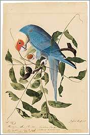
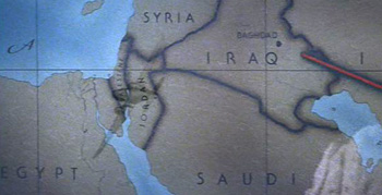
For the most part, the type usage in each of the movies is correct for the period depicted. With one exception: The maps used in the travel montages.
My theory is that this is because the travel maps are produced completely outside the standard production team. They’re done by some motion graphics house, outside the purview of the people on-set who are charged with issues of consistency. A nastier version of this theory might indict folks who do motion graphics for not knowing their typography and its time period—instead relying on the “feel” of the type when selecting. The bland version of this theory is that type history is esoteric, and nobody truly cares.
(Also a good time to point out how maps are used as a narrative device in the film, to great effect. The red line extending across the map is part of the Indiana Jones brand. I’d be curious to hear the story behind the mapping—who decided it needed to be there, who made it happen, who said “let’s do a moving red line that tracks the progress”—which parts were intentional, and which unintentional.)
Identifying the period for the faces reminded me of a 2005 profile of Matthew Carter, which described his involvement in court cases where date was in doubt, but typography of artifacts in question gave away their era. Sadly the article cannot be procured from the web site of The New Yorker, though you may have better luck if you possess a library card. Matthew Carter designed the typefaces Verdana and Bell Centennial (among many others). Spotting his wispy white ponytail around Harvard Square is a bit like seeing a rock star, if you’re a Cantabridgian typography geek.
From A to Z, font designer knows his type – a Boston Globe interview with type designer David Berlow (one of the founders of Font Bureau), some of the questions are unfortunate, but a few interesting anecdotes:
Playboy magazine came to me; they were printing with two printing processes, offset and gravure. Gravure (printing directly from cylinder to paper), gives a richer, smoother texture when printing flesh tones and makes the type look darker on the page than offset (indirect image transfer from plates). So if you want the type to look the same, you have to use two fonts. We developed two fonts for Playboy, but they kept complaining that the type was still coming out too dark or too light. Finally, I got a note attached to a proof that said, “Sorry. It was me. I needed new glasses. Thanks for all your help. Hef.” That was Hugh Hefner, of course.
Or speaking about his office:
From Oakland, Calif., to Delft, Holland, all the designers work from home. I have never been to the office. The first time I saw it was when I watched the documentary “Helvetica,” which showed our offices.
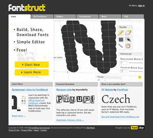
The strange allure of making your own fonts – Jason Fagone describes FontStruct, a web-based font design tool from FontShop:
FontStruct’s interface couldn’t be more intuitive. The central metaphor is a sheet of paper. You draw letters on the “sheet” using a set of standard paint tools (pencil, line, box, eraser) and a library of what FontStruct calls “bricks” (squares, circles, half-circles, crescents, triangles, stars). If you keep at it and complete an entire alphabet, FontStruct will package your letters into a TrueType file that you can download and plunk into your PC’s font folder. And if you’re feeling generous, you can tell FontStruct to share your font with everybody else on the Internet under a Creative Commons license. Every font has its own comment page, which tends to fill with praise, practical advice, or just general expressions of devotion to FontStruct.
Though I think my favorite bit might be this one:
But the vast majority of FontStruct users aren’t professional designers, just enthusiastic font geeks.
I know that because I’m one of them. FontStruct brings back a ton of memories; in college, I used to run my own free-font site called Alphabet Soup, where I uploaded cheapie fonts I made with a pirated version of a $300 program called Fontographer. Even today, when I self-Google, I mostly come up with links to my old, crappy fonts. (My secret fear is that no matter what I do as a reporter, the Monko family of fonts will remain my most durable legacy.)
The proliferation of bad typefaces: the true cost of software piracy.