 I’ve just posted the updated version of Salary vs. Performance for the 2009 baseball season. I had hoped this year to rewrite the piece to cover multiple years, have a couple more analysis options, and even to rebuild it using the JavaScript version of Processing (no Java! no plug-in!), but a busy spring has upended my carefully crafted but poorly implemented plans.
Meanwhile, my inbox has been filling with plaintive comments like this one:
Will you be updating this site for this year? It’s the first year I think my team, the Giants would have a blue line instead of a red line.
How can I ignore the Giants fans? (Or for that matter, their neighbors to the south, the Dodgers, who perch atop the list as I write this.)
More about the project can be found in the archives. Visualizing Data explains the code and how it works, and the code itself is amongst the book examples.
James Torget, by way of my inbox:
I wanted to touch base to let you know about a workshop that we’re putting together out here at the University of Richmond. Basically, UR (with James Madison University) will be hosting a workshop this spring focused on how scholars can create visualizations of historical data and how we can better share our data across the Internet. To that end, we are looking for people working on these questions who would be interested in participating in an NEH-sponsored workshop.
We are seeking proposals for presentations at the workshop, and participants for our in-depth discussions. The workshop is scheduled for February 20-21, 2009 at the University of Richmond. We are asking that people submit their proposals by December 15, and we will extend invitations for participation by December 31, 2008. Detailed information can be found at: http://dsl.richmond.edu/workshop/
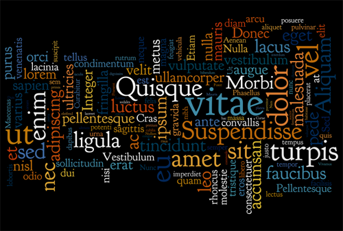
I’ve never really been fond of tag clouds, but Wordle, by MacGyver of software (and former drummer for They Might Be Giants) Jonathan Feinberg gives the representation an aesthetic nudge lacking in most representations. The application creates word clouds from input data submitted by users. I was reminded of it yesterday by Eugene, who submitted Lorem Ipsum:
I had first heard about it from emailer Bill Robertson, who had uploaded Organic Information Design, my master’s thesis. (Which was initially flattering but quickly became terrifying when I remembered that it still badly needs a cleanup edit.)
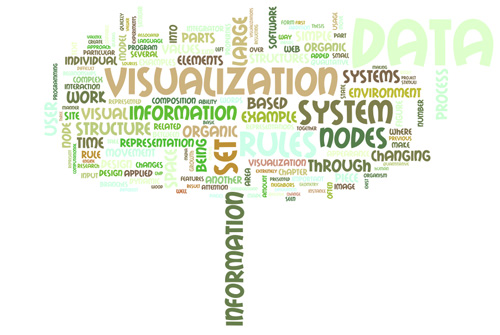
A wonderful tree shape! Can’t decide which I like better: “information” as the stem or “data” as a cancerous growth in the upper-right.
Mr. Feinberg is also the reason that Processing development has been moving to Eclipse (replacing emacs, some shell scripts, two packages of bazooka bubble gum and the command line) because of his donation of a long afternoon helping set up the software in the IDE back when I lived in East Cambridge, just a few blocks from where he works at IBM Research.
 Some potentially interesting data from NASA passed along by Chris Lonnen. The first is the Earth Observatory, which includes images of things like Carbon Monoxide, Snow Cover, Surface Temperature, UV Exposure, and so on. Chris writes:
I’m not sure how useful they would be to novices in terms of usable data (raw numbers are not provided in any easy to harvest manner), but the information is
still useful and they provide for a basic, if clunky, presentation that follows the basic steps you laid out in your book. They data can be found here, and they occasionally compile it all into interesting visualizations. My favorite being the carbon map here.
The carbon map movie is really cool, though I wish the raw data were available since the strong cyclical effect seen in the animation needs to be separated out. The cycles dominates the animation to such an extent that it’s nearly the only takeaway from the movie. For instance, each cycle is a 24 hour period. Instead of showing them one after another, show several days adjacent one another, so that we can compare 3am with one day to 3am the next.
For overseas readers, I’ll note that the images and data are not all U.S.-centric—most cover the surface of the Earth.
I asked Chris about availability for more raw data, and he did a little more digging:
The raw data availability is slim. From what I’ve gathered you need to contact NASA and have them give you clearance as a researcher. If you were looking for higher quality photography for a tutorial NASA Earth Observations has a newer website that I’ve just found which offers similar data in the format of your choice at up to 3600 x 1800. For some sets it will also offer you data in CSV or CSV for Excel.
If you needed higher resolutions that that NASA’s Visible Earth offers some TIFF’s at larger sizes. A quick search for .tiff gave me an 16384 x 8192 map of the earth with city lights shining, which would be relatively easy to filter out from the dark blue background. These two websites are probably a bit more helpful.
Interesting tidbits for someone interested in a little planetary digging. I’ve had a few of these links sitting in a pile waiting for me to finish the “data” section of my web site; in the meantime I’ll just mention things here.
Update 31 July 2008: Robert Simmon from NASA chimes in.
Just received this in a message from a journalism grad student studying information graphics:
I have looked at 2 years worth of Glamour (and Harper’s Bazaar too) magazines for my project and it shows that Glamour and other women’s magazines have less amount of information graphics in the magazines compared to men’s magazines, such as GQ and Esquire. Why do you think that is? Do you think that is gender-related at all?
I hadn’t really thought about it much. For the record, my reply:
My fiancée (who knows a lot more about being female than I do) pointed out that such magazines have much less practical content in general, so it may have more to do with that than a specific gender thing. Though she also pointed out that, for instance, in today’s news about the earthquake in China, she felt that women might be more inclined to read a story with the faces of those affected than one with information graphics tallying or describing the same.
I think you’d need to find something closer to a male equivalent of Glamour so that you can cover your question and remove the significant bias you’re getting for the content. Though, uh, a male equivalent of Glamour may not really exist… But perhaps there are better options.
And as I was writing this, she responded:
Finding a male equivalent of Glamour is hard but they actually do have some hard-hitting stories near the back in every issue that sometimes might be overshadowed by all the fashion and beauty stuff. Actually, finding a female equivalent of GQ or Esquire is also hard because they sort of have a niche of their own too. I have to agree with your fiancée too, because, I studied Oprah’s magazines a little in my previous study and sometimes it is really about what appeals to their audience.
Well, my study does not imply causality and it sometimes might be hard to differentiate if the result was due to gender differences or content. So, it’s interesting to find all these out, and actually men’s magazines have about 5 times more information graphics than women’s magazines which is amazing.
Wow—five times more. (At least amongst the magazines that she mentioned.)
My hope in posting this (rather than just sharing the contents of my inbox…can you tell that I’m answering mail today?) is that someone else out there knows more about the subject. Please drop me a line if you do; I’d like to know more and to post a follow-up.

