Nice heat map image of how people use the menu bar in Firefox by Alex Faaborg:

Most of the results are what you’d expect, but fun to see it nonetheless. Some other info graphics using the same data can be found here, and even better, the raw data can be found here.
Word on the street (where by “the street” I mean an email from Golan Levin), is that the Center for Responsive Politics has made available piles and piles of data:
The following data sets, along with a user guide, resource tables and other documentation, are now available in CSV format (comma-separated values, for easy importing) through OpenSecrets.org’s Action Center at http://www.opensecrets.org/action/data.php:
CAMPAIGN FINANCE: 195 million records dating to the 1989-1990 election cycle, tracking campaign fundraising and spending by candidates for federal office, as well as political parties and political action committees. CRP’s researchers add value to Federal Election Commission data by cleaning up and categorizing contribution records. This allows for easier totaling by industry and company or organization, to measure special-interest influence.
LOBBYING: 3.5 million records on federal lobbyists, their clients, their fees and the issues they reported working on, dating to 1998. Industry codes have been applied to this data, as well.
PERSONAL FINANCES: Reports from members of Congress and the executive branch that detail their personal assets, liabilities and transactions in 2004 through 2007. The reports covering 2008 will become available to the public in June, and the data will be available for download once CRP has keyed those reports.
527 ORGANIZATIONS: Electronically filed financial records beginning in the 2004 election cycle for the shadowy issue-advocacy groups known as 527s, which can raise unlimited sums of money from corporations, labor unions and individuals.
The best thing here is that they’ve already tidied and scrubbed the data for you, just like Mom used to. The personal finance information alone has already led to startling revelations.
 Back in December (or maybe even November… sorry, digging out my inbox this morning) Amazon announced the availability of public data sets for their Elastic Compute Cloud platform:
Previously, large data sets such as the mapping of the Human Genome and the US Census data required hours or days to locate, download, customize, and analyze. Now, anyone can access these data sets from their Amazon Elastic Compute Cloud (Amazon EC2) instances and start computing on the data within minutes. Users can also leverage the entire AWS ecosystem and easily collaborate with other AWS users. For example, users can produce or use prebuilt server images with tools and applications to analyze the data sets. By hosting this important and useful data with cost-efficient services such as Amazon EC2, AWS hopes to provide researchers across a variety of disciplines and industries with tools to enable more innovation, more quickly.
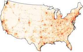
The current lists includes ENSEMBL (550 GB), GenBank (250 GB), various collections from the US Census (about 500 GB), and a handful of others (with more promised). I’m excited about the items under the “Economy” heading, since lots of that information has to date been difficult to track down in one place and in a single format.
While it may be possible to download these as raw files from FTP servers from their original sources, it’s already set up for you, rather than running rsync or ncftp for twenty-four hours, then spending an afternoon setting up a Linux server with MySQL and lots of big disk space, and dealing with various issues regarding versions of Apache, MySQL, PHP, different Perl modules to be installed, permissions to be fixed, etc. etc. (Can you tell the pain is real?)
As I understand it, you start with a frozen version of the database, then import that into your own workspace on AWS, and pay only for the CPU time, storage, and bandwidth that you actually use. Pricing details are here, but wear boots — there’s a lotta cloud marketingspeak to wade through.
(Thanks to Andrew Otwell for the nudge.)
Our forty-fourth president:
That we are in the midst of crisis is now well understood. Our nation is at war, against a far-reaching network of violence and hatred. Our economy is badly weakened, a consequence of greed and irresponsibility on the part of some, but also our collective failure to make hard choices and prepare the nation for a new age. Homes have been lost; jobs shed; businesses shuttered. Our health care is too costly; our schools fail too many; and each day brings further evidence that the ways we use energy strengthen our adversaries and threaten our planet.
These are the indicators of crisis, subject to data and statistics. Less measurable but no less profound is a sapping of confidence across our land – a nagging fear that America’s decline is inevitable, and that the next generation must lower its sights.
For the politically-oriented math geek in me, his mention of statistics stood out: we now have a president who can actually bring himself to reference numbers and facts. I searched for other mentions of “statistics” in previous inaugural speeches and found just a single, though oddly relevant, quote from William Howard Taft in 1909:
The progress which the negro has made in the last fifty years, from slavery, when its statistics are reviewed, is marvelous, and it furnishes every reason to hope that in the next twenty-five years a still greater improvement in his condition as a productive member of society, on the farm, and in the shop, and in other occupations may come.
Progress indeed. (And what’s the term for that? A surprising coincidence? Irony? Is there a proper term for such a connection? Perhaps a thirteen letter German word along the lines of schadenfreude?)
And it’s such a relief to see the return of science:
For everywhere we look, there is work to be done. The state of the economy calls for action, bold and swift, and we will act – not only to create new jobs, but to lay a new foundation for growth. We will build the roads and bridges, the electric grids and digital lines that feed our commerce and bind us together. We will restore science to its rightful place, and wield technology’s wonders to raise health care’s quality and lower its cost. We will harness the sun and the winds and the soil to fuel our cars and run our factories. And we will transform our schools and colleges and universities to meet the demands of a new age. All this we can do. And all this we will do.
 Featuring “38 projects and more than 730,000 records,” the Los Angeles Times now has a Data Desk feature, a collection of searchable data sets and information graphics from recent publications. It’s like reading the LA Times online but only paying attention to the data-oriented features. (Boring? Appealing? Your ideal newspaper? We database, you decide. Eww, don’t repeat that.) On first glance I thought (hoped) it would be more raw data, but even having all the items collected in one location suggests something interesting for how newspapers share (and perceive, internally) their carefully researched (an massaged) data that they collect on a regular basis.
Thanks to Casey for the pointer.
Some additional followup from Robert Simmon regarding the previous post. I asked more about the “amateur Earth observers” and the intermediate data access. He writes:
The original idea was sparked from the success of amateur astronomers discovering comets. Of course amateur astronomy is mostly about making observations, but we (NASA) already have the observations: the question is what to do with them–which we really haven’t figured out. One approach is to make in-situ observations like aerosol optical thickness (haziness, essentially), weather measurements, cloud type, etc. and then correlate them with satellite data. Unfortunately, calibration issues make this data difficult to use scientifically. It is a good outreach tool, so we’re partnering with science museums, and the GLOBE program does this with schools.
We don’t really have a good sense yet of how to allow amateurs to make meaningful analyses: there’s a lot of background knowledge required to make sense of the data, and it’s important to understand the limitations of satellite data, even if the tools to extract and display it are available. There’s also the risk that quacks with and axe to grind will willfully abuse data to make a point, which is more significant for an issue like climate change than it is for the face on Mars, for example. That’s just a long way of saying that we don’t know yet, and we’d appreciate suggestions.
I’m more of a “face on Mars” guy myself. It’s unfortunate that the quacks even have to be considered, though not surprising from what I’ve seen online. Also worth checking out:
Are you familiar with Web Map Service (WMS)?
http://www.opengeospatial.org/standards/wms
It’s one of the ways we distribute & display our data, in addition to KML.
And one last followup:
Here’s another data source for NASA satellite data that’s a bit easier than the data gateway:
http://daac.gsfc.nasa.gov/techlab/giovanni/
and examples of classroom exercises using data, with some additional data sources folded in to each one:
http://serc.carleton.edu/eet/
The EET holds an “access data workshop” each year in late spring, you may be interested in attending next year.
And with regards to guidelines, Mark Baltzegar (of The Cyc Foundation) sent along this note:
Are you familiar with the ongoing work within the W3C’s Linking Open Data project? There is a vibrant community actively exposing and linking open data.
http://richard.cyganiak.de/2007/10/lod/
http://esw.w3.org/topic/SweoIG/TaskForces/CommunityProjects/LinkingOpenData
More to read and eat up your evening, at any rate.
Robert Simmon of NASA caught this post about the NASA Earth Observatory and was kind enough to pass along some additional information.
Regarding the carbon emissions video:
The U.S. carbon emissions data were taken from the Vulcan Project:
http://www.purdue.edu/eas/carbon/vulcan/index.php
They distribute the data here:
http://www.purdue.edu/eas/carbon/vulcan/research.html
In addition to the animation (which was intended to show the daily cycle and the progress of elevated emissions from east to west each morning), we published a short feature about the project and the dataset, including some graphs that remove the diurnal cycle.
http://earthobservatory.nasa.gov/Study/AmericanCarbon/
American Carbon is an example of one of our feature articles, which are published every month or so. We try to cover current research, focusing on individual scientists, using narrative techniques. The visualizations tie in closely to the text of the story. I’m the primary visualizer, and I focus on presenting the data as clearly as possible, rather than allowing free-form investigation of data. We also publish daily images (with links to images at the original resolution), imagery of natural hazards emphasizing current events (fires, hurricanes, and dust storms, for example), nasa press releases, a handful of interactive lessons, and the monthly global maps of various parameters. We’re in the finishing stages of a redesign, which will hopefully improve the navigation and site usability.
Also some details about the difficulties of distributing and handling the data:
These sections draw on data from wide and varied sources. The raw data is extremely heterogeneous, formats include: text files, HDF, matlab, camera raw files, GRADS, NetCDF, etc. All in different projections, at different spatial scales, and covering different time periods. Some of them are updated every five minutes, and others are reprocessed periodically. Trying to make the data available—and current—through our site would be overly ambitious. Instead, we focus on a non-expert audience interested in space, technology, and the environment, and link to the original science groups and the relevant data archives. Look in the credit lines of images for links.
Unfortunately the data formats can be very difficult to read. Here’s the main portal for access to NASA Earth Observing System data:
http://esdis.eosdis.nasa.gov/index.html
and the direct link to several of the data access interfaces:
http://esdis.eosdis.nasa.gov/dataaccess/search.html
And finally, something closer to what was discussed in the earlier post:
With the complexity of the science data, there is a place for an intermediate level of data: processed to a consistent format and readable by common commercial or free software (intervention by a data fairy?). NASA Earth Observations (NEO) is one attempt at solving that problem: global images at 0.1 by 0.1 degrees distributed as lossless-compressed indexed color images and csv files. Obviously there’s work to be done to improve NEO, but we’re getting there. We’re having a workshop this month to develop material for “amateur Earth observers” which will hopefully help us in this area, as well.
This speaks to the audience I tried to address with Visualizing Data in particular (or with Processing in general). There is a group of people who want access to data that’s more low-level than what’s found in a newspaper article, but not as complicated as raw piles of data from measuring instruments that are only decipherable by the scientists who use them.
This is a general theme, not specific to NASA’s data. And I think it’s a little more low-level than requiring that everything be in mashup-friendly XML or JSON feeds, but it seems worthwhile to start thinking about what the guidelines would be for open data distribution. And with such guidelines in place, we can browbeat organizations to play along! Since that would be, uh, a nice way to thank them for making their data available in the first place.
 Some potentially interesting data from NASA passed along by Chris Lonnen. The first is the Earth Observatory, which includes images of things like Carbon Monoxide, Snow Cover, Surface Temperature, UV Exposure, and so on. Chris writes:
I’m not sure how useful they would be to novices in terms of usable data (raw numbers are not provided in any easy to harvest manner), but the information is
still useful and they provide for a basic, if clunky, presentation that follows the basic steps you laid out in your book. They data can be found here, and they occasionally compile it all into interesting visualizations. My favorite being the carbon map here.
The carbon map movie is really cool, though I wish the raw data were available since the strong cyclical effect seen in the animation needs to be separated out. The cycles dominates the animation to such an extent that it’s nearly the only takeaway from the movie. For instance, each cycle is a 24 hour period. Instead of showing them one after another, show several days adjacent one another, so that we can compare 3am with one day to 3am the next.
For overseas readers, I’ll note that the images and data are not all U.S.-centric—most cover the surface of the Earth.
I asked Chris about availability for more raw data, and he did a little more digging:
The raw data availability is slim. From what I’ve gathered you need to contact NASA and have them give you clearance as a researcher. If you were looking for higher quality photography for a tutorial NASA Earth Observations has a newer website that I’ve just found which offers similar data in the format of your choice at up to 3600 x 1800. For some sets it will also offer you data in CSV or CSV for Excel.
If you needed higher resolutions that that NASA’s Visible Earth offers some TIFF’s at larger sizes. A quick search for .tiff gave me an 16384 x 8192 map of the earth with city lights shining, which would be relatively easy to filter out from the dark blue background. These two websites are probably a bit more helpful.
Interesting tidbits for someone interested in a little planetary digging. I’ve had a few of these links sitting in a pile waiting for me to finish the “data” section of my web site; in the meantime I’ll just mention things here.
Update 31 July 2008: Robert Simmon from NASA chimes in.


