
The Earth at night
Via mailing list, Oswald Berthold passes along images and a short article of the Earth from space as compiled by NASA, highlighting city lights in particular.
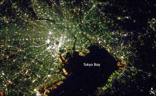
The collection is an update to the Earth Lights image developed a few years ago (and which made its way ’round the interwebs at the time).
For the more technical, a presentation from the NOAA titled Low Light Imaging of the Earth at Night provides greater detail about the methods used to produce such images. Also includes a couple interesting historical examples (such as the first image they created) as well as comparisons of city growth over time based on changes in the data.
Of course many conclusions can be drawn from seeing map data such as this. Look at the difference between North and South Korea, for instance (original image from globalsecurity.org).
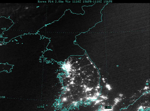
Apparently this is a favorite of former U.S. Secretary of Defense Donald Rumsfeld:
Mr Rumsfeld showed the picture to illustrate how backward the northern regime really is – and how oppressed its people are. Without electricity there can be none of the appliances that make life easy and that we take for granted, he said.
“Except for my wife and family, that is my favourite photo,” said Mr Rumsfeld.
“It says it all. There’s the south, the same people as the north, the same resources north and south, and the big difference is in the south it’s a free political system and a free economic system.
I’ve vowed to myself not to make this page be about politics so I won’t get into the fatuous arguments of a warmonger (oops), but I think the fascinating thing is that
- This image, this “information graphic,” would be of such great importance to a person that he would see fit to even mention it in reference to photos of his wife and children. This is a strong statement for any image, even if he is being dramatic.
- The use of images to make or score political points. There’s some great stuff buried in recent Congressional testimony about the Iraq War, for instance, that I want to get to soon.
In regards to #1, I’m trying to think of other images to which people maintain such a personal relationship (particularly those whose job is not info graphics—Tufte’s preoccupation with Napoleon’s March doesn’t count.)
As for #2, hopefully we’ll get to that a bit later.
