The roof of the Metrodome springs a leak following heavy snow in Minnesota:
I’ve been looking at too many particle and fluid dynamics simulations because it looks fake to me — more like a simulation created by the structural engineers of what would happen if the roof were to collapse — rather than thousands of pounds of honest-to-goodness midwestern snow pummeling the turf seemingly in slow motion. Beautiful.
And another version from a local FOX affiliate in Minnesota:
A beautiful image taken by a pinhole camera, showing the Sun’s path over six months:
From the explanation:
The picture clearly shows the path of the sun through the sky over the last six months. I believe you can see we didn’t have a great summer by the broken lines at the top. More sun shone in the month of October.
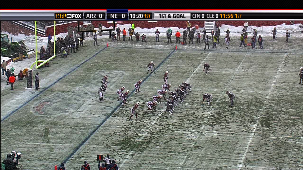
The field in snowy Foxborough, Massachusetts after a running play in Sunday’s football game:
(Click the image for the original version, taken from the broadcast.)
Look at all the footprints in the snow: The previous play began to the right of the white line, where you can see most of the snow was cleared by the players lining up. Just to the left of that is another cleared area, where a group of players began to tackle Sammy Morris. But it’s not until almost ten yards — two more white lines, and the area below where the players are standing in that picture — that he’s finally taken to the ground. For a visual explanation, watch the play:
(Mute the audio and spare yourself the insipid commentary from the FOX booth. And then be thankful that at least it’s not Joe Buck and Tim McCarver.)
The path left behind in the snow explains exactly how the play developed, according to the players’ feet. (And as a running play, feet are important.) Absolutely beautiful.
One of the best things about December is watching football games played in the snow. For instance last year, there was a game between Cleveland and Buffalo last year that looked like it was being played inside a snow globe, with the globe being picked up and shaken during each commercial break.
Boston was a complete mess yesterday with a few inches of snow, sleet, and muck falling from the sky, which made a mess of the field where the New England Patriots were happily hosting the Arizona Cardinals, who are less accustomed to digging out their cars and leaving behind patio furniture.
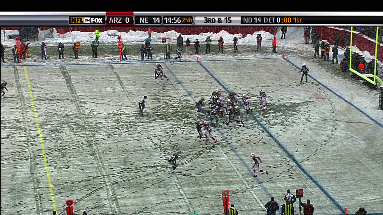
Another image from later in the game, this one instead depicts the substitutions of players as they near the goal line. Note the lines in the snow that begin at the left, and lead to where the players are lined up:
Another visualization from the see-through fish category, a segment from Sunday Morning about Dr. Walter Tschinkel who studies the structure of ant colonies using aluminum casts. Three easy steps: Heat aluminum to 1200 degrees, pour it down an ant hole, and dig away carefully to reveal the intricate structure of the interior:
What amazing structures! Whenever you think you’ve made something that looks “good,” you can count on nature to dole out humility. Maybe killing the ants in the process is a little way to get the control back. Um, or something.
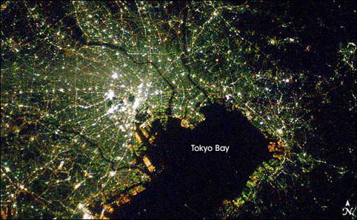
Via mailing list, Oswald Berthold passes along images and a short article of the Earth from space as compiled by NASA, highlighting city lights in particular.
The collection is an update to the Earth Lights image developed a few years ago (and which made its way ’round the interwebs at the time).
For the more technical, a presentation from the NOAA titled Low Light Imaging of the Earth at Night provides greater detail about the methods used to produce such images. Also includes a couple interesting historical examples (such as the first image they created) as well as comparisons of city growth over time based on changes in the data.
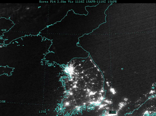
Of course many conclusions can be drawn from seeing map data such as this. Look at the difference between North and South Korea, for instance (original image from globalsecurity.org).
Apparently this is a favorite of former U.S. Secretary of Defense Donald Rumsfeld:
Mr Rumsfeld showed the picture to illustrate how backward the northern regime really is – and how oppressed its people are. Without electricity there can be none of the appliances that make life easy and that we take for granted, he said.
“Except for my wife and family, that is my favourite photo,” said Mr Rumsfeld.
“It says it all. There’s the south, the same people as the north, the same resources north and south, and the big difference is in the south it’s a free political system and a free economic system.
I’ve vowed to myself not to make this page be about politics so I won’t get into the fatuous arguments of a warmonger (oops), but I think the fascinating thing is that
This image, this “information graphic,” would be of such great importance to a person that he would see fit to even mention it in reference to photos of his wife and children. This is a strong statement for any image, even if he is being dramatic.
The use of images to make or score political points. There’s some great stuff buried in recent Congressional testimony about the Iraq War, for instance, that I want to get to soon.
In regards to #1, I’m trying to think of other images to which people maintain such a personal relationship (particularly those whose job is not info graphics—Tufte’s preoccupation with Napoleon’s March doesn’t count.)
As for #2, hopefully we’ll get to that a bit later.
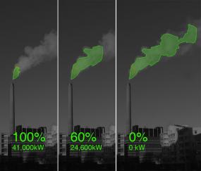
Wonderful project that shows power usage mapped to a green cloud, projected into the sky and onto the output of the Salmisaari power plant in Helsinki. From their description:
Every night from the 22 to the 29 of February 2008, the vapour emissions of he Salmisaari power plant in Helsinki will be illuminated to show the current levels of electricity consumption by local residents. A laser ray will trace the cloud during the night time and turn it into a city scale neon sign. Nuage Vert is a communal event for the area of Ruoholahti, which anticipates esoteric cults centred on energy and transforms an active power plant into a space for art, a living factory. In tandem, as a reversal of conventional roles whereby the post-industrial factory is turned into space for culture, Kaapeli (the cultural factory) becomes the site of operation and Salmisaari (the industrious factory) becomes the site of spectacle.
Visualizing Data is my 2007 book about computational information design. It covers the path from raw data to how we understand it, detailing how to begin with a set of numbers and produce images or software that lets you view and interact with information. When first published, it was the only book(s) for people who wanted to learn how to actually build a data visualization in code.
The text was published by O’Reilly in December 2007 and can be found at Amazon and elsewhere. Amazon also has an edition for the Kindle, for people who aren’t into the dead tree thing. (Proceeds from Amazon links found on this page are used to pay my web hosting bill.)
The book covers ideas found in my Ph.D. dissertation, which is the basis for Chapter 1. The next chapter is an extremely brief introduction to Processing, which is used for the examples. Next is (chapter 3) is a simple mapping project to place data points on a map of the United States. Of course, the idea is not that lots of people want to visualize data for each of 50 states. Instead, it’s a jumping off point for learning how to lay out data spatially.
The chapters that follow cover six more projects, such as salary vs. performance (Chapter 5), zipdecode (Chapter 6), followed by more advanced topics dealing with trees, treemaps, hierarchies, and recursion (Chapter 7), plus graphs and networks (Chapter 8).
This site is used for follow-up code and writing about related topics.