Writing

Already checked it in Photoshop, so you don’t have to

I wasn’t going to post this one, but I can’t get it out of my head. In the image below, the squares marked A and B are the same shade of gray.

prepare to have your mind blown. what's that? it already was?

The image is from Edward H. Adelson at MIT, and you can find my original source here. More details (proof, etc) on Adelson’s site here, which includes this explanation:

The visual system needs to determine the color of objects in the world. In this case the problem is to determine the gray shade of the checks on the floor. Just measuring the light coming from a surface (the luminance) is not enough: a cast shadow will dim a surface, so that a white surface in shadow may be reflecting less light than a black surface in full light. The visual system uses several tricks to determine where the shadows are and how to compensate for them, in order to determine the shade of gray “paint” that belongs to the surface.

The first trick is based on local contrast. In shadow or not, a check that is lighter than its neighboring checks is probably lighter than average, and vice versa. In the figure, the light check in shadow is surrounded by darker checks. Thus, even though the check is physically dark, it is light when compared to its neighbors. The dark checks outside the shadow, conversely, are surrounded by lighter checks, so they look dark by comparison.

A second trick is based on the fact that shadows often have soft edges, while paint boundaries (like the checks) often have sharp edges. The visual system tends to ignore gradual changes in light level, so that it can determine the color of the surfaces without being misled by shadows. In this figure, the shadow looks like a shadow, both because it is fuzzy and because the shadow casting object is visible.

The “paintness” of the checks is aided by the form of the “X-junctions” formed by 4 abutting checks. This type of junction is usually a signal that all the edges should be interpreted as changes in surface color rather than in terms of shadows or lighting.

As with many so-called illusions, this effect really demonstrates the success rather than the failure of the visual system. The visual system is not very good at being a physical light meter, but that is not its purpose. The important task is to break the image information down into meaningful components, and thereby perceive the nature of the objects in view.

(Like the earlier illusion post, this one’s also from my mother-in-law, who should apparently be writing this blog instead of its current—woefully negligent—author.)

Sunday, October 17, 2010 | perception, science  

Conveying multiple realities in research and journalism

A recent Boston Globe editorial covers the issue of multiple, seemingly (if obviously) contradictory statements that come from complex research, in this case around the oil spill:

Last week, Woods Hole researchers reported a 22-mile-long underwater plume that they mapped out in the Gulf of Mexico in June — a finding indicating that much more oil may lie deep underwater and be degrading so slowly that it might affect the ecosystem for some time. Also last week, University of Georgia researchers estimated up to 80 percent of the spill may still be at large, with University of South Florida researchers finding poisoned plankton between 900 feet and 3,300 feet deep. This differed from the Aug. 4 proclamation by Administrator Jane Lubchenco of the National Oceanic and Atmospheric Administration that three-quarters of the oil was “completely gone’’ or dispersed and the remaining quarter was “degrading rapidly.’’

But then comes the Lawrence Berkeley National Laboratory, which this week said a previously unclassified species of microbes is wolfing down the oil with amazing speed. This means that all the scientists could be right, with massive plumes being decimated these past two months by an unexpected cleanup crew from the deep.

This is often the case for anything remotely complex: the opacity of the research process to the general public, the communication skills of various institutions, the differing perspective between what the public cares about (whose fault is it? how bad is it?) versus the interests of the researchers, and so on.

It’s a basic issue around communicating complex ideas, and therefore affects visualization too — it’s rare that there’s a single answer.

sadness

On a more subjective note, I don’t know if I agree with the premise of the editorial is that it’s on the government to sort out the mess for the public. It’s certainly a role of the government, though the sniping at the Obama administration makes the editorial writer sound one who is equally likely to bemoan government spending, size, etc. But I could write an equally (perhaps more) compelling editorial making the point that it’s actually the role of newspapers like the Globe to sort out newsworthy issues that concern the public. But sadly, the Globe, or at least the front page of boston.com, has been overly obsessed with more click-ready topics like the Craigslist killer (or any other rapist, murderer, or stomach-turning story involving children du jour) and playing “gotcha” with spending and taxes for universities and public officials. What a bunch of ghouls.

(Thanks to my mother-in-law for the article link.)

Wednesday, September 1, 2010 | government, news, reading, science  

Illusive

A terrific set of videos from the “Best Illusion of the Year” contest. Congratulations to all the finalists, in particular first prize winner Koukichi Sugihara whose video is below:

More from Kokichi Sugihara (including an explanation of how this works) can be found here.

(thanks to my mother-in-law, who sent the link)

Saturday, May 22, 2010 | perception, science  

Pinhole camera image of the Sun’s path

A beautiful image taken by a pinhole camera, showing the Sun’s path over six months:

times square curvey billboards, eat your heart out

From the explanation:

The picture clearly shows the path of the sun through the sky over the last six months. I believe you can see we didn’t have a great summer by the broken lines at the top. More sun shone in the month of October.

The post also links to a description of how to make your own.

Tuesday, April 13, 2010 | physical, science  

Bio+Viz in da ‘berg

Give up those full hue heat map colors! Make images of biological data that even a grandmother can love! How about posters that no longer require an advanced degree to decipher? These platitudes and more coming next March, when I’ll be giving a keynote at the EMBO Workshop on Visualizing Biological Data in Heidelberg. Actually, I won’t be talking about any of those three things (though there’s a good chance I’ll talk about things like this), but registration is now open for participants:

Dear colleagues,

We invite you to participate in the first EMBO Workshop on Visualizing Biological Data (VizBi) 3 – 5 March 2010 at the EMBL’s new Advanced Training Centre in Heidelberg, Germany.

The goal of the workshop is to bring together, for the first time, researchers developing and using visualization systems across all areas of biology, including genomics, sequence analysis, macromolecular structures, systems biology, and imaging (including microscopy and magnetic resonance imaging). We have assembled an authoritative list of 29 invited speakers who will present an exciting program, reviewing the state-of-the-art and perspectives in each of these areas. The primary focus will be on visualizing processed and annotated data in their biological context, rather than on processing of raw data.

The workshop is limited in the total number participants, and each participant is normally required to present a poster and to give a ‘fastforward’ presentation about their work (limited to 30 seconds and 1 slide).

To apply to join the workshop, please go to http://vizbi.org and submit an abstract and image related to your work. Submissions close on 16 November 2009. Since places are limited, participants will be selected based on the relevance of their work to the goals of the workshop.

Notifications of acceptance will be sent within three weeks after the close of submissions.

We plan to award a prize for the submitted image that best conveys a strong scientific message in a visually compelling manner.

Please forward this announcement to anyone who may be interested. We hope to see you in Heidelberg next spring!

Seán O’Donoghue, EMBL
Jim Procter, University of Dundee
Nils Gehlenborg, European Bioinformatics Institute
Reinhard Schneider, EMBL

If you have any questions about the registration process please contact:

Adela Valceanu

Conference Officer
European Molecular Biology Laboratory
Meyerhofstr. 1
D-69117 Heidelberg
Tel: +49-6221-387 8625
Fax: +49-6221-387 8158
Email: valceanu@embl.de

For full event listings please visit our website or sign up for our newsletter.

Which also reminds me, I oughta finish cooking a few back-burner genetics projects before they go bad…

Tuesday, September 15, 2009 | science, talk  

Watching the evolution of the “Origin of Species”

I’ve just posted a new piece that depicts changes between the multiple editions of Darwin’s “On the Origin of Species:

screen-outline-500px

To quote myself, because it looks important:

We often think of scientific ideas, such as Darwin’s theory of evolution, as fixed notions that are accepted as finished. In fact, Darwin’s On the Origin of Species evolved over the course of several editions he wrote, edited, and updated during his lifetime. The first English edition was approximately 150,000 words and the sixth is a much larger 190,000 words. In the changes are refinements and shifts in ideas — whether increasing the weight of a statement, adding details, or even a change in the idea itself.

The idea that we can actually see change over time in a person’s thinking is fascinating. Darwin scholars are of course familiar with this story, but here we can view it directly, both on a macro-level as it animates, or word-by-word as we examine pieces of the text more closely.

This is hopefully the first of multiple pieces working with this data. Having worked with it since last December, I’ve been developing a larger application that deals with the information in a more sophisticated way, but that’s continually set aside because of other obligations. This simpler piece was developed for Emily King’s “Quick Quick Slow” exhibition opening next week at Experimenta Design in Portugal. As is often the case, many months were spent to try to create something monolithic, then in a very short time, an offshoot of all that work is developed that makes use of that infrastructure.

Oddly enough, I first became interested in this because of a discussion with a friend a few years ago, who had begun to wonder whether Darwin had stolen most of his better ideas from Alfred Russel Wallace, but gained the notoriety and credit because of his social status. (This appealed to the paranoid creator in me.) She cited the first edition of Darwin’s text as incoherent, and that it gradually improved over time. Interestingly (and happily, I suppose), the process of working on this piece has instead shown the opposite, and I have far greater appreciation for Darwin’s ideas than I had in the past.

Friday, September 4, 2009 | science, text, time  

No really, 3% of our GDP

Reader Eric Mika sent a link to the video of Obama’s speech that I mentioned a couple days ago. The speech was knocked from the headlines by news of Arlen Specter leaving the Republican party within just a few hours, so this is my chance to repeat the story again.

Specter’s defection is only relevant (if it’s relevant at all) until the next election cycle, so it’s frustrating to see something that could affect us for five to fifty years pre-empted by what talking heads are more comfortable bloviating about. It’s a reminder that with all the progress we’ve made on how quickly we can distribute news, and the increase in the number of outlets by which it’s available, the quality and thoughtfulness of the product has only been further undermined.

Update, a few hours later: it’s a battle of the readers! now Jamie Alessio passed along a high quality video of the the President’s speech from the White House channel on YouTube. Here’s the embedded version:

Monday, May 4, 2009 | government, news, science, speaky  

Not in our character to follow

obama rocks the academyObama’s goal for research and development is 3% of our GDP:

I believe it is not in our American character to follow – but to lead. And it is time for us to lead once again. I am here today to set this goal: we will devote more than three percent of our GDP to research and development. We will not just meet, but we will exceed the level achieved at the height of the Space Race, through policies that invest in basic and applied research, create new incentives for private innovation, promote breakthroughs in energy and medicine, and improve education in math and science. This represents the largest commitment to scientific research and innovation in American history.

I’m not much for patriotism rah-rah but it’s hard not to get fired up about this. I found the rest of his speech remarkable as well, listing specific technologies that emerged from basic research, too often overlooked:

The Apollo program itself produced technologies that have improved kidney dialysis and water purification systems; sensors to test for hazardous gasses; energy-saving building materials; and fire-resistant fabrics used by firefighters and soldiers.

And the announcement of a new agency along the lines of DARPA:

And today, I am also announcing that for the first time, we are funding an initiative – recommended by this organization – called the Advanced Research Projects Agency for Energy, or ARPA-E.

This is based on the Defense Advanced Research Projects Agency, known as DARPA, which was created during the Eisenhower administration in response to Sputnik. It has been charged throughout its history with conducting high-risk, high-reward research. The precursor to the internet, known as ARPANET, stealth technology, and the Global Positioning System all owe a debt to the work of DARPA.

The speech, nearly 5000 words in total (did our former President spill that many words for science during eight years in office?) continues with more policy regarding research, investment, and education–all very exciting to read. But perhaps my most favorite line of all, when he said to the members of the National Academy of Sciences in attendance:

And so today I want to challenge you to use your love and knowledge of science to spark the same sense of wonder and excitement in a new generation.

Tuesday, April 28, 2009 | government, science  

Statistics, Science, and Speeches

feat_624x351_service1_500px.jpg

Our forty-fourth president:

That we are in the midst of crisis is now well understood. Our nation is at war, against a far-reaching network of violence and hatred. Our economy is badly weakened, a consequence of greed and irresponsibility on the part of some, but also our collective failure to make hard choices and prepare the nation for a new age. Homes have been lost; jobs shed; businesses shuttered. Our health care is too costly; our schools fail too many; and each day brings further evidence that the ways we use energy strengthen our adversaries and threaten our planet.

These are the indicators of crisis, subject to data and statistics. Less measurable but no less profound is a sapping of confidence across our land – a nagging fear that America’s decline is inevitable, and that the next generation must lower its sights.

For the politically-oriented math geek in me, his mention of statistics stood out: we now have a president who can actually bring himself to reference numbers and facts. I searched for other mentions of “statistics” in previous inaugural speeches and found just a single, though oddly relevant, quote from William Howard Taft in 1909:

The progress which the negro has made in the last fifty years, from slavery, when its statistics are reviewed, is marvelous, and it furnishes every reason to hope that in the next twenty-five years a still greater improvement in his condition as a productive member of society, on the farm, and in the shop, and in other occupations may come.

Progress indeed. (And what’s the term for that? A surprising coincidence? Irony? Is there a proper term for such a connection? Perhaps a thirteen letter German word along the lines of schadenfreude?)

And it’s such a relief to see the return of science:

For everywhere we look, there is work to be done. The state of the economy calls for action, bold and swift, and we will act – not only to create new jobs, but to lay a new foundation for growth. We will build the roads and bridges, the electric grids and digital lines that feed our commerce and bind us together. We will restore science to its rightful place, and wield technology’s wonders to raise health care’s quality and lower its cost. We will harness the sun and the winds and the soil to fuel our cars and run our factories. And we will transform our schools and colleges and universities to meet the demands of a new age. All this we can do. And all this we will do.

Tuesday, January 20, 2009 | data, government, science  

Three-dimensional force-directed starling layout

Amazing video of starling flocking behavior, via Dan Paluska:

And how a swarm reacts to a falcon attack, via Burak Arikan:

For myself and all you designers out there just getting their heads around particle simulations, this is just a reminder: nature is better than you.

Wednesday, September 24, 2008 | forcelayout, physical, science  

Hide the bipolar data, here comes bioinformatics!

I was fascinated a few weeks ago to receive this email from the Genome-announce list at UCSC:

Last week the National Institutes of Health (NIH) modified their policy for posting and accessing genome-wide association studies (GWAS) data contained in NIH databases. They have removed public access to aggregate genotype GWAS data in response to the publication of new statistical techniques for analyzing dense genomic information that make it possible to infer the group assignment (case vs. control) of an individual DNA sample under certain circumstances. The Wellcome Trust Case Control Consortium in the UK and the Broad Institute of MIT and Harvard in Boston have also removed aggregate data from public availability. Consequently, UCSC has removed the “NIMH Bipolar” and “Wellcome Trust Case Control Consortium” data sets from our Genome Browser site.

The ingredients for a genome-wide association study are a few hundred people, and a list of what genetic letter (A, C, G, or T) is found at a few hundred specific locations in the DNA of each of those people. Such data is then correlated to whether individuals have a particular disease, and using the correlation, it’s possible to sometimes localize what part of the genome is responsible for the disease.

Of course, the diseases might be of a sensitive nature (e.g. bipolar disorder), so when such data is made publicly available, it’s done in a manner that protects the privacy of the individuals in the data set. What this message means is that a bioinformatics method has been developed that undermines those privacy protections. An amazing bit of statistics!

This made me curious about what led to such a result, so with a little digging, I found this press release, which describes the work:

A team of investigators led by scientists at the Translational Genomics Research Institute (TGen) have found a way to identify possible suspects at crime scenes using only a small amount of DNA, even if it is mixed with hundreds of other genetic fingerprints.

Using genotyping microarrays, the scientists were able to identify an individual’s DNA from within a mix of DNA samples, even if that individual represented less than 0.1 percent of the total mix, or less than one part per thousand. They were able to do this even when the mix of DNA included more than 200 individual DNA samples.

The discovery could help police investigators better identify possible suspects, even when dozens of people over time have been at a crime scene. It also could help reassess previous crime scene evidence, and it could have other uses in various genetic studies and in statistical analysis.

So the CSI folks have screwed it up for the bipolar folks. The titillatingly-titled “Resolving Individuals Contributing Trace Amounts of DNA to Highly Complex Mixtures Using High-Density SNP Genotyping Microarrays” can be found at PLoS Genetics, and a PDF describing the the policy changes is on the NIH’s site for Genome-Wide Association Studies. The PDF provides a much more thorough explanation of what association studies are, in case you’re looking for something better than my cartoon version described above.

Links to much more coverage can be found here, which includes major journals (Nature) and mainstream media outlets (LA Times, Financial Times) weighing in on the research. (It’s always funny to see how news outlets respond to this sort of thing—the Financial Times talk about the positive side, the LA Times focuses exclusively on the negative.) A discussion about the implications of the study can also be found on the PLoS site, with further background from the study’s primary author.

Science presents such fascinating contradictions. A potentially helpful advance that undermines another area of research. The breakthrough that opens a Pandora’s Box. It’s probably rare to see such a direct contradiction (that’s not heavily politicized like, say, stem cell research), but the social and societal impact is undoubtedly one of the things I love most about genetics in particular.

Tuesday, September 16, 2008 | genetics, mine, privacy, science  

NASA Earth Observatory

carbon.jpgSome potentially interesting data from NASA passed along by Chris Lonnen. The first is the Earth Observatory, which includes images of things like Carbon Monoxide, Snow Cover, Surface Temperature, UV Exposure, and so on. Chris writes:

I’m not sure how useful they would be to novices in terms of usable data (raw numbers are not provided in any easy to harvest manner), but the information is
still useful and they provide for a basic, if clunky, presentation that follows the basic steps you laid out in your book. They data can be found here, and they occasionally compile it all into interesting visualizations. My favorite being the carbon map here.

The carbon map movie is really cool, though I wish the raw data were available since the strong cyclical effect seen in the animation needs to be separated out. The cycles dominates the animation to such an extent that it’s nearly the only takeaway from the movie. For instance, each cycle is a 24 hour period. Instead of showing them one after another, show several days adjacent one another, so that we can compare 3am with one day to 3am the next.

For overseas readers, I’ll note that the images and data are not all U.S.-centric—most cover the surface of the Earth.

I asked Chris about availability for more raw data, and he did a little more digging:

The raw data availability is slim. From what I’ve gathered you need to contact NASA and have them give you clearance as a researcher. If you were looking for higher quality photography for a tutorial NASA Earth Observations has a newer website that I’ve just found which offers similar data in the format of your choice at up to 3600 x 1800. For some sets it will also offer you data in CSV or CSV for Excel.

If you needed higher resolutions that that NASA’s Visible Earth offers some TIFF’s at larger sizes. A quick search for .tiff gave me an 16384 x 8192 map of the earth with city lights shining, which would be relatively easy to filter out from the dark blue background. These two websites are probably a bit more helpful.

Interesting tidbits for someone interested in a little planetary digging. I’ve had a few of these links sitting in a pile waiting for me to finish the “data” section of my web site; in the meantime I’ll just mention things here.

Update 31 July 2008: Robert Simmon from NASA chimes in.

Saturday, July 19, 2008 | acquire, data, inbox, science  

Paternalism at the state level and the definition of “advice”

Following up on an earlier post, The New York Times jumps in with more about California (and New York before it) shutting down personal genomics companies, including this curious definition of advice:

“We think if you’re telling people you have increased risk of adverse health effects, that’s medical advice,” said Ann Willey, director of the office of laboratory policy and planning at the New York State Department of Health.

The dictionary confirmed my suspicion that advice refers to “guidance or recommendatios concerning prudent future action,” which doesn’t coincide with telling people they have increased risk for a disease. If they told you to take medication based on that risk, it would most certainly be advice. But as far as I know, the extent of the advice given by these companies is to consult a doctor for…advice.

As in the earlier post, the health department in California continues to sound nutty:

“We started this week by no longer tolerating direct-to-consumer genetic testing in California,” Karen L. Nickel, chief of laboratory field services for the state health department, said during a June 13 meeting of a state advisory committee on clinical laboratories.

We will not tolerate it! These tests are a scourge upon our society! The collapse of the housing loan market, high gas prices, and the “great trouble or suffering” brought on by this beast that preys on those with an excess of disposable income. Someone has to save these people who have $1000 to spare on self-curiosity! And the poor millionaires spending $350,000 to get their genome sequenced by Knome. Won’t someone think of the millionaires!?

I wish I still lived in California, because then I would know someone was watching out for me.

For the curious, the letters sent to the individual companies can be found here, sadly they aren’t any more insightful than the comments to the press. But speaking of scourge—the notices are all Microsoft Word files.

One interesting tidbit closing out the Times article:

Dr. Hudson [director of the Genetics and Public Policy Center at Johns Hopkins University] said it was “not surprising that the states are stepping in, in an effort to protect consumers, because there has been a total absence of federal leadership.” She said that if the federal government assured tests were valid, “paternalistic” state laws could be relaxed “to account for smart, savvy consumers” intent on playing a greater role in their own health care.

It’s not clear whether this person is just making a trivial dig at the federal government
or whether this is the root of the problem. In the previous paragraph she’s being flippant about “Genes R Us” so it might be just a swipe, but it’s an interesting point nonetheless.

Thursday, June 26, 2008 | genetics, government, privacy, science  

Personal genetic testing gets hilarious before it gets real

Before I even had a chance to write about personal genomics companies 23andMe, Navigenics, and deCODEme, Forbes reports that the California Health Department is looking to shut them down:

This week, the state health department sent cease-and-desist letters to 13 such firms, ordering them to immediately stop offering genetic tests to state residents.

Because of advances in genotyping, it’s possible for companies to detect changes from half a million data points (or soon, a million) of a person’s genome. The idea behind genotyping is that you look only for the single letter changes (SNPs) that are more likely to be unique between individuals, and then use that to create a profile of similarities and differences. So companies have sprung up, charging $1000 (ok, $999) a pop to decode these bits of your genome. It can then tell you some basic things about ancestry, or maybe a little about susceptibility for certain kinds of diseases (those that have a fairly simple genetic makeup—of which there aren’t many, to be sure).

Lea Brooks, spokesperson for the California Health Department, confirmed for Wired that:

…the investigation began after “multiple” anonymous complaints were sent to the Health Department. Their researchers began with a single target but the list of possible statute violators grew as one company led to another.

Listen folks, this is not just one California citizen, but two or more anonymous persons! Perhaps one of them was a doctor or insurance firm who have been neglected their cut of the $1000:

One controversy is that some gene testing Web sites take orders directly from patients without a doctor’s involvement.

Well now, that is a controversy! Genetics has been described as the future of medicine, and yet traditional drainers of wallets (is drainer a word?) in the current health care system have been sadly neglected. The Forbes article also describes the nature of the complaints:

The consumers were unhappy about the accuracy [of the tests] and thought they cost too much.

California residents will surely be pleased that the health department is taking a hard stand on the price of boutique self-testing. As soon as they finish off these scientifimagical “genetic test” goons, we could all use a price break on home pregnancy tests.

video1_6.pngAnd as to the accuracy of, or what can be ascertained from such tests? That’s certainly been a concern of the genetics community, and in fact 23andme has “admitted its tests are not medically useful, as they represent preliminary findings, and so are merely for educational purposes.” Which is perfectly clear to someone visiting their site, however that presents a bigger problem:

“These businesses are apparently operating without a clinical laboratory license in California. The genetic tests have not been validated for clinical utility and accuracy,” says Nickel.

So an accurate, clinical-level test is illegal. But a less accurate, do-it-yourself (without a doctor) test is also illegal. And yet, California’s complaint gets more bizarre:

“And they are scaring a lot of people to death.”

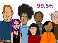
Who? The people who were just complaining about the cost of the test? That’s certainly a potential problem if you don’t do testing through a doctor—and in fact, it’s a truly significant concern. But who purchases a $999 test from a site with the cartoon characters seen above to check for Huntington’s disease?

And don’t you think if “scaring people” were the problem, wouldn’t the papers and the nightly news be all over it? The only thing they love more than a new scientific technology that’s going to save the world is a new scientific technology to be scared of. Ooga booga! Fearmongering hits the press far more quickly than it does the health department, so this particular line of argument just sounds specious.

The California Health Department does an enormous disservice to the debate of a complicated issue by mixing several lines of reasoning which taken as a whole simply contradict one another. The role of personal genetic testing in our society deserves a debate and consideration; I thought I would be able to post about that part first, but instead the CA government beat me to the dumb stuff.

Thomas Goetz, deputy editor at Wired has had two such tests (clearly not unhappy with the price), and angrily responds “Attention, California Health Department: My DNA Is My Data.” It’s not just those anonymous Californians who are wound up about genetic testing, he’s writing his sternly worded letter as we speak:

This is my data, not a doctor’s. Please, send in your regulators when a doctor needs to cut me open, or even draw my blood. Regulation should protect me from bodily harm and injury, not from information that’s mine to begin with.

Are angry declarations of ownership of one’s health data a new thing? It’s not like most people fight for their doctor’s office papers, or even something as simple as a fingerprint, this way.

It’ll be interesting to see how this shakes out. Or it might not, since it will probably consist of:

  1. A settlement by the various companies to continue doing business.
  2. Some means of doctors and insurance companies getting paid (requiring a visit, at a minimum).
  3. People trying to circumvent #2 (see related topics filed under “H” for Human Growth Hormone).
  4. An entrepreneur figures out how to do it online and in a large scale fashion (think WebMD), turning out new hoards of “information” seeking hypochondriacs to fret about their 42% potential alternate likelihood maybe chance of genetic malady. (You have brain cancer too!? OMG!)
  5. If this hits mainstream news, will people hear about the outcome of #1, or will there be an assumption that “personal genetic tests are illegal” from here on out? How skittish will this make investors (the Forbes set) about such companies?

Then again, I’ve already proven myself terrible at predicting the future. But I’ll happily enjoy the foolishness of the present.

Tuesday, June 17, 2008 | genetics, privacy, science  

Melting Ants for Science (or, Solenopsis invicta as Dross)

Another visualization from the see-through fish category, a segment from Sunday Morning about Dr. Walter Tschinkel who studies the structure of ant colonies using aluminum casts. Three easy steps: Heat aluminum to 1200 degrees, pour it down an ant hole, and dig away carefully to reveal the intricate structure of the interior:

What amazing structures! Whenever you think you’ve made something that looks “good,” you can count on nature to dole out humility. Maybe killing the ants in the process is a little way to get the control back. Um, or something.

Thursday, May 29, 2008 | physical, science  

Watching Cancer Growth with a See-Through Fish

080206-seethru-fish-02.jpgInformation visualization is the process of converting abstract information, like raw numbers, into form. Visualization is about representing phenomena, like weather, that already have a physical manifestation. Then there’s open your damn eyes, where you just stare at the thing you’re studying. Researchers at Children’s Hospital in Boston have created a see-through Zebrafish, allowing them to watch cancer growth in the fish’s body.

Via Slashdot.

Saturday, February 23, 2008 | science  

Restoring Sight with the Tongue

a887_2866.jpgVisualization works because our eyes are the highest bandwidth channel for getting information into our brains. Researchers working to restore sight have found that the second best place may be the the tongue, due to the high density of nerve endings. An amazing testament to the adaptability of the brain to begin perceiving visual/spatial information from sensors of another organ.

Researchers at the University of Wisconsin-Madison are developing this tongue-stimulating system, which translates images detected by a camera into a pattern of electric pulses that trigger touch receptors. The scientists say that volunteers testing the prototype soon lose awareness of on-the-tongue sensations. They then perceive the stimulation as shapes and features in space. Their tongue becomes a surrogate eye.

Earlier research had used the skin as a route for images to reach the nervous system. That people can decode nerve pulses as visual information when they come from sources other than the eyes shows how adaptable, or plastic, the brain is, says Wisconsin neuroscientist and physician Paul Bach-y-Rita, one of the device’s inventors.

Via mailing list post from Daniel Brown.

Saturday, February 23, 2008 | science  
Book

Visualizing Data Book CoverVisualizing Data is my 2007 book about computational information design. It covers the path from raw data to how we understand it, detailing how to begin with a set of numbers and produce images or software that lets you view and interact with information. When first published, it was the only book(s) for people who wanted to learn how to actually build a data visualization in code.

The text was published by O’Reilly in December 2007 and can be found at Amazon and elsewhere. Amazon also has an edition for the Kindle, for people who aren’t into the dead tree thing. (Proceeds from Amazon links found on this page are used to pay my web hosting bill.)

Examples for the book can be found here.

The book covers ideas found in my Ph.D. dissertation, which is the basis for Chapter 1. The next chapter is an extremely brief introduction to Processing, which is used for the examples. Next is (chapter 3) is a simple mapping project to place data points on a map of the United States. Of course, the idea is not that lots of people want to visualize data for each of 50 states. Instead, it’s a jumping off point for learning how to lay out data spatially.

The chapters that follow cover six more projects, such as salary vs. performance (Chapter 5), zipdecode (Chapter 6), followed by more advanced topics dealing with trees, treemaps, hierarchies, and recursion (Chapter 7), plus graphs and networks (Chapter 8).

This site is used for follow-up code and writing about related topics.