Writing

Bird Tracks in the Snow

The field in snowy Foxborough, Massachusetts after a running play in Sunday’s football game:

two-500px-levels.jpg

(Click the image for the original version, taken from the broadcast.)

Look at all the footprints in the snow: The previous play began to the right of the white line, where you can see most of the snow was cleared by the players lining up. Just to the left of that is another cleared area, where a group of players began to tackle Sammy Morris. But it’s not until almost ten yards — two more white lines, and the area below where the players are standing in that picture — that he’s finally taken to the ground. For a visual explanation, watch the play:

(Mute the audio and spare yourself the insipid commentary from the FOX booth. And then be thankful that at least it’s not Joe Buck and Tim McCarver.)

The path left behind in the snow explains exactly how the play developed, according to the players’ feet. (And as a running play, feet are important.) Absolutely beautiful.

One of the best things about December is watching football games played in the snow. For instance last year, there was a game between Cleveland and Buffalo last year that looked like it was being played inside a snow globe, with the globe being picked up and shaken during each commercial break.

Boston was a complete mess yesterday with a few inches of snow, sleet, and muck falling from the sky, which made a mess of the field where the New England Patriots were happily hosting the Arizona Cardinals, who are less accustomed to digging out their cars and leaving behind patio furniture.

Another image from later in the game, this one instead depicts the substitutions of players as they near the goal line. Note the lines in the snow that begin at the left, and lead to where the players are lined up:

later-closer-500px.jpg

Monday, December 22, 2008 | football, physical, sports  

Numbers Hurt

Oww, my data.

stocks_329__1229362245_6462.jpg

(Originally found on Boston.com, credited only to Reuters… If anyone knows where to find a larger version or the original, please drop me a line. Update – Paul St. Amant and Martin Wattenberg have also pointed out The Brokers With Hands On Their Faces Blog, which is also evocative, yet wildly entertaining, but not as data-centric as The Brokers With Tales Of Sadness Depicted On Multiple Brightly Colored Yet Highly Detailed Computer Displays in the Background Behind Them Blog that I’ve just started.)

Monday, December 15, 2008 | displays, news  

Anecdotes

Further down in the reading pile is an article from Slate titled Does Advertising Really Work?

Every book ever written about marketing will at some point dig up that old, familiar line: “I know half my advertising is wasted—I just don’t know which half.”

The article by Seth Stevenson goes on to discuss What Sticks, by Rex Briggs and Greg Stuart, a pair of marketing researchers who study the advertising industry. Mad Men notwithstanding, I find the topic fascinating as a trained designer (trained meaning someone who learned to make such things) who happily pays Comcast $12.95 a month for the privilege to never hear or see Levitra, Viagra, or Cialis advertisements.

But separately, and as someone who did a lecture last night, I really enjoyed this point about anecdotes:

Why is this anecdote-laden style so popular with business authors, and so successful (to the tune of best-selling books and huge speaking fees)? I think it comes down to two things: 1) Fascinating anecdotes can, just by themselves, make you feel like you’ve really learned something… 2) A skillful anecdote-wielder can trick us into thinking the anecdote is prescriptive. In fact, what’s being sold is success by association. It’s no coincidence that [one such book talks] about the iPod—a recent mega-hit we’re all familiar with—in at least three chapters. It’s tempting to believe that bite-sized anecdotes about how the iPod was conceived, or designed, or marketed will reveal the secret formula for kicking butt with our own projects. Of course, it’s never that simple. An anecdote is a single data point, …

I find the first point interesting in light of the way in which we digest information from the world around us. We’re continually consuming data and then trying to synthesize it to larger meanings. And perhaps anecdotes are a kind of shortcut for this process because they provide something that’s already been digested but still feels substantial because it affords a brief leap in our thinking (and one that seems significant at the time).

Of course, unless you’re a baby bird, you’re better off digesting on your own.

As a side note, I went looking for an image to illustrate this blob of text, and was amused to find that the results from a google image search for “anecdote” consisted almost entirely of cartoons. Which reminds me of a story…

Saturday, December 13, 2008 | speaky  

Wet and Dry Ingredients; Mixing Bowls and Baking Dishes

51mrbt0099l_ss400_.jpgDigging through my reading list pile, I begin skimming through A Box, Darkly: Obfuscation, Weird Languages, and Code Aesthetics by Michael Mateas and Nick Montfort. I was moving along pretty good until I reached the description of the Chef programming language:

Another language, Chef, illustrates different design decisions for structuring play. Chef facilities double-coding programs as recipes. Variables are declared in an ingredients list, with amounts indicating the initial value (e.g., 114 g of red salmon). The type of measurement determines whether an ingredient is wet or dry; wet ingredients are output as characters, dry ingredients are output as numbers. Two types of memory are provided, mixing bowls and baking dishes. Mixing bowls hold ingredients which are still being manipulated, while baking dishes hold collections of ingredients to output. What makes Chef particularly interesting is that all operations have a sensible interpretation as a step in a food recipe. Where Shakespeare programs parody Shakespearean plays, and often contain dialog that doesn’t work as dialog in a play (“you are as hard as the sum of yourself and a stone wall”), it is possible to write programs in Chef that might reasonably be carried out as a recipe. Chef recipes do have the unfortunate tendency to produce huge quantities of food, however, particularly because the sous-chef may be asked to produce sub-recipes, such as sauces, in a loop.

Wonderful. (And a nice break for someone who has been fretting about languages and syntax over the last couple weeks.)

Friday, December 12, 2008 | languages  

Lecture in Cambridge, MA this Thursday

The folks at the Boston Chapter of the IEEE Computer Society / Greater Boston Chapter of the ACM have kindly invited me to give a talk this Thursday, December 11.

The details can be found here, here, here, and here. They all contain identical information, but have different text layouts and varied sizes of my grinning mug. You can choose which one you like best (and sorry, none are available without my picture).

Tuesday, December 9, 2008 | talk  

Subjectively Attractive Client-Side Scripted Browser-Delivered Charts and Plots

annual-fruit-sales.png…also known as Bluff, though they call it “Beautiful Graphs in JavaScript.” And who can argue with pink?

Bluff is a JavaScript port of the Gruff graphing library for Ruby. It is designed to support all the features of Gruff with minimal dependencies; the only third-party scripts you need to run it are a copy of JS.Class (about 2kb gzipped) and a copy of Google’s ExCanvas to support canvas in Internet Explorer. Both these scripts are supplied with the Bluff download. Bluff itself is around 8kb gzipped.

There’s something cool (and hilarious) about the fact that even though we’re talking about bleeding edge features (decent JavaScript and Canvas support) only available in the most recent of modern browser releases, the criteria of awesomeness and usefulness is still the same as 1997 — that it’s only 8 Kb.

(The only thing that strikes me as odd, strictly from an interface perspective, is the fact that I can’t drag the “image” to the Desktop, the way that I would a JPEG or GIF image. Certainly that’s also the case for Flash and Java, but there’s something that strikes me as strange the way that JavaScript is so lightweight — part of the browser — yet the thing isn’t really “there”.)

At any rate, I’m fairly fascinated by this idea of JavaScript being a useful client-side means of generating images. Something very exciting is bound to happen.

Tuesday, December 9, 2008 | api, represent  

Visualization + Processing in Today’s IHT

Alice Rawsthorn writes about visualization in today’s International Herald Tribune, which also includes a mention of Processing:

Producing visualization required the development of new tools capable of analyzing huge quantities of complex data, and interpreting it visually. In the forefront is Processing, a software system devised by the American designers, Ben Fry and Casey Reas, to enable computer programmers to create visual images, and designers to get to grips with programming. “Processing is a bridge between those fields,” said Reas. “Designers feel comfortable with it because it enables them to work visually, yet it also feels familiar to programmers.”

Paola Antonelli on visualization:

“Visualization is not simply an evolution of graphic design, but a complete and complex design form that requires spatial, narrative, synthetic and graphic sensitivity and expertise,” explained Antonelli. “That’s why we see so many practitioners – architects, product designers, filmmakers, statisticians and graphic designers – flocking to it.”

The Humans vs. Chimps illustration even gets a mention:

Take a scientific question like the genetic difference between humans and chimpanzees. Would you prefer to plough through an essay on the subject, or to glance at the visualization created by Fry in which the 75,000 letters of coding in the human genome form a photographic image of a chimp’s head? Virtually all of our genetic information is identical, and Fry highlights the discrepancies by depicting nine of the letters as red dots. No contest again.

The full article is here, and also includes a slide show of other works.

Monday, December 8, 2008 | iloveme, processing, reviews  

220 Feet on 60 Minutes

From a segment on last night’s 60 Minutes:

Saudi Aramco was originally an American company. It goes way back to the 1930s when two American geologists from Standard Oil of California discovered oil in the Saudi desert.

Standard Oil formed a consortium with Texaco, Exxon and Mobil, which became Aramco. It wasn’t until the 1980s that Saudi Arabia bought them out and nationalized the company. Today, Saudi Aramco is the custodian of the country’s sole source of wealth and power.

Over 16,000 people work at the company’s massive compound, which is like a little country with its own security force, schools, hospitals, and even its own airline.

According to Abdallah Jum’ah, Saudi Aramco’s president and CEO, Aramco is the world’s largest oil producing company.

And it’s the richest company in the world, worth, according to the latest estimate, $781 billion.

I was about to change the channel (perhaps as you were just about to stop reading this post), when they showed the big board:

Jum’ah gave 60 Minutes a tour of the company’s command center, where engineers scrutinize and analyze every aspect of the company’s operations on a 220-foot digital screen.

“Every facility in the kingdom, every drop of oil that comes from the ground is monitored in real time in this room,” Jum’ah explained. “And we have control of each and every facility, each and every pipeline, each and every valve on the pipeline. And therefore, we know exactly what is happening in the system from A to Z.”

A large map shows all the oil fields in Saudi Arabia, including Ghawar, the largest on-shore oil field in the world, and Safaniya, the largest off-shore oil field in the world; green squares on the map monitor supertankers on the high seas in real time.

Here’s a short part of the segment that shows the display:

Since the smaller video doesn’t do it justice, several still images follow, each linked to their Comcastic, artifact-ridden HD versions:

02-small.jpg

Did rooms like this first exist in the movies and compelled everyone to imitate?

03-small.jpg

New guys and interns have to sit in front of the wall of vibrating bright blues:

04-small.jpg

The display is ambient in the sense that nobody’s actually using the larger version to do real work (you can see relevant portions replicated on individuals’ monitors). It seems to serve as a means of knowing what everyone in the room is up to (or as a deterrent against firing up Solitaire — I’m looking at you Ahmad). But more importantly, it’s there for visitors, especially visitors with video cameras, and people who write about visualization and happened to catch a segment about their info palace since it immediately followed the Patriots-Seahawks game.

A detail of one of the displays bears this out — an overload of ALL CAPS SANS SERIF TYPE with the appropriately unattractive array reds and greens. This sort of thing always makes me curious about what such displays would look like if they were designed properly. Rather than blowing up low resolution monitors, what would it look like if it were designed for the actual space and viewing distance in which it’s used?

08-small.jpg

Sexy numbers on curvaceous walls:

06-small.jpg

View the entire segment from 60 Minutes here.

Monday, December 8, 2008 | bigboard, energy, infographics, movies  

The Owl Learns Japanese

1378_visualdata_h1.jpgI’m incredibly pleased to write that O’Reilly Japan has just completed a Japanese translation of Visualizing Data. The book is available for pre-order on Amazon, and has also been announced on O’Reilly’s Japanese site.

Having the book published in Japanese is incredibly gratifying. Two of my greatest mentors (Suguru Ishizaki at CMU, and later John Maeda at MIT) were Japanese Americans who trained at Tsukuba University, training that informed both their own work and their teaching style.

I first unveiled Processing during a two week workshop course at Musashino Art University in Japan in August 2001, working with a group of about 40 students. And in 2005, we won the Interactive Design Prize from the Tokyo Type Director’s Club.

At any rate, I can’t wait to see the book in person, this is just too cool.

Monday, December 1, 2008 | processing, translation  

LA’s Dirtiest Pools & More

39342283-01163012.jpg
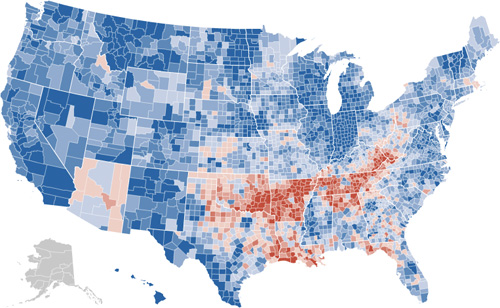
Featuring “38 projects and more than 730,000 records,” the Los Angeles Times now has a Data Desk feature, a collection of searchable data sets and information graphics from recent publications. It’s like reading the LA Times online but only paying attention to the data-oriented features. (Boring? Appealing? Your ideal newspaper? We database, you decide. Eww, don’t repeat that.) On first glance I thought (hoped) it would be more raw data, but even having all the items collected in one location suggests something interesting for how newspapers share (and perceive, internally) their carefully researched (an massaged) data that they collect on a regular basis.

Thanks to Casey for the pointer.

Thursday, November 27, 2008 | data, infographics  

Call for Papers: Visualizing the Past

James Torget, by way of my inbox:

I wanted to touch base to let you know about a workshop that we’re putting together out here at the University of Richmond. Basically, UR (with James Madison University) will be hosting a workshop this spring focused on how scholars can create visualizations of historical data and how we can better share our data across the Internet. To that end, we are looking for people working on these questions who would be interested in participating in an NEH-sponsored workshop.

We are seeking proposals for presentations at the workshop, and participants for our in-depth discussions. The workshop is scheduled for February 20-21, 2009 at the University of Richmond. We are asking that people submit their proposals by December 15, and we will extend invitations for participation by December 31, 2008. Detailed information can be found at: http://dsl.richmond.edu/workshop/

Thursday, November 27, 2008 | inbox, opportunities  

It only took 162 attempts, but Processing 1.0 is here!

We’ve just posted Processing 1.0 at http://processing.org/download. We’re so excited about it, we even took time to write a press release:

CAMBRIDGE, Mass. and LOS ANGELES, Calif. – November 24, 2008 – The Processing project today announced the immediate availability of the Processing 1.0 product family, the highly anticipated release of industry-leading design and development software for virtually every creative workflow. Delivering radical breakthroughs in workflow efficiency – and packed with hundreds of innovative, time-saving features – the new Processing 1.0 product line advances the creative process across print, Web, interactive, film, video and mobile.

Whups! That’s not the right one. Here we go:

Today, on November 24, 2008, we launch the 1.0 version of the Processing software. Processing is a programming language, development environment, and online community that since 2001 has promoted software literacy within the visual arts. Initially created to serve as a software sketchbook and to teach fundamentals of computer programming within a visual context, Processing quickly developed into a tool for creating finished professional work as well.

Processing is a free, open source alternative to proprietary software tools with expensive licenses, making it accessible to schools and individual students. Its open source status encourages the community participation and collaboration that is vital to Processing’s growth. Contributors share programs, contribute code, answer questions in the discussion forum, and build libraries to extend the possibilities of the software. The Processing community has written over seventy libraries to facilitate computer vision, data visualization, music, networking, and electronics.

Students at hundreds of schools around the world use Processing for classes ranging from middle school math education to undergraduate programming courses to graduate fine arts studios.

  • At New York University’s graduate ITP program, Processing is taught alongside its sister project Arduino and PHP as part of the foundation course for 100 incoming students each year.
  • At UCLA, undergraduates in the Design | Media Arts program use Processing to learn the concepts and skills needed to imagine the next generation of web sites and video games.
  • At Lincoln Public Schools in Nebraska and the Phoenix Country Day School in Arizona, middle school teachers are experimenting with Processing to supplement traditional algebra and geometry classes.

Tens of thousands of companies, artists, designers, architects, and researchers use Processing to create an incredibly diverse range of projects.

  • Design firms such as Motion Theory provide motion graphics created with Processing for the TV commercials of companies like Nike, Budweiser, and Hewlett-Packard.
  • Bands such as R.E.M., Radiohead, and Modest Mouse have featured animation created with Processing in their music videos.
  • Publications such as the journal Nature, the New York Times, Seed, and Communications of the ACM have commissioned information graphics created with Processing.
  • The artist group HeHe used Processing to produce their award-winning Nuage Vert installation, a large-scale public visualization of pollution levels in Helsinki.
  • The University of Washington’s Applied Physics Lab used Processing to create a visualization of a coastal marine ecosystem as a part of the NSF RISE project.
  • The Armstrong Institute for Interactive Media Studies at Miami University uses Processing to build visualization tools and analyze text for digital humanities research.

The Processing software runs on the Mac, Windows, and GNU/Linux platforms. With the click of a button, it exports applets for the Web or standalone applications for Mac, Windows, and GNU/Linux. Graphics from Processing programs may also be exported as PDF, DXF, or TIFF files and many other file formats. Future Processing releases will focus on faster 3D graphics, better video playback and capture, and enhancing the development environment. Some experimental versions of Processing have been adapted to other languages such as JavaScript, ActionScript, Ruby, Python, and Scala; other adaptations bring Processing to platforms like the OpenMoko, iPhone, and OLPC XO-1.

Processing was founded by Ben Fry and Casey Reas in 2001 while both were John Maeda’s students at the MIT Media Lab. Further development has taken place at the Interaction Design Institute Ivrea, Carnegie Mellon University, and the UCLA, where Reas is chair of the Department of Design | Media Arts. Miami University, Oblong Industries, and the Rockefeller Foundation have generously contributed funding to the project.

The Cooper-Hewitt National Design Museum (a Smithsonian Institution) included Processing in its National Design Triennial. Works created with Processing were featured prominently in the Design and the Elastic Mind show at the Museum of Modern Art. Numerous design magazines, including Print, Eye, and Creativity, have highlighted the software.

For their work on Processing, Fry and Reas received the 2008 Muriel Cooper Prize from the Design Management Institute. The Processing community was awarded the 2005 Prix Ars Electronica Golden Nica award and the 2005 Interactive Design Prize from the Tokyo Type Director’s Club.

The Processing website includes tutorials, exhibitions, interviews, a complete reference, and hundreds of software examples. The Discourse forum hosts continuous community discussions and dialog with the developers.

Tuesday, November 25, 2008 | processing  

Visualizing Data with an English translation and Processing.js

Received a note from Vitor Silva, who created the Portuguese-language examples from Visualizing Data using Processing.js:

i created a more “world friendly” version of the initial post. it’s now in english (hopefully in a better translation than babelfish) and it includes a variation on your examples of chapter 3.

The new page can be found here. And will you be shocked to hear that indeed it is far better than Babelfish?

Many thanks to Vitor for the examples and the update.

Wednesday, November 19, 2008 | examples, feedbag, translation, vida  

John Oliver and John King’s Magic Wall

Hilarious, bizarre, and rambling segment from last night’s Daily Show featuring John Oliver’s take on CNN’s favorite toy from this year’s election.

I’m continually amazed by the amount of interest this technology generates (yeah, I posted about it too), so perspective from the Daily Show is always helpful and welcome.

Wednesday, November 19, 2008 | election, interact  

What has driven women out of Computer Science?

1116-sbn-webdigi-crop.gifCasey yesterday noted this article from the New York Times on the declining number of women who are pursuing computer science degrees. Declining as in “wow, weren’t the numbers too low already?” From the article’s introduction:

ELLEN SPERTUS, a graduate student at M.I.T., wondered why the computer camp she had attended as a girl had a boy-girl ratio of six to one. And why were only 20 percent of computer science undergraduates at M.I.T. female? She published a 124-page paper, “Why Are There So Few Female Computer Scientists?”, that catalogued different cultural biases that discouraged girls and women from pursuing a career in the field. The year was 1991.

Computer science has changed considerably since then. Now, there are even fewer women entering the field. Why this is so remains a matter of dispute.

The article goes on to explain that even though there is far better gender parity (since 1991) when looking at roles in technical fields, computer science still stands alone in moving backwards.

The text also covers some of the “do it with gaming!” nonsense. As someone who became interested in programming because I didn’t like games, I’ve never understood why gaming was pushed as a cure-all for disinterest in programming:

Such students who choose not to pursue their interest may have been introduced to computer science too late. The younger, the better, Ms. Margolis says. Games would offer considerable promise, except that they have been tried and have failed to have an effect on steeply declining female enrollment.

But I couldn’t agree more with the sentiment with regard to age. I know of two all-girls schools (Miss Porter’s in Connecticut and Nightingale-Bamford in New York) who have used Processing in courses with high school and middle school students, and I couldn’t be more excited about it. Let’s hope there are more.

Tuesday, November 18, 2008 | cs, gender, reading  

Visualizing Data with Portuguese and Processing.js

Very cool! Check out these implementations of several Visualizing Data examples that make use of John Resig’s Processing.js, an adaptation of the Processing API with pure JavaScript. This means running in a web browser with no additional plug-ins (no Java Virtual Machine kicking in while you take a sip of coffee—much less drain the whole cup, depending the speed of your computer). Since the first couple chapters cover straightforward, static exercises, I’d been wanting to try this, but it’s more fun when someone beats you to it. (Nothing is better than feeling like a slacker, after all.)

map-example.pngView the introductory Processing sketch from Page 22, or the map of the United States populated with random data points from Page 35.

Babelfish translation of the page here, with choice quotes like “also the shipment of external filing-cabinets had that to be different of what was in the book.”

And the thing is, when I finished the proof of the book for O’Reilly, I had this uneasy feeling that I was shipping the wrong filing-cabinets. Particularly the external ones.

Monday, November 17, 2008 | examples, processing, translation, vida  

Did Forbes just write an article about a font?

Via this Slate article from Farhad Manjoo (writer of tech-hype articles with Salon and now Slate), I just read about Droid, the typeface used in Google’s new Android phones. More specifically, he references this Forbes article, describing the background of the font, and its creator, Steve Matteson of Ascender Corporation in Elk Grove, Illinois.

Some background from the Forbes piece:

In fonts, Google has a predilection for cute letters and bright primary colors, as showcased in the company’s own logo. But for Android Google wanted a font with “common appeal,” Davis says. Ascender’s chief type designer, Steve Matteson, who created the Droid fonts, says Google requested a design that was friendly and approachable. “They wanted to see a range of styles, from the typical, bubbly Google image to something very techno-looking,” Matteson says.

droidfont_426x100.jpg

The sweet spot—and the final look for Droid—fell somewhere in the middle. Matteson’s first design was “bouncy”: a look in line with the Google logo’s angled lowercase “e.” Google passed on the design because it was “a little too mannered,” Matteson says. “There was a fine line between wanting the font to have character but not cause too much commotion.”

Another proposal erred on the side of “techno” with squared-off edges reminiscent of early computer typefaces. That too was rejected, along with several others, in favor of a more neutral design that Matteson describes as “upright with open forms, but not so neutral as a design like, say, Helvetica.”

I haven’t had a chance to play with an Android phone (as much as I’ve been happy with T-Mobile, particularly their customer service, do I re-up with them for two years just to throw money at alpha hardware?) so I can’t say much about the face, but I find the font angle fascinating, particular in light of Apple’s Helvetica-crazy iPhone and iPod Touch. (Nothing says late 1950s Switzerland quite like a touch-screen interface mobile phone, after all.)

Ascender Corporation also seems to be connected to the hideously named C@#$(*$ fonts found in Windows Vista and Office 2007: Calibri, Cambria, Candara, Consolas, Constantia, Corbel, Cariadings. In the past several years, Microsoft has shown a notable and impressive commitment to typography (most notably, hiring Matthew Carter to create Verdana, and other decisions of that era), but the new C* fonts have that same air of creepiness of a family who names all their kids with names that start with the same letter. I mean sure, they’re terrific people, but man, isn’t that just a little…unnecessary?

Monday, November 17, 2008 | mobile, typography  

Change is always most interesting

The New York Times has a very nicely done election map this year. Amongst its four viewing options is a depiction of counties that voted more Democratic (blue) or Republican (red) in comparison to the 2004 presidential election:

shift-levels-500.jpg

The blue is to be expected, given that the size of the win for Obama, but the red pattern is quite striking.

Also note the shift for candidate home states, in Arizona with McCain on the ticket, and what appears to be the reverse result in parts of Massachusetts, with Kerry no longer on the ticket. (The shift to the Democrats in Indiana is also amazing: without looking at the map closely enough I had assumed that area to be Obama’s home of Illinois.)

I recommend checking out the actual application on the Times site, the interaction lacks some of the annoying ticks that can be found in some of their other work (irritating rollovers that get in the way, worthless zooming, and silly transition animations). It’s useful and succinct, just like an infographic should be. Or just the way Mom used to make. Or whatever.

Thursday, November 6, 2008 | infographics, interact, mapping, politics  

iPolljunkie, iPoliticsobsession, iFix, iLackawittytitle

I apologize that I’ve been too busy and distracted with preparing Processing 1.0 to have any time to post things here, but here’s a quickie so that the page doesn’t just rot into total embarrassment.

Slate this morning announced the availability of a poll tracking application for the iPhone:

iphoneapp2-crop.jpg

I haven’t yet ponied up ninety nine of my hard-earned cents to buy it but find it oddly fascinating. Is there actually any interest for this? Is this a hack? Is there a market for such things? Is the market simply based on the novelty of it? Is it possible to quantify the size of the poll-obsessed political junkie market? And how is that market comprised—what percentage of those people are part of campaigns, versus just people who spend too much time reading political news? (I suspect the former is negligible, but may be tainted as a card-carrying member of the latter group.)

To answer my own questions, I suspect that it was thrown together by a couple of people from the tech side of the organization (meaning “hack” in the best sense of the word), who then sold management on it, with the rationale of 1) it’ll generate a little press (or hype on, um, blogs), 2) it’ll reinforce Slate readers’ interest in or connection to the site, and 3) it’s a little cool and trendy. I don’t think they’re actually planning to make money on it (or recoup any development costs), but that the price tag has more to do with 99¢ sounds more valuable and interesting than a free giveaway.

Of course, anyone with more interesting insights (let alone useful facts), please pass them along. I’m hoping it’s an actual Cocoa app, and not just a special link to web pages reformatted for the iPhone, which would largely invalidate this post and extinguish my own curiosity about the beast.

Update: The application is a branded reincarnation of a poll tracker developed by Aaron Brethorst at Chimp Software. Here’s his blog post announcing the change, and even a press release.

Friday, October 3, 2008 | infographics, mobile, politics, software  

Three-dimensional force-directed starling layout

Amazing video of starling flocking behavior, via Dan Paluska:

And how a swarm reacts to a falcon attack, via Burak Arikan:

For myself and all you designers out there just getting their heads around particle simulations, this is just a reminder: nature is better than you.

Wednesday, September 24, 2008 | forcelayout, physical, science  

Small Design Firm is looking for a programmer-designer

nobel00.jpg
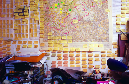
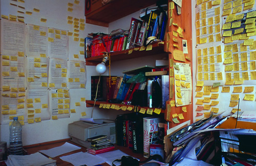
My friends down the street at Small Design Firm (started by Media Lab alum and namesake David Small) are looking for a programmer-designer type:

Small Design Firm is an interactive design studio that specializes in museum exhibits, information design, dynamic typography and interactive art. We write custom graphics software and build unique physical installations and media environments. Currently our clients include the Metropolitan Museum of Art, United States Holocaust Memorial Museum and Maya Lin.

We are looking to hire an individual with computer programming and design/art/architecture skills. Applicants should have a broad skill set that definitely includes C++ programming experience and an interest in the arts. This position is open to individuals with a wide variety of experiences and specialities. Our employees have backgrounds in computer graphics, typography, electrical engineering, architecture, music, and physics.

Responsibilities will be equally varied. You will be programming, designing, writing proposals, working directly with clients, managing content and production, and fabricating prototypes and installations.

Small Design Firm is an energetic and exciting place to work. We are a close-knit community, so we are looking for an outgoing team member who is willing to learn new skills and bring new ideas to the group.

Salary is commensurate with experience and skill set. Benefits include health insurance, SIMPLE IRA, and paid vacation.

Contact john (at) smalldesignfirm.com if you’re interested.

Tuesday, September 16, 2008 | opportunities  

Hide the bipolar data, here comes bioinformatics!

I was fascinated a few weeks ago to receive this email from the Genome-announce list at UCSC:

Last week the National Institutes of Health (NIH) modified their policy for posting and accessing genome-wide association studies (GWAS) data contained in NIH databases. They have removed public access to aggregate genotype GWAS data in response to the publication of new statistical techniques for analyzing dense genomic information that make it possible to infer the group assignment (case vs. control) of an individual DNA sample under certain circumstances. The Wellcome Trust Case Control Consortium in the UK and the Broad Institute of MIT and Harvard in Boston have also removed aggregate data from public availability. Consequently, UCSC has removed the “NIMH Bipolar” and “Wellcome Trust Case Control Consortium” data sets from our Genome Browser site.

The ingredients for a genome-wide association study are a few hundred people, and a list of what genetic letter (A, C, G, or T) is found at a few hundred specific locations in the DNA of each of those people. Such data is then correlated to whether individuals have a particular disease, and using the correlation, it’s possible to sometimes localize what part of the genome is responsible for the disease.

Of course, the diseases might be of a sensitive nature (e.g. bipolar disorder), so when such data is made publicly available, it’s done in a manner that protects the privacy of the individuals in the data set. What this message means is that a bioinformatics method has been developed that undermines those privacy protections. An amazing bit of statistics!

This made me curious about what led to such a result, so with a little digging, I found this press release, which describes the work:

A team of investigators led by scientists at the Translational Genomics Research Institute (TGen) have found a way to identify possible suspects at crime scenes using only a small amount of DNA, even if it is mixed with hundreds of other genetic fingerprints.

Using genotyping microarrays, the scientists were able to identify an individual’s DNA from within a mix of DNA samples, even if that individual represented less than 0.1 percent of the total mix, or less than one part per thousand. They were able to do this even when the mix of DNA included more than 200 individual DNA samples.

The discovery could help police investigators better identify possible suspects, even when dozens of people over time have been at a crime scene. It also could help reassess previous crime scene evidence, and it could have other uses in various genetic studies and in statistical analysis.

So the CSI folks have screwed it up for the bipolar folks. The titillatingly-titled “Resolving Individuals Contributing Trace Amounts of DNA to Highly Complex Mixtures Using High-Density SNP Genotyping Microarrays” can be found at PLoS Genetics, and a PDF describing the the policy changes is on the NIH’s site for Genome-Wide Association Studies. The PDF provides a much more thorough explanation of what association studies are, in case you’re looking for something better than my cartoon version described above.

Links to much more coverage can be found here, which includes major journals (Nature) and mainstream media outlets (LA Times, Financial Times) weighing in on the research. (It’s always funny to see how news outlets respond to this sort of thing—the Financial Times talk about the positive side, the LA Times focuses exclusively on the negative.) A discussion about the implications of the study can also be found on the PLoS site, with further background from the study’s primary author.

Science presents such fascinating contradictions. A potentially helpful advance that undermines another area of research. The breakthrough that opens a Pandora’s Box. It’s probably rare to see such a direct contradiction (that’s not heavily politicized like, say, stem cell research), but the social and societal impact is undoubtedly one of the things I love most about genetics in particular.

Tuesday, September 16, 2008 | genetics, mine, privacy, science  

Mention Offhand and Ye Shall Receive

Just received a helpful note from Nelson Minar, who notes an already redrawn version of the graph from the last post over at Chartjunk. The redraw aims to improve the proportion between the different tax brackets:

taxplans-crop-small.jpg

Much better! Read more about their take, and associated caveats here. (Also thanks to Peter Merholz and Andrew Otwell who also wrote, yet were no match for Nelson’s swift fingers.)

Saturday, September 13, 2008 | feedbag, infographics, notaneconomist, politics  

Glancing at Tax Proposals

Finally, the infographic I’ve been waiting for, the Washington Post compares the tax proposals of United States presidential candidates John McCain and Barack Obama:

graphic-halfsize.jpg

Lots of words have been spilled over the complexities of tax policy, whether in stump speeches, advertisements, or policy papers. But these are usually distilled for voters in lengthy articles that throw more words at the problem. But compare even a well-written article like this one at Business Week versus the graphic above from the Washington Post. Which of the two will you be able to remember tomorrow?

I also appreciate that the graphic very clearly represents the general tax policies of Republicans vs. Democrats, without showing bias toward either. The only thing that’s missing is a sense of how big each of the categories are – how many people are in the “over $2.87 million” category versus how many are in the “$66,000 to $112,000” category, which would help convey a better sense of the “middle class” term that candidates like to throw around.

There is still greater complexity to the debate than what’s shown in this image (the Business Week article describes treasury shortfalls based on the McCain proposal, for instance), but without the initial explanation provided by that graphic, will voters even bother with those details?

Saturday, September 13, 2008 | infographics, notaneconomist, politics  

Sustainable Creativity at Pixar

pixar_photo5_blursharpen.jpgGiven some number of talented people, success is not particularly surprising. But sustaining that success in a creative organization, the way that Pixar has over the last fifteen years is truly exceptional. Ed Catmull, cofounder of Pixar (and computer graphics pioneer) writes about their success for the Harvard Business Review:

Unlike most other studios, we have never bought scripts or movie ideas from the outside. All of our stories, worlds, and characters were created internally by our community of artists. And in making these films, we have continued to push the technological boundaries of computer animation, securing dozens of patents in the process.

On Creativity:

People tend to think of creativity as a mysterious solo act, and they typically reduce products to a single idea: This is a movie about toys, or dinosaurs, or love, they’ll say. However, in filmmaking and many other kinds of complex product development, creativity involves a large number of people from different disciplines working effectively together to solve a great many problems. The initial idea for the movie—what people in the movie business call “the high concept”—is merely one step in a long, arduous process that takes four to five years.

A movie contains literally tens of thousands of ideas.

On Taking Risks:

…we as executives have to resist our natural tendency to avoid or minimize risks, which, of course, is much easier said than done. In the movie business and plenty of others, this instinct leads executives to choose to copy successes rather than try to create something brand-new. That’s why you see so many movies that are so much alike. It also explains why a lot of films aren’t very good. If you want to be original, you have to accept the uncertainty, even when it’s uncomfortable, and have the capability to recover when your organization takes a big risk and fails. What’s the key to being able to recover? Talented people!

Reminding us that we learn more from failure, the more interesting part of the article talks about how Pixar responded to early failures in Toy Story 2:

Toy Story 2 was great and became a critical and commercial success—and it was the defining moment for Pixar. It taught us an important lesson about the primacy of people over ideas: If you give a good idea to a mediocre team, they will screw it up; if you give a mediocre idea to a great team, they will either fix it or throw it away and come up with something that works.

Toy Story 2 also taught us another important lesson: There has to be one quality bar for every film we produce. Everyone working at the studio at the time made tremendous personal sacrifices to fix Toy Story 2. We shut down all the other productions. We asked our crew to work inhumane hours, and lots of people suffered repetitive stress injuries. But by rejecting mediocrity at great pain and personal sacrifice, we made a loud statement as a community that it was unacceptable to produce some good films and some mediocre films. As a result of Toy Story 2, it became deeply ingrained in our culture that everything we touch needs to be excellent.

On mixing art and technology:

[Walt Disney] believed that when continual change, or reinvention, is the norm in an organization and technology and art are together, magical things happen. A lot of people look back at Disney’s early days and say, “Look at the artists!” They don’t pay attention to his technological innovations. But he did the first sound in animation, the first color, the first compositing of animation with live action, and the first applications of xerography in animation production. He was always excited by science and technology.

At Pixar, we believe in this swirling interplay between art and technology and constantly try to use better technology at every stage of production. John coined a saying that captures this dynamic: “Technology inspires art, and art challenges the technology.”

I saw Catmull speak to the Computer Science department a month or two before I graduated from Carnegie Mellon. Toy Story had been released two years earlier, and 20 or 30 of us were all jammed into a room listening to this computer graphics legend speaking about…storytelling. The importance of narrative. How the movies Pixar was creating had less to do with the groundbreaking computer graphics (the reason that most were in the room) than it did with a good story. This is less shocking nowadays, especially if you’ve ever seen a lecture by someone from Pixar, but the scene left an incredible impression on me. It was a wonderful message to the programmers in attendance about the importance of placing purpose before the technology, but without belitting the importance of either.

(While digging for an image to illustrate this post, I also found this review of The Pixar Touch: The Making of a Company, a book that seems to cover similar territory as the HBR article, but from the perspective of an outside author. The image is stolen from Ricky Grove’s review.)

Tuesday, September 9, 2008 | creativity, failure, movies  

Temple of Post-Its

The writing room of author Will Self (Wikipedia), where he organizes his complicated stories through copious use of small yellow (and pink) adhesive papers on the wall:

ws24-wall-500.jpg

Or amongst a map and more papers:

ws5-map-500.jpg

Not even the bookshelf is safe:

ws6-shelf-500.jpg

Check out the whole collection.

Reminds me of taking all the pages of my Ph.D. dissertation (a hundred or so) and organizing them on the floor of a friend’s living room. (Luckily it was a large living room.) It was extremely helpful and productive but frightened my friend who returned home to a sea of paper and a guy who had been indoors all day sitting in the middle of it with a slightly wild look in his eyes.

(Thanks to Jason Leigh, who mentioned the photos during his lecture at last week’s iCore summit in Banff.)

Wednesday, September 3, 2008 | collections, organize  

In A World…Without Don LaFontaine

Don LaFontaine, voice artist for some 5,000 movies and 350,000 advertisements passed away Monday. He’s the man who came up with the “In A World…” that begins most film trailers, as well as the baritone voice style that goes with it. The Washington Post has an obituary.

In the early 1960s, he landed a job in New York with National Recording Studios, where he worked alongside radio producer Floyd L. Peterson, who was perfecting radio spots for movies. Until then, movie studios primarily relied on print advertising or studio-made theatrical trailers. The two men became business partners and, together, perfected the familiar format.

Mr. LaFontaine, who was editing, writing and producing in the early days of the partnership, became a voice himself by accident. In 1964, when an announcer failed to show up for a job, he recorded himself reading copy and sent it to the studio with a message: “This is what it’ll sound like when we get a ‘real’ announcer.”

Trailer for The Elephant Man, proclaimed to be his favorite:

And a short interview/documentary:

Don’s impact is unmistakable, and it’s striking to think of how his approach changed movie advertising. May he rest in peace.

Wednesday, September 3, 2008 | movies  

Handcrafted Data

1219473416_8507.jpgContinuing Luddite Monday, a new special feature on benfry.com, an article from the Boston Globe about the prevalence of handcrafted images in reference texts. Dushko Petrovich writes:

But in fact, nearly two centuries after the publication of his famous folios, it is Audubon’s technique, and not the sharp eye of the modern camera, that prevails in a wide variety of reference books. For bird-watchers, the best guides, the most coveted guides – like those by David Allen Sibley and Roger Tory Peterson – are still filled with hand-painted images. The same is true for similar volumes on fish, trees, and even the human body. Ask any first-year medical student what they consult during dissections, and they will name Dr. Frank H. Netter’s meticulously drafted “Atlas of Human Anatomy.” Or ask architects and carpenters to see their structures, and they will often show you chalk and pencil “renderings,” even after the things have been built and professionally photographed.

This nicely reinforces the case for drawing, and why it’s so powerful. The article later gets to the meat of the issue, which is the same reason that drawing is a topic on a site about data visualization.

Besides seamlessly imposing a hierarchy of information, the handmade image is also free to present its subject from the most efficient viewpoint. Audubon sets a high standard in this regard; he is often at pains to depict the beak in its most revealing profile, the crucial feathers at an identifiable angle, the front leg extended just so. When the nighthawk and the whip-poor-will are pictured in full flight, their legs tucked away, he draws the feet at the side of the page, so we’re not left guessing. If Audubon draws a bird in profile, as he does with the pitch-black rook and the grayer hooded crow, we’re not missing any details a three-quarters view would have shown.

And finally, a reminder:

Confronted with unprecedented quantities of data, we are constantly reminded that quality is what really matters. At a certain point, the quality and even usefulness of information starts being defined not by the precision and voracity of technology, but by the accuracy and circumspection of art. Seen in this context, Audubon shows us that painting is not just an old fashioned medium: it is a discipline that can serve as a very useful filter, collecting, editing, and carefully synthesizing information into a single efficient and evocative image – giving us the information that we really want, information we can use and, as is the case with Audubon, even cherish.

Consider this your constant reminder, because I think it’s actually quite rare that quality is acknowledged. I regularly attend lectures by speakers who boast about how much data they’ve collected and the complexity of their software and hardware, but it’s one in ten thousand who even mention the art of removing or ignoring data in search of better quality.

Looks like the Early Drawings book mentioned in the article will be available at the end of September.

Monday, September 1, 2008 | drawing, human, refine  

Skills as Numbers

numerati-small.jpgBusinessWeek has an excerpt of Numerati, a book about the fabled monks of data mining (publishers weekly calls them “entrepreneurial mathematicians”) who are sifting through the personal data we create every day.

Picture an IBM manager who gets an assignment to send a team of five to set up a call center in Manila. She sits down at the computer and fills out a form. It’s almost like booking a vacation online. She puts in the dates and clicks on menus to describe the job and the skills needed. Perhaps she stipulates the ideal budget range. The results come back, recommending a particular team. All the skills are represented. Maybe three of the five people have a history of working together smoothly. They all have passports and live near airports with direct flights to Manila. One of them even speaks Tagalog.

Everything looks fine, except for one line that’s highlighted in red. The budget. It’s $40,000 over! The manager sees that the computer architect on the team is a veritable luminary, a guy who gets written up in the trade press. Sure, he’s a 98.7% fit for the job, but he costs $1,000 an hour. It’s as if she shopped for a weekend getaway in Paris and wound up with a penthouse suite at the Ritz.

Hmmm. The manager asks the system for a cheaper architect. New options come back. One is a new 29-year-old consultant based in India who costs only $85 per hour. That would certainly patch the hole in the budget. Unfortunately, he’s only a 69% fit for the job. Still, he can handle it, according to the computer, if he gets two weeks of training. Can the job be delayed?

This is management in a world run by Numerati.

I’m highly skeptical of management (a fundamentally human activity) being distilled to numbers in this manner. Unless, of course, the managers are that poor at doing their job. And further, what’s the point of the manager if they’re spending most of their time filling out the vacation form-style work order? (Filling out tedious year-end reviews, no doubt.) Perhaps it should be an indication that the company is simply too large:

As IBM sees it, the company has little choice. The workforce is too big, the world too vast and complicated for managers to get a grip on their workers the old-fashioned way—by talking to people who know people who know people.

Then we descend (ascend?) into the rah-rah of today’s global economy:

Word of mouth is too foggy and slow for the global economy. Personal connections are too constricted. Managers need the zip of automation to unearth a consultant in New Delhi, just the way a generation ago they located a shipment of condensers in Chicago. For this to work, the consultant—just like the condensers—must be represented as a series of numbers.

I say rah-rah because how else can you put refrigeration equipment parts in the same sentence as a living, breathing person with a mind, free will and a life.

And while I don’t think I agree with this particular thesis, the book as a whole looks like an interesting survey of efforts in this area. Time to finish my backlog of Summer reading so I can order more books…

Monday, September 1, 2008 | human, mine, notafuturist, numberscantdothat, privacy, social  
Book

Visualizing Data Book CoverVisualizing Data is my 2007 book about computational information design. It covers the path from raw data to how we understand it, detailing how to begin with a set of numbers and produce images or software that lets you view and interact with information. When first published, it was the only book(s) for people who wanted to learn how to actually build a data visualization in code.

The text was published by O’Reilly in December 2007 and can be found at Amazon and elsewhere. Amazon also has an edition for the Kindle, for people who aren’t into the dead tree thing. (Proceeds from Amazon links found on this page are used to pay my web hosting bill.)

Examples for the book can be found here.

The book covers ideas found in my Ph.D. dissertation, which is the basis for Chapter 1. The next chapter is an extremely brief introduction to Processing, which is used for the examples. Next is (chapter 3) is a simple mapping project to place data points on a map of the United States. Of course, the idea is not that lots of people want to visualize data for each of 50 states. Instead, it’s a jumping off point for learning how to lay out data spatially.

The chapters that follow cover six more projects, such as salary vs. performance (Chapter 5), zipdecode (Chapter 6), followed by more advanced topics dealing with trees, treemaps, hierarchies, and recursion (Chapter 7), plus graphs and networks (Chapter 8).

This site is used for follow-up code and writing about related topics.