Hilarious, bizarre, and rambling segment from last night’s Daily Show featuring John Oliver’s take on CNN’s favorite toy from this year’s election.
I’m continually amazed by the amount of interest this technology generates (yeah, I posted about it too), so perspective from the Daily Show is always helpful and welcome.
Wonderfully simple delegate calculator from the New York Times. Addresses a far simpler question than the previously mentioned Slate calculator, but bless the NYT for realizing that something that complicated was no longer necessary.
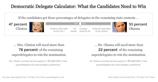
Good example of throwing out extraneous information to tell a story more directly: a quick left and right drag provides a more accurate depiction than the horse race currently in the headlines.
 One of the chapters that I had to cut from Visualizing Data was about scenarios—building interactive “what if” tools that help you quickly try out several possibilities. This is one of the most useful aspects of dynamic visualization—being able to try out different ideas in a quick way (and safe, as in non-destructive, since Undo is always nearby). Hopefully I’ll be able to cover this sometime soon.
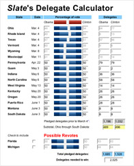
At any rate, one such scenario-building tool is Slate’s Delegate Calculator, where you can drag primitive sliders back and forth and see the possibilities for delegate outcomes for Hillary and Obama.
I’ve seen complaints about its math, but it seems to do an OK job for a big-picture look at the likelihood of different outcomes. Getting the math 100% is impossible (unless you have a far more complicated interface) because the delegate selection process is different in each state. It appears that none of the states wanted to be seen using the same approach as another, and with fifty states going their own way, things got pretty random (Texas: we’ll have a caucus and a primary).
I think that’s enough posting about politics for a bit.
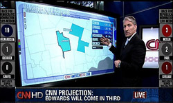 I missed seeing it live, but was told about it by a baffled friend who muttered about watching CNN and that the anchors were having a little too much fun with a new touch-screen toy while they covered returns for the primaries. The Washington Post provides more details.
Standing in front of an oversize monitor, King began poking, touching and waving at the screen like an over-caffeinated traffic cop. Each movement set in motion a series of zooming maps and flying pie charts, which King was then able to position around the screen at will.
The story also references Tim Russert’s much-talked-about (and I’d-forgotten-about) whiteboard scribbling for the 2000 election, which has me wondering about which presentation was actually more informative for viewers.
Thankfully, The Daily Show provides some insight:

