
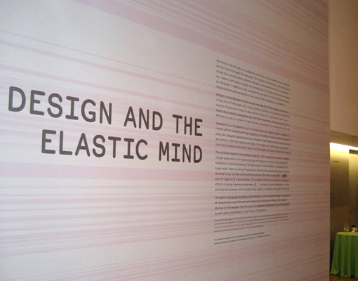
Design and the Elastic Mind
Perhaps three months late for an announcement, and at the risk of totally reckless narcissism, I should mention that four of my projects are currently on display in the Design and the Elastic Mind exhibition at the Museum of Modern Art in New York. My work notwithstanding, I hear that the show is generating lots of foot traffic and positive reviews, which is a well-deserved compliment to curator Paola Antonelli.
There’s a New York Times article and slide show (too much linking to the Times lately, weird…) and a writeup in the International Herald Tribune that even mentions my Humans vs. Chimps piece.
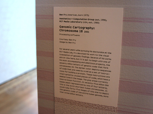
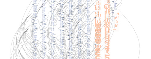
The first wall as you enter the show is all of Chromosome 18, done in the style of this piece.
It’s a 3 pixel font at 150 dpi, so there are 37.5 letters per inch in either direction, and the wall is about 20 feet square, making 75 million letters total. Paola and her staff asked whether it was OK to put the text on the piece itself, which I felt was fine, as the nature of the piece is about scale, and the printing would not detract from that. The funny side effect of this was watching people at the opening take one another’s picture in front of the piece, mostly probably not realizing that the wall itself was part of the exhibition. Perhaps my most popular work so far, given the number of family photos in which it will be found.
Former classmate Ron Kurti also took a nice detail shot:
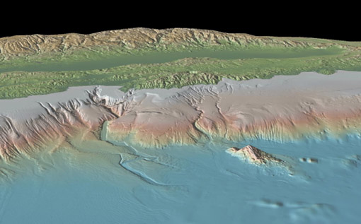
Also in the show is the previously mentioned Humans vs. Chimps project as seen below:
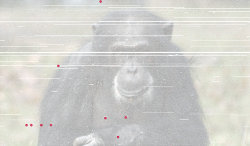
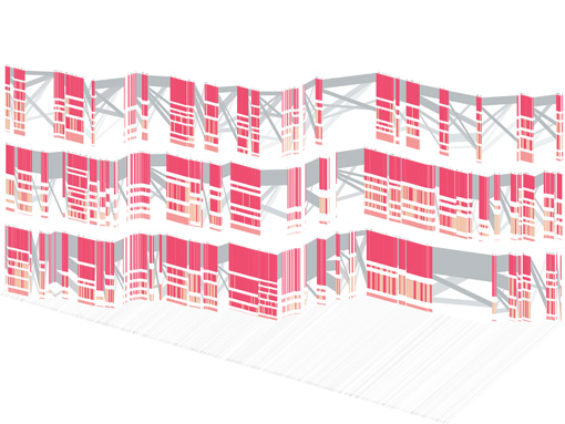
This image is about three feet wide so you can read the letters accurately. It’s found next to an identically sized print of isometricblocks depicting the CFTR region of the human genome (the area implicated in connection to Cystic Fibrosis). The image was first developed for a Nature cover.
Finally, the Pac-Man print of distellamap is printed floor to ceiling on another wall in the exhibition. Unfortunately there was a glitch in the printing that caused the lines connecting portions of the code to be lost (because they’re too thin to see at a distance), but no matter.
Much moreso than my own work, however, by far the most exciting for me is the number of projects built with Processing that are in the show. It’s a bit humbling and the sort of thing that makes me excited (and relieved) to have some time this summer to devote to Processing itself.

 One of the chapters that I had to cut from Visualizing Data was about scenarios—building interactive “what if” tools that help you quickly try out several possibilities. This is one of the most useful aspects of dynamic visualization—being able to try out different ideas in a quick way (and safe, as in non-destructive, since Undo is always nearby). Hopefully I’ll be able to cover this sometime soon.
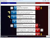 Found this on

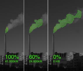
 Given the number of data points provided, it would be difficult to refute the findings depicted in this chart.
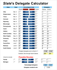
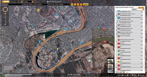 of mash-up type things that are all the rage is the ability to actually annotate map information in a useful way by combining these features.
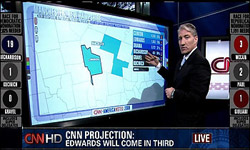 I missed seeing it live, but was told about it by a baffled friend who muttered about watching CNN and that the anchors were having a little too much fun with a new touch-screen toy while they covered returns for the primaries. The
 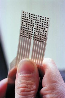 Visualization works because our eyes are the highest bandwidth channel for getting information into our brains. Researchers working to restore sight have found that the second best place may be the
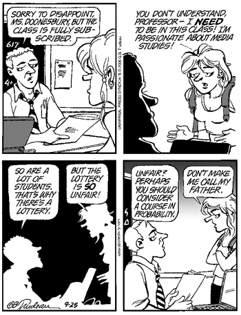
  An example of how cartoonists embed sophisticated ideas inside their drawings, videos from the Washington Post of
