I wanted to post this last week in my excitement over week 1 of pro football season (that’s the 300 lbs. locomotives pounding into each other kind of football, not the game played with actual balls and feet), but ran out of time. So instead, in honor of football Sunday, week 2, my favorite advertisement of last year’s football season:
The ad is a phone conversation with Coca-Cola’s Katie Bayne, animated by Imaginary Forces. A couple things I like about this… First, that the attitude is so much less heavy-handed than, say, the IBM spots that seem to be based on the premise that if they jump cut quickly enough, they can cure cancer. The woman being interviewed actually laughs about “big data” truisms. Next is the fact that it’s actually a fairly smart question that’s asked:
How important is it that you get the right information rather than just a lot of information?
Well… you know you can roll around in facts all day long. It’s critical that we stay aware of that mountain of data that’s coming in and mine it for the most valuable nuggets. It helps keep us honest.
And third, the visual quality that reinforces the lighter attitude. Cleverly drawn without overdoing it. She talks about being honest and a hand comes flying in to push back a Pinnocchio nose. Nuggets of data are shown as… eh, nuggets.
Just posted an essay about the work of artist Mark Lombardi that I presented at Experimenta Design in Lisbon last week. I don’t usually post lectures, but this is a kind of work-in-progress that I’m trying to sort out for myself.
For the panel, we were to choose “an individual, movement, technology, whatever – whose importance has been overlooked” and follow that with “two themes that [we] believe will define the future of design and architecture.” In that context, I chose Lombardi’s work, and how it highlights a number of themes that are important to the future of design, particularly in working with data.
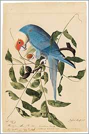
Continuing Luddite Monday, a new special feature on benfry.com, an article from the Boston Globe about the prevalence of handcrafted images in reference texts. Dushko Petrovich writes:
But in fact, nearly two centuries after the publication of his famous folios, it is Audubon’s technique, and not the sharp eye of the modern camera, that prevails in a wide variety of reference books. For bird-watchers, the best guides, the most coveted guides – like those by David Allen Sibley and Roger Tory Peterson – are still filled with hand-painted images. The same is true for similar volumes on fish, trees, and even the human body. Ask any first-year medical student what they consult during dissections, and they will name Dr. Frank H. Netter’s meticulously drafted “Atlas of Human Anatomy.” Or ask architects and carpenters to see their structures, and they will often show you chalk and pencil “renderings,” even after the things have been built and professionally photographed.
This nicely reinforces the case for drawing, and why it’s so powerful. The article later gets to the meat of the issue, which is the same reason that drawing is a topic on a site about data visualization.
Besides seamlessly imposing a hierarchy of information, the handmade image is also free to present its subject from the most efficient viewpoint. Audubon sets a high standard in this regard; he is often at pains to depict the beak in its most revealing profile, the crucial feathers at an identifiable angle, the front leg extended just so. When the nighthawk and the whip-poor-will are pictured in full flight, their legs tucked away, he draws the feet at the side of the page, so we’re not left guessing. If Audubon draws a bird in profile, as he does with the pitch-black rook and the grayer hooded crow, we’re not missing any details a three-quarters view would have shown.
And finally, a reminder:
Confronted with unprecedented quantities of data, we are constantly reminded that quality is what really matters. At a certain point, the quality and even usefulness of information starts being defined not by the precision and voracity of technology, but by the accuracy and circumspection of art. Seen in this context, Audubon shows us that painting is not just an old fashioned medium: it is a discipline that can serve as a very useful filter, collecting, editing, and carefully synthesizing information into a single efficient and evocative image – giving us the information that we really want, information we can use and, as is the case with Audubon, even cherish.
Consider this your constant reminder, because I think it’s actually quite rare that quality is acknowledged. I regularly attend lectures by speakers who boast about how much data they’ve collected and the complexity of their software and hardware, but it’s one in ten thousand who even mention the art of removing or ignoring data in search of better quality.
Looks like the Early Drawings book mentioned in the article will be available at the end of September.
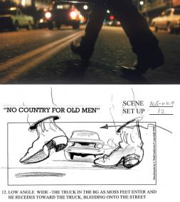
Wonderful article about the work of J. Todd Anderson, who storyboards the Coen Brothers’ movies:
Anderson’s drawings have a jauntiness that seems absent from the more serious cinematic depiction; Anderson says he is simply trying to inject as much of a sense of action as possible into each scene.
Anderson describes the process of meeting about a new film:
“It’s like they’re making a movie in front of me,” he says. “They tell me the shots. I do fast and loose drawings on a clipboard with a Sharpie pen—one to three drawings to a sheet of regular bond paper. I try to establish the scale, trap the angle, ID the character, get the action.”
Wonderfully simple explanation of how to draw an eye. Karl used to be the graphics editor at Newsweek, and now teaches in the journalism school at Sparty.
I thought I’d share a short video I just made on how to draw an eye. I think it’s fun… Skip to the end if you’re in a hurry, though it’s only a couple of minutes long. Please pass it along to any budding artists! I plan to do a series of drawing instruction videos over time and this is the first.
Karl put together a fun conference last year. Conference might not be the right word (the attendees were the speakers, and the speakers the only attendees); really it was a handful of info geeks hanging out in Newport discussing each other’s work, but we certainly had a good time.
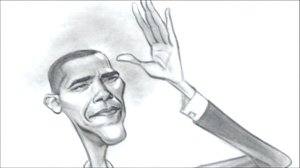
An example of how cartoonists embed sophisticated ideas inside their drawings, videos from the Washington Post of caricaturist John Kascht describing his process. I especially liked the idea of Obama not smiling (in spite of the positive persona the campaign has been selling), and the description of McCain’s head as a “clenched fist” couldn’t be more apt. These are impressions that will stick with me next time I see all these candidates.
On Obama: “There’s a messianic aura about him. … That air of destiny really registers all across his face and in his body language as well. He shines. Light literally bounces off the guy from everywhere … And yet for all of the surface appeal of him, I’m drawn to the unsmiling images of him, where he has his head tipped back with an almost aristocratic bearing. Seems very telling somehow. As a work in progress he’s completely fascinating to watch and to draw.”
On Hillary: “It seems to fit that Clinton’s cheeks are her most prominent features. Cheeks aren’t exactly the windows to the soul, but Hillary Clinton’s not exactly a ‘peek inside my soul’ kind of person, anyway. … Her round facial features seem to balance on top of one another, and along the same lines her head seems to balance on top of her narrow shoulders like a boulder on a pyramid. I find it really interesting that this graphic profile that she cuts—of all of these elements in precarious alignment—is such a perfect metaphor for her political balancing act.”
On McCain: “His jaw gives him away…it’s an anger barometer. During debates when he’s being challenged by an opponent, he bites down hard, and you know what he really wants to do is go to the podium next door and smack somebody. … He’s got a head like a clenched fist, and it expands with every passing year. … His small, dark eyes are watchful and wary. Whether he’s smiling or talking he bares his teeth; they’re choppers really, and they flash with metal. They look like weapons. His skin isn’t skin so much as hide.”
On Mitt: “Mitt Romney is both the easiest and the hardest of the candidates to caricature. … He seems less like an individual person than a ‘type’ of person. He’s what central casting might come up with for the game show host type or the Ward Cleaverish 50’s dad type. … Because of the heavy ridge of his brow and his deep-set eyes, it’s tough to even see his eyes, much less find a twinkle in them. But his hair sparkles. That’s what we end up making eye contact with. It’s off-putting rather than inviting.”
Visualizing Data is my 2007 book about computational information design. It covers the path from raw data to how we understand it, detailing how to begin with a set of numbers and produce images or software that lets you view and interact with information. When first published, it was the only book(s) for people who wanted to learn how to actually build a data visualization in code.
The text was published by O’Reilly in December 2007 and can be found at Amazon and elsewhere. Amazon also has an edition for the Kindle, for people who aren’t into the dead tree thing. (Proceeds from Amazon links found on this page are used to pay my web hosting bill.)
The book covers ideas found in my Ph.D. dissertation, which is the basis for Chapter 1. The next chapter is an extremely brief introduction to Processing, which is used for the examples. Next is (chapter 3) is a simple mapping project to place data points on a map of the United States. Of course, the idea is not that lots of people want to visualize data for each of 50 states. Instead, it’s a jumping off point for learning how to lay out data spatially.
The chapters that follow cover six more projects, such as salary vs. performance (Chapter 5), zipdecode (Chapter 6), followed by more advanced topics dealing with trees, treemaps, hierarchies, and recursion (Chapter 7), plus graphs and networks (Chapter 8).
This site is used for follow-up code and writing about related topics.


 An example of how cartoonists embed sophisticated ideas inside their drawings, videos from the Washington Post of