On the heels of today’s posting of the updated Salary vs. Performance piece comes word in the New York Times that a film version of Moneyball has been shelved:
Just days before shooting was to begin, Sony Pictures pulled the plug on “Moneyball,” a major film project starring Brad Pitt and being directed by Steven Soderbergh.
Yesterday I found it far more unsettling that such a movie would be made period, but today I’m oddly curious about how they might pull it off:
What baseball saw as accurate, Sony executives saw as being too much a documentary. Mr. Soderbergh, for instance, planned to film interviews with some of the people who were connected to the film’s story.
I guess we’ll never know, since other studios also passed on the project, but that’s probably a good thing.
As an aside, I’m in the midst of reading Liar’s Poker (another by Moneyball author Michael Lewis) and again find myself amused by his ability as a storyteller: he reminds me of a friend who can take the most banal event and turn it into the most peculiar and hilarious story you’ve ever heard.
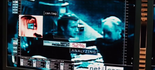
Casey wrote with more info regarding the previous post about Pelham. The command center in the movie is fake (as expected), because the real command center looks too sophisticated. NPR had this quote from John Johnson (spelling?), New York City Transit’s Chief Transportation Officer:
“They actually … attempted to downplay what the existing control center looks like, because they wanted to make it look real to the average eye as compared to… we’re pretty Star Trekky up in the new control center now.”
So that would explain the newish typeface used in the image, and the general dumbing-down of the display. The audio from the NPR story is here, with the quote near the 3:00 mark.
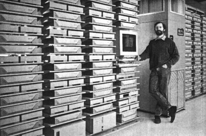
This is the only image I’ve been able to find of the real command center:
Links to larger/better/more descriptive images welcome!
Is this a real place? Buried within the bowels of New York City? And Mr. Washington, how about using one of your two telephones to order a new typeface for that wall? Looks like a hundred thousand dollars of display technology being used for ASCII line art.
I was in the midst of starting a new post in January so I failed to make a post about it at the time, but Oblong‘s Tamper installation was on display at the 2009 Sundance Film Festival. John writes (and I copy verbatim):
Our Sundance guests — who already number in the thousands — find the experience exhilarating. A few grim cinephiles have supplementally raised an eyebrow (one per cinephile) at the filmic heresy that TAMPER provides: a fluid new ability to isolate, manipulate, and juxtapose (rudely, say the grim) disparate elements (ripped from some of the greatest works of cinema, continue the grim). For us, what’s important is the style of work: real-time manipulation of media elements at a finer granularity than has previously been customary or, for the most part, possible; and a distinctly visceral, dynamic, and geometric mode of interaction that’s hugely intuitive because the incorporeal suddenly now reacts just like bits of the corporeal world always have. Also, it’s glasses-foggingly fun.
Saudi Aramco was originally an American company. It goes way back to the 1930s when two American geologists from Standard Oil of California discovered oil in the Saudi desert.
Standard Oil formed a consortium with Texaco, Exxon and Mobil, which became Aramco. It wasn’t until the 1980s that Saudi Arabia bought them out and nationalized the company. Today, Saudi Aramco is the custodian of the country’s sole source of wealth and power.
Over 16,000 people work at the company’s massive compound, which is like a little country with its own security force, schools, hospitals, and even its own airline.
According to Abdallah Jum’ah, Saudi Aramco’s president and CEO, Aramco is the world’s largest oil producing company.
And it’s the richest company in the world, worth, according to the latest estimate, $781 billion.
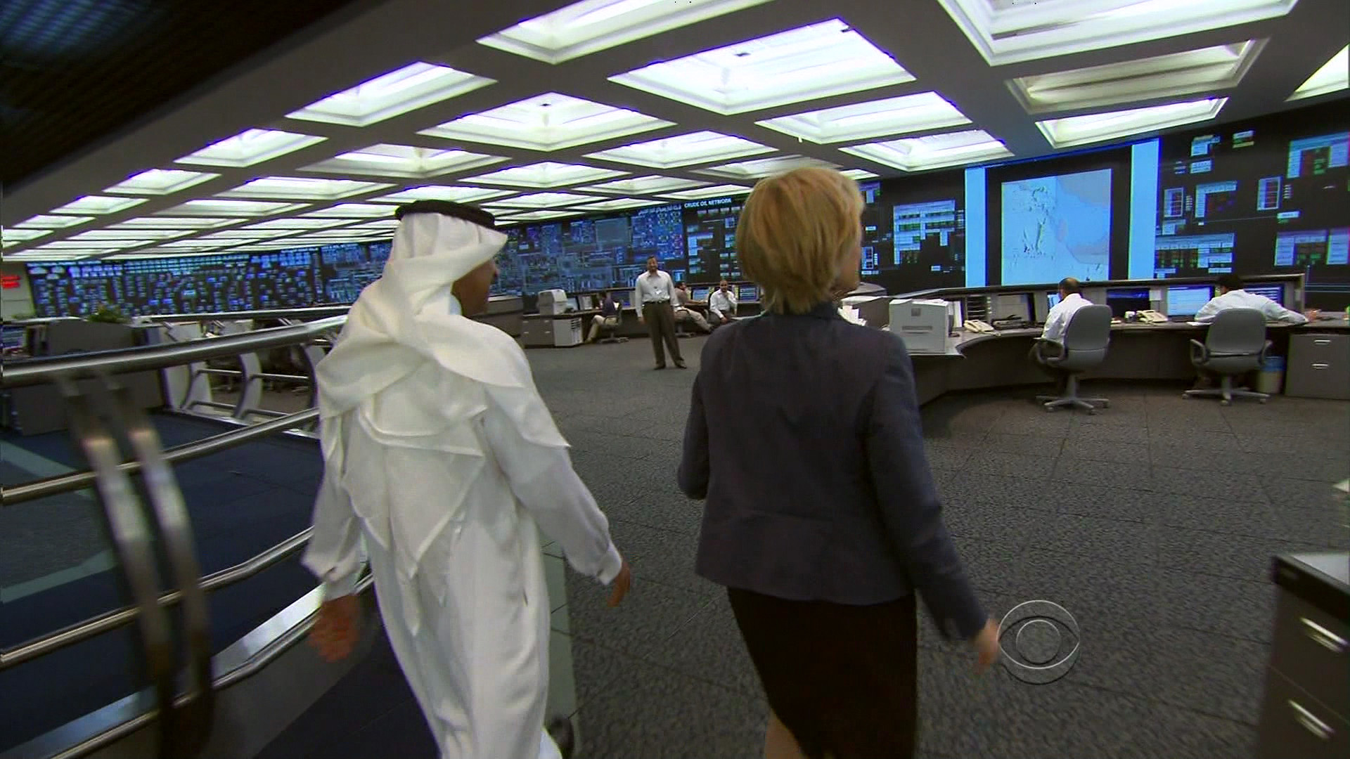
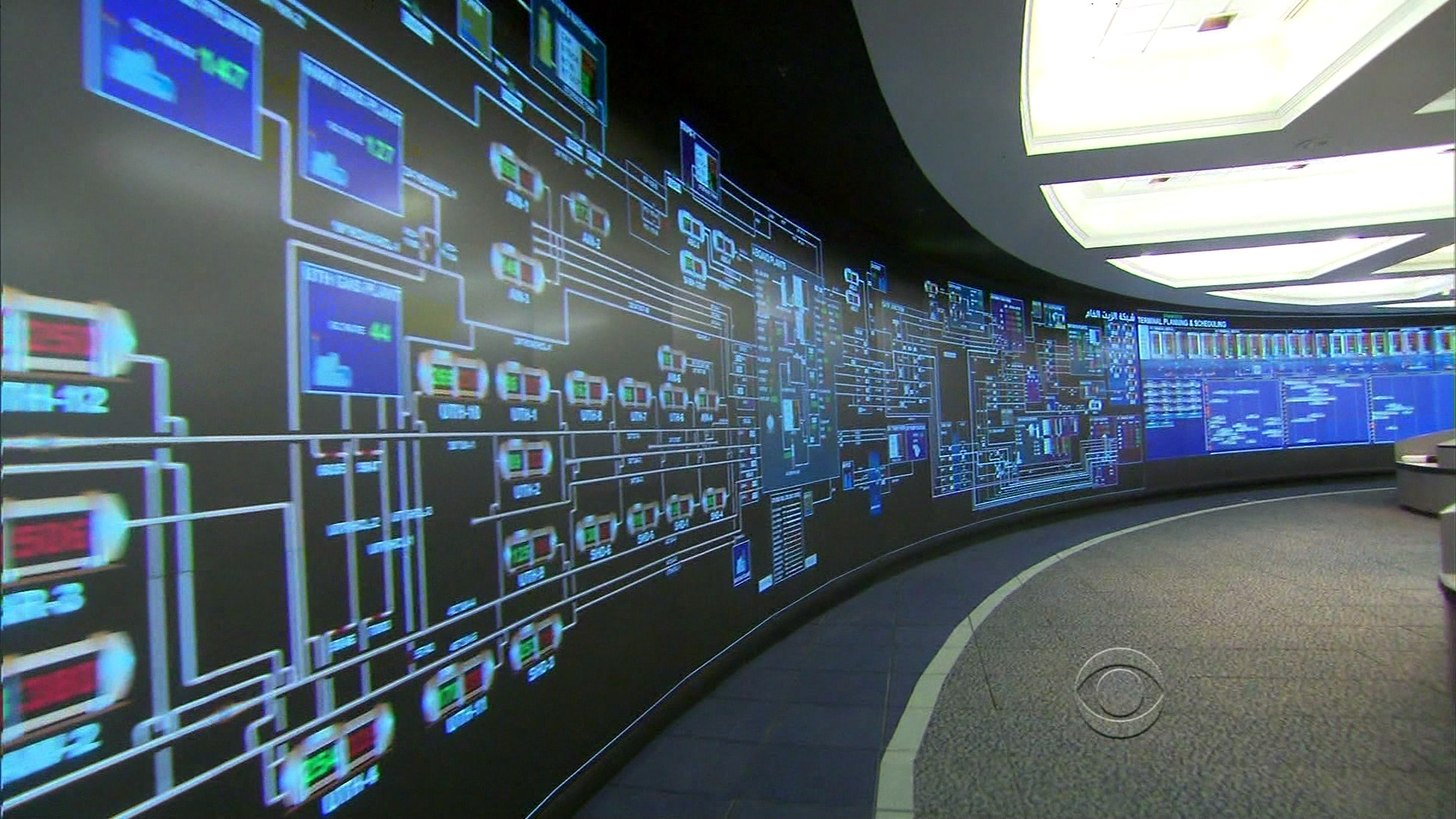
I was about to change the channel (perhaps as you were just about to stop reading this post), when they showed the big board:
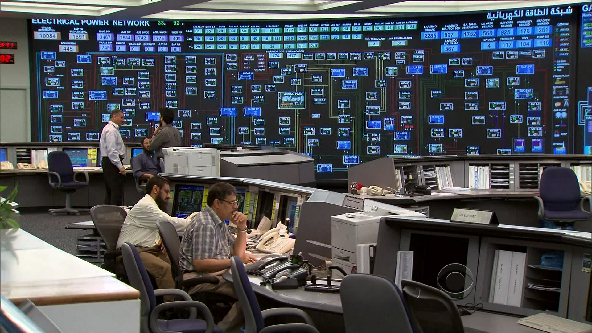
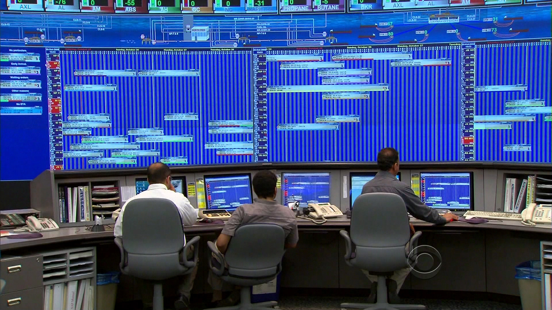
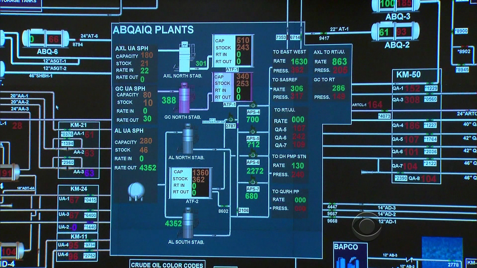
Jum’ah gave 60 Minutes a tour of the company’s command center, where engineers scrutinize and analyze every aspect of the company’s operations on a 220-foot digital screen.
“Every facility in the kingdom, every drop of oil that comes from the ground is monitored in real time in this room,” Jum’ah explained. “And we have control of each and every facility, each and every pipeline, each and every valve on the pipeline. And therefore, we know exactly what is happening in the system from A to Z.”
A large map shows all the oil fields in Saudi Arabia, including Ghawar, the largest on-shore oil field in the world, and Safaniya, the largest off-shore oil field in the world; green squares on the map monitor supertankers on the high seas in real time.
Here’s a short part of the segment that shows the display:
Since the smaller video doesn’t do it justice, several still images follow, each linked to their Comcastic, artifact-ridden HD versions:
Did rooms like this first exist in the movies and compelled everyone to imitate?
New guys and interns have to sit in front of the wall of vibrating bright blues:
The display is ambient in the sense that nobody’s actually using the larger version to do real work (you can see relevant portions replicated on individuals’ monitors). It seems to serve as a means of knowing what everyone in the room is up to (or as a deterrent against firing up Solitaire — I’m looking at you Ahmad). But more importantly, it’s there for visitors, especially visitors with video cameras, and people who write about visualization and happened to catch a segment about their info palace since it immediately followed the Patriots-Seahawks game.
A detail of one of the displays bears this out — an overload of ALL CAPS SANS SERIF TYPE with the appropriately unattractive array reds and greens. This sort of thing always makes me curious about what such displays would look like if they were designed properly. Rather than blowing up low resolution monitors, what would it look like if it were designed for the actual space and viewing distance in which it’s used?
Given some number of talented people, success is not particularly surprising. But sustaining that success in a creative organization, the way that Pixar has over the last fifteen years is truly exceptional. Ed Catmull, cofounder of Pixar (and computer graphics pioneer) writes about their success for the Harvard Business Review:
Unlike most other studios, we have never bought scripts or movie ideas from the outside. All of our stories, worlds, and characters were created internally by our community of artists. And in making these films, we have continued to push the technological boundaries of computer animation, securing dozens of patents in the process.
On Creativity:
People tend to think of creativity as a mysterious solo act, and they typically reduce products to a single idea: This is a movie about toys, or dinosaurs, or love, they’ll say. However, in filmmaking and many other kinds of complex product development, creativity involves a large number of people from different disciplines working effectively together to solve a great many problems. The initial idea for the movie—what people in the movie business call “the high concept”—is merely one step in a long, arduous process that takes four to five years.
A movie contains literally tens of thousands of ideas.
On Taking Risks:
…we as executives have to resist our natural tendency to avoid or minimize risks, which, of course, is much easier said than done. In the movie business and plenty of others, this instinct leads executives to choose to copy successes rather than try to create something brand-new. That’s why you see so many movies that are so much alike. It also explains why a lot of films aren’t very good. If you want to be original, you have to accept the uncertainty, even when it’s uncomfortable, and have the capability to recover when your organization takes a big risk and fails. What’s the key to being able to recover? Talented people!
Reminding us that we learn more from failure, the more interesting part of the article talks about how Pixar responded to early failures in Toy Story 2:
Toy Story 2 was great and became a critical and commercial success—and it was the defining moment for Pixar. It taught us an important lesson about the primacy of people over ideas: If you give a good idea to a mediocre team, they will screw it up; if you give a mediocre idea to a great team, they will either fix it or throw it away and come up with something that works.
Toy Story 2 also taught us another important lesson: There has to be one quality bar for every film we produce. Everyone working at the studio at the time made tremendous personal sacrifices to fix Toy Story 2. We shut down all the other productions. We asked our crew to work inhumane hours, and lots of people suffered repetitive stress injuries. But by rejecting mediocrity at great pain and personal sacrifice, we made a loud statement as a community that it was unacceptable to produce some good films and some mediocre films. As a result of Toy Story 2, it became deeply ingrained in our culture that everything we touch needs to be excellent.
On mixing art and technology:
[Walt Disney] believed that when continual change, or reinvention, is the norm in an organization and technology and art are together, magical things happen. A lot of people look back at Disney’s early days and say, “Look at the artists!” They don’t pay attention to his technological innovations. But he did the first sound in animation, the first color, the first compositing of animation with live action, and the first applications of xerography in animation production. He was always excited by science and technology.
At Pixar, we believe in this swirling interplay between art and technology and constantly try to use better technology at every stage of production. John coined a saying that captures this dynamic: “Technology inspires art, and art challenges the technology.”
I saw Catmull speak to the Computer Science department a month or two before I graduated from Carnegie Mellon. Toy Story had been released two years earlier, and 20 or 30 of us were all jammed into a room listening to this computer graphics legend speaking about…storytelling. The importance of narrative. How the movies Pixar was creating had less to do with the groundbreaking computer graphics (the reason that most were in the room) than it did with a good story. This is less shocking nowadays, especially if you’ve ever seen a lecture by someone from Pixar, but the scene left an incredible impression on me. It was a wonderful message to the programmers in attendance about the importance of placing purpose before the technology, but without belitting the importance of either.
(While digging for an image to illustrate this post, I also found this review of The Pixar Touch: The Making of a Company, a book that seems to cover similar territory as the HBR article, but from the perspective of an outside author. The image is stolen from Ricky Grove’s review.)
Don LaFontaine, voice artist for some 5,000 movies and 350,000 advertisements passed away Monday. He’s the man who came up with the “In A World…” that begins most film trailers, as well as the baritone voice style that goes with it. The Washington Post has an obituary.
In the early 1960s, he landed a job in New York with National Recording Studios, where he worked alongside radio producer Floyd L. Peterson, who was perfecting radio spots for movies. Until then, movie studios primarily relied on print advertising or studio-made theatrical trailers. The two men became business partners and, together, perfected the familiar format.
Mr. LaFontaine, who was editing, writing and producing in the early days of the partnership, became a voice himself by accident. In 1964, when an announcer failed to show up for a job, he recorded himself reading copy and sent it to the studio with a message: “This is what it’ll sound like when we get a ‘real’ announcer.”
Trailer for The Elephant Man, proclaimed to be his favorite:
And a short interview/documentary:
Don’s impact is unmistakable, and it’s striking to think of how his approach changed movie advertising. May he rest in peace.
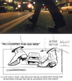
Wonderful article about the work of J. Todd Anderson, who storyboards the Coen Brothers’ movies:
Anderson’s drawings have a jauntiness that seems absent from the more serious cinematic depiction; Anderson says he is simply trying to inject as much of a sense of action as possible into each scene.
Anderson describes the process of meeting about a new film:
“It’s like they’re making a movie in front of me,” he says. “They tell me the shots. I do fast and loose drawings on a clipboard with a Sharpie pen—one to three drawings to a sheet of regular bond paper. I try to establish the scale, trap the angle, ID the character, get the action.”
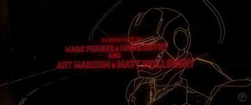
Apropos of the recent film graphics post, Jessica Helfand at Design Observer writes about the recently released Iron Man:
Iron Man is the fulfillment of all the computer-integrated movies were ever meant to be, and by computer-integrated, I mean just that: beyond the technical wizardry of special effects, this is a film in which the computer is incorporated, like a cast member, into the development of the plot itself.
I’ve not seen the movie but the statement appears to be provocative enough to elicit cheers and venom from the scribes in the comments section. (This seems to be common at Design Observer, are designers really this angry and unhappy? How ’bout them antisocial personal attacks! I take back what I wrote in the last post about wanting to be a designer when I grow up. Some thick skin or self-fashioned military grade body armor over at DO.)
On the other hand, a more helpful post linked to the lovely closing title sequence, designed by Danny Yount of Prologue.
I wish they didn’t use Black Sabbath. Is that really the way it’s done in the film? Paranoid is a great album (even if Iron Man is my least favorite track) but the titles and the music couldn’t have less to do with each other. Enjoy the music or enjoy the video; just don’t do ’em together.
As much as snickering about computers in movies might make me feel smart, I’ve since become fascinated by how software, and in particular information, is portrayed in film. There are many layers at work:
Film is visual storytelling. As such, you have to be able to see everything that’s happening. Data is not visual, which is why you see symbols that represent data used more often: It’s 2012 but they’re still storing data on physical media because at some point, showing the data being moved is important. (Nevermind that it can be transmitted thousands of kilomteters in a fraction of a second.) This is less interesting, since it means a sort of dumbing-down of the technology, and presents odd contradictions. It can also make things ugly: progress bars are often full screen interface elements, or how many technology-heavy action flicks have included the pursuit of a computer disk? (On the other hand, the non-visual aspect can be a positive one: a friend finishing film school at NYU once pursued a nanotechnology thriller as his final film because “you can’t see it.” It would allow him to tackle a technical subject without needing the millions of dollars in props.)
Things need to “feel” like a computer. When this piece appeared in the Hulk, they added extra gray interface elements in and around it so that it didn’t look too futuristic. Nevermind that it was a real, working piece of software for browsing the human genome. To the consternation of a friend who worked on Minority Report, on-screen “windows” in the interface all had borders around them. If you have a completely fluid interface with hands, motion, and accessing piles of video being output from three people in a tank, do we really need…title bars?
It’s not just computers—anything remotely complicated is handled in this manner. Science may be worse off than software, though I don’t think scientists complain as loudly as the geeks did when they heard “This is UNIX, I know this!” (My personal favorite in that one was a scene where a video phone discussion was actually an actor talking to a QuickTime movie—you could see the progress bar moving left to right as the scene wore on.)
There’s a lot of superfluous gimmickery that goes on too. There’s just no way you’re gonna show important information in a film without random numbers twitching or counting down. Everything is more important when we have know the current time with millisecond accuracy (that’s three digits after the decimal point for seconds). Or maybe some random software code (since that’s incomprehensible but seems significant). This is obvious and sometimes painful to watch, except in the case of a talented visual designer who makes it look compelling.
Finally, the way that computers are represented in film has something to do with how we (society? lay people? them?) think that computers should work.
It’s that last one that is the fascinating point for me: by virtue of the intent to reach a large audience, a movie streamlines the way that information is handled and interfaces behave. A their best, it suggests where we need to go (at their worst, they blink “Access Denied”). It’s easy to point out the ridiculousness of the room full of people hunched over computers at CIA headquarters and the guy saying “give me all people with last name Jones in the Baltimore area” and in the next scene that’s tallied against satellite video (which of course can be enhanced ad infinitum). But think about how ridiculous those scenes looked twenty years ago, and the parts of that scenario that are no longer far-fetched as the population at large gets used to Google and having satellite imagery available for the price of typing a query. Even the most outrageous—the imagery enhancement—has had breakthroughs associated with it, some of which can be done by anyone using Photoshop, like the case of people trying to figure out if Bush was wearing a wire at the debates in 2004. (Contradicting their earlier denials, Bush’s people later admitted that he was wearing a bulletproof vest.)
That’s the end of today’s lecture on movie graphics, so I’ll leave you with a link to Mark Coleran, a visual designer who has produced many such sequences for film.
I recommend the large version of his demo reel, and I’ll be returning to this topic later with more designers. Drop me an email if you have favorite designer or film sequence.
Halfway through The Fog of War by Errol Morris (of The Thin Blue Line, or the Apple “Switch” ad campaign depending on your persuasion), Robert S. McNamara (Secretary of Defense for the Kennedy and Johnson administrations) describes proportionality in war:
Why was it necessary to drop the nuclear bomb if [General Curtis] LeMay was burning up Japan? And he went on from Tokyo to firebomb other cities. 58% of Yokohama. Yokohama is roughly the size of Cleveland. 58% of Cleveland destroyed. Tokyo is roughly the size of New York. 51% percent of New York destroyed. 99% of the equivalent of Chattanooga, which was Toyama. 40% of the equivalent of Los Angeles, which was Nagoya. This was all done before the dropping of the nuclear bomb, which by the way was dropped by LeMay’s command.
The gruesome description is abetted by a different kind of proportionality—that when placed in the context of size with regard to U.S. cities, these numbers become more “real.” I found this set particularly striking for how ordinary the cities were—Cleveland and Chattanooga, in addition to the usual New York and Los Angeles. The huge metropolitan areas may be too abstract for many, but Cleveland!?—those are actual people!
The entire transcript is also on Errol Morris’ site—amazing. Why don’t more studios do this? It’s great to be able to study it more closely, and was enough to convince me to purchase (rather than just rent) the movie.
Visualizing Data is my 2007 book about computational information design. It covers the path from raw data to how we understand it, detailing how to begin with a set of numbers and produce images or software that lets you view and interact with information. When first published, it was the only book(s) for people who wanted to learn how to actually build a data visualization in code.
The text was published by O’Reilly in December 2007 and can be found at Amazon and elsewhere. Amazon also has an edition for the Kindle, for people who aren’t into the dead tree thing. (Proceeds from Amazon links found on this page are used to pay my web hosting bill.)
The book covers ideas found in my Ph.D. dissertation, which is the basis for Chapter 1. The next chapter is an extremely brief introduction to Processing, which is used for the examples. Next is (chapter 3) is a simple mapping project to place data points on a map of the United States. Of course, the idea is not that lots of people want to visualize data for each of 50 states. Instead, it’s a jumping off point for learning how to lay out data spatially.
The chapters that follow cover six more projects, such as salary vs. performance (Chapter 5), zipdecode (Chapter 6), followed by more advanced topics dealing with trees, treemaps, hierarchies, and recursion (Chapter 7), plus graphs and networks (Chapter 8).
This site is used for follow-up code and writing about related topics.

 On the heels of today’s posting of the updated Salary vs. Performance piece comes word in the New York Times that a film version of Moneyball has been shelved:

 I was in the midst of starting a new post in January so I failed to make a post about it at the time, but