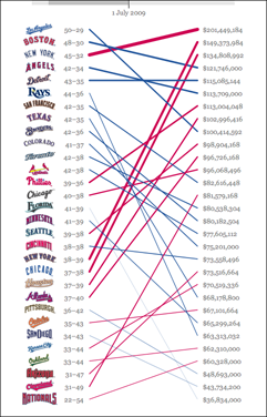
Salary vs. Performance for 2009
 I’ve just posted the updated version of Salary vs. Performance for the 2009 baseball season. I had hoped this year to rewrite the piece to cover multiple years, have a couple more analysis options, and even to rebuild it using the JavaScript version of Processing (no Java! no plug-in!), but a busy spring has upended my carefully crafted but poorly implemented plans.
Meanwhile, my inbox has been filling with plaintive comments like this one:
Will you be updating this site for this year? It’s the first year I think my team, the Giants would have a blue line instead of a red line.
How can I ignore the Giants fans? (Or for that matter, their neighbors to the south, the Dodgers, who perch atop the list as I write this.)
More about the project can be found in the archives. Visualizing Data explains the code and how it works, and the code itself is amongst the book examples.

