Most of the results are what you’d expect, but fun to see it nonetheless. Some other info graphics using the same data can be found here, and even better, the raw data can be found here.
Having spent my morning at the doctor’s office (I’m fine, Mom–just a physical), I passed the time by asking my doctor about the system they use for electronic medical records. Our GE work (1, 2) and seeing her gripe and sigh as truly awful-looking screen after screen flew past on her display caught my interest. And as someone who has an odd fascination with bad interfaces, I just had to ask…
Perhaps the most surprising bit was that without explicitly saying so, she seemed to find the EMR system most useful not as a thing that aggregates data, or makes her work easier, but instead as a communication tool. It combats the (very real, not just an overused joke) penmanship issues of fellow doctors, but equally as important, it sets a baseline or common framework for the details of a visit. The latter part is obvious, but the actual nature of it is more subtle. For instance, she would often find herself deciphering a scribble that says “throat, amox” by another doctor, and it says nothing of dosage, frequency, type of Amoxicillin, much less the nature of the throat trouble. A patient (particularly a sick patient) is also not the person to provide precise details. How many would remember whether they were assigned a 50, 150 or 500 milligram dosage (very different things, you might say). And for that matter, they’re probably equally likely to think they’re on a 500 kilogram dose. (“No, that’s too high. Must be 5 kilogram.”)
My doctor might be seeing such a patient because their primary care doctor (the mad scribbler) was out, or the patient was a referral, or had just moved offices, or whatever. But it makes an interesting point for the transience of medical data: importance increases as it’s in motion, which is especially true since the patient it’s attached to is not a static entity (from changing health conditions to changing jobs, cities, and doctors).
Or from a simpler angle, if you’re sick enough that you have to be seen by someone other than your primary care doctor, then it’s especially important for the information to be complete. So with any luck, the EMR removes a layer of translation that was required before.
As she described things off the top of her head, the data only came up later. Ok, it’s all data, but I’m referring to the numbers and the tests and the things that can be tracked easily over time. The sort of reduce-the-patient-to-numbers things we usually think of when hearing about EMRs. Readouts that display an array of tests, such as blood pressure history, is an important feature, but it wasn’t the killer app of EMRs. (And that will be the last time I use “killer app” and “electronic medical records” together. Pun not intended.)
The biggest downside (she’s now using her second system) is that the interfaces are terrible, usually that they do things in the wrong order, or require several windows and multiple clicks to do mundane tasks. She said there were several things that she liked and hated about this one, but that it was a completely different set of pros/cons from the other system she used. (And to over-analyze for a moment, I think she even said “like” and “hate” not “love” and “hate” or “like” and “dislike”. She also absentmindedly mentioned “this computer is going to kill me.” She’s not a whiner, and may truly believe it. EMRs may be killing our doctors! Call The New York Times, or at least Fox 25.) This isn’t surprising, I assume it’s just that technology purchasers are several levels removed from the doctors who have to use the equipment, which is usually the case for software systems like this, so there’s little market pressure for usability. If you’re big enough to need such a beast, then it means that the person making the decision about what to buy is a long ways removed. But I’m curious about whether this is a necessity of how big software is implemented, or a market opportunity.
At some point she also stated that it would be great if the software company had asked a doctor for their input in how the system was implemented. I think it’s safe to assume that there was at least one M.D.–if not an arsenal of individuals with a whole collection of alphabet soup trailing their names–who were involved with the software. But I was struck with how matter-of-fact she was that nobody had even thought about it. The software was that bad, and to her, the flaws were that obvious. The process by which she was forced to travel through the interface had little to do with the way she worked. Now, for any expert, they might have their own way of doing things, but that’s probably not the discrepancy here. (And in fact, if the differences between doctors are that great, then that itself should be part of the software: the doctor needs to be able to change the order in which the software works.) But it’s worth noting that the data (again, meaning the numbers and test history and easily measurable things) were all easily accessible from the interface, which suggests that like so many data-oriented projects, the numbers seduced the implementors. And so those concrete numbers (fourth or so on ranked importance for this doctor) won out over process (the way the doctor spends their day, and their time with the patient).
All of which is a long way of wondering, “are electronic medical records really about data?”
As a continuation of this project, we’ve just finished a second health visualization (also built with Processing) using GE’s data. Like the first round, we started with ~6 million patient records from their “MQIC” database. Using the software, you input gender, age range, height/weight (to calculate BMI), and smoking status. Based on the selections it shows you the number of people in the database that match those settings, and the percentages that have been diagnosed with diabetes, heart disease, hypertension, or have had a stroke:
For people reading the site because they’re interested in visualization (I guess that’s all of you, except for mom, who is just trying to figure out what I’m up to), some inside baseball:
On the interaction side, the main objective here was to make it easy to move around the interface as quickly as possible. The rows are shown in succession so that the interface can teach itself, but we also provide a reset button so that you can return to the starting point. Once the rows are visible, though, it’s easy to move laterally and make changes to the settings (swapping between age ranges, for instance).
One irony of making the data accessible this way is that most users — after looking up their own numbers — will then try as many different possibilities, in a quick hunt for the extremes. How high do the percentages go? If I select bizarre values, what happens at the edges? Normally, you don’t have to spend as much time on these 1% cases, and it would be alright for things to be a little weird when truly odd values are entered (300 lb. people who are 4′ tall, smokers, and age 75 and over). But in this case, a lot more time has to be spent making sure things work. So while most of the time the percentages at the top are in the 5-15% range, I had to write code so that when one category shoots up to 50%, the other bars in the chart scale down in proportion.
Another aspect of the interface is the body mass index calculator. Normally a BMI chart looks something like this, a large two-dimensional plot that would otherwise use up half of the interface. By using a little interaction, we can make a simpler chart that dynamically updates itself based on the current height or weight settings. Also, because the ranges have (mathematically) hard edges, we’re showing that upper and lower bound of the range so that it’s more apparent. Otherwise, a 5’8″ person steps from 164 to 165 lbs to find themselves suddenly overweight. In reality, the boundaries are more fuzzy, which would be taken into account by a doctor. But with the software, we instead have to be clear about the way the logic is working.
(Note that the height and weight are only used to calculate a BMI range — it’s not pulling individuals from the database who are 5’8″ and 160 lbs, it’s pulling people from the “normal” BMI range.)
For the statistically (or at least numerically) inclined, there are also some interesting quirks that can be found, like a situation or two where health risk would be expected to go up, but in fact they go down (I’ll leave you to find them yourself). This is not a bug. We’re not doing any sort of complex math here to evaluate actual risk, the software is just a matching game with individuals in the database. These cases in particular show up when there are only a few thousand individuals, say 2,000 out of the full 6 million records. The number of people in these edge cases is practically a rounding error, which means that we can’t make sound conclusions with them. As armchair doctor-scientist, it’s also interesting to speculate as to what might be happening in such cases, and how other factors may come into play.
I was in the midst of starting a new post in January so I failed to make a post about it at the time, but Oblong‘s Tamper installation was on display at the 2009 Sundance Film Festival. John writes (and I copy verbatim):
Our Sundance guests — who already number in the thousands — find the experience exhilarating. A few grim cinephiles have supplementally raised an eyebrow (one per cinephile) at the filmic heresy that TAMPER provides: a fluid new ability to isolate, manipulate, and juxtapose (rudely, say the grim) disparate elements (ripped from some of the greatest works of cinema, continue the grim). For us, what’s important is the style of work: real-time manipulation of media elements at a finer granularity than has previously been customary or, for the most part, possible; and a distinctly visceral, dynamic, and geometric mode of interaction that’s hugely intuitive because the incorporeal suddenly now reacts just like bits of the corporeal world always have. Also, it’s glasses-foggingly fun.
Hilarious, bizarre, and rambling segment from last night’s Daily Show featuring John Oliver’s take on CNN’s favorite toy from this year’s election.
I’m continually amazed by the amount of interest this technology generates (yeah, I posted about it too), so perspective from the Daily Show is always helpful and welcome.
The New York Times has a very nicely done election map this year. Amongst its four viewing options is a depiction of counties that voted more Democratic (blue) or Republican (red) in comparison to the 2004 presidential election:
The blue is to be expected, given that the size of the win for Obama, but the red pattern is quite striking.
Also note the shift for candidate home states, in Arizona with McCain on the ticket, and what appears to be the reverse result in parts of Massachusetts, with Kerry no longer on the ticket. (The shift to the Democrats in Indiana is also amazing: without looking at the map closely enough I had assumed that area to be Obama’s home of Illinois.)
I recommend checking out the actual application on the Times site, the interaction lacks some of the annoying ticks that can be found in some of their other work (irritating rollovers that get in the way, worthless zooming, and silly transition animations). It’s useful and succinct, just like an infographic should be. Or just the way Mom used to make. Or whatever.
Visualizing Data is my 2007 book about computational information design. It covers the path from raw data to how we understand it, detailing how to begin with a set of numbers and produce images or software that lets you view and interact with information. When first published, it was the only book(s) for people who wanted to learn how to actually build a data visualization in code.
The text was published by O’Reilly in December 2007 and can be found at Amazon and elsewhere. Amazon also has an edition for the Kindle, for people who aren’t into the dead tree thing. (Proceeds from Amazon links found on this page are used to pay my web hosting bill.)
The book covers ideas found in my Ph.D. dissertation, which is the basis for Chapter 1. The next chapter is an extremely brief introduction to Processing, which is used for the examples. Next is (chapter 3) is a simple mapping project to place data points on a map of the United States. Of course, the idea is not that lots of people want to visualize data for each of 50 states. Instead, it’s a jumping off point for learning how to lay out data spatially.
The chapters that follow cover six more projects, such as salary vs. performance (Chapter 5), zipdecode (Chapter 6), followed by more advanced topics dealing with trees, treemaps, hierarchies, and recursion (Chapter 7), plus graphs and networks (Chapter 8).
This site is used for follow-up code and writing about related topics.


 I was in the midst of starting a new post in January so I failed to make a post about it at the time, but
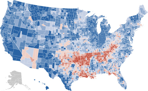
