
Writing

Controlling the news cycle & the terror alert level
I’ve been hesitant to post this video of Keith Olbermann’s 17-minute timeline connecting the shifting terror alert level to the news cycle and administration at the risk of veering too far into politics, but I’m reminded again of it with Tom Ridge essentially admitting to it in his book:
In The Test of Our Times: America Under Siege, Ridge wrote that although Rumsfeld and Ashcroft wanted to raise the alert level, “There was absolutely no support for that position within our department. None. I wondered, ‘Is this about security or politics?'”
Only to recant and be taken to task by Rachel Maddow:
Ridge went on to say that “politics was not involved” and that “I was not pressured.” Maddow then read to Ridge directly from his book’s jacket: “‘He recounts episodes such as the pressure that the DHS received to raise the security alert on the eve of of the ’04 presidential election.’ That’s wrong?”
As Seth Meyers put it, “My shock level on manipulation of terror alerts for political gain is green, or low.”
At any rate, whether there is in fact correlation, causation, or simply a conspiracy theory that gives far too much credit to the number of people who would have to be involved, I think it’s an interesting look at 1) message control 2) using the press (or a clear example of the possibilities) 3) the power of assembling information like this to produce such a timeline, and 4) actual reporting (as opposed to tennis match commentary) done by a 24-hour news channel.
Of course, I was disappointed that it wasn’t an actual visual timeline, though somebody has probably done that as well.
Also from the office of scary flowcharts
Responding to the Boehner post, Jay Parkinson, M.D. pointed me to this improved chart by designer Robert Palmer, accompanied by an angst-ridden open letter (an ironic contrast to the soft pastels in his diagram) decrying the crimes of visual malfeasance.
 Meanwhile, Ezra Klein over at the Washington Post seems to be thinking along similar lines as my original post, noting this masked artist’s earlier trip to Kinko’s a few weeks ago. Klein writes:
Whoever is heading the Scary Flowcharts Division of John Boehner’s office is quickly becoming my favorite person in Washington. A few weeks ago, we got this terror-inducing visualization of the process behind “Speaker Pelosi’s National Energy Tax.”

That’s hot!
If I were teaching right now, I’d make all my students do a one day charrette on trying to come up with something worse than the Boehner health care image while staying in the realm of colloquial things you can do with PowerPoint. It’d be a great time, and we’d all learn a lot.
Having spent two posts making fun of the whole un-funny mess around health care, I’ll leave you with the best bit of op-ed I’ve read on the topic, from Harold Meyerson, also at the Washington Post:
Watching the centrist Democrats in Congress create more and more reasons why health care can’t be fixed, I’ve been struck by a disquieting thought: Suppose our collective lack of response to Hurricane Katrina wasn’t exceptional but, rather, the new normal in America. Suppose we can no longer address the major challenges confronting the nation. Suppose America is now the world’s leading can’t-do country.
I agree and find it terrifying. And I don’t think that’s a partisan issue.
Now back to your purposefully apolitical, regularly scheduled blog on making pictures of data.
Mapping Health Care: Here Be Dragons!
I’m so completely impressed with this incredible bit of info graphic awesomeness distributed by the office of John Boehner, Republican congressman from Ohio’s 8th District. The flow chart purports to show the Democrats’ health care proposal:

The image needs to be much larger to be fully appreciated in its magnificent glory of awfulness, so a high resolution version is here, and the PDF version is here.
The chart was used by Boehner as a way to make the plan look as awful as possible — a tactic used to great effect by the same political party during the last attempt at health care reform in 1994. The diagram appears to be the result of a heart-warming collaboration between a colorblind draughtsman, the architect of a nightmarish city water works, and whoever designed the instructions for the bargain shelving unit I bought from Target.
Don’t waste your time, by the way — I’ve already nominated it for an AIGA award.
(And yes, The New Republic also created a cleaner version, and the broader point is that health care is just a complex mess no matter what, so don’t let that get in the way of my enjoyment of this masterwork.)
Additional perspective from The Daily Show (my original source) follows.
OpenSecrets no longer secret
Word on the street (where by “the street” I mean an email from Golan Levin), is that the Center for Responsive Politics has made available piles and piles of data:
The following data sets, along with a user guide, resource tables and other documentation, are now available in CSV format (comma-separated values, for easy importing) through OpenSecrets.org’s Action Center at http://www.opensecrets.org/action/data.php:
CAMPAIGN FINANCE: 195 million records dating to the 1989-1990 election cycle, tracking campaign fundraising and spending by candidates for federal office, as well as political parties and political action committees. CRP’s researchers add value to Federal Election Commission data by cleaning up and categorizing contribution records. This allows for easier totaling by industry and company or organization, to measure special-interest influence.
LOBBYING: 3.5 million records on federal lobbyists, their clients, their fees and the issues they reported working on, dating to 1998. Industry codes have been applied to this data, as well.
PERSONAL FINANCES: Reports from members of Congress and the executive branch that detail their personal assets, liabilities and transactions in 2004 through 2007. The reports covering 2008 will become available to the public in June, and the data will be available for download once CRP has keyed those reports.
527 ORGANIZATIONS: Electronically filed financial records beginning in the 2004 election cycle for the shadowy issue-advocacy groups known as 527s, which can raise unlimited sums of money from corporations, labor unions and individuals.
The best thing here is that they’ve already tidied and scrubbed the data for you, just like Mom used to. The personal finance information alone has already led to startling revelations.
Can a bunch of mathematicians make government more representative?
An interesting article from Slate about a session at the Joint Mathematics Meeting that discussed mathematical solutions and proposals to undo the problem of gerrymandered congressional districts. That is, politicians in congress having the ability to draw an outline around the group of people they want to represent (which is based on how likely they are to vote for said politician’s re-election). The resulting shapes are often comical, insofar as you’re willing to be cheerful in a “politics is perpetually broken and corrupt” kind of way. Chris Wilson writes:
It’s tough to find many defenders of the status quo, in which a supermajority of House seats are noncompetitive. (Congressional Quarterly ranked 324 of the 435 seats as “safe” for one party or the other in 2008.) The mathematicians—and social scientists and lawyers—who gathered to discuss the subject Thursday are certain there’s a better way to do it. They just haven’t quite figured out what it is.
The meeting also seemed to include a contest (knock down, drag out, winner take pocket protector) between the presenters each trying to one-up each other for worst district. For instance, Florida’s 23rd, provided by govtrack.us:
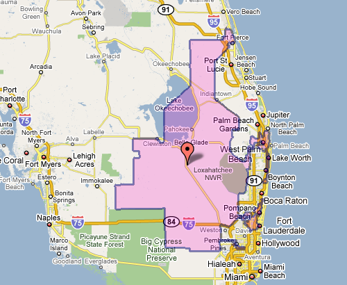
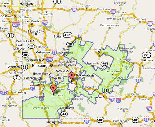
Which doesn’t seem awful at first, until you see the squiggle up the coast. Or Pennsylvania’s 12th, which Wilson describes as “an anchor glued to a sea anemone.”
Fixing the problem is difficult, but sometimes there are elegant and straightforward metrics that get you closer to a solution:
The most interesting proposal of the afternoon came from a Caltech grad student named Alan Miller, who proposed a simple test: If you take two random people in a district, what are the odds that one can walk in a straight line to the other without ever leaving the district? (Actually, it’s without leaving the district while remaining in the state, so as not to penalize districts like Maryland’s 6th, which has to account for Virginia’s hump.) This rewards neat, simple shapes. But it penalizes districts like Maryland’s 3rd, which looks like something out of Kandinsky’s Improvisation 31.
This turns the issue into something directly testable (two residents and their path) for which we can calculate a probability — the sort of thing statisticians love (because it can be measured). Given this criteria (and others like it) for congressional district godliness, another proposal was a kind of Netflix Prize for redistricting, where groups could compete to develop the best redistricting algorithm. Such an algorithm would seek to remove the (bipartisan) mischief by limiting human intervention.
The original article also includes a slide show of particularly heinous district shapes. And as an aside, the images above, while enormously useful, illustrate part of my beef with mash-ups: Google Maps was designed as a mapping application, not a mapping-with-stuff-on-it application. So when you add data to the map image — itself a completed design —you throw off that balance. It’s difficult to read the additional information (the district area), and the information that’s there (the map coloring, specific details of the roads) is more than necessary for this purpose.
Change is always most interesting
The New York Times has a very nicely done election map this year. Amongst its four viewing options is a depiction of counties that voted more Democratic (blue) or Republican (red) in comparison to the 2004 presidential election:
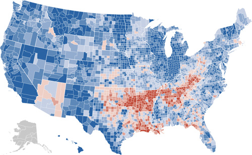
The blue is to be expected, given that the size of the win for Obama, but the red pattern is quite striking.
Also note the shift for candidate home states, in Arizona with McCain on the ticket, and what appears to be the reverse result in parts of Massachusetts, with Kerry no longer on the ticket. (The shift to the Democrats in Indiana is also amazing: without looking at the map closely enough I had assumed that area to be Obama’s home of Illinois.)
I recommend checking out the actual application on the Times site, the interaction lacks some of the annoying ticks that can be found in some of their other work (irritating rollovers that get in the way, worthless zooming, and silly transition animations). It’s useful and succinct, just like an infographic should be. Or just the way Mom used to make. Or whatever.
iPolljunkie, iPoliticsobsession, iFix, iLackawittytitle
I apologize that I’ve been too busy and distracted with preparing Processing 1.0 to have any time to post things here, but here’s a quickie so that the page doesn’t just rot into total embarrassment.
Slate this morning announced the availability of a poll tracking application for the iPhone:

I haven’t yet ponied up ninety nine of my hard-earned cents to buy it but find it oddly fascinating. Is there actually any interest for this? Is this a hack? Is there a market for such things? Is the market simply based on the novelty of it? Is it possible to quantify the size of the poll-obsessed political junkie market? And how is that market comprised—what percentage of those people are part of campaigns, versus just people who spend too much time reading political news? (I suspect the former is negligible, but may be tainted as a card-carrying member of the latter group.)
To answer my own questions, I suspect that it was thrown together by a couple of people from the tech side of the organization (meaning “hack” in the best sense of the word), who then sold management on it, with the rationale of 1) it’ll generate a little press (or hype on, um, blogs), 2) it’ll reinforce Slate readers’ interest in or connection to the site, and 3) it’s a little cool and trendy. I don’t think they’re actually planning to make money on it (or recoup any development costs), but that the price tag has more to do with 99¢ sounds more valuable and interesting than a free giveaway.
Of course, anyone with more interesting insights (let alone useful facts), please pass them along. I’m hoping it’s an actual Cocoa app, and not just a special link to web pages reformatted for the iPhone, which would largely invalidate this post and extinguish my own curiosity about the beast.
Update: The application is a branded reincarnation of a poll tracker developed by Aaron Brethorst at Chimp Software. Here’s his blog post announcing the change, and even a press release.
Mention Offhand and Ye Shall Receive
Just received a helpful note from Nelson Minar, who notes an already redrawn version of the graph from the last post over at Chartjunk. The redraw aims to improve the proportion between the different tax brackets:
Much better! Read more about their take, and associated caveats here. (Also thanks to Peter Merholz and Andrew Otwell who also wrote, yet were no match for Nelson’s swift fingers.)
Glancing at Tax Proposals
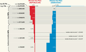
Finally, the infographic I’ve been waiting for, the Washington Post compares the tax proposals of United States presidential candidates John McCain and Barack Obama:
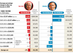
Lots of words have been spilled over the complexities of tax policy, whether in stump speeches, advertisements, or policy papers. But these are usually distilled for voters in lengthy articles that throw more words at the problem. But compare even a well-written article like this one at Business Week versus the graphic above from the Washington Post. Which of the two will you be able to remember tomorrow?
I also appreciate that the graphic very clearly represents the general tax policies of Republicans vs. Democrats, without showing bias toward either. The only thing that’s missing is a sense of how big each of the categories are – how many people are in the “over $2.87 million” category versus how many are in the “$66,000 to $112,000” category, which would help convey a better sense of the “middle class” term that candidates like to throw around.
There is still greater complexity to the debate than what’s shown in this image (the Business Week article describes treasury shortfalls based on the McCain proposal, for instance), but without the initial explanation provided by that graphic, will voters even bother with those details?
Obama Limited to 16 Bits
I guess I never thought I’d read about the 16-bit limitations of Microsoft Excel in mainstream press (or at least outside the geek press), but here it is:
Obama’s January fundraising report, detailing the $23 million he raised and $41 million he spent in the last three months of 2007, far exceeded 65,536 rows listing contributions, refunds, expenditures, debts, reimbursements and other details.
Excel has since its inception been limited to 65,536 rows, the maximum number you get when you represent the row number using two bytes. Mr. Millionsfromsmallcontributions has apparently flown past this limit in his FEC reports, forcing poor reporters to either use Microsoft Access (a database program) or pray for the just-released Excel 2007, where in fact the row restriction has been lifted.
In the past the argument against fixing the restriction had always been a mixture of “it’s too messy to upgrade something like that” and “you shouldn’t have that many rows of data in a spreadsheet anyway, you should use a database.” Personally I disagree with the latter; and as silly as the former sounds, it’s been the case for a good 20 years (or was the row limit even lower back then?)
The OpenOffice project, for instance, has an entire page dedicated to fixing the issue in OpenOffice Calc, where they’re limited to 30,000 rows—the limit being tied to 32,768, or the number you get with 15 bits instead of 16 (use the sixteenth bit as the sign bit indicating positive or negative, and you can represent numbers from -32768 to 32767 instead of unsigned 16 bit values that range from 0 to 65535).
Bottoms up for the first post tagged both “parse” and “politics”.
Another delegate calculator
Wonderfully simple delegate calculator from the New York Times. Addresses a far simpler question than the previously mentioned Slate calculator, but bless the NYT for realizing that something that complicated was no longer necessary.
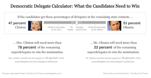
Good example of throwing out extraneous information to tell a story more directly: a quick left and right drag provides a more accurate depiction than the horse race currently in the headlines.
The Earth at night
Via mailing list, Oswald Berthold passes along images and a short article of the Earth from space as compiled by NASA, highlighting city lights in particular.

The collection is an update to the Earth Lights image developed a few years ago (and which made its way ’round the interwebs at the time).
For the more technical, a presentation from the NOAA titled Low Light Imaging of the Earth at Night provides greater detail about the methods used to produce such images. Also includes a couple interesting historical examples (such as the first image they created) as well as comparisons of city growth over time based on changes in the data.
Of course many conclusions can be drawn from seeing map data such as this. Look at the difference between North and South Korea, for instance (original image from globalsecurity.org).

Apparently this is a favorite of former U.S. Secretary of Defense Donald Rumsfeld:
Mr Rumsfeld showed the picture to illustrate how backward the northern regime really is – and how oppressed its people are. Without electricity there can be none of the appliances that make life easy and that we take for granted, he said.
“Except for my wife and family, that is my favourite photo,” said Mr Rumsfeld.
“It says it all. There’s the south, the same people as the north, the same resources north and south, and the big difference is in the south it’s a free political system and a free economic system.
I’ve vowed to myself not to make this page be about politics so I won’t get into the fatuous arguments of a warmonger (oops), but I think the fascinating thing is that
- This image, this “information graphic,” would be of such great importance to a person that he would see fit to even mention it in reference to photos of his wife and children. This is a strong statement for any image, even if he is being dramatic.
- The use of images to make or score political points. There’s some great stuff buried in recent Congressional testimony about the Iraq War, for instance, that I want to get to soon.
In regards to #1, I’m trying to think of other images to which people maintain such a personal relationship (particularly those whose job is not info graphics—Tufte’s preoccupation with Napoleon’s March doesn’t count.)
As for #2, hopefully we’ll get to that a bit later.
Democratic Delegate Scenarios
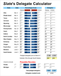 One of the chapters that I had to cut from Visualizing Data was about scenarios—building interactive “what if” tools that help you quickly try out several possibilities. This is one of the most useful aspects of dynamic visualization—being able to try out different ideas in a quick way (and safe, as in non-destructive, since Undo is always nearby). Hopefully I’ll be able to cover this sometime soon.
At any rate, one such scenario-building tool is Slate’s Delegate Calculator, where you can drag primitive sliders back and forth and see the possibilities for delegate outcomes for Hillary and Obama.
I’ve seen complaints about its math, but it seems to do an OK job for a big-picture look at the likelihood of different outcomes. Getting the math 100% is impossible (unless you have a far more complicated interface) because the delegate selection process is different in each state. It appears that none of the states wanted to be seen using the same approach as another, and with fifty states going their own way, things got pretty random (Texas: we’ll have a caucus and a primary).
I think that’s enough posting about politics for a bit.
Basing News Categorization on Blog Blather
 Found this on Slashdot, but their headline—“Microsoft Developing News Sorting Based On Political Bias” made it sound a lot more interesting than it may be. The idea of mining text data to tease out mythical media biases and leanings sounds fascinating. What sort of axes could be determined? Could we see how different kinds of language are used, or ways that particular code words or phrases infect news coverage?
Unfortunately, the research project from Microsoft looks like it’s just procuring link counts from “liberal” and “conservative” blogs, and gauging the vigor of commentary on either side. Does this make you uneasy yet?
- We are politically binary: the world has devolved into conservative and liberal! (Or not, yet why do people insist on it?) The representation seems almost entirely U.S.-centric, right down to the red and blue coloring on either side. Red states! Blue states! Red blogs! Blue Blogs! A maleficent Dr. Seuss has infected our political outlook.
- What about those other axes, where are they? Of all the things to cull from political discourse, liberal vs. conservative must be one of the least interesting. Did you need a team of six from Microsoft, plus all the computing power at their disposal, to tell you that one article or another ruffled more feathers on either side of this simplified spectrum?
- There’s so much to be learned from propagation of phrases and ideas in the news; why hasn’t there been a more sophisticated representation of it? (Because it’s hard?) The Daily Show has shown this successfully (queueing several people in order repeating something like “axis of evil” or something about “momentum” for a candidate).
- Blogs are not real. When you turn off the computer, they go away. The internet is not a place, and is too divorced from actual reality to be a useful gauge on most social phenomena. Using blogs as input for a kind of meta-study seems like a poor way to acquire data.
The problems I cite are a bit unfair since they haven’t posted much on their site (looks like they’re presenting a paper…soon?) so the reaction is just based on what they’ve provided. I knew Sumit Basu back at the Media Lab and I think it’s safe to assume there’s more going on…
But what about these bigger issues?
Book
 Visualizing Data is my 2007 book about computational information design. It covers the path from raw data to how we understand it, detailing how to begin with a set of numbers and produce images or software that lets you view and interact with information. When first published, it was the only book(s) for people who wanted to learn how to actually build a data visualization in code.
The text was published by O’Reilly in December 2007 and can be found at Amazon and elsewhere. Amazon also has an edition for the Kindle, for people who aren’t into the dead tree thing. (Proceeds from Amazon links found on this page are used to pay my web hosting bill.)
Examples for the book can be found here.
The book covers ideas found in my Ph.D. dissertation, which is the basis for Chapter 1. The next chapter is an extremely brief introduction to Processing, which is used for the examples. Next is (chapter 3) is a simple mapping project to place data points on a map of the United States. Of course, the idea is not that lots of people want to visualize data for each of 50 states. Instead, it’s a jumping off point for learning how to lay out data spatially.
The chapters that follow cover six more projects, such as salary vs. performance (Chapter 5), zipdecode (Chapter 6), followed by more advanced topics dealing with trees, treemaps, hierarchies, and recursion (Chapter 7), plus graphs and networks (Chapter 8).
This site is used for follow-up code and writing about related topics.
Much Clicked
- Visualizing Data Examples
- On needing approval for what we create, and losing control over how it’s distributed
- Brains on the Line
- All Streets
- Watching the evolution of the “Origin of Species”
- The Earth at night
- Piet Mondrian Goes to the Super Bowl
- Sustainable Creativity at Pixar
- Surfing, Orgies, and Apple Pie
- Eric Idle on “Scale”
- New for 2010
- Are electronic medical records really about data?