
Can a bunch of mathematicians make government more representative?
An interesting article from Slate about a session at the Joint Mathematics Meeting that discussed mathematical solutions and proposals to undo the problem of gerrymandered congressional districts. That is, politicians in congress having the ability to draw an outline around the group of people they want to represent (which is based on how likely they are to vote for said politician’s re-election). The resulting shapes are often comical, insofar as you’re willing to be cheerful in a “politics is perpetually broken and corrupt” kind of way. Chris Wilson writes:
It’s tough to find many defenders of the status quo, in which a supermajority of House seats are noncompetitive. (Congressional Quarterly ranked 324 of the 435 seats as “safe” for one party or the other in 2008.) The mathematicians—and social scientists and lawyers—who gathered to discuss the subject Thursday are certain there’s a better way to do it. They just haven’t quite figured out what it is.
The meeting also seemed to include a contest (knock down, drag out, winner take pocket protector) between the presenters each trying to one-up each other for worst district. For instance, Florida’s 23rd, provided by govtrack.us:
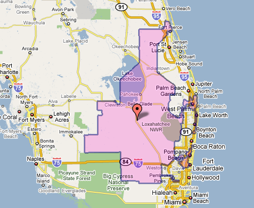
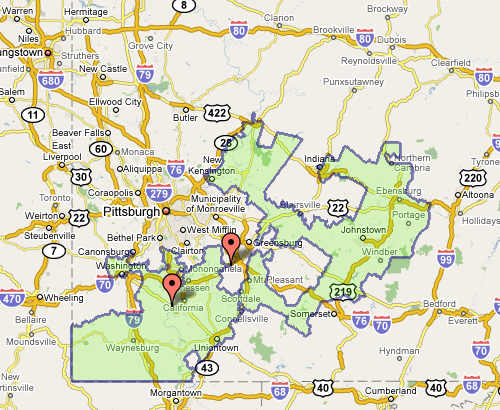
Which doesn’t seem awful at first, until you see the squiggle up the coast. Or Pennsylvania’s 12th, which Wilson describes as “an anchor glued to a sea anemone.”
Fixing the problem is difficult, but sometimes there are elegant and straightforward metrics that get you closer to a solution:
The most interesting proposal of the afternoon came from a Caltech grad student named Alan Miller, who proposed a simple test: If you take two random people in a district, what are the odds that one can walk in a straight line to the other without ever leaving the district? (Actually, it’s without leaving the district while remaining in the state, so as not to penalize districts like Maryland’s 6th, which has to account for Virginia’s hump.) This rewards neat, simple shapes. But it penalizes districts like Maryland’s 3rd, which looks like something out of Kandinsky’s Improvisation 31.
This turns the issue into something directly testable (two residents and their path) for which we can calculate a probability — the sort of thing statisticians love (because it can be measured). Given this criteria (and others like it) for congressional district godliness, another proposal was a kind of Netflix Prize for redistricting, where groups could compete to develop the best redistricting algorithm. Such an algorithm would seek to remove the (bipartisan) mischief by limiting human intervention.
The original article also includes a slide show of particularly heinous district shapes. And as an aside, the images above, while enormously useful, illustrate part of my beef with mash-ups: Google Maps was designed as a mapping application, not a mapping-with-stuff-on-it application. So when you add data to the map image — itself a completed design —you throw off that balance. It’s difficult to read the additional information (the district area), and the information that’s there (the map coloring, specific details of the roads) is more than necessary for this purpose.
