I love this image of a radio signal reading found on Futility Closet, mostly because it belongs in a movie:

As the post explains, this was a signal seen by astronomer Jerry Ehman, coming from Sagittarius in 1977, but never replicated.
As a continuation of this project, we’ve just finished a second health visualization (also built with Processing) using GE’s data. Like the first round, we started with ~6 million patient records from their “MQIC” database. Using the software, you input gender, age range, height/weight (to calculate BMI), and smoking status. Based on the selections it shows you the number of people in the database that match those settings, and the percentages that have been diagnosed with diabetes, heart disease, hypertension, or have had a stroke:

For people reading the site because they’re interested in visualization (I guess that’s all of you, except for mom, who is just trying to figure out what I’m up to), some inside baseball:
On the interaction side, the main objective here was to make it easy to move around the interface as quickly as possible. The rows are shown in succession so that the interface can teach itself, but we also provide a reset button so that you can return to the starting point. Once the rows are visible, though, it’s easy to move laterally and make changes to the settings (swapping between age ranges, for instance).
One irony of making the data accessible this way is that most users — after looking up their own numbers — will then try as many different possibilities, in a quick hunt for the extremes. How high do the percentages go? If I select bizarre values, what happens at the edges? Normally, you don’t have to spend as much time on these 1% cases, and it would be alright for things to be a little weird when truly odd values are entered (300 lb. people who are 4′ tall, smokers, and age 75 and over). But in this case, a lot more time has to be spent making sure things work. So while most of the time the percentages at the top are in the 5-15% range, I had to write code so that when one category shoots up to 50%, the other bars in the chart scale down in proportion.
Another aspect of the interface is the body mass index calculator. Normally a BMI chart looks something like this, a large two-dimensional plot that would otherwise use up half of the interface. By using a little interaction, we can make a simpler chart that dynamically updates itself based on the current height or weight settings. Also, because the ranges have (mathematically) hard edges, we’re showing that upper and lower bound of the range so that it’s more apparent. Otherwise, a 5’8″ person steps from 164 to 165 lbs to find themselves suddenly overweight. In reality, the boundaries are more fuzzy, which would be taken into account by a doctor. But with the software, we instead have to be clear about the way the logic is working.
(Note that the height and weight are only used to calculate a BMI range — it’s not pulling individuals from the database who are 5’8″ and 160 lbs, it’s pulling people from the “normal” BMI range.)
For the statistically (or at least numerically) inclined, there are also some interesting quirks that can be found, like a situation or two where health risk would be expected to go up, but in fact they go down (I’ll leave you to find them yourself). This is not a bug. We’re not doing any sort of complex math here to evaluate actual risk, the software is just a matching game with individuals in the database. These cases in particular show up when there are only a few thousand individuals, say 2,000 out of the full 6 million records. The number of people in these edge cases is practically a rounding error, which means that we can’t make sound conclusions with them. As armchair doctor-scientist, it’s also interesting to speculate as to what might be happening in such cases, and how other factors may come into play.
Have fun!
An interesting article from Slate about a session at the Joint Mathematics Meeting that discussed mathematical solutions and proposals to undo the problem of gerrymandered congressional districts. That is, politicians in congress having the ability to draw an outline around the group of people they want to represent (which is based on how likely they are to vote for said politician’s re-election). The resulting shapes are often comical, insofar as you’re willing to be cheerful in a “politics is perpetually broken and corrupt” kind of way. Chris Wilson writes:
It’s tough to find many defenders of the status quo, in which a supermajority of House seats are noncompetitive. (Congressional Quarterly ranked 324 of the 435 seats as “safe” for one party or the other in 2008.) The mathematicians—and social scientists and lawyers—who gathered to discuss the subject Thursday are certain there’s a better way to do it. They just haven’t quite figured out what it is.
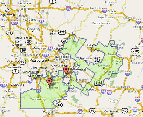
The meeting also seemed to include a contest (knock down, drag out, winner take pocket protector) between the presenters each trying to one-up each other for worst district. For instance, Florida’s 23rd, provided by govtrack.us:
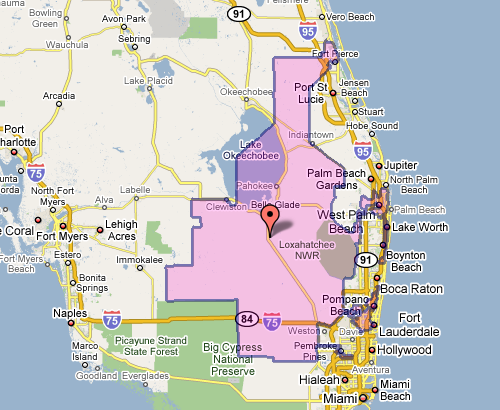
Which doesn’t seem awful at first, until you see the squiggle up the coast. Or Pennsylvania’s 12th, which Wilson describes as “an anchor glued to a sea anemone.”
Fixing the problem is difficult, but sometimes there are elegant and straightforward metrics that get you closer to a solution:
The most interesting proposal of the afternoon came from a Caltech grad student named Alan Miller, who proposed a simple test: If you take two random people in a district, what are the odds that one can walk in a straight line to the other without ever leaving the district? (Actually, it’s without leaving the district while remaining in the state, so as not to penalize districts like Maryland’s 6th, which has to account for Virginia’s hump.) This rewards neat, simple shapes. But it penalizes districts like Maryland’s 3rd, which looks like something out of Kandinsky’s Improvisation 31.
This turns the issue into something directly testable (two residents and their path) for which we can calculate a probability — the sort of thing statisticians love (because it can be measured). Given this criteria (and others like it) for congressional district godliness, another proposal was a kind of Netflix Prize for redistricting, where groups could compete to develop the best redistricting algorithm. Such an algorithm would seek to remove the (bipartisan) mischief by limiting human intervention.
The original article also includes a slide show of particularly heinous district shapes. And as an aside, the images above, while enormously useful, illustrate part of my beef with mash-ups: Google Maps was designed as a mapping application, not a mapping-with-stuff-on-it application. So when you add data to the map image — itself a completed design —you throw off that balance. It’s difficult to read the additional information (the district area), and the information that’s there (the map coloring, specific details of the roads) is more than necessary for this purpose.
 Article from the Chronicle of Higher Education about course selection (competition, class lotteries, etc).
Every college has a hot-ticket class. Maybe it’s the subject matter (serial killers! sailing!) or maybe it’s a celebrity professor (George Tenet! Toni Morrison!). Whatever it is, everybody wants to get in.
And, of course, not everybody can. So how do you decide who gets a seat and who’s disappointed?
If you’re Patricia de Castries, you make everybody sleep outside your door. Ms. de Castries, assistant director of the Stanford Language Center, teaches a wildly popular wine-tasting course at the university. Often more than 100 would-be connoisseurs compete for the 60 spots, so on the eve of registration students show up with pillows and sleeping bags, hoping to get their names on the list. “It’s tough,” says Ms. de Castries, “but if you want to be in the class, you do it.”
Covers the range from MIT’s technical approach to Wharton’s free market approach, where students at the latter bid on courses using a point system. Sadly, the article now seems to be blocked except for those academic-types who have access to a subscription.
(Thanks Eugene)


