
Writing

Conveying multiple realities in research and journalism
A recent Boston Globe editorial covers the issue of multiple, seemingly (if obviously) contradictory statements that come from complex research, in this case around the oil spill:
Last week, Woods Hole researchers reported a 22-mile-long underwater plume that they mapped out in the Gulf of Mexico in June — a finding indicating that much more oil may lie deep underwater and be degrading so slowly that it might affect the ecosystem for some time. Also last week, University of Georgia researchers estimated up to 80 percent of the spill may still be at large, with University of South Florida researchers finding poisoned plankton between 900 feet and 3,300 feet deep. This differed from the Aug. 4 proclamation by Administrator Jane Lubchenco of the National Oceanic and Atmospheric Administration that three-quarters of the oil was “completely gone’’ or dispersed and the remaining quarter was “degrading rapidly.’’
But then comes the Lawrence Berkeley National Laboratory, which this week said a previously unclassified species of microbes is wolfing down the oil with amazing speed. This means that all the scientists could be right, with massive plumes being decimated these past two months by an unexpected cleanup crew from the deep.
This is often the case for anything remotely complex: the opacity of the research process to the general public, the communication skills of various institutions, the differing perspective between what the public cares about (whose fault is it? how bad is it?) versus the interests of the researchers, and so on.
It’s a basic issue around communicating complex ideas, and therefore affects visualization too — it’s rare that there’s a single answer.

On a more subjective note, I don’t know if I agree with the premise of the editorial is that it’s on the government to sort out the mess for the public. It’s certainly a role of the government, though the sniping at the Obama administration makes the editorial writer sound one who is equally likely to bemoan government spending, size, etc. But I could write an equally (perhaps more) compelling editorial making the point that it’s actually the role of newspapers like the Globe to sort out newsworthy issues that concern the public. But sadly, the Globe, or at least the front page of boston.com, has been overly obsessed with more click-ready topics like the Craigslist killer (or any other rapist, murderer, or stomach-turning story involving children du jour) and playing “gotcha” with spending and taxes for universities and public officials. What a bunch of ghouls.
(Thanks to my mother-in-law for the article link.)

A glimpse of modern reporting
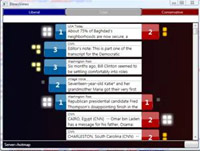
Colin Raney turned me on to this project (podcast? article? info graphic? series? part of what’s great is that there isn’t really a good term for this) by the team of five running the Planet Money podcast for NPR. To explain toxic assets, they bought one, and are now tracking its demise:
![]()
Here I’m showing the info graphic, which is just one component of telling the broader story. The series does a great job of balancing 1) investigative journalism (an engaging story), 2) participation by a small team (the four reporters plus their producer each pooled $200 apiece), 3) timely and relevant, 4) really understanding an issue (toxic assets are in the news but we still don’t quite get it), 5) distribution (blog with updates, regular podcast), and 6) telling a story with information graphics (being able to track what’s happening with the asset).
I could keep adding to that numbered list, but my hastily and poorly worded point is that the idea is just right.
Perhaps if the papers weren’t so busy wringing their hands about the loss of classified ads, maybe this would have been the norm five years ago when it should have been. But it’s a great demonstration of where we need to be with online news, particularly as it’s consumed with all these $500 devices we keep purchasing, that deliver the news in a tiny, scrolly text format that echoes the print version. A print format that’s 100s of years old.
Anyhow, this is great. Cheers to the Planet Money folks.
(Another interesting perspective here, from TechDirt, which was the original link I read.)
Controlling the news cycle & the terror alert level
I’ve been hesitant to post this video of Keith Olbermann’s 17-minute timeline connecting the shifting terror alert level to the news cycle and administration at the risk of veering too far into politics, but I’m reminded again of it with Tom Ridge essentially admitting to it in his book:
In The Test of Our Times: America Under Siege, Ridge wrote that although Rumsfeld and Ashcroft wanted to raise the alert level, “There was absolutely no support for that position within our department. None. I wondered, ‘Is this about security or politics?'”
Only to recant and be taken to task by Rachel Maddow:
Ridge went on to say that “politics was not involved” and that “I was not pressured.” Maddow then read to Ridge directly from his book’s jacket: “‘He recounts episodes such as the pressure that the DHS received to raise the security alert on the eve of of the ’04 presidential election.’ That’s wrong?”
As Seth Meyers put it, “My shock level on manipulation of terror alerts for political gain is green, or low.”
At any rate, whether there is in fact correlation, causation, or simply a conspiracy theory that gives far too much credit to the number of people who would have to be involved, I think it’s an interesting look at 1) message control 2) using the press (or a clear example of the possibilities) 3) the power of assembling information like this to produce such a timeline, and 4) actual reporting (as opposed to tennis match commentary) done by a 24-hour news channel.
Of course, I was disappointed that it wasn’t an actual visual timeline, though somebody has probably done that as well.
No really, 3% of our GDP
Reader Eric Mika sent a link to the video of Obama’s speech that I mentioned a couple days ago. The speech was knocked from the headlines by news of Arlen Specter leaving the Republican party within just a few hours, so this is my chance to repeat the story again.
Specter’s defection is only relevant (if it’s relevant at all) until the next election cycle, so it’s frustrating to see something that could affect us for five to fifty years pre-empted by what talking heads are more comfortable bloviating about. It’s a reminder that with all the progress we’ve made on how quickly we can distribute news, and the increase in the number of outlets by which it’s available, the quality and thoughtfulness of the product has only been further undermined.
Update, a few hours later: it’s a battle of the readers! now Jamie Alessio passed along a high quality video of the the President’s speech from the White House channel on YouTube. Here’s the embedded version:
Numbers Hurt
Oww, my data.

(Originally found on Boston.com, credited only to Reuters… If anyone knows where to find a larger version or the original, please drop me a line. Update – Paul St. Amant and Martin Wattenberg have also pointed out The Brokers With Hands On Their Faces Blog, which is also evocative, yet wildly entertaining, but not as data-centric as The Brokers With Tales Of Sadness Depicted On Multiple Brightly Colored Yet Highly Detailed Computer Displays in the Background Behind Them Blog that I’ve just started.)
Basing News Categorization on Blog Blather
 Found this on Slashdot, but their headline—“Microsoft Developing News Sorting Based On Political Bias” made it sound a lot more interesting than it may be. The idea of mining text data to tease out mythical media biases and leanings sounds fascinating. What sort of axes could be determined? Could we see how different kinds of language are used, or ways that particular code words or phrases infect news coverage?
Unfortunately, the research project from Microsoft looks like it’s just procuring link counts from “liberal” and “conservative” blogs, and gauging the vigor of commentary on either side. Does this make you uneasy yet?
- We are politically binary: the world has devolved into conservative and liberal! (Or not, yet why do people insist on it?) The representation seems almost entirely U.S.-centric, right down to the red and blue coloring on either side. Red states! Blue states! Red blogs! Blue Blogs! A maleficent Dr. Seuss has infected our political outlook.
- What about those other axes, where are they? Of all the things to cull from political discourse, liberal vs. conservative must be one of the least interesting. Did you need a team of six from Microsoft, plus all the computing power at their disposal, to tell you that one article or another ruffled more feathers on either side of this simplified spectrum?
- There’s so much to be learned from propagation of phrases and ideas in the news; why hasn’t there been a more sophisticated representation of it? (Because it’s hard?) The Daily Show has shown this successfully (queueing several people in order repeating something like “axis of evil” or something about “momentum” for a candidate).
- Blogs are not real. When you turn off the computer, they go away. The internet is not a place, and is too divorced from actual reality to be a useful gauge on most social phenomena. Using blogs as input for a kind of meta-study seems like a poor way to acquire data.
The problems I cite are a bit unfair since they haven’t posted much on their site (looks like they’re presenting a paper…soon?) so the reaction is just based on what they’ve provided. I knew Sumit Basu back at the Media Lab and I think it’s safe to assume there’s more going on…
But what about these bigger issues?
Book
 Visualizing Data is my 2007 book about computational information design. It covers the path from raw data to how we understand it, detailing how to begin with a set of numbers and produce images or software that lets you view and interact with information. When first published, it was the only book(s) for people who wanted to learn how to actually build a data visualization in code.
The text was published by O’Reilly in December 2007 and can be found at Amazon and elsewhere. Amazon also has an edition for the Kindle, for people who aren’t into the dead tree thing. (Proceeds from Amazon links found on this page are used to pay my web hosting bill.)
Examples for the book can be found here.
The book covers ideas found in my Ph.D. dissertation, which is the basis for Chapter 1. The next chapter is an extremely brief introduction to Processing, which is used for the examples. Next is (chapter 3) is a simple mapping project to place data points on a map of the United States. Of course, the idea is not that lots of people want to visualize data for each of 50 states. Instead, it’s a jumping off point for learning how to lay out data spatially.
The chapters that follow cover six more projects, such as salary vs. performance (Chapter 5), zipdecode (Chapter 6), followed by more advanced topics dealing with trees, treemaps, hierarchies, and recursion (Chapter 7), plus graphs and networks (Chapter 8).
This site is used for follow-up code and writing about related topics.
Much Clicked
- Visualizing Data Examples
- On needing approval for what we create, and losing control over how it’s distributed
- Brains on the Line
- All Streets
- Watching the evolution of the “Origin of Species”
- The Earth at night
- Piet Mondrian Goes to the Super Bowl
- Sustainable Creativity at Pixar
- Surfing, Orgies, and Apple Pie
- Eric Idle on “Scale”
- New for 2010
- Are electronic medical records really about data?