Beneath a pile of 1099s, I found myself distracted still thinking about the logo colors and proportions seen in the previous post. This led to a diversion to extract the colors from the Super Bowl logos and depict them according to their usage. The colors are counted up and laid out using a Treemap.
The result for all 43 Super Bowl logos, using the same layout as the previous image:
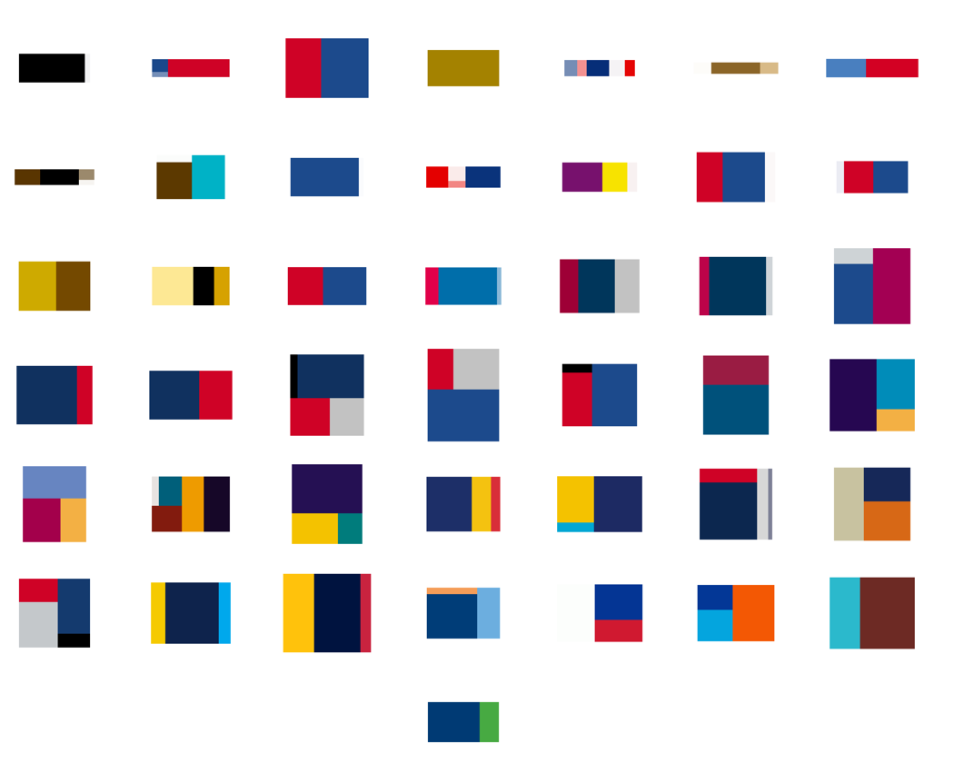
A few of the typical pairs, starting with 2001:


See all of the pairings here. Some notes about what’s mildly clever, and the less so:
- The empty space (white areas or transparent background) is subtracted from the logo, and the code tries to size the Treemap according to the aspect ratio of the original image, so that when seen adjacent the logo, things look balanced (kinda).
- The code is a simple adaptation of the Treemap project in Chapter 7 of Visualizing Data.
- Unfortunately, I could not find vector images (for all of the games, at least), which means the colors in the original images are not pure. For instance, edges of a solid blue color will have light blue edges because of smoothing (anti-aliasing). This makes it difficult to accurately figure out what’s a real color and what isn’t. Sometimes the fuzzy edge colors are correctly removed, other times not so much. Even worse, it may even remove legitimate colors that are used in less than 4-5% of the image.
- The color quantization isn’t good. On a few, it’s bad, and causes a few similar colors to disappear.
- All the above could be fixed, but taxes are more important than non-representational art. (That’s not a blanket statement — just for me this evening.)
And finally, I don’t honestly think there’s any relationship between a software algorithm for data visualization and the work of an artist like Piet Mondrian. But I do love the idea of a Dutch painter from the De Stijl movement making his way through the turnstiles at Raymond Jones Stadium.
Received a note from Vitor Silva, who created the Portuguese-language examples from Visualizing Data using Processing.js:
i created a more “world friendly” version of the initial post. it’s now in english (hopefully in a better translation than babelfish) and it includes a variation on your examples of chapter 3.
The new page can be found here. And will you be shocked to hear that indeed it is far better than Babelfish?
Many thanks to Vitor for the examples and the update.
Very cool! Check out these implementations of several Visualizing Data examples that make use of John Resig’s Processing.js, an adaptation of the Processing API with pure JavaScript. This means running in a web browser with no additional plug-ins (no Java Virtual Machine kicking in while you take a sip of coffee—much less drain the whole cup, depending the speed of your computer). Since the first couple chapters cover straightforward, static exercises, I’d been wanting to try this, but it’s more fun when someone beats you to it. (Nothing is better than feeling like a slacker, after all.)
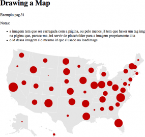 View the introductory Processing sketch from Page 22, or the map of the United States populated with random data points from Page 35.
Babelfish translation of the page here, with choice quotes like “also the shipment of external filing-cabinets had that to be different of what was in the book.”
And the thing is, when I finished the proof of the book for O’Reilly, I had this uneasy feeling that I was shipping the wrong filing-cabinets. Particularly the external ones.
It’s April again, which means that there are messages lurking in my inbox asking about the whereabouts of this year’s Salary vs. Performance project (found in Chapter 5 of the good book). I got around to updating it a few days ago, which means now my inbox has changed to suggestions on how the piece might be improved. (It’s tempting to say, “Hey! Check out the book and the code, you can do anything you’d like with it! It’s more fun that way.” but that’s not really what they’re looking for.)
One of the best messages I’ve received so far is from someone who I strongly suspect is a statistician, who was wishing to see a scatter plot of the data rather than its current representation. Who else would be pining for a scatterplot? There are lots of jokes about the statistically inclined that might cover this situation, but… we’re much too high minded to let things devolve to that (actually, it’s more of a pot-kettle-black situation). If prompted, statisticians usually tell better jokes about themselves anyways.
At any rate, as it’s relevant to the issue of how you choose representations, my response follows:
Sadly, the scatter plot of the same data is actually kinda uninformative, since one of your axes (salary) is more or less fixed all season (might change at the trade deadline, but more or less stays fixed) and it’s just the averages that move about. So in fact if we’re looking for more “accurate”, a time series is gonna be better for our purposes. In an actual analytic piece, for instance, I’d do something very different (which would include multiple years, more detail about the salaries and how they amortize over time, etc).
But even so, making the piece more “correct” misses the intentional simplifications found in it, e.g. it doesn’t matter whether a baseball team was 5% away from winning, it only matters whether they’ve won. At the end of the day, it’s all about the specific rankings, who gets into the playoffs, and who wins those final games. Since the piece isn’t intended as an analytical tool, but something that conveys the idea of salary vs. performance to an audience who by and large cares little about 1) baseball and 2) stats. That’s not to say that it’s about making something zoomy and pretty (and irrelevant), but rather, how do you engage people with the data in a way that teaches them something in the end and gets them thinking about it.
Now to get back to my inbox and the guy who would rather have the data sonified since he thinks this visual thing is just a fad.
Source code for the book examples for the folks who have kindly purchased the book (lining my pockets, $1.50 at a time).
Chapter 3 (the US map example).
Chapter 4 (time series with milk, tea, coffee consumption)
Chapter 5 (connections & correlations – salary vs. performance)
Chapter 6 (scatterplot maps – zipdecode)
Chapter 7 (hierarchies, recursion, word treemap, disk space treemap)
Chapter 8 (graph layout adaptation)
These links should cover the bulk of the code. More can be found at the URLs printed in the book, or copy & pasted from Safari online. As I understand it, those who have purchased the book should have access to the online version (see the back cover).
All examples have been tested but if you find errors of any kind (typos, unused variables, profanities in the comments, the usual), please drop me an email and I’ll be happy to fix the code.

