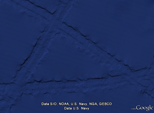
Some combination of internet-fed conspiracy theorists and Google Earthlings (lings that use Google Earth) were abuzz last week with an odd image find, possibly representing the lost city of Atlantis:

These hopes were later dashed (or perhaps only fed further) when the apparition was denied in a post on the Official Google Blog crafted by two of the gentlemen involved in the data collection for Google Ocean. The post is fascinating as it describes much of the process that they use to get readings of the ocean floor. They explain how echosounding (soundwaves bounced into the depths) is used to determine distance, and when that’s not possible, they actually use the sea level itself:
Above large underwater mountains (seamounts), the surface of the ocean is actually higher than in surrounding areas. These seamounts actually increase gravity in the area, which attracts more water and causes sea level to be slightly higher. The changes in water height are measurable using radar on satellites. This allows us to make a best guess as to what the rest of the sea floor looks like, but still at relatively low resolutions (the model predicts the ocean depth about once every 4000 meters). What you see in Google Earth is a combination of both this satellite-based model and real ship tracks from many research cruises (we first published this technique back in 1997).
How great is that? The water actually reveals shapes beneath because of gravity’s rearrangement of the ocean surface.
A more accurate map of the entire ocean would require a bit more effort:
…we could map the whole ocean using ships. A published U.S. Navy study found that it would take about 200 ship-years, meaning we’d need one ship for 200 years, or 10 ships for 20 years, or 100 ships for two years. It costs about $25,000 per day to operate a ship with the right mapping capability, so 200 ship-years would cost nearly two billion dollars.
Holy crap, two billion dollars? That’s real money!
That may seem like a lot of money…
Yeah, no kidding — that’s what I just said!
…but it’s not that far off from the price tag of, say, a new sports stadium.
Oh.
You mean this would teach us more than New Yorkers will learn from the Meadowlands Stadium debacle, beyond “the Jets still stink” and “Eli Manning is still a weenie”? (Excellent Bob Herbert op-ed on a similar topic — the education part, not the Manning part.)
So in the end, this “Atlantis” is the result of the rounding error in the patchwork of data produced by the various measurement and tiling methods. Not as exciting as a waterlogged and trident-wielding civilization, but the remainder of the article is a great read if you’re curious about how the ocean images are collected assembled.
 Back in December (or maybe even November… sorry, digging out my inbox this morning) Amazon announced the availability of public data sets for their Elastic Compute Cloud platform:
Previously, large data sets such as the mapping of the Human Genome and the US Census data required hours or days to locate, download, customize, and analyze. Now, anyone can access these data sets from their Amazon Elastic Compute Cloud (Amazon EC2) instances and start computing on the data within minutes. Users can also leverage the entire AWS ecosystem and easily collaborate with other AWS users. For example, users can produce or use prebuilt server images with tools and applications to analyze the data sets. By hosting this important and useful data with cost-efficient services such as Amazon EC2, AWS hopes to provide researchers across a variety of disciplines and industries with tools to enable more innovation, more quickly.
The current lists includes ENSEMBL (550 GB), GenBank (250 GB), various collections from the US Census (about 500 GB), and a handful of others (with more promised). I’m excited about the items under the “Economy” heading, since lots of that information has to date been difficult to track down in one place and in a single format.
While it may be possible to download these as raw files from FTP servers from their original sources, it’s already set up for you, rather than running rsync or ncftp for twenty-four hours, then spending an afternoon setting up a Linux server with MySQL and lots of big disk space, and dealing with various issues regarding versions of Apache, MySQL, PHP, different Perl modules to be installed, permissions to be fixed, etc. etc. (Can you tell the pain is real?)
As I understand it, you start with a frozen version of the database, then import that into your own workspace on AWS, and pay only for the CPU time, storage, and bandwidth that you actually use. Pricing details are here, but wear boots — there’s a lotta cloud marketingspeak to wade through.
(Thanks to Andrew Otwell for the nudge.)
Some additional followup from Robert Simmon regarding the previous post. I asked more about the “amateur Earth observers” and the intermediate data access. He writes:
The original idea was sparked from the success of amateur astronomers discovering comets. Of course amateur astronomy is mostly about making observations, but we (NASA) already have the observations: the question is what to do with them–which we really haven’t figured out. One approach is to make in-situ observations like aerosol optical thickness (haziness, essentially), weather measurements, cloud type, etc. and then correlate them with satellite data. Unfortunately, calibration issues make this data difficult to use scientifically. It is a good outreach tool, so we’re partnering with science museums, and the GLOBE program does this with schools.
We don’t really have a good sense yet of how to allow amateurs to make meaningful analyses: there’s a lot of background knowledge required to make sense of the data, and it’s important to understand the limitations of satellite data, even if the tools to extract and display it are available. There’s also the risk that quacks with and axe to grind will willfully abuse data to make a point, which is more significant for an issue like climate change than it is for the face on Mars, for example. That’s just a long way of saying that we don’t know yet, and we’d appreciate suggestions.
I’m more of a “face on Mars” guy myself. It’s unfortunate that the quacks even have to be considered, though not surprising from what I’ve seen online. Also worth checking out:
Are you familiar with Web Map Service (WMS)?
http://www.opengeospatial.org/standards/wms
It’s one of the ways we distribute & display our data, in addition to KML.
And one last followup:
Here’s another data source for NASA satellite data that’s a bit easier than the data gateway:
http://daac.gsfc.nasa.gov/techlab/giovanni/
and examples of classroom exercises using data, with some additional data sources folded in to each one:
http://serc.carleton.edu/eet/
The EET holds an “access data workshop” each year in late spring, you may be interested in attending next year.
And with regards to guidelines, Mark Baltzegar (of The Cyc Foundation) sent along this note:
Are you familiar with the ongoing work within the W3C’s Linking Open Data project? There is a vibrant community actively exposing and linking open data.
http://richard.cyganiak.de/2007/10/lod/
http://esw.w3.org/topic/SweoIG/TaskForces/CommunityProjects/LinkingOpenData
More to read and eat up your evening, at any rate.
Robert Simmon of NASA caught this post about the NASA Earth Observatory and was kind enough to pass along some additional information.
Regarding the carbon emissions video:
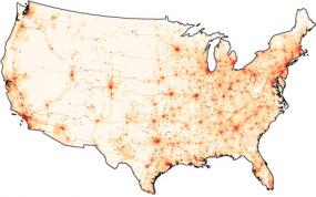
The U.S. carbon emissions data were taken from the Vulcan Project:
http://www.purdue.edu/eas/carbon/vulcan/index.php
They distribute the data here:
http://www.purdue.edu/eas/carbon/vulcan/research.html
In addition to the animation (which was intended to show the daily cycle and the progress of elevated emissions from east to west each morning), we published a short feature about the project and the dataset, including some graphs that remove the diurnal cycle.
http://earthobservatory.nasa.gov/Study/AmericanCarbon/
American Carbon is an example of one of our feature articles, which are published every month or so. We try to cover current research, focusing on individual scientists, using narrative techniques. The visualizations tie in closely to the text of the story. I’m the primary visualizer, and I focus on presenting the data as clearly as possible, rather than allowing free-form investigation of data. We also publish daily images (with links to images at the original resolution), imagery of natural hazards emphasizing current events (fires, hurricanes, and dust storms, for example), nasa press releases, a handful of interactive lessons, and the monthly global maps of various parameters. We’re in the finishing stages of a redesign, which will hopefully improve the navigation and site usability.
Also some details about the difficulties of distributing and handling the data:
These sections draw on data from wide and varied sources. The raw data is extremely heterogeneous, formats include: text files, HDF, matlab, camera raw files, GRADS, NetCDF, etc. All in different projections, at different spatial scales, and covering different time periods. Some of them are updated every five minutes, and others are reprocessed periodically. Trying to make the data available—and current—through our site would be overly ambitious. Instead, we focus on a non-expert audience interested in space, technology, and the environment, and link to the original science groups and the relevant data archives. Look in the credit lines of images for links.
Unfortunately the data formats can be very difficult to read. Here’s the main portal for access to NASA Earth Observing System data:
http://esdis.eosdis.nasa.gov/index.html
and the direct link to several of the data access interfaces:
http://esdis.eosdis.nasa.gov/dataaccess/search.html
And finally, something closer to what was discussed in the earlier post:
With the complexity of the science data, there is a place for an intermediate level of data: processed to a consistent format and readable by common commercial or free software (intervention by a data fairy?). NASA Earth Observations (NEO) is one attempt at solving that problem: global images at 0.1 by 0.1 degrees distributed as lossless-compressed indexed color images and csv files. Obviously there’s work to be done to improve NEO, but we’re getting there. We’re having a workshop this month to develop material for “amateur Earth observers” which will hopefully help us in this area, as well.
This speaks to the audience I tried to address with Visualizing Data in particular (or with Processing in general). There is a group of people who want access to data that’s more low-level than what’s found in a newspaper article, but not as complicated as raw piles of data from measuring instruments that are only decipherable by the scientists who use them.
This is a general theme, not specific to NASA’s data. And I think it’s a little more low-level than requiring that everything be in mashup-friendly XML or JSON feeds, but it seems worthwhile to start thinking about what the guidelines would be for open data distribution. And with such guidelines in place, we can browbeat organizations to play along! Since that would be, uh, a nice way to thank them for making their data available in the first place.
 Some potentially interesting data from NASA passed along by Chris Lonnen. The first is the Earth Observatory, which includes images of things like Carbon Monoxide, Snow Cover, Surface Temperature, UV Exposure, and so on. Chris writes:
I’m not sure how useful they would be to novices in terms of usable data (raw numbers are not provided in any easy to harvest manner), but the information is
still useful and they provide for a basic, if clunky, presentation that follows the basic steps you laid out in your book. They data can be found here, and they occasionally compile it all into interesting visualizations. My favorite being the carbon map here.
The carbon map movie is really cool, though I wish the raw data were available since the strong cyclical effect seen in the animation needs to be separated out. The cycles dominates the animation to such an extent that it’s nearly the only takeaway from the movie. For instance, each cycle is a 24 hour period. Instead of showing them one after another, show several days adjacent one another, so that we can compare 3am with one day to 3am the next.
For overseas readers, I’ll note that the images and data are not all U.S.-centric—most cover the surface of the Earth.
I asked Chris about availability for more raw data, and he did a little more digging:
The raw data availability is slim. From what I’ve gathered you need to contact NASA and have them give you clearance as a researcher. If you were looking for higher quality photography for a tutorial NASA Earth Observations has a newer website that I’ve just found which offers similar data in the format of your choice at up to 3600 x 1800. For some sets it will also offer you data in CSV or CSV for Excel.
If you needed higher resolutions that that NASA’s Visible Earth offers some TIFF’s at larger sizes. A quick search for .tiff gave me an 16384 x 8192 map of the earth with city lights shining, which would be relatively easy to filter out from the dark blue background. These two websites are probably a bit more helpful.
Interesting tidbits for someone interested in a little planetary digging. I’ve had a few of these links sitting in a pile waiting for me to finish the “data” section of my web site; in the meantime I’ll just mention things here.
Update 31 July 2008: Robert Simmon from NASA chimes in.
As cited on Slashdot, Google has announced that they’ll be providing real-time stock quotes from NASDAQ. As referred to in the title, this “real time” isn’t likely the same “real time” that financial institutions get for their “quotes,” since they still need to process the data and serve it up to you somehow. But for an old internet codger who thought quotes delayed by 15 minutes back in 1995 was pretty nifty, this is just one more sign of the information apocalypse.

The Wall Street Journal is also in on the gig, and Allen Wastler from CNBC crows that they’re also a player. Interestingly, the data will be free from the WSJ at their Markets Data Center page—one more sign of a Journal that’s continuing to open up its grand Oak doors to give us plebes a peek inside their exclusive club.
An earlier post from the Google blog has some interesting details:
As a result, we’ve worked with the SEC, the New York Stock Exchange (NYSE) and our D.C. trade association, NetCoalition, to find a way to bring stock data to Google users in a way that benefits users and is practical for all parties. We have encouraged the SEC to ensure that this data can be made available to our users at fair and reasonable rates, and applaud their recent efforts to review this issue. Today, the NYSE has moved the issue a great step forward with a proposal to the SEC which if approved, would allow you to see real-time, last-sale prices…
The NYSE hasn’t come around yet, but the move by NASDAQ should give them the additional competitive push to make it happen soon enough. As it appears, this had more to do with getting SEC approval than the exchanges themselves. Which, if you think about it, makes sense—and if you think about it more, makes one wonder what sort of market-crashing scenario might be opened by millions having access to the live data. Time to write that movie script.
At right: CNBC’s publicity photo of Allen Wastler, which appears to have been shot in the 1930s and later hand-colorized. Upon seeing this, Wastler was then heard to say to the photo and paste-up people, “That’s amazing, can you also give me a stogie?” Who doesn’t want that coveted fat cat, robber baron blogger look.
The quote is primarily in regards to Web 2.0 (cough), and I couldn’t agree more.
“Praising companies for providing APIs to get your own data out is like praising auto companies for not filling your airbags with gravel. I’m not saying data export isn’t important, it’s just aiming kinda low. You mean when I give you data, you’ll give it back to me? People who think this is the pinnacle of freedom aren’t really worth listening to.”
Via pmarca, I think?
 The United Nations has just launched a new web site to house all their data for all you kids out there who wanna crush Hans Rosling. The availability of this sort of information has been a huge problem in the past (Hans’ talks are based on World Bank data that costs real money), and while the U.N. has been pretty good about making things available, a site whose sole purpose is to disseminate usable data is enormous.


 Back in December (or maybe even November… sorry, digging out my inbox this morning) Amazon announced the availability of

 The United Nations has just launched