The roof of the Metrodome springs a leak following heavy snow in Minnesota:
I’ve been looking at too many particle and fluid dynamics simulations because it looks fake to me — more like a simulation created by the structural engineers of what would happen if the roof were to collapse — rather than thousands of pounds of honest-to-goodness midwestern snow pummeling the turf seemingly in slow motion. Beautiful.
And another version from a local FOX affiliate in Minnesota:
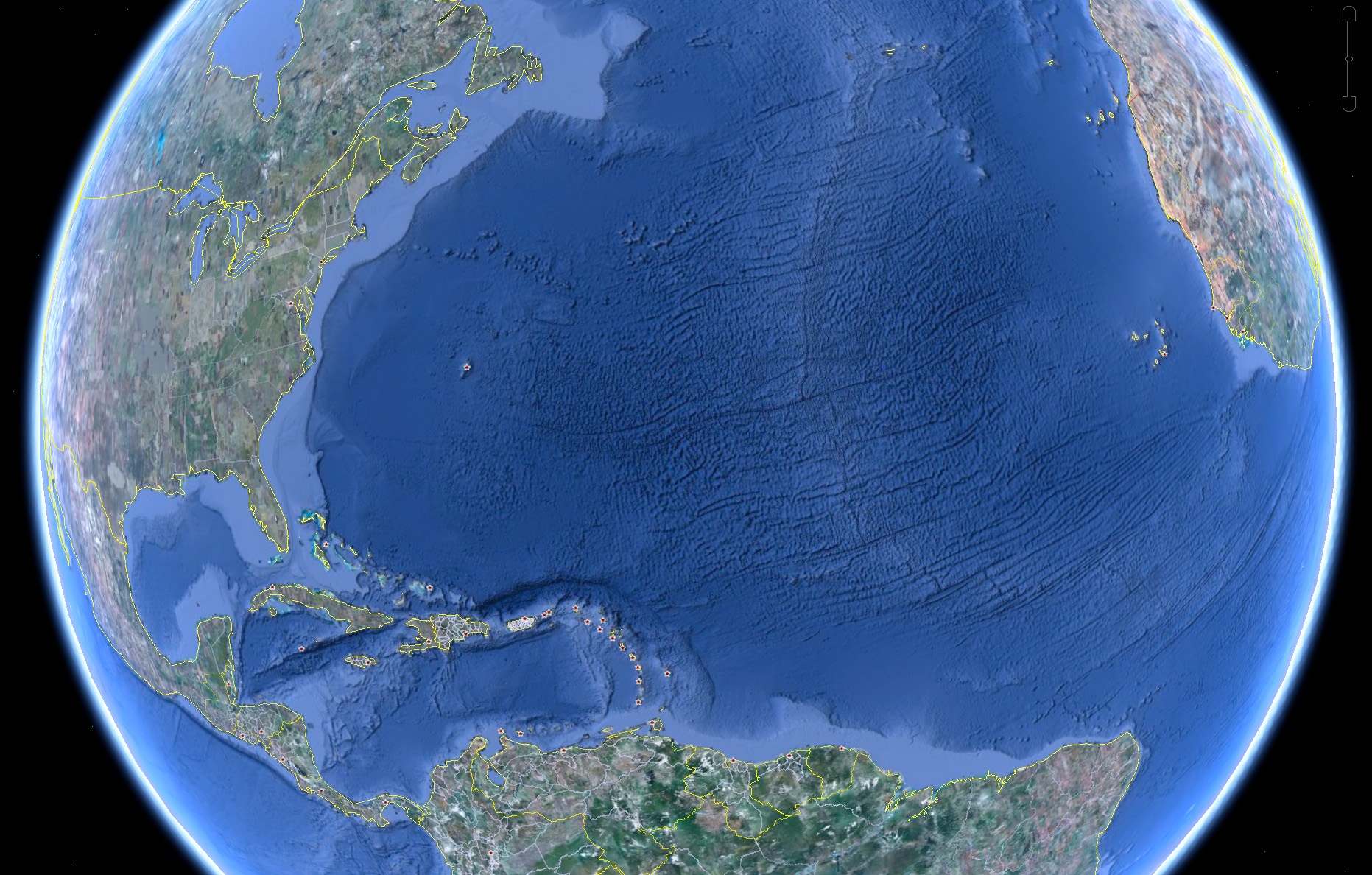
Some combination of internet-fed conspiracy theorists and Google Earthlings (lings that use Google Earth) were abuzz last week with an odd image find, possibly representing the lost city of Atlantis:
These hopes were later dashed (or perhaps only fed further) when the apparition was denied in a post on the Official Google Blog crafted by two of the gentlemen involved in the data collection for Google Ocean. The post is fascinating as it describes much of the process that they use to get readings of the ocean floor. They explain how echosounding (soundwaves bounced into the depths) is used to determine distance, and when that’s not possible, they actually use the sea level itself:
Above large underwater mountains (seamounts), the surface of the ocean is actually higher than in surrounding areas. These seamounts actually increase gravity in the area, which attracts more water and causes sea level to be slightly higher. The changes in water height are measurable using radar on satellites. This allows us to make a best guess as to what the rest of the sea floor looks like, but still at relatively low resolutions (the model predicts the ocean depth about once every 4000 meters). What you see in Google Earth is a combination of both this satellite-based model and real ship tracks from many research cruises (we first published this technique back in 1997).
How great is that? The water actually reveals shapes beneath because of gravity’s rearrangement of the ocean surface.
A more accurate map of the entire ocean would require a bit more effort:
…we could map the whole ocean using ships. A published U.S. Navy study found that it would take about 200 ship-years,meaning we’d need one ship for 200 years, or 10 ships for 20 years, or 100 ships for two years. It costs about $25,000 per day to operate a ship with the right mapping capability, so 200 ship-years would cost nearly two billion dollars.
Holy crap, two billion dollars? That’s real money!
That may seem like a lot of money…
Yeah, no kidding — that’s what I just said!
…but it’s not that far off from the price tag of, say, a new sports stadium.
Oh.
You mean this would teach us more than New Yorkers will learn from the Meadowlands Stadium debacle, beyond “the Jets still stink” and “Eli Manning is still a weenie”? (Excellent Bob Herbert op-ed on a similar topic — the education part, not the Manning part.)
So in the end, this “Atlantis” is the result of the rounding error in the patchwork of data produced by the various measurement and tiling methods. Not as exciting as a waterlogged and trident-wielding civilization, but the remainder of the article is a great read if you’re curious about how the ocean images are collected assembled.
I wrote about my excitement over the rumor that Google was going under back in April, but now it has officially happened — the Ocean has arrived as part of Google Earth:
Look at those trenches! And now you can use the Google Earth software to fly through the area in the middle of the Atlantic where some god has decided to begin peeling the globe like an orange.
I’m waiting for the day (presumably a few years from now) that this feature includes other major bodies of water, revealing the hidden shapes beneath the surface of lakes or rivers that you know well from above. The physical relief version, that is. I’ll pass on the underwater Google Street View with their privacy-invading minisubs sticking their nose in everyone’s business.
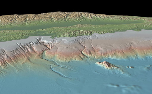
So that might not be the awesome name that they’ll be using, but CNET is rumormongering about Google cooking up something oceanographic along the lines of Maps or Earth. Their speculation includes this lovely image from the Lamont-Doherty Earth Observatory (LDEO) of Columbia University.
Unlike most people with a heartbeat, I didn’t find Google Maps particularly interesting on arrival. I was a fan of the simplicity of Yahoo Maps at the time (but no longer, eek!) and Microsoft’s Terraserver had done satellite imagery for a few years. But the same way that Google Mars shows us something we’re even less familiar with than satellite imagery of Earth, there’s something really exciting about possibility of seeing beneath the oceans.
Visualizing Data is my 2007 book about computational information design. It covers the path from raw data to how we understand it, detailing how to begin with a set of numbers and produce images or software that lets you view and interact with information. When first published, it was the only book(s) for people who wanted to learn how to actually build a data visualization in code.
The text was published by O’Reilly in December 2007 and can be found at Amazon and elsewhere. Amazon also has an edition for the Kindle, for people who aren’t into the dead tree thing. (Proceeds from Amazon links found on this page are used to pay my web hosting bill.)
The book covers ideas found in my Ph.D. dissertation, which is the basis for Chapter 1. The next chapter is an extremely brief introduction to Processing, which is used for the examples. Next is (chapter 3) is a simple mapping project to place data points on a map of the United States. Of course, the idea is not that lots of people want to visualize data for each of 50 states. Instead, it’s a jumping off point for learning how to lay out data spatially.
The chapters that follow cover six more projects, such as salary vs. performance (Chapter 5), zipdecode (Chapter 6), followed by more advanced topics dealing with trees, treemaps, hierarchies, and recursion (Chapter 7), plus graphs and networks (Chapter 8).
This site is used for follow-up code and writing about related topics.