 On the heels of today’s posting of the updated Salary vs. Performance piece comes word in the New York Times that a film version of Moneyball has been shelved:
Just days before shooting was to begin, Sony Pictures pulled the plug on “Moneyball,” a major film project starring Brad Pitt and being directed by Steven Soderbergh.
Yesterday I found it far more unsettling that such a movie would be made period, but today I’m oddly curious about how they might pull it off:
What baseball saw as accurate, Sony executives saw as being too much a documentary. Mr. Soderbergh, for instance, planned to film interviews with some of the people who were connected to the film’s story.
I guess we’ll never know, since other studios also passed on the project, but that’s probably a good thing.
As an aside, I’m in the midst of reading Liar’s Poker (another by Moneyball author Michael Lewis) and again find myself amused by his ability as a storyteller: he reminds me of a friend who can take the most banal event and turn it into the most peculiar and hilarious story you’ve ever heard.
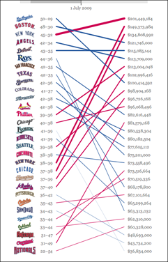
 I’ve just posted the updated version of Salary vs. Performance for the 2009 baseball season. I had hoped this year to rewrite the piece to cover multiple years, have a couple more analysis options, and even to rebuild it using the JavaScript version of Processing (no Java! no plug-in!), but a busy spring has upended my carefully crafted but poorly implemented plans.
Meanwhile, my inbox has been filling with plaintive comments like this one:
Will you be updating this site for this year? It’s the first year I think my team, the Giants would have a blue line instead of a red line.
How can I ignore the Giants fans? (Or for that matter, their neighbors to the south, the Dodgers, who perch atop the list as I write this.)
More about the project can be found in the archives. Visualizing Data explains the code and how it works, and the code itself is amongst the book examples.
Got an email from Mebane Faber who noted the roughly inverse correlation you currently see in salaryper, and asking about whether I’d done proper year-end analysis. The response follows:
I threw the project together as sort of a fun thing out of curiosity, and haven’t taken the time to do a proper analysis. However you can see in the previous years that the inverse relationship happens each year at the beginning of the season, and then as it progresses, the big market teams tend to mow down the small guys. Or at least those that are successful–the correlation between salary and performance at the end of a season is generally pretty haphazard. In fact, it’s possible that the inverse correlation at the beginning of the season is actually stronger than the positive correlation at the end.
I think the last point is kinda funny, though I’d imagine there’s a less funny statistics term for that phenomenon. Such a fine line between funny and sounding important.
I tend to avoid reading online comments since they’re either overly negative or overly positive (neither is healthy), but I laughed out loud after happening across this comment from a post about salaryper on the Freakonomics blog at the New York Times site:
How do I become a “data visualization guru?”
Seems like a pretty sweet gig. But you probably need a degree in Useless Plots from Superficial Analysis School.
– Ben D.
No my friend, it takes a Ph.D. in Useless Plots from Superficial Analysis School. (And if you know this guy, please take him out for a drink — I’m concerned he’s been indoors too long.)
Kottke and Freakonomics were kind enough to link over here, which has brought more queries about salaryper. Rather than piling onto the original web page, I’ll add updates to this section of the site.
I didn’t include the project’s back story with the 2008 version of the piece, so here goes:
Some background for people who don’t watch/follow/care about baseball:
When I first created this piece in 2005, the Yankees had a particularly bad year, with a team full of aging all-stars and owner George Steinbrenner hoping that a World Series trophy could be purchased for $208 million. The World Champion Red Sox did an ample job of defending their title, but as the second highest paid team in baseball, they’re not exactly young upstarts. The Chicago White Sox had an excellent year with just one third the salary of the Yankees, while the Cardinals are performing roughly on par with what they’re paid. Interestingly, the White Sox went on to win the World Series. The performance of Oakland, which previous years has far exceeded their overall salary, was a story, largely about their General Manager Billy Beane, told in the book Moneyball.
Some background for people who do watch/follow/care about baseball:
I neglected to include a caveat on the original page that this is a really simplistic view of salary vs. performance. I created this piece because the World Series victory of my beloved Red Sox was somewhat bittersweet in the sense that the second highest paid team in baseball finally managed to win a championship. This fact made me curious about how that works across the league, with raw salaries and the general performance of the individual teams.
There are lots of proportional things that can be done too—the salaries especially exist across a wide range (the Yankees waaaay out in front, followed the another pack of big market teams, then everyone else).
There are far more complex things about how contracts work over multiple years, how the farm system works, and scoring methods for individual players that could be taken into consideration.
This piece was thrown together while watching a game, so it’s perhaps dangerously un-advanced, given the amount of time and energy that’s put into the analysis (and argument) of sports statistics.
That last point is really important… This is fun! I encourage people to try out their own methods of playing with the data. For those who need a guide on building such a beast, the book has all the explanation and all the code (which isn’t much). And if you adapt the code, drop me a line so I can link to your example.
I have a handful of things I’d like to try (such as a proper method for doing proportional spacing at the sides without overdoing it), though the whole point of the project is to strip away as much as possible, and make a straightforward statement about salaries, so I haven’t bothered coming back to it since it succeeds in that original intent.
It’s April again, which means that there are messages lurking in my inbox asking about the whereabouts of this year’s Salary vs. Performance project (found in Chapter 5 of the good book). I got around to updating it a few days ago, which means now my inbox has changed to suggestions on how the piece might be improved. (It’s tempting to say, “Hey! Check out the book and the code, you can do anything you’d like with it! It’s more fun that way.” but that’s not really what they’re looking for.)
One of the best messages I’ve received so far is from someone who I strongly suspect is a statistician, who was wishing to see a scatter plot of the data rather than its current representation. Who else would be pining for a scatterplot? There are lots of jokes about the statistically inclined that might cover this situation, but… we’re much too high minded to let things devolve to that (actually, it’s more of a pot-kettle-black situation). If prompted, statisticians usually tell better jokes about themselves anyways.
At any rate, as it’s relevant to the issue of how you choose representations, my response follows:
Sadly, the scatter plot of the same data is actually kinda uninformative, since one of your axes (salary) is more or less fixed all season (might change at the trade deadline, but more or less stays fixed) and it’s just the averages that move about. So in fact if we’re looking for more “accurate”, a time series is gonna be better for our purposes. In an actual analytic piece, for instance, I’d do something very different (which would include multiple years, more detail about the salaries and how they amortize over time, etc).
But even so, making the piece more “correct” misses the intentional simplifications found in it, e.g. it doesn’t matter whether a baseball team was 5% away from winning, it only matters whether they’ve won. At the end of the day, it’s all about the specific rankings, who gets into the playoffs, and who wins those final games. Since the piece isn’t intended as an analytical tool, but something that conveys the idea of salary vs. performance to an audience who by and large cares little about 1) baseball and 2) stats. That’s not to say that it’s about making something zoomy and pretty (and irrelevant), but rather, how do you engage people with the data in a way that teaches them something in the end and gets them thinking about it.
Now to get back to my inbox and the guy who would rather have the data sonified since he thinks this visual thing is just a fad.
 On the heels of today’s posting of the updated Salary vs. Performance piece comes word in the New York Times that a film version of Moneyball has been shelved:

