Writing

Visualizing Data with an English translation and Processing.js

Received a note from Vitor Silva, who created the Portuguese-language examples from Visualizing Data using Processing.js:

i created a more “world friendly” version of the initial post. it’s now in english (hopefully in a better translation than babelfish) and it includes a variation on your examples of chapter 3.

The new page can be found here. And will you be shocked to hear that indeed it is far better than Babelfish?

Many thanks to Vitor for the examples and the update.

Wednesday, November 19, 2008 | examples, feedbag, translation, vida  

Visualizing Data with Portuguese and Processing.js

Very cool! Check out these implementations of several Visualizing Data examples that make use of John Resig’s Processing.js, an adaptation of the Processing API with pure JavaScript. This means running in a web browser with no additional plug-ins (no Java Virtual Machine kicking in while you take a sip of coffee—much less drain the whole cup, depending the speed of your computer). Since the first couple chapters cover straightforward, static exercises, I’d been wanting to try this, but it’s more fun when someone beats you to it. (Nothing is better than feeling like a slacker, after all.)

map-example.pngView the introductory Processing sketch from Page 22, or the map of the United States populated with random data points from Page 35.

Babelfish translation of the page here, with choice quotes like “also the shipment of external filing-cabinets had that to be different of what was in the book.”

And the thing is, when I finished the proof of the book for O’Reilly, I had this uneasy feeling that I was shipping the wrong filing-cabinets. Particularly the external ones.

Monday, November 17, 2008 | examples, processing, translation, vida  

Blood, guts, gore and the data fairy

The O’Reilly press folks passed along this review (PDF) of Visualizing Data from USENIX magazine. I really appreciated this part:

My favorite thing about Visualizing Data is that it tackles the whole process in all its blood, guts, and gore. It starts with finding the data and cleaning it up. Many books assume that the data fairy is going to come bring you data, and that it will either be clean, lovely data or you will parse it carefully into clean, lovely data. This book assumes that a significant portion of the data you care about comes from some scuzzy Web page you don’t control and that you are going to use exactly the minimum required finesse to tear out the parts you care about. It talks about how to do this, and how to decide what the minimum required finesse would be. (Do you do it by hand? Use a regular expression? Actually bother to parse XML?)

Indeed, writing this book was therapy for that traumatized inner child who learned at such a tender young age that the data fairy did not exist.

Wednesday, July 23, 2008 | iloveme, parse, reviews, vida  

Postleitzahlen in Deutschland

germany-contrast-small.pngMaximillian Dornseif has adapted Zipdecode from Chapter 6 of Visualizing Data to handle German postal codes. I’ve wanted to do this myself since hearing about the OpenGeoDB data set which includes the data, but thankfully he’s taken care of it first and is sharing it with the rest of us along with his modified code.

(The site is in German…I’ll trust any of you German readers to let me know if the site actually says that Visualizing Data is the dumbest book he’s ever read.)

Also helpful to note that he used Python for preprocessing the data. He doesn’t bother implementing a map projection, as done in the book, but the Python code is a useful example of using another language when appropriate, and how the syntax differs from Processing:

# Convert opengeodb data for zipdecode
fd = open('PLZ.tab')
out = []
minlat = minlon = 180
maxlat = maxlon = 0

for line in fd:
    line = line.strip()
    if not line or line.startswith('#'):
        continue
    parts = line.split('\t')
    dummy, plz, lat, lon, name = parts
    out.append([plz, lat, lon, name])
    minlat = min([float(lat), minlat])
    minlon = min([float(lon), minlon])
    maxlat = max([float(lat), maxlat])
    maxlon = max([float(lon), maxlon])

print "# %d,%f,%f,%f,%f" % (len(out), minlat, maxlat, minlon, maxlon)
for data in out:
    plz, lat, lon, name = data
    print '\t'.join([plz, str(float(lat)), str(float(lon)), name])

In the book, I used Processing for most of the examples (with a little bit of Perl) for sake of simplicity. (The book is already introducing a lot of new material, why hurt people and introduce multiple languages while I’m at it?) However that’s one place where the book diverges from my own process a bit, since I tend to use a lot of Perl when dealing with large volumes of text data. Python is also a good choice (or Ruby if that’s your thing), but I’m tainted since I learned Perl first, while a wee intern at Sun.

Tuesday, July 15, 2008 | adaptation, vida, zipdecode  

You’ve never actually known what the question is

Douglas Adams addresses “What is the Question?”, the mantra of Visualizing Data, my Ph.D. dissertation, and hopefully haunts any visualization student I’ve ever taught:

The answer to the Great Question…?
Yes…!
Is…
Yes…!
Is…
Yes…!!!…?
“Forty-two,” said Deep Thought with infinite majesty and calm.
“Forty-two!” yelled Loonquawl, “Is that all you’ve got to show for seven and a half million years of work?”
“I checked it very thoroughly,” said the computer, “and that quite definitely is the answer. I think the problem, to be quite honest with you, is that you’ve never actually known what the question is.”

The Hitchhiker’s Guide to the Galaxy

(Found at the FontForge FAQ)

Monday, June 9, 2008 | question, vida  

Distribution of the foreign customers at a particular youth hostel

Two pieces representing youth hostel data from Julien Bayle. Both adaptations of the code found in Visualizing Data. The first a map:

bayle-worldmap.jpg

The map looks like most maps of data connected to a world map, but the second representation uses a treemap, which is much more effective (meaning that it answers his question much more directly).

bayle-treemap.jpg

The image as background is a nice technique, since if you’re not using colors to differentiate individual sectors, the treemap tends to be dominated by the outlines around the squares (search for treemap images and you’ll see what I mean). The background image lets you use the border lines, but the visual weight of the image prevents them from being in the foreground.

Anyone else with adaptations? Pass them along.

Thursday, June 5, 2008 | adaptation, vida  

Unicode, character encodings, and the declining dominance of Western European character sets

Computers know nothing but numbers. As humans we have varying levels of skill in using numbers, but most of the time we’re communicating with words and phrases. So in the early days of computing, the earliest software developers had to find a way to map each character—a letter Q, the character #, or maybe a lowercase b—into a number. A table of characters would be made, usually either 128 or 256 of them, depending on whether data was stored or transmitted using 7 or 8 bits. Often the data would be stored as 7 bits, so that the eighth bit could be used as a parity bit, a simple method of error correction (because data transmission—we’re talking modems and serial ports here—was so error prone).

Early on, such encoding systems were designed in isolation, which meant that they were rarely compatible with one another. The number 34 in one character set might be assigned to “b”, while in another character set, assigned to “%”. You can imagine how that works out over an entire message, but the hilarity was lost on people trying to get their work done.

In the 1960s, the American National Standards Institute (or ANSI) came along and set up a proper standard, called ASCII, that could be shared amongst computers. It was 7 bits (to allow for the parity bit) and looked like:

  0 nul    1 soh    2 stx    3 etx    4 eot    5 enq    6 ack    7 bel
  8 bs     9 ht    10 nl    11 vt    12 np    13 cr    14 so    15 si
 16 dle   17 dc1   18 dc2   19 dc3   20 dc4   21 nak   22 syn   23 etb
 24 can   25 em    26 sub   27 esc   28 fs    29 gs    30 rs    31 us
 32 sp    33  !    34  "    35  #    36  $    37  %    38  &    39  '
 40  (    41  )    42  *    43  +    44  ,    45  -    46  .    47  /
 48  0    49  1    50  2    51  3    52  4    53  5    54  6    55  7
 56  8    57  9    58  :    59  ;    60  <    61  =    62  >    63  ?
 64  @    65  A    66  B    67  C    68  D    69  E    70  F    71  G
 72  H    73  I    74  J    75  K    76  L    77  M    78  N    79  O
 80  P    81  Q    82  R    83  S    84  T    85  U    86  V    87  W
 88  X    89  Y    90  Z    91  [    92  \    93  ]    94  ^    95  _
 96  `    97  a    98  b    99  c   100  d   101  e   102  f   103  g
104  h   105  i   106  j   107  k   108  l   109  m   110  n   111  o
112  p   113  q   114  r   115  s   116  t   117  u   118  v   119  w
120  x   121  y   122  z   123  {   124  |   125  }   126  ~   127 del

The lower numbers are various control codes, and the characters 32 (space) through 126 are actual printed characters. An eagle-eyed or non-Western reader will note that there are no umlauts, cedillas, or Kanji characters in that set. (You’ll note that this is the American National Standards Institute, after all. And to be fair, those were things well outside their charge.) So while the immediate character encoding problem of the 1960s was solved for Westerners, other languages would still have their own encoding systems.

As time rolled on, the parity bit became less of an issue, and people were antsy to add more characters. Getting rid of the parity bit meant 8 bits instead of 7, which would double the number of available characters. Other encoding systems like ISO-8859-1 (also called Latin-1) were developed. These had better coverage for Western European languages, by adding some umlauts we’d all been missing. The encodings kept the first 0–127 characters identical to ASCII, but defined characters numbered 128–255.

However this still remained a problem, even for Western languages, because if you were on a Windows machine, there was a different definition for characters 128–255 than there was on the Mac. Windows used what was called Windows 1252, which was just close enough to Latin-1 (embraced and extended, let’s say) to confuse everyone and make a mess. And because they like to think different, Apple used their own standard, called Mac Roman, which had yet another colorful ordering for characters 128–255.

This is why there are lots of web pages that will have squiggly marks or odd characters where em dashes or quotes should be found. If authors of web pages include a tag in the HTML that defines the character set (saying essentially “I saved this on a Western Mac!” or “I made this on a Norwegian Windows machine!”) then this problem is avoided, because it gives the browser a hint at what to expect in those characters with numbers from 128–255.

Those of you who haven’t fallen asleep yet may realize that even 200ish characters still won’t do—remember our Kanji friends? Such languages usually encode with two bytes (16 bits to the West’s measly 8), providing access to 65,536 characters. Of course, this creates even more issues because software must be designed to no longer think of characters as a single byte.

In the very early 90s, the industry heavies got together to form the Unicode consortium to sort out all this encoding mess once and for all. They describe their charge as:

Unicode provides a unique number for every character,
no matter what the platform,
no matter what the program,
no matter what the language.

They’ve produced a series of specifications, both for a wider character set (up to 4! bytes) and various methods for encoding these character sets. It’s truly amazing work. It means we can do things like have a font (such as the aptly named Arial Unicode) that defines tens of thousands of character shapes. The first of these (if I recall correctly) was Bitstream Cyberbit, which was about the coolest thing a font geek could get their hands on in 1998.

The most basic version of Unicode defines characters 0–65535, with the first 0–255 characters defined as identical to Latin-1 (for some modicum of compatibility with older systems).

One of the great things about the Unicode spec is the UTF-8 encoding. The idea behind UTF-8 is that the majority of characters will be in that standard ASCII set. So if the eighth bit of a character is a zero, then the other seven bits are just plain ASCII. If the eighth bit is 1, then it’s some sort of extended format. At which point the remaining bits determine how many additional characters (usually two) are required to encode the value for that character. It’s a very clever scheme because it degrades nicely, and provides a great deal of backward compatibility with the large number of systems still requiring only ASCII.

Of course, assuming that ASCII characters will be most predominant is to some repeating the same bias as back in the 1960s. But I think this is an academic complaint, and the benefits of the encoding far outweigh the negatives.

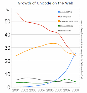
Anyhow, the purpose of this post was to write that Google reported yesterday that Unicode adoption on the web has passed ASCII and Western European. This doesn’t mean that English language characters have been passed up, but rather that the number of pages encoded using Unicode (usually in UTF-8 format), has finally left behind the archaic ASCII and Western European formats. The upshot is that it’s a sign of us leaving the dark ages—almost 20 years since the internet was made publicly available, and since the start of the Unicode consortium, we’re finally starting to take this stuff seriously.

The Processing book also has a bit of background on ASCII and Unicode in an Appendix, which includes more about character sets and how to work with them. And future editions of vida will also cover such matters in the Parse chapter.

Tuesday, May 6, 2008 | parse, unicode, updates, vida  

Me blog big linky

Kottke and Freakonomics were kind enough to link over here, which has brought more queries about salaryper. Rather than piling onto the original web page, I’ll add updates to this section of the site.

I didn’t include the project’s back story with the 2008 version of the piece, so here goes:

Some background for people who don’t watch/follow/care about baseball:

When I first created this piece in 2005, the Yankees had a particularly bad year, with a team full of aging all-stars and owner George Steinbrenner hoping that a World Series trophy could be purchased for $208 million. The World Champion Red Sox did an ample job of defending their title, but as the second highest paid team in baseball, they’re not exactly young upstarts. The Chicago White Sox had an excellent year with just one third the salary of the Yankees, while the Cardinals are performing roughly on par with what they’re paid. Interestingly, the White Sox went on to win the World Series. The performance of Oakland, which previous years has far exceeded their overall salary, was a story, largely about their General Manager Billy Beane, told in the book Moneyball.

Some background for people who do watch/follow/care about baseball:

I neglected to include a caveat on the original page that this is a really simplistic view of salary vs. performance. I created this piece because the World Series victory of my beloved Red Sox was somewhat bittersweet in the sense that the second highest paid team in baseball finally managed to win a championship. This fact made me curious about how that works across the league, with raw salaries and the general performance of the individual teams.

There are lots of proportional things that can be done too—the salaries especially exist across a wide range (the Yankees waaaay out in front, followed the another pack of big market teams, then everyone else).

There are far more complex things about how contracts work over multiple years, how the farm system works, and scoring methods for individual players that could be taken into consideration.

This piece was thrown together while watching a game, so it’s perhaps dangerously un-advanced, given the amount of time and energy that’s put into the analysis (and argument) of sports statistics.

That last point is really important… This is fun! I encourage people to try out their own methods of playing with the data. For those who need a guide on building such a beast, the book has all the explanation and all the code (which isn’t much). And if you adapt the code, drop me a line so I can link to your example.

I have a handful of things I’d like to try (such as a proper method for doing proportional spacing at the sides without overdoing it), though the whole point of the project is to strip away as much as possible, and make a straightforward statement about salaries, so I haven’t bothered coming back to it since it succeeds in that original intent.

Wednesday, April 30, 2008 | salaryper, updates, vida  

Li’l Endian

GulliverChapters 9 and 10 (acquire and parse) are secretly my favorite parts of Visualizing Data. They’re a grab bag of useful bits based on many years of working with information (previous headaches)… the sort of things that come up all the time.

Page 327 (Chapter 10) has some discussion about little endian versus big endian, the way in which different computer architectures (Intel vs. the rest of the world, respectively) handle multi-byte binary data. I won’t repeat the whole section here, though I have two minor errata for that page.

First, an error in formatting which lists network byte order, rather than network byte order. The other problem is that I mention that little endian versions of Java’s DataInputStream class can be found on the web for little more than a search for DataInputStreamLE. As it turns out, that was a big fat lie, though you can find a handful if you search for LEDataInputStream (even though that’s a goofier name).

To make it up to you, I’m posting proper DataInputStreamLE (and DataOutputStreamLE) which are a minor adaptation of code from the GNU Classpath project. They work just like DataInputStream and DataOutputStream, but just swap the bytes around for the Intel-minded. Have fun!

DataInputStreamLE.java

DataOutputStreamLE.java

I’ve been using these for a project and they seem to be working, but let me know if you find errors. In particular, I’ve not looked closely at the UTF encoding/decoding methods to see if there’s anything endian-oriented in there. I tried to clean it up a bit, but the javadoc may also be a bit hokey.

(Update) Household historian Shannon on the origin of the terms:

The terms “big-endian” and “little-endian” come from Gulliver’s Travels by Jonathan Swift, published in England in 1726. Swift’s hero Gulliver finds himself in the midst of a war between the empire of Lilliput, where people break their eggs on the smaller end per a royal decree (Protestant England) and the empire of Blefuscu, which follows tradition and breaks their eggs on the larger end (Catholic France). Swift was satirizing Henry VIII’s 1534 decision to break with the Roman Catholic Church and create the Church of England, which threw England into centuries of both religious and political turmoil despite the fact that there was little doctrinal difference between the two religions.

Friday, March 7, 2008 | code, parse, updates, vida  

Zipdecode in der Schweiz

gossau.pngDominic Allemann has developed a Swiss version of the zipdecode example from chapter six of Visualizing Data. This is the whole point of the book—to actually try things out and adapt them in different ways and see what you can learn from it.

Switzerland makes an interesting example because it has far fewer postal codes than the U.S., though the dots are quite elegant on their own. With fewer data points, I’d be inclined to 1) change the size of the individual points to make them larger without making them overwhelming, 2) or work with the colors to make the contrast more striking, since changing the point size is likely to be too much), and 3) get the text into mixed case (in this example, Gossau SG instead of GOSSAU SG). Something as minor as avoiding ALL CAPS helps get us away from the representation looking too much like COMPUTERS and DATABASES, and instead into something meant for regular humans. Finally, 4) with the smaller (and far more regular) data set, it’s not clear if the zoom even helps—could even be better off without it.

Thanks to Dominic for passing this along; it’s great to see!

Thursday, March 6, 2008 | adaptation, vida, zipdecode  

The minimum, the maximum, and the typos therein

Blake Tregre found a typo on page 55 of Visualizing Data in one of the comments:

// Set the value of m arbitrarily high, so the first value
// found will be set as the maximum.
float m = MIN_FLOAT;

That should instead read something like:

// Set the value of m to the lowest possible value,
// so that the first value found will automatically be larger.
float m = MIN_FLOAT;

This also reminds me that the Table class used in chapter 4, makes use of Float.MAX_VALUE and -Float.MAX_VALUE, which are inherited from Java. Processing has constants named MAX_FLOAT and MIN_FLOAT that do the same thing. We added the constants because -Float.MAX_VALUE seems like especially awkward syntax when you’re just trying to get the smallest possible float. The Table class was written sometime before the constants were added to the Processing syntax, so they use the Java approach.

There is a Float.MIN_VALUE in Java, however the spec does a very unfortunate thing, because MIN_VALUE is defined as “A constant holding the smallest positive nonzero value of type float”, which sounds promising until you realize that it just means a very tiny positive number, not the minimum possible value for float. It’s not clear why they thought this would be a more useful constant (or useful at all).

And to make things even more confusing, Integer.MAX_VALUE and Integer.MIN_VALUE behave more like the way you might expect, where the MIN_VALUE is in fact that the lowest (most negative) value for an int. Had they used the same definition as Float.MIN_VALUE, then Integer.MIN_VALUE would equal 1. Which illustrates just how silly it is to do that for the Float class.

Tuesday, February 26, 2008 | series, updates, vida  

Book

Visualizing Data Book CoverVisualizing Data is my book about computational information design. It covers the path from raw data to how we understand it, detailing how to begin with a set of numbers and produce images or software that lets you view and interact with information. Unlike nearly all books in this field, it is a hands-on guide intended for people who want to learn how to actually build a data visualization.

The text was published by O’Reilly in December 2007 and can be found at Amazon and elsewhere. Amazon also has an edition for the Kindle, for people who aren’t into the dead tree thing. (Proceeds from Amazon links found on this page are used to pay my web hosting bill.)

Examples for the book can be found here.

The book covers ideas found in my Ph.D. dissertation, which is basis for Chapter 1. The next chapter is an extremely brief introduction to Processing, which is used for the examples. Next is (chapter 3) is a simple mapping project to place data points on a map of the United States. Of course, the idea is not that lots of people want to visualize data for each of 50 states. Instead, it’s a jumping off point for learning how to lay out data spatially.

The chapters that follow cover six more projects, such as salary vs. performance (Chapter 5), zipdecode (Chapter 6), followed by more advanced topics dealing with trees, treemaps, hierarchies, and recursion (Chapter 7), plus graphs and networks (Chapter 8).

This site is used for follow-up code and writing about related topics.

Saturday, February 23, 2008 | vida  

Examples for Visualizing Data

Source code for the book examples for the folks who have kindly purchased the book (lining my pockets, $1.50 at a time).

Chapter 3 (the US map example).

Chapter 4 (time series with milk, tea, coffee consumption)

Chapter 5 (connections & correlations – salary vs. performance)

Chapter 6 (scatterplot maps – zipdecode)

Chapter 7 (hierarchies, recursion, word treemap, disk space treemap)

Chapter 8 (graph layout adaptation)

These links should cover the bulk of the code. More can be found at the URLs printed in the book, or copy & pasted from Safari online. As I understand it, those who have purchased the book should have access to the online version (see the back cover).

All examples have been tested but if you find errors of any kind (typos, unused variables, profanities in the comments, the usual), please drop me an email and I’ll be happy to fix the code.

Monday, February 4, 2008 | examples, vida  
Book

Visualizing Data Book CoverVisualizing Data is my 2007 book about computational information design. It covers the path from raw data to how we understand it, detailing how to begin with a set of numbers and produce images or software that lets you view and interact with information. When first published, it was the only book(s) for people who wanted to learn how to actually build a data visualization in code.

The text was published by O’Reilly in December 2007 and can be found at Amazon and elsewhere. Amazon also has an edition for the Kindle, for people who aren’t into the dead tree thing. (Proceeds from Amazon links found on this page are used to pay my web hosting bill.)

Examples for the book can be found here.

The book covers ideas found in my Ph.D. dissertation, which is the basis for Chapter 1. The next chapter is an extremely brief introduction to Processing, which is used for the examples. Next is (chapter 3) is a simple mapping project to place data points on a map of the United States. Of course, the idea is not that lots of people want to visualize data for each of 50 states. Instead, it’s a jumping off point for learning how to lay out data spatially.

The chapters that follow cover six more projects, such as salary vs. performance (Chapter 5), zipdecode (Chapter 6), followed by more advanced topics dealing with trees, treemaps, hierarchies, and recursion (Chapter 7), plus graphs and networks (Chapter 8).

This site is used for follow-up code and writing about related topics.