Evolution of the Super Bowl Logo
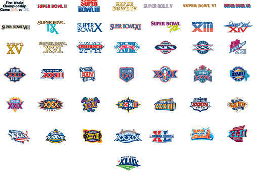
From The New York Times, a collection of all 43 logos used to advertise the Super Bowl:
The original article cites how the logos reflect the evolution and growth of the league. Which makes sense, you can see that it was more than fifteen years before it moved from just a logotype to a fully branded extravaganza. Or that in its first year it wasn’t the Super Bowl at all, and instead billed as “The First World Championship Game of the American Football Conference versus the National Football Conference,” a title that sounds great in a late-60s broadcaster voice (try it, you’ll like it), but was still shortened to the neanderthal “First World World Championship Game AFC vs NFC” for the logo, before it was renamed the “Super Bowl” the following year. (You can stop repeating the name in the broadcaster voice now, your officemates are getting annoyed.)
The similarities in the coloring are perhaps more interesting than the differences, though the general Americana obsession of the constant blue/red coloring is unsurprising, especially when you recall that some of the biggest perennial ad buyers (Coke, Pepsi, Budweiser) also share red, white, and blue labels. I’m guessing that the heavy use of yellow in the earlier logos had more to do with yellow looking good against a background when used for broadcast.
Or maybe not — like any good collection, there’s plenty to speculate about and many hypotheses to be drawn — and the investigation is more interesting for the exercise.


