Writing

Data & Drawing, Football Sunday Edition

I wanted to post this last week in my excitement over week 1 of pro football season (that’s the 300 lbs. locomotives pounding into each other kind of football, not the game played with actual balls and feet), but ran out of time. So instead, in honor of football Sunday, week 2, my favorite advertisement of last year’s football season:

The ad is a phone conversation with Coca-Cola’s Katie Bayne, animated by Imaginary Forces. A couple things I like about this… First, that the attitude is so much less heavy-handed than, say, the IBM spots that seem to be based on the premise that if they jump cut quickly enough, they can cure cancer. The woman being interviewed actually laughs about “big data” truisms. Next is the fact that it’s actually a fairly smart question that’s asked:

How important is it that you get the right information rather than just a lot of information?

Well… you know you can roll around in facts all day long. It’s critical that we stay aware of that mountain of data that’s coming in and mine it for the most valuable nuggets. It helps keep us honest.

And third, the visual quality that reinforces the lighter attitude. Cleverly drawn without overdoing it. She talks about being honest and a hand comes flying in to push back a Pinnocchio nose. Nuggets of data are shown as… eh, nuggets.

And the interviewer is a dog.

Sunday, September 20, 2009 | drawing, football, motion  

Piet Mondrian Goes to the Super Bowl

Beneath a pile of 1099s, I found myself distracted still thinking about the logo colors and proportions seen in the previous post. This led to a diversion to extract the colors from the Super Bowl logos and depict them according to their usage. The colors are counted up and laid out using a Treemap.

The result for all 43 Super Bowl logos, using the same layout as the previous image:

my last hour or two

A few of the typical pairs, starting with 2001:

35_500px.jpg

36_500px.jpg

37_500px.jpg

See all of the pairings here. Some notes about what’s mildly clever, and the less so:

  • The empty space (white areas or transparent background) is subtracted from the logo, and the code tries to size the Treemap according to the aspect ratio of the original image, so that when seen adjacent the logo, things look balanced (kinda).
  • The code is a simple adaptation of the Treemap project in Chapter 7 of Visualizing Data.
  • Unfortunately, I could not find vector images (for all of the games, at least), which means the colors in the original images are not pure. For instance, edges of a solid blue color will have light blue edges because of smoothing (anti-aliasing). This makes it difficult to accurately figure out what’s a real color and what isn’t. Sometimes the fuzzy edge colors are correctly removed, other times not so much. Even worse, it may even remove legitimate colors that are used in less than 4-5% of the image.
  • The color quantization isn’t good. On a few, it’s bad, and causes a few similar colors to disappear.
  • All the above could be fixed, but taxes are more important than non-representational art. (That’s not a blanket statement — just for me this evening.)

And finally, I don’t honestly think there’s any relationship between a software algorithm for data visualization and the work of an artist like Piet Mondrian. But I do love the idea of a Dutch painter from the De Stijl movement making his way through the turnstiles at Raymond Jones Stadium.

Monday, February 2, 2009 | collections, examples, football, represent, sports, time  

Evolution of the Super Bowl Logo

From The New York Times, a collection of all 43 logos used to advertise the Super Bowl:

super bowl logos over time

The original article cites how the logos reflect the evolution and growth of the league. Which makes sense, you can see that it was more than fifteen years before it moved from just a logotype to a fully branded extravaganza. Or that in its first year it wasn’t the Super Bowl at all, and instead billed as “The First World Championship Game of the American Football Conference versus the National Football Conference,” a title that sounds great in a late-60s broadcaster voice (try it, you’ll like it), but was still shortened to the neanderthal “First World World Championship Game AFC vs NFC” for the logo, before it was renamed the “Super Bowl” the following year. (You can stop repeating the name in the broadcaster voice now, your officemates are getting annoyed.)

The similarities in the coloring are perhaps more interesting than the differences, though the general Americana obsession of the constant blue/red coloring is unsurprising, especially when you recall that some of the biggest perennial ad buyers (Coke, Pepsi, Budweiser) also share red, white, and blue labels. I’m guessing that the heavy use of yellow in the earlier logos had more to do with yellow looking good against a background when used for broadcast.

Or maybe not — like any good collection, there’s plenty to speculate about and many hypotheses to be drawn — and the investigation is more interesting for the exercise.

Monday, February 2, 2009 | collections, football, sports, time, typography  

Bird Tracks in the Snow

The field in snowy Foxborough, Massachusetts after a running play in Sunday’s football game:

two-500px-levels.jpg

(Click the image for the original version, taken from the broadcast.)

Look at all the footprints in the snow: The previous play began to the right of the white line, where you can see most of the snow was cleared by the players lining up. Just to the left of that is another cleared area, where a group of players began to tackle Sammy Morris. But it’s not until almost ten yards — two more white lines, and the area below where the players are standing in that picture — that he’s finally taken to the ground. For a visual explanation, watch the play:

(Mute the audio and spare yourself the insipid commentary from the FOX booth. And then be thankful that at least it’s not Joe Buck and Tim McCarver.)

The path left behind in the snow explains exactly how the play developed, according to the players’ feet. (And as a running play, feet are important.) Absolutely beautiful.

One of the best things about December is watching football games played in the snow. For instance last year, there was a game between Cleveland and Buffalo last year that looked like it was being played inside a snow globe, with the globe being picked up and shaken during each commercial break.

Boston was a complete mess yesterday with a few inches of snow, sleet, and muck falling from the sky, which made a mess of the field where the New England Patriots were happily hosting the Arizona Cardinals, who are less accustomed to digging out their cars and leaving behind patio furniture.

Another image from later in the game, this one instead depicts the substitutions of players as they near the goal line. Note the lines in the snow that begin at the left, and lead to where the players are lined up:

later-closer-500px.jpg

Monday, December 22, 2008 | football, physical, sports  

Brains on the Line

I was reminded this morning that Mario Manningham, a wide receiver who played for Michigan was rumored to have scored a 6 (out of 50) on the Wonderlic, an intelligence test administered in some occupations (and now pro football) to check the mental capability of job candidates. Intelligence tests are strange beasts, but after watching my niece working on similar problems—for fun—during her summer vacation last week, the tests caught my eye more than when I first heard about it.

Manningham was once a promising undergrad receiver for U of M, but has in recent years proven himself to be a knucklehead, loafing through plays and most recently making headlines for marijuana use and an interview on Sirius radio described as “… arrogant and defensive. When asked about the balls he dropped in big spots, he responded, ‘What about the ball I caught?’” So while an exceptionally low score on a standardized test might suggest dyslexia, the guy’s an egotistical bonehead even without mitigating factors.

Most people don’t associate brains with football, but in recent years teams have begun to use a Wonderlic test while scouting, which consists of 50 questions to be completed in 12 minutes. Many of the questions are multiple choice, but the time is certainly a factor when completing the tests. A score of 10 is considered “literate”, while 20 is said to coincide with average intelligence (an IQ of 100, though now we’re comparing one somewhat arbitrary numerically scored intelligence test with another).

In another interesting twist, the test is also administered to players the day of the NFL combine—which means they first spend the day running, jumping, benching, interviewing, and lots of other -ings, before they sit down and take an intelligence test. It’s a bit like a medical student running a half marathon before taking the boards.

Wonderlic himself says that basically, the scores decrease as you move further away from the ball, which is interesting but unsurprising. It’s sort of obvious that a quarterback needs to be on the smarter side, but I was curious to see what this actually looked like. Using this table as a guide, I then grabbed this diagram from Wikipedia showing a typical formation in a football game. I cleaned up the design of the diagram a bit and replaced the positions with their scores:

positions1.png

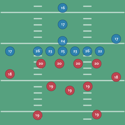
Offense is shown in blue, defense in red. You can see the quarterback with a 24, the center (over 6 feet and around 300 lbs.) averaging higher at 25, and the outside linemen even a little higher. Presumably this is because the outside linemen need to mentally quick (as well as tough) to read the defense and respond to it. Those are the wide receivers (idiot loud mouths) with the 17s on the outside.

(For people not familiar with American Football, the offense and defense are made up of totally separate sets of players. I once showed this piece to a group who stared at me blankly, wondering how someone's IQ could change mid-game.)

To make the diagram a bit clearer, I scaled each position based on its score:

positions2.png

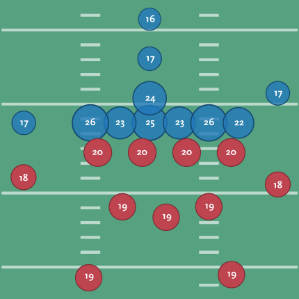
That’s a little better since you can see the huddle around the ball and where the brains need to be for the system of protection around it. With the proportion, I no longer need the numbers, so I’ve switched back to using the initials for each position’s title:

positions3.png

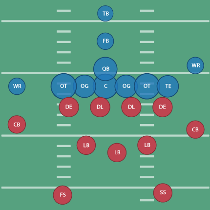
(Don’t tell Tufte that I’ve used the radius, not the proportional area, of the circle as the value for each ellipse! A cardinal sin that I’m using in this case to improve proportion and clarify a point.)

I’ll also happily point out that the linemen for the Patriots all score above average for their position:

Player Position Year Score
Matt Light left tackle 2001 29
Logan Mankins left guard 2005 25
Dan Koppen center 2003 28
Stephen Neal right guard 2001 31
Nick Kaczur right tackle 2005 29

A position-by-position image for a team would be interesting, but I’ve already spent too much time thinking about this. The Patriots are rumored to be heavy on brains, with Green Bay at the other end of the spectrum.

An ESPN writeup about the test (and testing in general) can be found here, along with a sample test here.

One odd press release from Wonderlic even compares scores per NFL position with private sector job titles. For instance, a middle linebacker scores like a hospital orderly, while an offensive tackle is closer to a marketing executive. Fullbacks and halfbacks share the lower end with dock hands and material handlers.

During the run-up to Super Bowl XXXII in 1998, one reporter even dug up the Wonderlic scores for the Broncos and Packers, showing Denver with an average score of 20.4 compared to Green Bay’s 19.6. As defending champions, the Packers were favored but wound up losing 31-24.

Nobody cited test scores in the post-game coverage.

Wednesday, July 16, 2008 | football, sports  
Book

Visualizing Data Book CoverVisualizing Data is my 2007 book about computational information design. It covers the path from raw data to how we understand it, detailing how to begin with a set of numbers and produce images or software that lets you view and interact with information. When first published, it was the only book(s) for people who wanted to learn how to actually build a data visualization in code.

The text was published by O’Reilly in December 2007 and can be found at Amazon and elsewhere. Amazon also has an edition for the Kindle, for people who aren’t into the dead tree thing. (Proceeds from Amazon links found on this page are used to pay my web hosting bill.)

Examples for the book can be found here.

The book covers ideas found in my Ph.D. dissertation, which is the basis for Chapter 1. The next chapter is an extremely brief introduction to Processing, which is used for the examples. Next is (chapter 3) is a simple mapping project to place data points on a map of the United States. Of course, the idea is not that lots of people want to visualize data for each of 50 states. Instead, it’s a jumping off point for learning how to lay out data spatially.

The chapters that follow cover six more projects, such as salary vs. performance (Chapter 5), zipdecode (Chapter 6), followed by more advanced topics dealing with trees, treemaps, hierarchies, and recursion (Chapter 7), plus graphs and networks (Chapter 8).

This site is used for follow-up code and writing about related topics.