Last week at the CaT conference, I met Sheena Matheiken, a designer who is … I’ll let her explain:
Starting May 2009, I have pledged to wear one dress for one year as an exercise in sustainable fashion. Here’s how it works: There are 7 identical dresses, one for each day of the week. Every day I will reinvent the dress with layers, accessories and all kinds of accouterments, the majority of which will be vintage, hand-made, or hand-me-down goodies. Think of it as wearing a daily uniform with enough creative license to make it look like I just crawled out of the Marquis de Sade’s boudoir.
Interesting, right? Particularly where the idea is to make the outfit new through the sort of forced creativity that comes from wearing a uniform. But also not unlike the dozens (hundreds? thousands?) of other “I’m gonna do x each day for 365 days” projects, where obsessive compulsive types take a photo, choose a Pantone swatch, learn a new word, etc. in celebration of the Earth revolving about its axis once more. Yale’s graduate graphic design program even frequents a yearly “100 day” project along these lines. (Don’t get me wrong–I’m happy to obsess and compulse with the best of them.)
But then it gets more interesting:
The Uniform Project is also a year-long fundraiser for the Akanksha Foundation, a grassroots movement that is revolutionizing education in India. At the end of the year, all contributions will go toward Akanksha’s School Project to fund uniforms and other educational expenses for slum children in India.
How cool! I love how this ties the project together. More can be found at The Uniform Project, with daily photos of Sheena’s progress. And be sure to donate.
I’m looking forward to what she has to say about what she’s learned about clothes and how you wear them after the year is complete. Ironic, that the year she wears the same thing for 365 days will be her most creative.
Fantastic TED talk from Chris Jordan back in February 2008. Chris creates beautiful images that convey scale in the millions. Examples include statistics like the number of plastic cups used in a day — four million — and here showing one million of them:
The talk is ten minutes, and well worth a look. I’m linking a sinfully small version here, but check out the higher resolution version on the TED site.
As much as I love looking at this work (and his earlier portraits, more can be found on his site), there’s also something peculiar about the beauty of the images perhaps neutering their original point. Does seeing the number of prison uniforms spur viewers to action, or does it give chin-rubbing intellectual fulfillment accompanied by a deep sigh of worldliness? I’d hate to think it’s the latter. Someone I asked about this had a different reaction, and cited a group that had actually begun to act based on what they saw in his work. I wish I had the reference, but if that’s the case (and I hope it is), there’s no argument.
Looking at it another way, next time you reach for a plastic cup, will Jordan’s image that will come to mind? Will you make a different decision, even some of the time?
I’ve also just purchased his “Running the Numbers” book, since these web images are an injustice to the work. And I have more chin scratching and sighing to do.
(Thanks to Ron Kurti for the heads up on the video.)
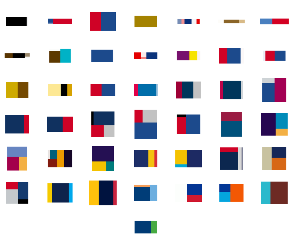
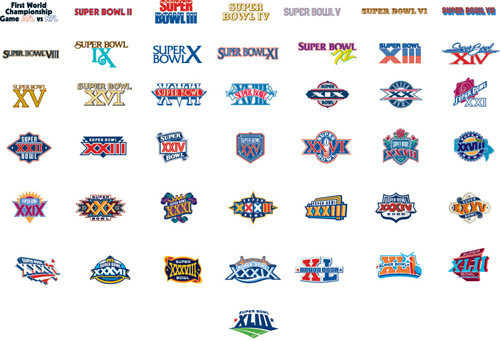
Beneath a pile of 1099s, I found myself distracted still thinking about the logo colors and proportions seen in the previous post. This led to a diversion to extract the colors from the Super Bowl logos and depict them according to their usage. The colors are counted up and laid out using a Treemap.
The result for all 43 Super Bowl logos, using the same layout as the previous image:
A few of the typical pairs, starting with 2001:
See all of the pairings here. Some notes about what’s mildly clever, and the less so:
The empty space (white areas or transparent background) is subtracted from the logo, and the code tries to size the Treemap according to the aspect ratio of the original image, so that when seen adjacent the logo, things look balanced (kinda).
The code is a simple adaptation of the Treemap project in Chapter 7 of Visualizing Data.
Unfortunately, I could not find vector images (for all of the games, at least), which means the colors in the original images are not pure. For instance, edges of a solid blue color will have light blue edges because of smoothing (anti-aliasing). This makes it difficult to accurately figure out what’s a real color and what isn’t. Sometimes the fuzzy edge colors are correctly removed, other times not so much. Even worse, it may even remove legitimate colors that are used in less than 4-5% of the image.
The color quantization isn’t good. On a few, it’s bad, and causes a few similar colors to disappear.
All the above could be fixed, but taxes are more important than non-representational art. (That’s not a blanket statement — just for me this evening.)
And finally, I don’t honestly think there’s any relationship between a software algorithm for data visualization and the work of an artist like Piet Mondrian. But I do love the idea of a Dutch painter from the De Stijl movement making his way through the turnstiles at Raymond Jones Stadium.
The original article cites how the logos reflect the evolution and growth of the league. Which makes sense, you can see that it was more than fifteen years before it moved from just a logotype to a fully branded extravaganza. Or that in its first year it wasn’t the Super Bowl at all, and instead billed as “The First World Championship Game of the American Football Conference versus the National Football Conference,” a title that sounds great in a late-60s broadcaster voice (try it, you’ll like it), but was still shortened to the neanderthal “First World World Championship Game AFC vs NFC” for the logo, before it was renamed the “Super Bowl” the following year. (You can stop repeating the name in the broadcaster voice now, your officemates are getting annoyed.)
The similarities in the coloring are perhaps more interesting than the differences, though the general Americana obsession of the constant blue/red coloring is unsurprising, especially when you recall that some of the biggest perennial ad buyers (Coke, Pepsi, Budweiser) also share red, white, and blue labels. I’m guessing that the heavy use of yellow in the earlier logos had more to do with yellow looking good against a background when used for broadcast.
Or maybe not — like any good collection, there’s plenty to speculate about and many hypotheses to be drawn — and the investigation is more interesting for the exercise.
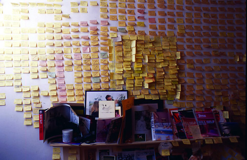
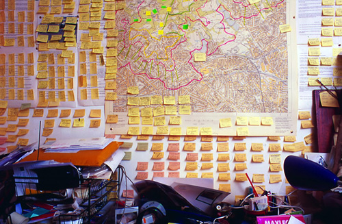
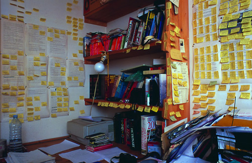
The writing room of author Will Self (Wikipedia), where he organizes his complicated stories through copious use of small yellow (and pink) adhesive papers on the wall:
Reminds me of taking all the pages of my Ph.D. dissertation (a hundred or so) and organizing them on the floor of a friend’s living room. (Luckily it was a large living room.) It was extremely helpful and productive but frightened my friend who returned home to a sea of paper and a guy who had been indoors all day sitting in the middle of it with a slightly wild look in his eyes.
(Thanks to Jason Leigh, who mentioned the photos during his lecture at last week’s iCore summit in Banff.)
Visualizing Data is my 2007 book about computational information design. It covers the path from raw data to how we understand it, detailing how to begin with a set of numbers and produce images or software that lets you view and interact with information. When first published, it was the only book(s) for people who wanted to learn how to actually build a data visualization in code.
The text was published by O’Reilly in December 2007 and can be found at Amazon and elsewhere. Amazon also has an edition for the Kindle, for people who aren’t into the dead tree thing. (Proceeds from Amazon links found on this page are used to pay my web hosting bill.)
The book covers ideas found in my Ph.D. dissertation, which is the basis for Chapter 1. The next chapter is an extremely brief introduction to Processing, which is used for the examples. Next is (chapter 3) is a simple mapping project to place data points on a map of the United States. Of course, the idea is not that lots of people want to visualize data for each of 50 states. Instead, it’s a jumping off point for learning how to lay out data spatially.
The chapters that follow cover six more projects, such as salary vs. performance (Chapter 5), zipdecode (Chapter 6), followed by more advanced topics dealing with trees, treemaps, hierarchies, and recursion (Chapter 7), plus graphs and networks (Chapter 8).
This site is used for follow-up code and writing about related topics.

 Last week at the CaT conference, I met Sheena Matheiken, a designer who is … I’ll let her explain: