Writing

Comorbidity: it’s no longer just for physicians and statisticians

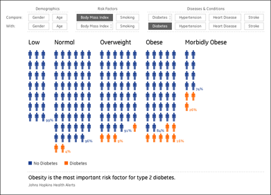
A simple, interactive means for seeing connections between demographics, diseases, and diagnoses:

imagining health as 300 people symbols rearranging themselves in a data symphony

We just finished developing this project for GE as part of the launch of their new health care initiative. With the input and guidance of a handful of departments within the company, we began by looking at their proprietary database of 14 million patient records looking for ways to show connections between related conditions. For instance, we wanted visitors to the site to be able to learn how diabetes diagnoses increase along with obesity, but convey it in a manner that didn’t feel like a math lesson. By cycling through the eight items at the top (and the row beneath it), you can make several dozen comparisons, highlighting what’s found in actual patient data. At the bottom, some additional background is provided based on various national health care studies.

I’m excited to have the project finished and online, and have people making use of it, as I readjust from the instant gratification of building things one day and then talking about them the next day. More to come!

Monday, May 18, 2009 | seed  
Book

Visualizing Data Book CoverVisualizing Data is my 2007 book about computational information design. It covers the path from raw data to how we understand it, detailing how to begin with a set of numbers and produce images or software that lets you view and interact with information. When first published, it was the only book(s) for people who wanted to learn how to actually build a data visualization in code.

The text was published by O’Reilly in December 2007 and can be found at Amazon and elsewhere. Amazon also has an edition for the Kindle, for people who aren’t into the dead tree thing. (Proceeds from Amazon links found on this page are used to pay my web hosting bill.)

Examples for the book can be found here.

The book covers ideas found in my Ph.D. dissertation, which is the basis for Chapter 1. The next chapter is an extremely brief introduction to Processing, which is used for the examples. Next is (chapter 3) is a simple mapping project to place data points on a map of the United States. Of course, the idea is not that lots of people want to visualize data for each of 50 states. Instead, it’s a jumping off point for learning how to lay out data spatially.

The chapters that follow cover six more projects, such as salary vs. performance (Chapter 5), zipdecode (Chapter 6), followed by more advanced topics dealing with trees, treemaps, hierarchies, and recursion (Chapter 7), plus graphs and networks (Chapter 8).

This site is used for follow-up code and writing about related topics.